
AI dashboards fail in predictable ways. The hero is a generic line chart. The AI features hide behind a sparkle icon. Every metric on the home view fights every other metric. The user closes the tab and writes the same status update in a Notion doc instead. A working AI dashboard in 2026 does not ship more components, it makes the right decisions about hierarchy, AI placement, and density.
This is a working list of the seven practices that consistently separate dashboards founders are proud to demo from ones that quietly never get opened. Each practice comes with a real-product example, a score on impact and difficulty, and the mistake teams make when they ignore it.
TL;DR, the single highest-leverage practice in 2026 is placing AI inside the data path (Vercel, PostHog, Stripe) rather than behind a separate AI tab.
AI dashboard UI design best practices: a brief overview
One hero, not seven: Make the primary metric or action visually dominant, everything else supports.
AI in the data path: Place AI summaries and suggestions inside existing components, not in a separate AI tab.
Job-segmented IA: Organize navigation by user job (ship, monitor, resolve), not by data type (charts, tables, settings).
Agent UX with diff review: Let agents edit the canvas, surface the diff for human approval inside the editor.
Calm density: High data density with low visual noise, hierarchy carries the weight.
Evals and traces as first-class surfaces: For LLM products, ship eval workflows alongside prompts, not after launch.
Empty states as onboarding: Treat first-load and zero-data screens as the most important UX surface.
Practice | Information density | Clarity impact | Aesthetic impact | Customization | Score (/20) |
|---|---|---|---|---|---|
One hero, not seven | 3 | 5 | 4 | 3 | 15 |
AI in the data path | 5 | 5 | 4 | 5 | 19 |
Job-segmented IA | 4 | 5 | 3 | 5 | 17 |
Agent UX with diff review | 4 | 5 | 4 | 4 | 17 |
Calm density | 5 | 4 | 5 | 3 | 17 |
Evals as first-class | 5 | 4 | 3 | 5 | 17 |
Empty states as onboarding | 2 | 5 | 4 | 3 | 14 |
1. One hero, not seven, best for fixing scattered home views
The most common AI dashboard mistake is treating the home view as a metrics buffet. Seven tiles of equal visual weight tell the user nothing. The fix is to pick the one piece of information or one action that drives the user's primary job, and size it as the hero. Everything else lives at a clearly supporting weight.
Stripe is the canonical reference. Revenue is the hero. Below it, balance, payouts, and disputes live as supporting sections. Vercel does the same thing differently: the project list is the hero, metrics are one click deeper. The pattern works because hierarchy is louder than density.
Key strengths
Removes the "where do I look first" problem on first load
Forces a useful product conversation about which user job matters most
Translates cleanly to mobile, where you cannot show seven equal tiles
Creates a memorable surface buyers can describe in one sentence
Makes scaling easy, new metrics fit the supporting hierarchy without redesign
Best for
SaaS dashboards with one clear primary user job (operate, ship, monitor)
Founders shipping their first dashboard who default to "all metrics on the home"
Pricing impact
No tooling cost
Design time investment to pick the right hero
Pros
Highest ROI design decision for a dashboard's first 12 months
Translates across themes, density profiles, and device sizes
Cons
Requires real product opinion, harder than shipping a grid
2. AI in the data path, best for AI features that get used
AI tabs die. AI summaries that show up next to the log row the user is already reading get clicked every session. The practice is to place AI suggestions, summaries, and explanations inside the existing component, in the user's existing flow, rather than behind a separate tab.
Vercel is the strongest mainstream example. When a build fails, the AI summary lives next to the log. When analytics are weird, the AI explanation lives next to the chart. PostHog applies the same idea differently: Max AI is invoked from the canvas, and the generated chart drops back into the canvas as a real component.
Key strengths
Drives AI feature usage by removing the "remember to use AI" step
Makes AI feel native to the product, not a separate app
Scales across many product surfaces without IA inflation
Improves trust by showing AI in context, with the source data visible
Easier to evaluate AI quality when output sits next to ground truth
Best for
Any AI product where AI is a feature inside an existing workflow
Teams shipping AI features that need to feel like product, not demos
Pricing impact
Engineering cost to integrate AI into existing components
Lower long-term cost than maintaining a separate AI surface
Pros
The single highest-leverage practice for AI dashboard adoption in 2026
Removes the most common reason AI features die: nobody remembered to click the AI tab
Cons
Requires AI features to be reliable enough to live in the user's main flow
3. Job-segmented IA, best for navigation that scales
Most dashboards organize navigation by data type: charts, tables, settings, integrations. The better practice is to organize by user job: ship, monitor, resolve, configure. Job-segmented IA scales because adding a new feature usually fits into an existing job. Data-type IA inflates because every new feature wants its own tab.
Stripe's nav is the cleanest production example: Home, Payments, Customers, Balances, Payouts, Disputes, each one a user job. Cloudflare uses the same approach across thirty-plus products: each product is grouped by the job it serves (security, network, AI, storage). When AI Gateway shipped, it fit the existing nav. No redesign needed.
Key strengths
Scales as the product adds features
Maps onto user mental models, not internal team boundaries
Makes onboarding faster because labels match user intent
Survives product rebrands and feature renames
Easier to localize because job names translate predictably
Best for
Multi-feature SaaS and AI products with growth ambitions
Teams whose roadmap includes shipping more AI features in the next year
Pricing impact
Design time investment upfront
Saves redesign cost downstream
Pros
Best long-term decision a designer can make on a v1 dashboard
Translates cleanly across products, teams, and pricing tiers
Cons
Requires real user research to pick the right job labels
4. Agent UX with diff review, best for trusting AI to act
Agents that produce a chat reply rarely get used twice. Agents that edit the canvas, surface the diff, and let the user review and approve become a primary work pattern. The practice is to give the agent write access to the work surface, then make the human approval step inline with the existing IA.
Cursor is the benchmark. Agent mode reads the codebase, edits files, runs commands, and surfaces every change as a diff inside the editor. The user reviews the diff like they would a teammate's pull request. PostHog applies the same idea differently: Max AI generates a chart, the user reviews it, edits it like any other chart, then saves it.
Key strengths
Builds user trust through transparent diff review
Reduces "AI generated but unused" output, the agent's changes are reviewed in flow
Scales agent capability without losing human oversight
Makes agent failures easy to catch and undo
Translates to almost any product where the agent acts on user content
Best for
AI products where the agent has write access to user content (docs, code, charts, configs)
Teams shipping agent features that need to feel like product, not science projects
Pricing impact
Engineering cost to build diff and undo surfaces
Lower support cost downstream because users catch agent mistakes faster
Pros
The benchmark agent UX pattern in 2026
Translates from code (Cursor) to charts (PostHog) to docs (Notion AI)
Cons
Requires real engineering investment in a diff or change-review surface
5. Calm density, best for dashboards that scale
High data density does not have to mean visual noise. The practice is to use one or two type weights, a restrained color palette, accent color only for state (green for healthy, yellow for warning, red for failure), and consistent spacing. Density carries the weight, hierarchy carries the readability.
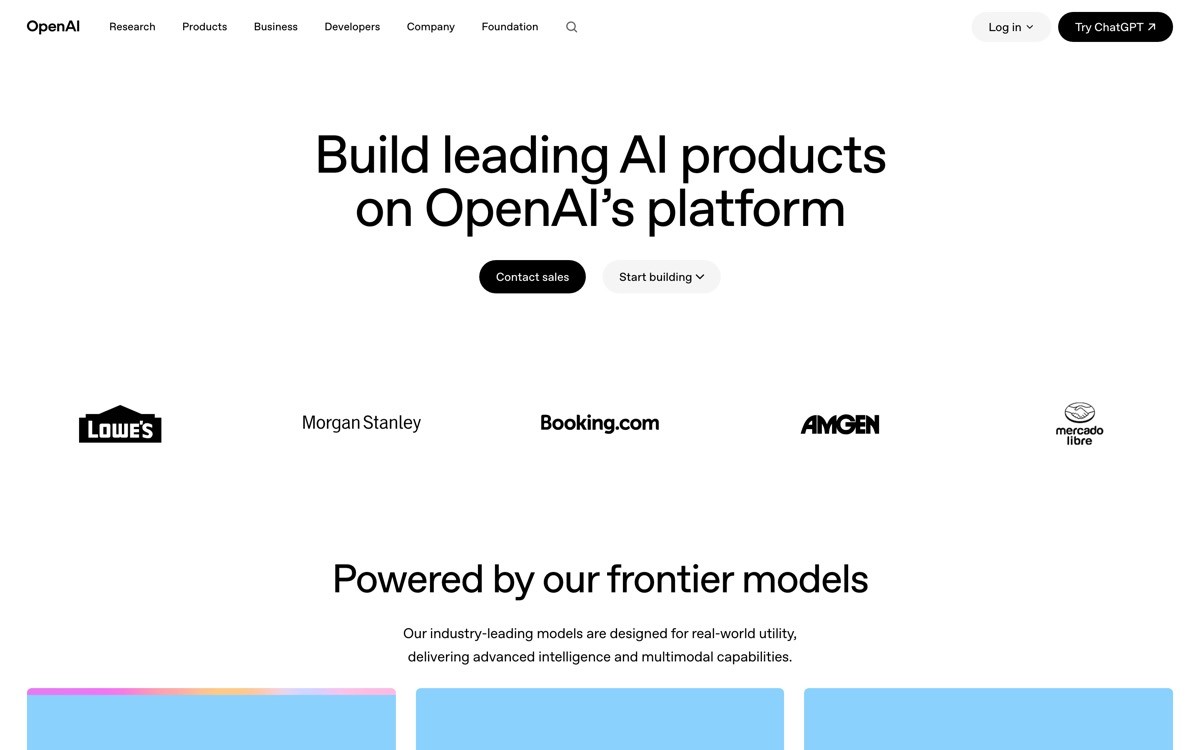
Stripe and OpenAI Platform both run wide IAs with dozens of routes, and both stay calm because the visual language is restrained. The opposite pattern, dense plus loud, is the most common reason dashboards feel "templated." Most v1 AI dashboards over-style the chrome and under-style the data.
Key strengths
Lets a dashboard carry a wide IA without overwhelming the user
Scales across themes, density profiles, and product surfaces
Reduces visual fatigue for users opening the dashboard daily
Makes states (success, warning, failure) instantly readable
Translates well to dark and light themes
Best for
Operational dashboards with high daily usage
Multi-product or enterprise platforms with wide IA needs
Pricing impact
Design system investment upfront
Pays back across every future surface
Pros
The visual practice that most clearly separates "designed" from "templated"
Compounds value as the product adds surfaces
Cons
Requires a confident designer or a strong design system reference
6. Evals and traces as first-class, best for LLM products
For LLM applications, the dashboard is incomplete without an eval workflow. The practice is to ship traces (every LLM call as an inspectable tree) and evals (automated scoring against datasets) as first-class surfaces alongside the prompt or chat surface, not as a separate observability product.
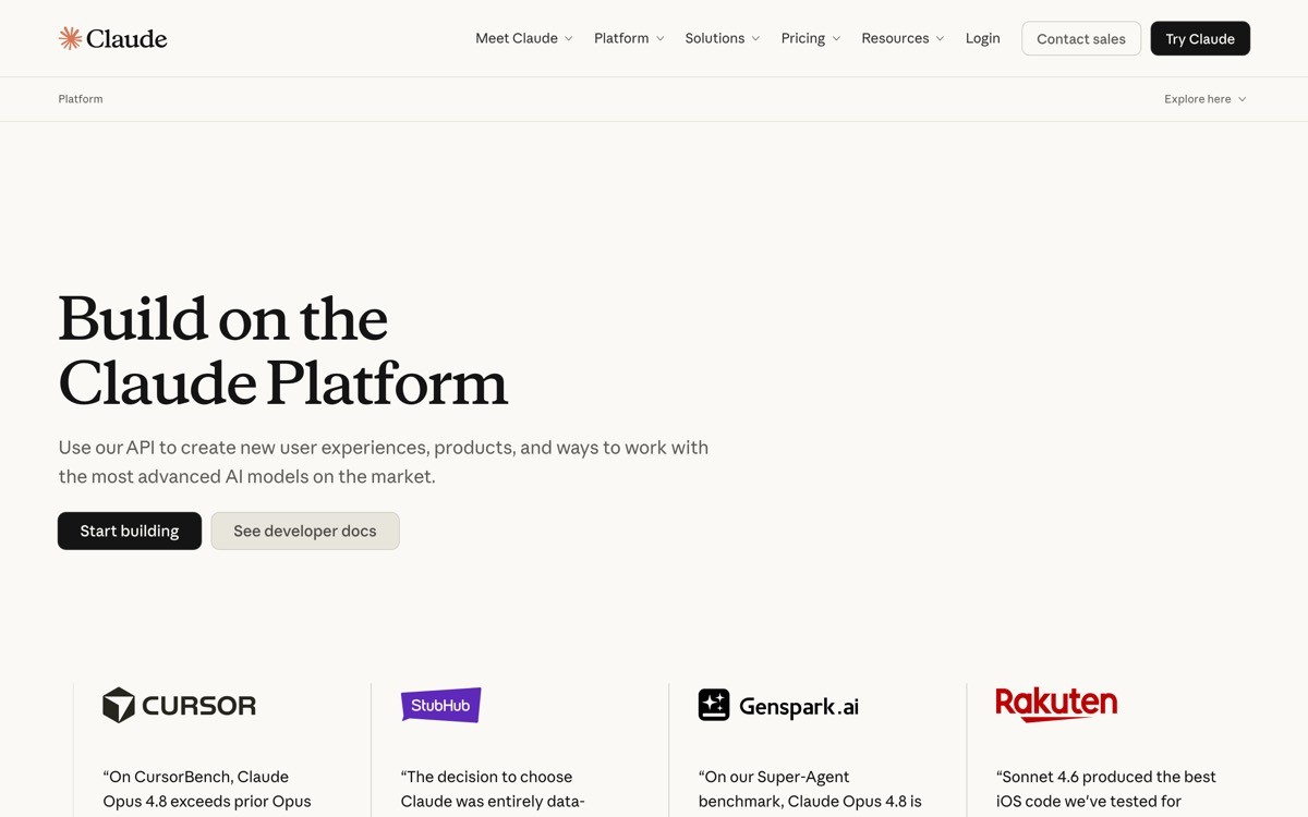
LangSmith is the strongest reference. Every trace is a tree the developer can inspect, every dataset is a real artefact, every eval is a scheduled run with regression detection. Anthropic Console hints at the same pattern in a simpler form, with usage and rate limits visible alongside the playground.
Key strengths
Makes LLM debugging tractable, the alternative is grep on logs
Catches regressions before they hit production
Surfaces cost and latency alongside quality
Builds team trust in AI features through measurable evals
Scales as the product adds prompts, chains, and agents
Best for
Any product shipping LLM features in production
Teams designing AI tools for other AI developers
Pricing impact
Engineering cost to build trace and eval surfaces
Avoidable production incident costs downstream
Pros
The fastest way to move an LLM product from "vibes-based" to "evidence-based"
Translates evidence into a competitive sales artefact
Cons
Requires upfront investment in dataset curation and eval design
7. Empty states as onboarding, best for first-load conversion
The first time a user lands on a dashboard, there is no data. Most teams treat this as an error state. The practice is to treat empty states as the most important UX surface, because they are the user's first impression and the moment that decides whether they configure the product or close the tab.
Linear, Vercel, and Stripe all treat empty states as onboarding: each blank zone has a clear next action, a short explanation of what will appear once data lands, and a quick-start prompt or template. The pattern works because the empty state is the only moment the dashboard can directly tell the user what to do.
Key strengths
Turns blank zones into a guided first-run experience
Reduces churn at the most common drop-off point
Removes the need for separate onboarding tours that feel paternalistic
Builds trust by showing the user what the product will look like populated
Easy to test, the impact is measurable on activation rates
Best for
Self-serve SaaS and AI products with a configure-or-leave first run
Teams that have strong activation but weak day-one engagement
Pricing impact
Design and copy investment per surface
Pays back in activation rate
Pros
One of the highest-ROI design practices for activation
Easy to ship incrementally, one empty state at a time
Cons
Requires real copywriting craft, not just visual design
How to choose the right practices for your AI dashboard
1) Are you shipping v1 or fixing v3?
If you are shipping a v1 dashboard, prioritize one hero metric, job-segmented IA, and empty states as onboarding. These three practices set the foundation, and getting them wrong forces a redesign in twelve months. If you are fixing a v3 dashboard that already exists, focus on AI in the data path and calm density. These two practices can be retrofitted without rewriting the IA.
2) Is AI a feature or the canvas?
If AI is a feature inside an existing product, prioritize AI in the data path and job-segmented IA. The goal is to make AI feel native to the existing flow. If AI is the canvas (agent workspace, analytics composer, model runner), prioritize agent UX with diff review and evals as first-class. The goal is to make the AI a trustworthy participant in the work.
3) Are your users debugging non-deterministic systems?
LLM apps need observability that traditional logging dashboards do not provide. If your users are shipping LLM features, evals and traces as first-class is non-negotiable. If your users are shipping deterministic systems (deployments, payments, infra), traditional observability plus AI summaries in the data path is enough.
4) How much daily usage does the dashboard need to support?
Operational dashboards that buyers open every day need calm density and job-segmented IA above everything else. Analytical dashboards that buyers open weekly can carry more visual style and less hierarchy discipline. Be honest about which one you are shipping. Most "operational" dashboards are actually analytical because nobody opens them daily.
If you have picked your practices but want a design partner to turn them into a profitable, human-grade product, that is what AY Design does. We help AI product teams ship dashboards that stop looking like every other AI admin panel and start driving daily usage. Book a design audit to see which practice will move your numbers first.
FAQ
What are the most important AI dashboard UI design best practices in 2026?
The highest-leverage practices in 2026 are AI in the data path, job-segmented IA, agent UX with diff review, and one hero metric per home view. These four decisions account for most of the difference between dashboards that drive daily usage and dashboards that quietly never get opened. Visual style, theme, and chart selection matter much less than IA and AI placement.
How do I avoid an "AI tab ghetto" in my dashboard?
Place AI suggestions, summaries, and explanations inside the components users already interact with, not in a separate AI tab. Vercel, Stripe, and PostHog all do this. When a user opens a log, the AI summary is there. When a user opens a chart, the AI explanation is there. The AI tab pattern is the strongest predictor of an AI feature that nobody uses.
How dense should an AI dashboard be?
As dense as the user job requires, with hierarchy strong enough to make the density readable. Stripe and OpenAI Platform both carry wide IAs and high data density, and both stay readable because they use restrained typography, calm color, and accent only for state. Density is not the enemy. Visual noise is the enemy.
How do I design empty states for an AI dashboard?
Treat each empty state as a first-run onboarding moment. Show the user what will appear once data lands, give them a clear next action (connect a source, run a prompt, ship a deployment), and use the empty state as a copy surface to explain the product's value. Vercel, Linear, and Stripe all do this exceptionally well.
Should I use dark mode by default in an AI dashboard?
Only if dark mode is the default in your category. Developer tools (Vercel, Linear, Cursor) default to dark because their users prefer it. Operational dashboards (Stripe) often default to light. The pattern is to match the user's editor or terminal default, not to follow a visual trend. Both modes should be production-quality regardless.
What is the role of charts in a modern AI dashboard?
Charts are decoration when they are not tied to a decision. The best practice is to ship one or two charts that drive a primary user job, and resist the temptation to add more. Stripe's revenue chart drives a decision. Most "engagement" charts on AI dashboards do not, and they should be cut or moved out of the home view.
How do I design an AI dashboard that does not look templated?
Pick a real hero metric, segment navigation by user job, and integrate AI inside existing components. Templated dashboards usually fail at all three. Visual style is downstream of these decisions, not upstream. A calm dashboard with strong IA looks bespoke. A glowing dark dashboard with weak IA looks templated.
How important are evals and traces for an AI dashboard?
For LLM applications, evals and traces are non-negotiable in 2026. LangSmith and Anthropic Console treat them as first-class surfaces because LLM apps are non-deterministic and need statistical debugging, not single-trace logging. For deterministic AI products (recommenders, classifiers, deployment automation), traditional observability is usually sufficient.
Checkout other Blogs:

Multi-agent system UX design guide for 2026
A pattern-by-pattern guide to designing multi-agent system UX in 2026, with a scoring matrix and references from Claude Code, LangGraph, Devin, and Replit Agent.
Author:
AY Designs Team

Human-in-the-loop AI design guide for 2026
A 2026 guide to human-in-the-loop AI design with patterns, scoring framework, and examples from Cursor, Claude Code, Stripe, and Notion AI.
Author:
AY Designs Team

How to design agentic AI products in 2026: a 7-step playbook
A seven-step design playbook for shipping agentic AI products that users actually trust, with scoring matrix and real product references from Cursor, Claude Code, Devin, and Perplexity.
Author:
AY Designs Team

How much does AI SaaS design cost in 2026?
AI SaaS design cost in 2026 by tier and engagement type, with ranges, timelines, and a value scorecard for founders shipping with Lovable, Bolt, and v0.
Author:
AY Designs Team