
Minimalist SaaS design is the most misunderstood label in product design. Founders see "minimalist" and ship a white page with a thin sans typeface, three columns, and a single CTA, then wonder why the result feels boring instead of premium. The real minimalist SaaS products in 2026 are not stripped down, they are precisely tuned: every element earns its place, the density is high but never crowded, and the restraint comes from a strong point of view, not from removing things until nothing is left.
The products in this list each picked a different version of minimalism. Linear leans into product-led density. Vercel uses monochrome with discipline. Stripe makes complex finance feel calm. Notion uses an empty canvas as the brand. Each design choice is opinionated, repeatable, and worth pulling apart if your AI SaaS product currently feels templated or busy.
TL;DR, if you only steal one move, copy Linear or Stripe: pick one typographic voice, one tight color discipline, and one density rule, then commit hard enough that any single screen is instantly recognisable.
Best minimalist SaaS designs: a brief overview
Linear: Best product-led minimalism, marketing and app share one design language.
Vercel: Best monochrome minimalism, black and white plus one disciplined accent.
Stripe: Best functional minimalism, makes financial complexity feel calm.
Notion: Best canvas minimalism, the empty page is the entire pitch.
Framer: Best editorial minimalism, treats marketing surfaces like print design.
Anthropic Claude: Best research-led minimalism, restraint as a trust position.
Granola: Best utility minimalism, real product screens over marketing illustration.
Product | Minimalist signature | Density approach | Common color move |
|---|---|---|---|
Linear | Sharp UI, gradient orb signature | High density, ruthless hierarchy | Dark base with single saturated accent |
Vercel | Black on white with one accent | Dense dashboards, calm marketing | Monochrome, deliberate negative space |
Stripe | Calm gradients, precise typography | Moderate density, generous whitespace | Pastel accents over neutral base |
Notion | Empty canvas as the brand | Low chrome, content-first | Mostly neutral with content color |
Framer | Editorial typography, big numerals | Spacious, magazine-style | Bold accent paired with off-white base |
Anthropic Claude | Warm neutrals, serif headlines | One idea per section | Cream and ink, no saturated color |
Granola | Real product screenshots | Honest density, no decorative space | Quiet brand color around a busy UI |
1. Linear, best product-led minimalism
Linear's design is the clearest 2026 proof that minimalism is about discipline, not emptiness. The product UI is dense: many lanes, many issues, many states, many keyboard shortcuts. What makes it feel minimalist is the ruthlessness of the hierarchy. Every screen has one primary surface (the list, the issue, the project), one secondary surface (the sidebar), and a navigation rail. Nothing competes for attention, and the typography handles all the weight that color and ornament would carry in a busier product.
What is notable is how the marketing site mirrors the product without ever feeling like documentation. The gradient orb motif, the dark base, the typography pairing, and the dense feature blocks all show up in both places. A buyer who lands on the marketing site already knows what the product feels like, and the design promise holds the moment they sign in. Most SaaS startups break this seam, which is why their landing page never matches the app.
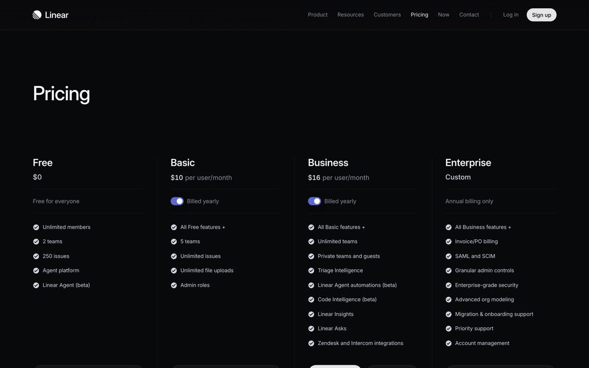
Key strengths
Product UI and marketing site share one design language and one motion grammar
Dense screens that feel calm because hierarchy is ruthless, not loose
Typography carries weight where color and ornament usually have to
Gradient orb motif acts as a signature without becoming a cliche
Dark mode executed with restraint, not the typical "dark equals dramatic" trap
Best for
Product-led SaaS where the in-app density is the strongest sales argument
Teams that want a brand system that scales from changelog to keyboard shortcut overlay
Patterns to lift
Decide which surface is primary on every screen, demote everything else
Use type weight and size to handle hierarchy before reaching for color
Pick one signature visual element and use it across every surface
Common mistakes founders make in this area
Stripping density without strengthening the typographic hierarchy underneath, which produces an empty page, not a minimalist one
Reserving the minimalist language for marketing and shipping a templated product UI
Cons of this approach
Demands a strong product UI to lead with, weak UI cannot fake the discipline
2. Vercel, best monochrome minimalism
Vercel is the most-copied dev-tool brand of 2026 because the design system is small, sharp, and almost impossible to misuse. Black on white, a single sharp accent, geometric typography, and one strict rule: every accent has to mean something. The dashboards are dense, the marketing site is calm, and the brand voice is consistent from docs to event signage.
What is notable is how Vercel treats motion and loading states. Animation is restrained, transitions are short, and skeleton states use the same color discipline as the rendered UI. The product never feels theatrical, which is rare for a developer brand that has to feel premium without using color as a crutch. The minimalism is engineered into the smallest details, which is why it scales.
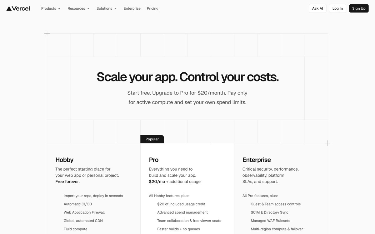
Key strengths
Monochrome palette with one disciplined accent that survives every surface
Geometric type system that pairs sans with monospace without a third typeface
Dense dashboards that still feel designed, not just functional
Restrained motion and skeleton states that match the rendered UI
Documentation that reads like the brand, not like a separate product
Best for
Developer-tool SaaS and infrastructure products aimed at technical buyers
Brands that need to feel premium without leaning on color
Patterns to lift
Start with black and white, add color only when it carries meaning
Pair sans with monospace for code, skip the third typeface
Treat motion and skeleton states as brand surfaces, not afterthoughts
Common mistakes founders make in this area
Adding a second and third accent for "hierarchy," which dilutes the discipline
Letting docs and marketing diverge into separate visual systems
Cons of this approach
Several dev-tool brands now look like Vercel-lite, the pattern is increasingly crowded
3. Stripe, best functional minimalism
Stripe's design has set the standard for "complex product, calm interface" for almost a decade, and the 2026 version is the most refined yet. The product handles payments, fraud, treasury, identity, billing, terminal hardware, and tax compliance, yet every screen feels composed. The trick is a tight type system, generous whitespace around dense data, and a small set of repeating UI primitives that the user learns once and recognises everywhere.
What is notable in 2026 is how Stripe's marketing site treats gradients. They are subtle, slow, and tied to specific concepts (revenue, growth, motion), not decorative. Compare with the average AI SaaS hero, where the gradient exists because everyone else has one. Stripe is one of the few brands in this list that uses gradient as a meaning layer, not a fashion choice.
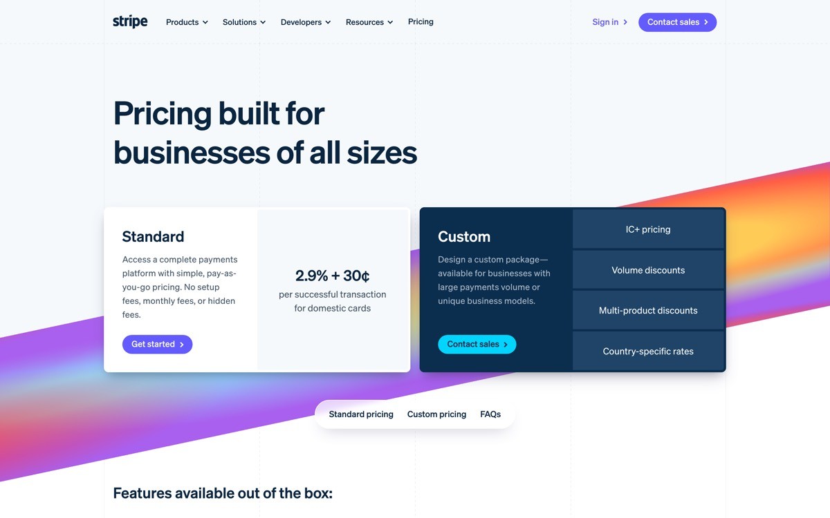
Key strengths
Repeating UI primitives that scale across payments, treasury, billing, and tax
Calm typography that handles dense financial data without overwhelm
Gradients used as meaning layers, not decorative ornament
Code samples in the documentation styled with the same discipline as the marketing site
Empty states, error states, and loading states all feel like the product, not edge cases
Best for
SaaS products with high product complexity that need to feel approachable
Brands selling into both developers and finance buyers in the same UI
Patterns to lift
Build a small UI primitive library and use it everywhere, no one-off components
Tie gradients and accent color to meaning, not to mood
Treat empty and error states as primary brand surfaces
Common mistakes founders make in this area
Designing the "main flow" then shipping inconsistent edge-case screens
Using gradients as decoration, which weakens the meaning of the ones that should carry weight
Cons of this approach
Stripe's level of polish requires a mature design org, hard to replicate at seed stage
4. Notion, best canvas minimalism
Notion's design has been the same essential idea since launch: the canvas is the brand. The marketing site, the product, and the templates all treat the empty page as the dominant surface, with chrome (toolbars, sidebars, formatting) reduced to a thin frame around it. The minimalist effect is not from removing features, it is from getting the chrome out of the way so the user's content fills the screen.
What is notable in 2026 is how Notion has resisted the AI-everywhere temptation. AI features live as quiet inline affordances (the "Ask AI" surface, slash commands, suggestion blocks), not as a new persistent panel. The canvas stays the canvas, and the AI augments instead of taking over. That is the right model for a productivity product where the user's work is the point.
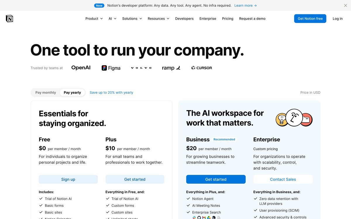
Key strengths
Empty canvas as the dominant surface, chrome reduced to a thin frame
Slash commands and inline affordances keep advanced features available without cluttering the UI
AI features live as quiet augmentations, not a new persistent panel
Templates demonstrate the canvas range without breaking the design language
Mobile experience preserves the canvas-first hierarchy, no separate redesign
Best for
Productivity, content, and collaboration tools where the user's work is the point
Products that need to support a wide feature set without crowding the primary surface
Patterns to lift
Reduce chrome to a thin frame, give the user's content the rest of the screen
Use slash commands and inline menus for power features, not persistent panels
Ship AI as an augmentation of the existing surface, not as a new tab
Common mistakes founders make in this area
Adding a permanent "AI panel" that competes with the user's content for attention
Stripping chrome without designing strong inline affordances for advanced features
Cons of this approach
Canvas-first design demands strong inline affordances, otherwise advanced features get hidden
5. Framer, best editorial minimalism
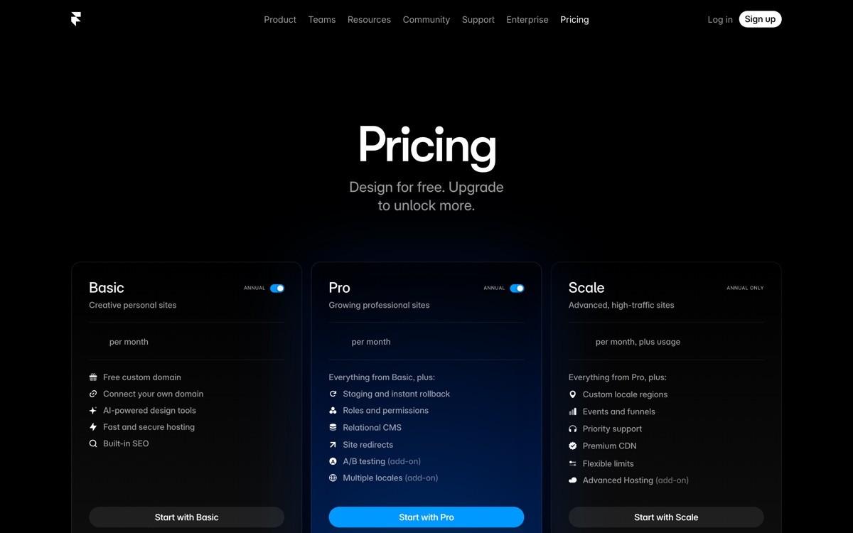
Framer is the SaaS product that most consistently uses editorial design as a brand position. The marketing site reads like a magazine: big numerals, deliberate typographic pairings, generous whitespace, and bold accent moves used as punctuation rather than decoration. Inside the product, the canvas is calm and the right-hand inspector is dense, which mirrors the print layout convention of "big image, dense caption."
What is notable in 2026 is how Framer makes templates feel branded. Most template marketplaces look like a sea of similar designs, but Framer's curated set follows the same editorial restraint as the product. A user shipping with a Framer template inherits a measurable amount of brand discipline by default, which is unusual in SaaS.
Key strengths
Editorial typography that treats marketing surfaces like print design
Big numerals and bold accent moves used as punctuation, not decoration
Calm canvas paired with a dense inspector, mirrors print layout conventions
Curated templates that inherit the brand discipline by default
Motion that feels designed, not bolted on
Best for
Design-led SaaS and creative tools where the brand voice is the product
Products that want to look unicorn-grade without a heavy color system
Patterns to lift
Use big numerals and editorial typography to handle visual weight
Treat the canvas-plus-inspector split as a brand pattern, not just a UI choice
Curate templates and starter content so they inherit brand discipline
Common mistakes founders make in this area
Borrowing the editorial look without the underlying typographic discipline, which reads as "tried to look like Framer"
Letting templates drift from the brand language, breaking the design promise
Cons of this approach
Editorial minimalism is harder for buyers who expect software to look like software
6. Anthropic Claude, best research-led minimalism
Claude's design is the strongest 2026 example of restraint as a positioning move. The marketing site uses warm neutrals, an editorial serif paired with a clean sans, and a typographic logo treatment that signals research-institute, not SaaS startup. The product UI carries the same temperature: cream and ink palette, conversation-first layout, artifacts panel that respects the user's work, and zero decorative motion.
What is notable is how the brand reads as calm without reading as cold. Most "minimalist" AI tools end up feeling sterile because they strip color and warmth at the same time. Claude keeps the warmth (the cream base, the serif headlines, the careful copy voice) while still leaving most surfaces near-empty. That balance is the hardest version of minimalism to execute, which is why most AI brands fail at it.

Key strengths
Warm neutrals and editorial serifs that read calm without feeling cold
One idea per section, no carousels or scroll-jacking
Identity stretches across marketing, product UI, API console, and research papers
Restraint as a positioning move, signals trust and care to enterprise buyers
Typography handles hierarchy that color and ornament would carry elsewhere
Best for
AI tools sold to enterprise, regulated, or risk-averse buyers
Brands that want to differentiate by feeling careful, not loud
Patterns to lift
Pair an editorial serif with a clean sans, avoid Inter-by-default
Use warm neutrals instead of the standard cool grey AI palette
Cap sections to one idea each, no carousels and no scroll hijack
Common mistakes founders make in this area
Stripping color and warmth at the same time, producing a sterile UI
Copying Claude's restraint without the underlying typographic craft
Cons of this approach
Demands typography and brand investment that most pre-seed teams cannot afford yet
7. Granola, best utility minimalism
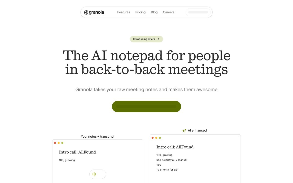
Granola is the strongest 2026 example of minimalism in a utility AI product. The marketing site is built almost entirely around real product screenshots, the in-app interface keeps note-taking as the dominant surface with the agent layered quietly on top, and the brand color is reserved for the smallest, most meaningful UI moments. The minimalism is honest rather than aspirational: the product looks like the product.
What is notable is how Granola resists marketing illustration. There is no abstract "AI thinks" diagram, no glowing brain icon, no purple gradient hero. The screens are the screens, and the buyer sees exactly what they will get inside the app. That honesty is rare in AI SaaS, and it is one of the reasons Granola's design feels trustworthy in a category that usually overpromises.
Key strengths
Real product screenshots dominate marketing, no decorative AI illustration
Note-taking surface stays primary, agent augmentations layered quietly
Brand color reserved for the smallest, most meaningful UI moments
Founder quotes and real notes as social proof, not stock testimonials
Privacy and storage copy visible at point of capture, not buried in settings
Best for
Utility AI tools where the output quality is the entire sales argument
Products where the buyer wants to verify usefulness before signing up
Patterns to lift
Replace abstract AI hero art with real product screens
Reserve brand color for the smallest meaningful moments, not the hero block
Use founder quotes with names and faces, not generic testimonial blocks
Common mistakes founders make in this area
Cherry-picking the prettiest screen instead of representative ones, which breaks trust on first use
Using stock testimonial blocks that any AI tool could borrow, which removes social-proof value
Cons of this approach
Requires constant screenshot maintenance as the UI evolves
How to choose the right minimalist direction for your SaaS
1) Is your product surface strong enough to lead with?
If yes (Linear, Granola, Vercel-style UI), make the product the primary brand image and design the marketing site to mirror it. If not, lean on typography and color discipline first (Anthropic, Framer, Stripe) and let the product catch up. Trying to lead with a weak product surface is the fastest way to make a minimalist brand feel templated.
2) Who is your buyer, and what density do they expect?
Technical buyers (developers, ops, infra) expect density and reward it (Linear, Vercel, Stripe). Generalist buyers (founders, marketing, content) expect calm and reward whitespace (Notion, Framer). Enterprise and regulated buyers expect calm plus credibility (Anthropic). Pick the density rule that matches the buyer, then enforce it across every screen.
3) Are you using color as decoration or as meaning?
Minimalist designs that work treat every accent color as a signal: this is a CTA, this is a state, this is a brand moment. Designs that fail use color as decoration, then have nothing left when something actually needs to stand out. The strongest products in this list (Vercel, Stripe, Granola) all reserve color for moments that matter and stay near-monochrome elsewhere.
4) Can the design survive the screenshot test?
Take any single screen, crop the logo, and put it next to a competitor. If a buyer cannot tell the two apart, the minimalism is not differentiated, it is just empty. Linear, Anthropic, Stripe, Framer, and Notion all pass the screenshot test on the first frame. Most "minimalist" AI SaaS launches fail it inside three sections.
If you have picked a minimalist direction but the product still feels templated, the fix is rarely "remove more." It is sharper typography, tighter color rules, more honest product screenshots, and a brand voice that matches the buyer. AY Design redesigns SaaS and AI products for founders shipping with Lovable, Bolt, v0, and Cursor who need a minimalist look that does real work, not a generic white page. Book a design audit and we will show you which of these patterns fits your buyer and where to start.
FAQ
What is minimalist SaaS design?
Minimalist SaaS design is a product design approach that uses restraint, typographic hierarchy, and tight color discipline to make complex software feel calm and recognisable. It is not about removing features or shipping empty pages, it is about giving every element a clear job and a clear visual rank. The strongest examples in 2026 are Linear, Vercel, Stripe, Notion, Framer, Anthropic, and Granola.
Which SaaS has the best minimalist design in 2026?
Linear sets the bar for product-led minimalism because the marketing site and product UI share one design language. Stripe leads in functional minimalism, making complex finance feel calm. Anthropic leads in research-led minimalism, where restraint signals trust to enterprise buyers. The "best" depends on the buyer and the category.
Is minimalism still relevant for AI SaaS in 2026?
Yes, more than ever. The AI SaaS category is saturated with templated hero gradients, generic glowing orbs, and Inter-everywhere typography. A genuinely minimalist design (Linear, Anthropic, Granola) stands out by feeling considered and intentional, while the loud "AI futuristic" look has become the new template. Restraint is now the differentiator.
How do I make a minimalist SaaS not feel boring?
Strong minimalism uses typography, density, and color discipline to carry weight where ornament usually does. Look at Linear (typographic hierarchy), Vercel (one disciplined accent), Stripe (calm gradients tied to meaning), and Framer (editorial numerals). A minimalist SaaS feels boring when the team strips ornament without strengthening these underlying systems.
Should a minimalist SaaS use dark mode or light mode?
Either works, but the choice has to match the buyer and the product. Developer tools (Linear, Vercel) lean dark because their buyers expect it, productivity and writing tools (Notion, Framer) lean light because content reads better on a calm base. Anthropic uses warm cream as a third path that signals editorial trust. Pick once, commit, do not ship a half-implemented dark mode.
How much whitespace does a minimalist SaaS need?
Enough to make hierarchy obvious, not enough to make the page feel empty. Linear and Vercel run dense screens with calm spacing, Stripe and Framer run spacious sections with denser data inside, Notion runs nearly empty marketing surfaces. The density rule should match the buyer's expectation, not a Dribbble aesthetic.
Should my AI features get their own UI panel?
Usually no. The strongest minimalist SaaS in 2026 (Notion, Linear, Granola) ship AI as inline augmentations of existing surfaces, not as a new persistent panel that competes for attention. Treating AI as a tab or sidebar fragments the product and signals that AI is bolted on, not native.
How do I make my SaaS look more like Linear or Stripe?
Three moves: tighten the type system to one or two typefaces, pick one accent color and reserve it for moments that matter, and bring your product UI into the marketing site so the two surfaces share one design language. The third is the one most teams skip, and it is the single biggest reason their site never feels as polished as the products in this list.
Checkout other Blogs:

Multi-agent system UX design guide for 2026
A pattern-by-pattern guide to designing multi-agent system UX in 2026, with a scoring matrix and references from Claude Code, LangGraph, Devin, and Replit Agent.
Author:
AY Designs Team

Human-in-the-loop AI design guide for 2026
A 2026 guide to human-in-the-loop AI design with patterns, scoring framework, and examples from Cursor, Claude Code, Stripe, and Notion AI.
Author:
AY Designs Team

How to design agentic AI products in 2026: a 7-step playbook
A seven-step design playbook for shipping agentic AI products that users actually trust, with scoring matrix and real product references from Cursor, Claude Code, Devin, and Perplexity.
Author:
AY Designs Team

How much does AI SaaS design cost in 2026?
AI SaaS design cost in 2026 by tier and engagement type, with ranges, timelines, and a value scorecard for founders shipping with Lovable, Bolt, and v0.
Author:
AY Designs Team