
Most AI chatbot interfaces are web forms with a chat bubble bolted on. Same input field. Same submit button. Same flat response box. The interaction model is identical to a contact form from 2012.
That approach fails users because AI chatbot UI/UX design has fundamentally different rules. AI responses stream. They arrive over seconds, not milliseconds. They vary in length and confidence. They fail in ways regular software does not. And users know they are talking to something that can be wrong.
If you design an AI chatbot like a regular UI, you create an experience that feels broken even when it works. This post covers what users actually expect and how to design around the real mechanics of AI chat.
Why AI Chatbots Need Different UX Rules
Traditional UI has one core assumption: the system responds instantly and deterministically. Click a button, get a result. The response is either correct or an error. It never arrives in pieces. It never hedges.
AI chatbots break every one of those assumptions:
Responses take 2-20 seconds depending on model and query complexity
Output arrives in a stream, not all at once
The system may be uncertain, and that uncertainty matters to the user
Errors look different: the AI might give a plausible but wrong answer
Context from earlier in the conversation affects current output
Users need signals for when to trust the output and when to verify
The UX patterns that work for standard software actively hurt AI chat. A spinner that runs for 8 seconds while an AI thinks feels like a bug. A flat text block makes a long AI response unreadable. An error message that says "Something went wrong" gives the user nothing to act on.
Standard UI Pattern | Why It Fails in AI Chat |
|---|---|
Submit button with instant response | AI latency averages 3-8 seconds, spinner feels broken |
All-or-nothing response display | Streaming output requires progressive rendering |
Binary error states (success or fail) | AI errors are often partial or uncertain, not binary |
Static input field | Users need to know if AI is still processing before re-submitting |
No response length signal | Long AI answers overwhelm without formatting cues |
No confidence indicators | Users cannot tell when to verify vs. trust the output |
Designing for Streaming Text Output
Streaming is how most large language models return responses. Instead of waiting for the full answer to generate, text arrives token by token, word by word, over 2-15 seconds.
If you display nothing until the full response arrives, users assume the interface is broken. If you dump the complete response in one block at the end, users miss the sense of the AI working through the answer, which is actually a trust-building signal.
Design streaming text with these principles:
Show output as it arrives. Progressive text appearance is itself useful feedback that the system is working.
Use a blinking cursor or typewriter caret at the end of the streaming text. This is the universal signal that more is coming.
Add a subtle "Generating..." label with a pulsing indicator near the input or response header during streaming.
Lock the input field while streaming. If users can re-submit while the AI is mid-response, they create confusing overlapping outputs.
Render partial markdown in real time. If the response includes headers or bullet lists, format them progressively rather than waiting for the full block.
The worst streaming UX is a blank screen for 8 seconds followed by a wall of text. The best is text appearing word by word with a clear visual signal that more is coming.
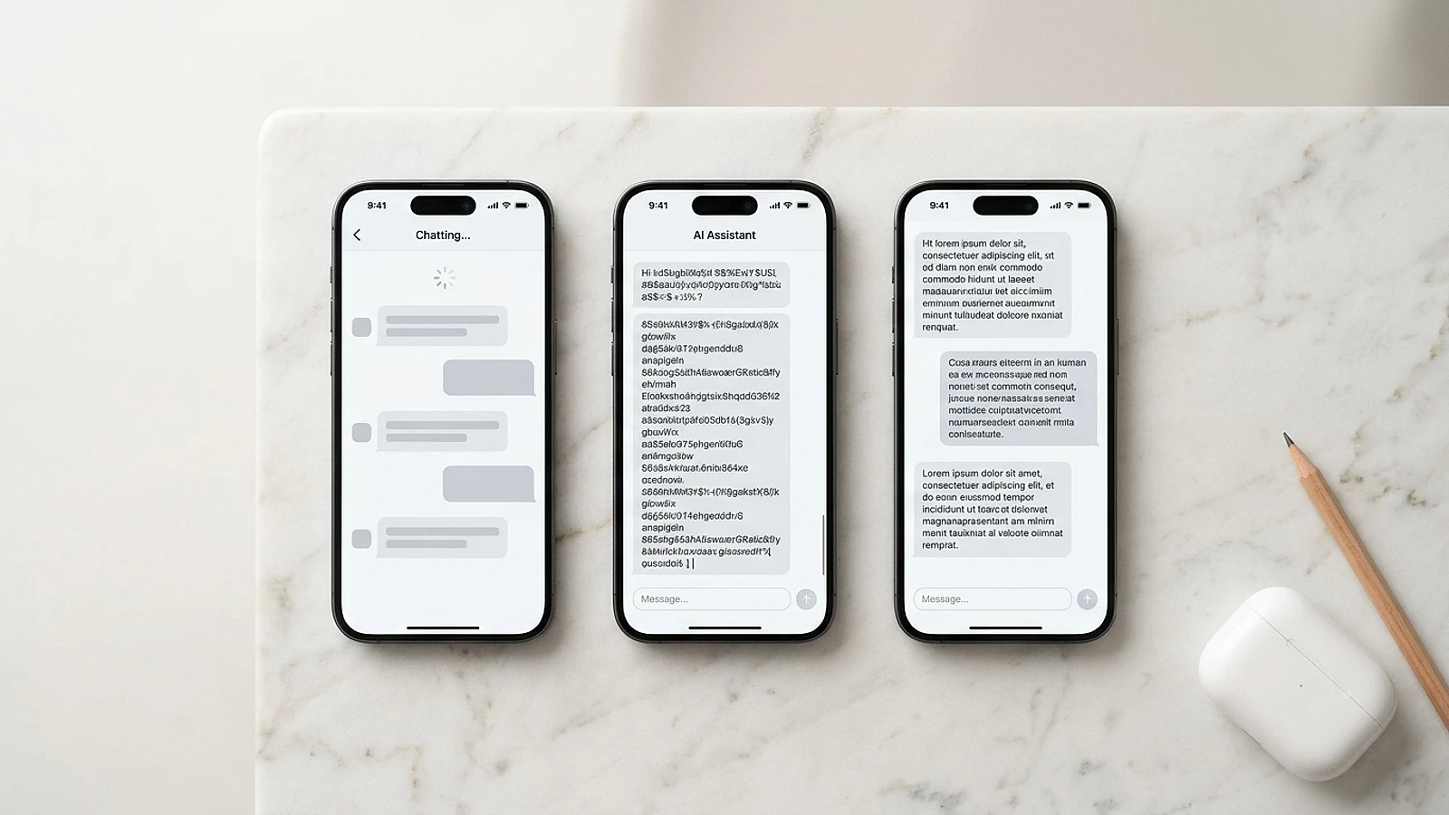
Three distinct AI chat states that each need intentional design: the loading skeleton (left), active streaming with a blinking cursor (center), and the completed formatted response (right).
Latency Design: When Your AI Is Thinking
Users perceive anything over 1 second as a delay. Anything over 3 seconds as a problem. AI responses routinely take 4-12 seconds for complex queries. That gap needs intentional design, not a spinner.
Research from Nielsen Norman Group shows that 1 second is the limit for keeping a user's flow of thought uninterrupted. At 10 seconds, users lose focus and question whether anything is happening at all.
Response Time | User Perception | Recommended UX Pattern |
|---|---|---|
Under 1s | Instant | Standard response display |
1-3s | Slight delay | Subtle "thinking" animation |
3-8s | Noticeable wait | Skeleton screen or progressive placeholder |
8-15s | Long wait | Progress indicator with reassuring copy |
15s+ | Very long | Progress indicator plus estimated time |
Skeleton screens work better than spinners for AI chat because they show the shape of the response that is coming. A few shimmer bars where the text will appear tells the user: "content is loading here." A spinner tells the user: "something is happening, I don't know what."
For complex AI tasks (generating a report, analyzing data, writing code), add a short label like "Analyzing your data..." or "Writing your response..." These micro-copy choices reduce perceived wait time by giving users a sense of purposeful activity, not undefined waiting.
Confidence Signals: Helping Users Trust AI Output
AI output is probabilistic. The model is not certain. Most AI chat interfaces pretend otherwise, displaying responses with the same visual weight whether the AI is highly confident or guessing.
That is a trust problem. Users who get burned by confidently-presented wrong answers stop using the product.
Confidence signals are design elements that communicate the reliability of AI output. They do not need to expose raw probability scores, which confuse most users. They need to communicate one thing: should you verify this before acting on it?
Effective confidence signal patterns:
Source citations. If the AI references specific data, show the source inline. A small citation badge next to a claim signals "this is grounded" versus "this is generated."
Uncertainty language in the response. Design the AI prompt to include hedging language when uncertain: "Based on available information..." or "You may want to verify this with..."
Verification prompts for high-stakes responses. When the AI gives advice on legal, financial, or technical topics, a small notice below the response ("AI-generated. Verify before acting.") builds trust rather than eroding it.
Confidence badges for factual claims. In B2B tools where accuracy matters more than speed, a small "Verified" tag next to specific claims reduces user anxiety significantly.
Users do not need the exact probability score. They need one clear signal: safe to act on, or worth double-checking.
Error States That Don't Lose Users
AI chat errors are different from standard software errors. A regular app either works or returns an error code. An AI chatbot can fail in multiple ways: network timeout, model overload, content policy refusal, context length exceeded, or a response that is technically delivered but factually wrong.
Each failure mode needs a different response from the UI.
Design your AI error states with three principles:
1. Name what happened. "Something went wrong" tells the user nothing. "The AI took too long to respond" or "This request exceeded the context limit" gives them something to work with.
2. Give a clear next action. Every error state needs a recovery path. "Try a shorter question," "Regenerate the response," or "Start a new conversation" are all better than a dead end.
3. Preserve the user's input. If the AI errors mid-response, the user's original message should stay in the input field so they can resend without retyping. Losing user input on error is one of the fastest ways to destroy trust in any AI product.
The goal is not to hide AI failures. It is to make failures feel recoverable, not catastrophic.
When to Use Chat UI vs. Structured Forms
Not every AI feature should live in a chat interface. Chat UI is the right choice when the task is open-ended, exploratory, or conversational. Structured forms are better when the task has predictable inputs and outputs.
Use chat UI when:
The user's need is hard to define upfront
The task requires back-and-forth refinement
The AI needs to ask clarifying questions
Output varies widely based on user intent
Use structured UI when:
The input is always the same type (a file, a URL, a set of parameters)
The output is always the same format (a report, a score, a list)
The interaction is single-step, not iterative
Users need to compare or filter multiple outputs
Many AI products default to chat when a structured interface would convert better. A chat interface for an AI that generates social media posts from a URL is a worse experience than a simple form with a URL input, tone selector, and platform dropdown. The AI does the same work. The user does less.
If you are unsure which to use, ask: does the user know exactly what they want before starting? If yes, use a structured form. If no, use chat.
The AY Designs team has redesigned AI products that defaulted to chat when a structured interface converted 30-40% better. The choice of interaction model is a design decision, not a default. See how we approach AI product design if you want a second opinion on yours.
Actionable Takeaways
Add a blinking cursor to streaming AI text output. It is the clearest signal that more is coming and costs nothing to implement.
Replace spinners with skeleton screens for AI responses that take over 3 seconds. Skeleton screens communicate "content is loading" instead of "something is happening."
Add source citations or confidence labels to factual AI claims. Users who trust AI output stay longer and convert more.
Write a specific error message for each AI failure mode (timeout, context limit, content policy refusal). Generic errors kill user recovery.
Audit each AI feature in your product: does it need a chat interface, or would a structured form convert better? The answer is often the form.
Sources: Nielsen Norman Group: Response Times, Google PAIR Guidebook, Baymard Institute: UX of Error Messages, McKinsey: The State of AI 2025
Frequently Asked Questions
What is AI chatbot UI/UX design? AI chatbot UI/UX design is the practice of designing chat interfaces that account for how large language models actually behave: streaming output, variable latency, probabilistic accuracy, and multi-turn conversation context. It differs from standard UI design because AI responses are non-deterministic, arrive progressively, and require trust signals that traditional software does not need.
How do I design for streaming text in an AI chatbot? Display text as it arrives rather than waiting for the full response. Add a blinking cursor or typewriter caret at the end of the streaming text to signal that more is coming. Lock the input field during streaming to prevent users from submitting overlapping requests. Render markdown formatting progressively so that headers and bullet lists appear as the AI generates them.
What is the right way to show AI loading states? Use skeleton screens for responses that take over 3 seconds. Skeleton screens show the shape of the incoming content, which reduces perceived wait time better than a spinner. For long-running tasks (10 seconds or more), add a short label like "Analyzing your data..." to communicate purposeful activity. A blank screen while the AI processes is never acceptable.
How should I communicate AI errors to users? Name the specific failure rather than using a generic message. If the AI timed out, say "The AI took too long to respond. Try again." If the context limit was exceeded, say "Your conversation is too long. Start a new chat." Always preserve the user's original input so they can resend without retyping, and provide a clear next action for recovery.
Should I use a chat interface or a structured form for my AI feature? Use chat when the task is open-ended or requires iterative refinement. Use structured forms when the inputs and outputs are predictable and the task is single-step. Many AI products default to chat when a structured interface would perform significantly better. If your users know exactly what they want before they start, a form converts better than a chat box.
How do I show AI confidence levels without confusing users? Avoid raw probability scores. Use contextual signals instead: inline source citations for factual claims, hedging language in the AI response for uncertain answers, and brief verification prompts for high-stakes topics like legal or financial content. Users do not need to understand model confidence technically. They need to know whether to act on a response or verify it first.
What makes a good AI chatbot interface in 2026? A good AI chat interface handles four things well: it makes latency feel intentional with skeleton screens and progressive text rendering, it signals uncertainty without hiding it, it gives users clear recovery paths when the AI fails, and it knows when to use a structured form instead of chat. Every interaction state (loading, streaming, complete, error, empty) must be explicitly designed, not left as a framework default.
How long should AI responses be in a chat interface? Design for scannability rather than length. AI responses that exceed 200 words should include headers, bullet lists, or numbered steps to break up the text. For mobile interfaces, keep default response length short and offer a "Tell me more" prompt for users who want depth. Long walls of plain text in a chat interface are one of the most common and damaging AI UX mistakes.
What is the difference between a chatbot UI and a regular form UI? A regular form UI is deterministic: the same inputs always produce the same outputs, instantly. A chatbot UI is probabilistic and asynchronous: responses vary, take time, and arrive incrementally. Chatbot UI requires streaming rendering, latency design, confidence signals, and multi-turn context handling that forms do not need. Treating them as the same type of interface is the most common AI UX mistake teams make.
How do I design for users who don't trust AI output? Build trust incrementally through transparency. Show sources for factual claims. Use hedging language for uncertain answers. Add verification prompts for high-stakes responses. Let users regenerate responses they disagree with. Give users the ability to copy, edit, or export AI output. Trust in AI is not built by hiding its limitations. It is built by making those limitations visible and manageable. Our portfolio shows AI products where trust-centered design directly improved retention. Get in touch if you want to apply the same approach to yours.
Checkout other Blogs:

Multi-agent system UX design guide for 2026
A pattern-by-pattern guide to designing multi-agent system UX in 2026, with a scoring matrix and references from Claude Code, LangGraph, Devin, and Replit Agent.
Author:
AY Designs Team

Human-in-the-loop AI design guide for 2026
A 2026 guide to human-in-the-loop AI design with patterns, scoring framework, and examples from Cursor, Claude Code, Stripe, and Notion AI.
Author:
AY Designs Team

How to design agentic AI products in 2026: a 7-step playbook
A seven-step design playbook for shipping agentic AI products that users actually trust, with scoring matrix and real product references from Cursor, Claude Code, Devin, and Perplexity.
Author:
AY Designs Team

How much does AI SaaS design cost in 2026?
AI SaaS design cost in 2026 by tier and engagement type, with ranges, timelines, and a value scorecard for founders shipping with Lovable, Bolt, and v0.
Author:
AY Designs Team