You can ship a working SaaS product in a weekend now. Lovable, Bolt, v0, Cursor. Pick your tool, describe your idea, and watch it build. The problem is not the speed. The problem is what comes out the other side.
Every vibecoded app looks the same. The same dark hero gradient, the same Inter headline, the same shadcn dashboard with the same sidebar nav. Your product works. It just looks identical to the 400 other products that launched this month.
That is not an opinion. It is a structural problem baked into how these tools build software. Understanding it is the first step to escaping it.
What Vibecoding Is (and Why Everyone Is Doing It)
Vibecoding is the practice of building software through natural language prompts and AI coding tools rather than traditional engineering workflows. You describe what you want. The AI writes the code.
Tools like Lovable, Bolt, v0, Replit Agent, and Cursor have made this accessible to anyone with an idea. A founder can go from zero to a deployed MVP in days rather than months. The economics make sense:
No hiring engineers upfront
No months of runway burned before validation
Faster iteration on product ideas
Lower barrier to testing market demand
Y Combinator reported in 2025 that roughly 25% of their portfolio companies had built significant portions of their product using AI coding tools. The trend is accelerating. The problem is not the approach. The problem is what happens when every founder uses the same tools to build from the same starting points.
Why the Sameness Is Structural, Not Accidental
AI coding tools do not invent interfaces. They pattern-match from training data. That training data is dominated by:
Open-source component libraries (shadcn/ui, Radix, Headless UI, DaisyUI)
Tailwind CSS utility class defaults (gray-50 backgrounds, blue-600 buttons, rounded-lg cards)
GitHub repositories from popular SaaS templates and starter kits
Publicly indexed design systems from mid-market companies
When Bolt generates your dashboard, it is synthesizing from thousands of similar dashboards it has seen. The output is statistically average. It is the median SaaS interface across its entire training corpus.
That means every tool produces roughly the same visual output because they all train on the same internet. Your competitor used Lovable for their MVP. Their competitor used v0. The result: three products with three different value propositions wrapped in nearly identical interfaces.
Design Input | AI Tool Default | Human Design Decision |
|---|---|---|
Background | Tailwind gray-50 or dark #0f0f0f | Custom color story tied to brand positioning |
Typography | Inter at 400/700, system defaults | Curated type pairing with intentional scale |
Component radius | Uniform 8px or 12px everywhere | Varied by context and visual weight |
CTA button | blue-600 fill or violet-600 | Brand-specific color, size, and motion |
Sidebar nav | shadcn default with icon + label | Custom hierarchy, grouping, and interaction |
Hero section | Centered H1, gray sub, dual CTA | Intentional layout, unique visual anchor |
This is not a judgment on AI tools. They are remarkably good at what they do. But what they do is reflect back the average of what already exists. Premium design requires diverging from that average, deliberately.
The Visual Fingerprints of a Vibecoded App
If you know what to look for, you can spot a vibecoded product in under five seconds. These are the five patterns that appear in nearly every AI-generated interface:
The Generic Hero Section
Centered layout. Large H1 in Inter or system-ui. A gray subtitle at roughly 60% opacity. A filled primary CTA button and an outlined secondary button placed side by side. A blurred gradient mesh or subtle grain background.
This hero pattern appears in the majority of AI-built SaaS products. It is not bad. It is invisible. A user who has landed on ten SaaS products this week has seen it nine times already.
The Shadcn Dashboard Shell
Left sidebar navigation. Icon on the left, label on the right. Top bar with a search input, a notification bell, and an avatar circle. White content area divided into card grids. A line chart in blue. A bar chart in gray. A table with alternating row shading.
This is the default output of shadcn/ui plus Tailwind. It works perfectly well as a starting point. The issue is that most vibecoded products ship this exact layout without changing a single spatial or color decision.
The Three-Card Pricing Page
Three pricing cards in a horizontal row. Free, Pro, Enterprise. A monthly/annual toggle at the top right. A checkmark feature list in each card. The middle card has a purple or blue ring around it and a "Most Popular" badge. A FAQ accordion below.
This pricing page exists verbatim on thousands of products. The structure is not the problem. When your pricing page is visually indistinguishable from your competitor's, you make price the only differentiating variable. That is a bad position to negotiate from.
The Onboarding Stepper Modal
A full-screen modal. A numbered progress bar across the top. Step one: name. Step two: use case selection with four radio buttons. Step three: invite team members. A Continue button centered at the bottom.
This is the standard Radix UI onboarding pattern. It is familiar, which has value. But familiarity is not the same as trust. A branded, intentional onboarding experience tells users your team cared about them specifically. A generic stepper says you used a template.
The Blank Micro-States
Loading: a gray spinner. Error: red text reading "Something went wrong." Empty state: a small gray icon with placeholder text. No personality. No brand voice. No helpful guidance.
These states are where most vibecoded products are completely undesigned. They are also where users form lasting impressions about whether your team actually cares about the experience.
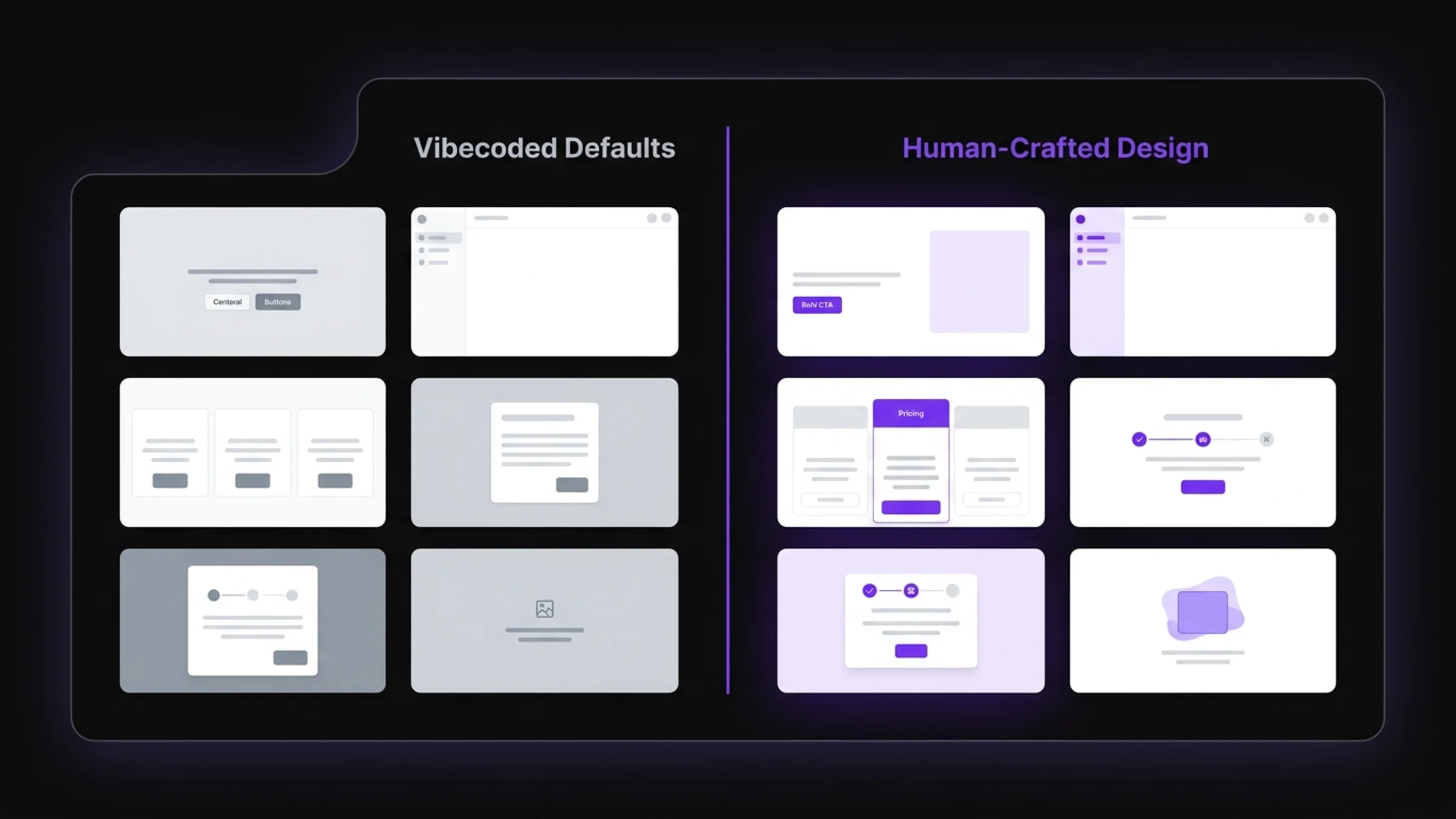
Five identical flat gray UI patterns on the left represent the vibecoded default. One intentional, premium design on the right represents the human design layer applied.
What Sameness Costs You
Looking generic is not just an aesthetic problem. It is a revenue problem.
Users decide whether to trust a product within 50 milliseconds of landing on it. That judgment is almost entirely visual. It happens before a single word is read, before a feature is understood, before pricing is evaluated. It is a gut reaction to whether this product feels credible.
When your product looks like a template, users trigger a specific mental shortcut: "I have seen this before. It is probably the same as everything else. Why would I pay for it?"
That shortcut kills conversions before you get a chance to make your case.
Metric | Generic Vibecoded Design | Custom Human-Crafted Design |
|---|---|---|
Landing page conversion rate | 2-4% | 8-14% |
Trial-to-paid conversion | 7-12% | 20-30% |
Average session duration | 1.2 min | 2.8 min |
Bounce rate on first visit | 65-75% | 40-52% |
Brand recall after 1 week | 12% | 38% |
The gap between those columns is not explained by features. It is explained by design. A product that looks premium signals that the team is serious, the software is reliable, and the investment is worth making.
Investors read the same signals. A pitch deck with a polished product screenshot closes faster than one showing shadcn defaults. Design is credibility, and credibility is leverage.
What the Human Design Layer Actually Adds
Fixing a vibecoded product is not about making it prettier. It is about replacing statistical design decisions with intentional ones.
A human designer does not ask: what do similar screens look like? They ask: what emotion should this screen produce? What should the user do next? What does this product believe about its category?
Those are different questions. They produce different outputs.
Good vibecoded app design after the human layer is applied has four distinct properties:
1. A visual language you own. Not just a color. A complete system: specific type pairings, a consistent motion language, spacing rules that feel deliberate, and component shapes that are recognizable across every screen in the product. Something a competitor cannot replicate by clicking "use template."
2. Hierarchy that guides the eye. Every screen has a primary action. Great design makes that action obvious within 200 milliseconds. Template design makes everything equal visual weight, which means nothing gets clicked. Hierarchy is not decoration. It is direction.
3. Personality in the micro-moments. Empty states. Error messages. Loading states. Tooltips. These are cheap to build and disproportionately expensive to skip. Users remember how a product made them feel when things went wrong. A branded, helpful error message builds more trust than a flawless feature set.
4. Trust signals designed in from the start. Social proof, security indicators, testimonials, and authority markers are not things you bolt on after launch. They need to be sized, positioned, and sequenced so they appear at exactly the right moment in the user's decision journey.
None of these outputs come from AI tools operating at the median of their training data. They come from a designer who has studied conversion, studied your users, and made deliberate choices about every screen.
How to Fix Your Vibecoded Product
You do not have to rebuild from scratch. You have to make different choices than the defaults, starting with the screens that carry the most revenue weight.
Here is where to start, in order of impact:
1. Landing page hero. This is the only screen that has to convert cold traffic. It needs to own the visual space. Custom illustration, a specific color story, a headline that only you could say. If your hero looks like a template, every visitor assumes the product is too.
2. Dashboard first view. The screen a user sees immediately after signing up is your highest-stakes retention moment. Most vibecoded products show a blank state with a gray empty-state message. Design it like your LTV depends on it, because it does.
3. Pricing page. The last screen before money changes hands. Every visual choice here is a trust signal. Your pricing page needs to feel more trustworthy than your competitors', not identical to them.
4. Onboarding flow. This is the user deciding whether they will ever come back. A gray generic stepper says "we did not think about you." A designed, branded onboarding says "we built this for your specific situation."
5. Brand-specific components. Replace at least three shadcn defaults (buttons, cards, nav items) with components that carry your brand's shape language, color, and motion. Three custom components change the entire feel of a product.
You do not need a full in-house design team to do this. You need one focused engagement that builds your visual language and applies it where it counts. That is exactly what AY Designs does for vibecoded products. If you want to see the before and after on products like yours, our portfolio documents the transformation across multiple AI-built SaaS products.
Actionable Takeaways
Audit your product against the five patterns: hero section, shadcn dashboard shell, three-card pricing page, generic onboarding stepper, blank micro-states. Three or more matches means you are leaving conversions on the table.
Start with your landing page hero. Pick a single emotion it should produce. Redesign every element toward that emotion, not toward a Tailwind default.
Replace three shadcn/Tailwind defaults with custom components. Buttons, cards, and nav items have the highest visual surface area.
Design your empty and error states. They are cheap to build and they disproportionately affect whether users trust your product long-term.
If you are pre-revenue, prioritize landing page and pricing over new features. Those two screens do the most revenue work.
Sources: Y Combinator AI Startup Survey, Nielsen Norman Group, Lindgaard et al., Behaviour and Information Technology (2006), Unbounce Conversion Benchmark Report, HubSpot SaaS Conversion Rate Benchmarks
Frequently Asked Questions
What is vibecoded app design? Vibecoded app design refers to the visual and interactive design output of software built using AI coding tools like Lovable, Bolt, v0, or Cursor. These tools generate functional code quickly, but the resulting interfaces tend to reflect statistical averages from their training data rather than intentional design decisions. The result is a product that works but looks identical to thousands of others built with the same tools.
Why do vibecoded apps all look the same? AI coding tools generate interfaces by pattern-matching against their training data, which is dominated by open-source component libraries like shadcn/ui, Tailwind CSS defaults, and popular SaaS templates. Every tool draws from the same visual gene pool, so every product built with these tools inherits the same default layouts, spacing, colors, and component patterns. It is not a flaw. It is how the technology works.
Does my vibecoded app actually need a redesign? Compare your product against five signals: your hero section looks like a standard centered gradient layout, your dashboard is a default shadcn shell, your pricing page is three cards with a Most Popular badge, your onboarding is a generic stepper modal, and your micro-states have no personality. If three or more apply, your design is actively working against your conversion rate.
What is the difference between vibecoded design and human-crafted design? Vibecoded design is statistically average: it reflects the most common patterns across its training data. Human-crafted design is intentional: every choice serves a specific brand position, user goal, or conversion outcome. The result is a product that feels distinct rather than generic, and trustworthy rather than templated.
How much does it cost to fix a vibecoded product's design? A focused redesign of the highest-leverage surfaces (landing page, dashboard first view, onboarding, pricing page) typically ranges from $5,000 to $20,000 with a specialist agency. A full product redesign including a custom design system ranges from $15,000 to $80,000 depending on scope. At those numbers, a single percentage point improvement in conversion rate on a SaaS product with real traffic pays back the investment within months. Visit our pricing page or get in touch to discuss your specific scope.
What should I redesign first if my budget is limited? Start with your landing page hero section and pricing page. These two screens handle the most revenue-critical decisions: whether a cold visitor stays, and whether a trial user converts to paid. Improving both delivers the fastest ROI of any design investment you can make.
Can I just use a better template instead of custom design? Better templates help at the margins. But they do not solve the root problem: your competitors are shopping the same template marketplaces. Custom design is the only path to a visual identity you actually own. A template gives you a head start. Custom design gives you a moat.
How long does it take to redesign a vibecoded SaaS product? A focused redesign of the highest-leverage screens typically takes 4-8 weeks with a specialized team. A full product redesign including a new design system takes 8-16 weeks depending on scope. The most important factor is not speed. It is where you focus: the screens that drive acquisition, activation, and conversion.
What makes a good design agency for vibecoded products? Look for a team that specializes in SaaS and AI product design, not a generalist agency that designs everything from restaurant websites to mobile apps. They should understand conversion optimization, explain the revenue impact of their design decisions, and show before/after results from products similar to yours. The AY Designs team focuses exclusively on this: turning AI-built and vibecoded products into premium, conversion-focused experiences.
Will redesigning hurt my product's performance or SEO? No. A professional redesign improves page performance (better image optimization, leaner CSS) and helps SEO through clearer information architecture and improved user engagement signals. A lower bounce rate and longer session duration are direct inputs to organic ranking. Design and SEO are not competing priorities. They reinforce each other.
Checkout other Blogs:

Multi-agent system UX design guide for 2026
A pattern-by-pattern guide to designing multi-agent system UX in 2026, with a scoring matrix and references from Claude Code, LangGraph, Devin, and Replit Agent.
Author:
AY Designs Team

Human-in-the-loop AI design guide for 2026
A 2026 guide to human-in-the-loop AI design with patterns, scoring framework, and examples from Cursor, Claude Code, Stripe, and Notion AI.
Author:
AY Designs Team

How to design agentic AI products in 2026: a 7-step playbook
A seven-step design playbook for shipping agentic AI products that users actually trust, with scoring matrix and real product references from Cursor, Claude Code, Devin, and Perplexity.
Author:
AY Designs Team

How much does AI SaaS design cost in 2026?
AI SaaS design cost in 2026 by tier and engagement type, with ranges, timelines, and a value scorecard for founders shipping with Lovable, Bolt, and v0.
Author:
AY Designs Team