
B2B buyers decide whether to keep evaluating your product within 7 seconds of landing on it. If your B2B SaaS design looks like every other tool in the category, they move on.
Generic design doesn't just hurt first impressions. It signals risk. To a B2B buyer, a product that looks like a template feels like a company that hasn't invested in its product. That feeling kills deals before your sales team ever gets on a call.
This article breaks down why B2B SaaS design fails, what high-converting products do differently, and how to fix the design gaps that are costing you pipeline.
Why B2B SaaS Design Is Different
B2B and B2C design share principles but serve completely different psychology. B2C design optimizes for desire and impulse. B2B design optimizes for trust and confidence.
Your buyer isn't spending their own money. They're spending their company's money and putting their reputation on the line. Every design decision either builds or erodes that confidence.
Design Priority | B2C SaaS | B2B SaaS |
|---|---|---|
Primary emotion | Desire, excitement | Trust, confidence |
Decision maker | Individual | Committee of 3-7 |
Sales cycle | Minutes to days | Weeks to months |
Key design goal | Conversion | Credibility |
Navigation style | Simple, minimal | Structured, role-based |
Data density | Low | High |
Trust signals | Reviews, social proof | Security, compliance, ROI |
This distinction matters for every design decision: your navigation, your onboarding, your empty states, your CTAs. B2B buyers need to see that your product can handle enterprise complexity. B2C buyers need to fall in love fast.
The 4 Design Mistakes Killing B2B Pipeline
1. Looking Like a Startup Template
Most B2B SaaS products are built with a component library and a template. Shadcn, Tailwind UI, or a Framer template. Fast to ship. Identical to 400 other products.
When a VP of Operations is evaluating your tool against three competitors, they're looking for signals that your company is serious. A templated UI sends the opposite signal. It says: "We prioritized speed over craft." That's not a buying signal.
2. No Role-Based Visual Hierarchy
B2B products serve multiple user types. An admin, a manager, an analyst, and an end user all use the same product differently. If your design treats all users the same, all of them feel like the product wasn't built for them.
High-performing B2B SaaS products use role-based design: different dashboards, different navigation states, different onboarding flows for different user types. This isn't just a features decision. It's a design decision.
3. Weak Trust Signals
Trust signals in B2B are not optional. They are conversion infrastructure. The absence of trust signals (security badges, compliance logos, client logos, data handling disclosures) creates friction that kills deals during the evaluation phase.
Most B2B SaaS products bury their trust signals at the bottom of a marketing page. High-converting products embed them throughout the product interface itself: in the onboarding flow, on the dashboard, near data inputs, and at payment and contract steps.
4. Confusing Information Architecture
B2B tools are complex. That complexity is unavoidable. The mistake is letting that complexity bleed into the navigation.
A product with 40 features doesn't need 40 menu items. It needs smart grouping, contextual navigation, and progressive disclosure. Users should always know where they are, what they can do next, and how to get back. If they can't, your information architecture is costing you retention.
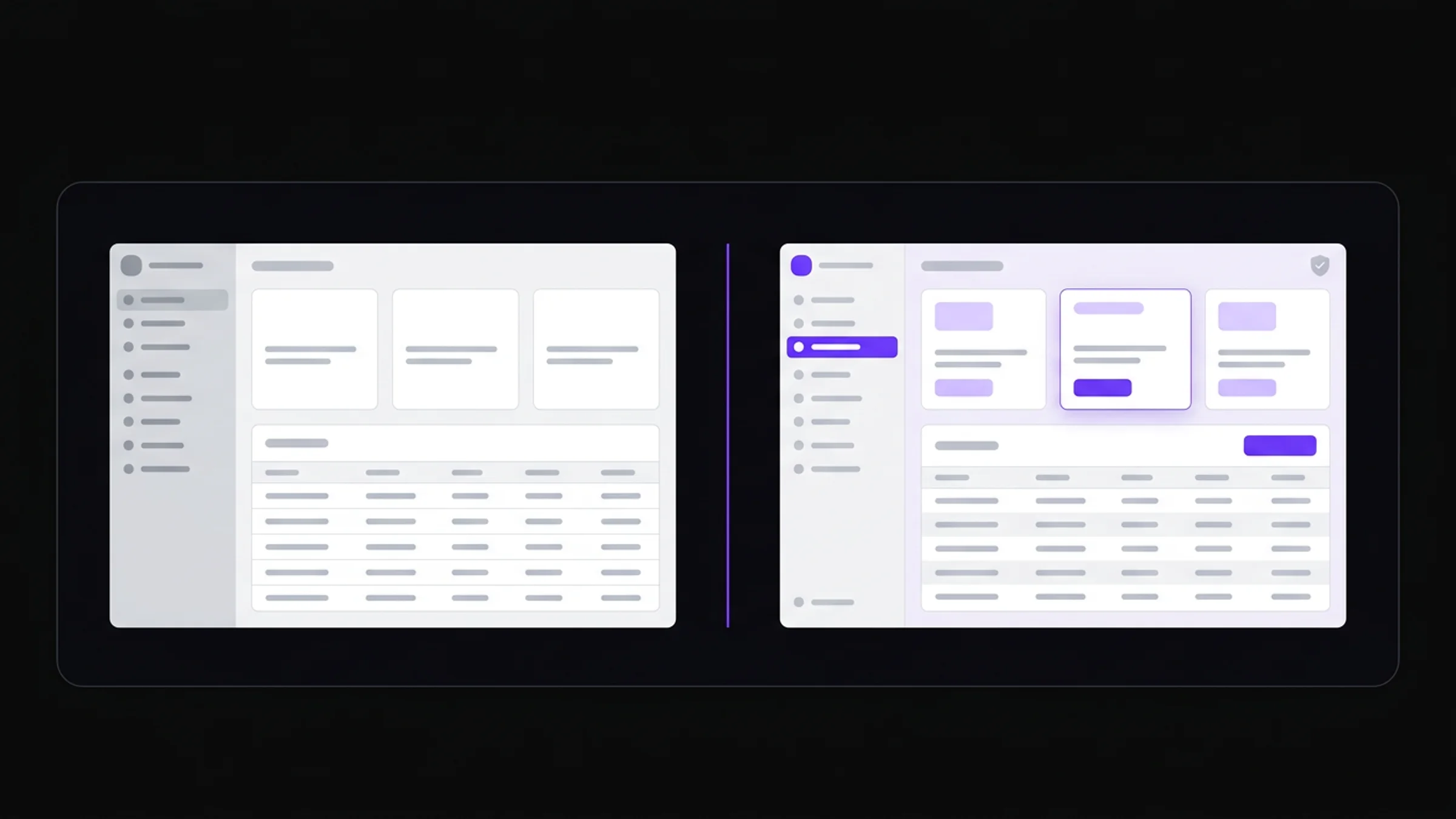
Generic B2B SaaS design (left) versus a premium, trust-signal-rich interface built to convert enterprise buyers (right).
What High-Converting B2B SaaS Design Looks Like
The best B2B SaaS products share a design signature. Not the same aesthetic, but the same underlying decisions:
Clear value proof on the dashboard. The first screen after login answers "Is this working?" not "Where do I start?"
Friction-matched CTAs. Low-commitment actions ("Start free trial") use subtle design. High-commitment actions ("Book a demo") use bold, high-contrast design. The visual weight matches the ask.
Data density without clutter. B2B users need to see a lot of data. High-converting products organize data into scannable layers: summary at the top, detail on demand, raw data behind a click.
Consistent component language. Every button, badge, modal, and table follows the same visual logic. Inconsistency reads as incomplete, which reads as risky.
Empty states with direction. No blank screens. Every empty state tells the user exactly what to do next and why it matters.
View our portfolio to see how we apply these principles to real B2B products.
Navigation and Information Architecture
Information architecture is the most underinvested area in B2B SaaS design. Teams spend weeks on visual polish and hours on IA. It's backwards.
For B2B products, use this hierarchy when structuring navigation:
Tier 1: Primary Navigation (always visible)
The 4-6 core sections a user returns to every session. These go in your sidebar or top nav. No more than 6 items. Each item should be a destination, not a category.
Tier 2: Contextual Navigation (section-specific)
Tabs, sub-menus, and secondary actions that appear inside a section. These are not global. They're contextual to where the user is.
Tier 3: Utility Navigation (persistent but secondary)
Settings, notifications, help, profile. These live in the corner of the interface. They're important but not the primary job to be done.
The mistake most products make: putting Tier 2 items in the Tier 1 nav. This overloads the primary navigation and makes the product feel complex before the user has done anything.
Navigation Element | Placement | Max Items |
|---|---|---|
Core sections | Sidebar / top nav | 6 |
Section sub-pages | Secondary nav / tabs | 5 |
Settings, account | Corner utility nav | 4 |
Contextual actions | Inline, near content | 3 |
Building Trust Through Design
Trust in B2B design is not just about logos and certifications. It's built through consistency, density, and precision.
Consistency means every element in your product looks like it belongs to the same system. Mismatched fonts, random button styles, and inconsistent spacing all trigger unconscious distrust.
Density means showing enough data to signal depth. Empty dashboards feel lightweight. B2B buyers want to see that your product can handle real volume.
Precision means every number is formatted correctly, every label is accurate, and every state has been designed. Typos, broken states, and missing labels say: "We shipped this too fast."
These aren't cosmetic concerns. They are the signals a committee of buyers reads when deciding whether to put your product in front of their CTO.
If you want to see what trust-building B2B design looks like in practice, talk to our team. We've rebuilt the interfaces of products that were technically solid but losing deals at the evaluation stage.
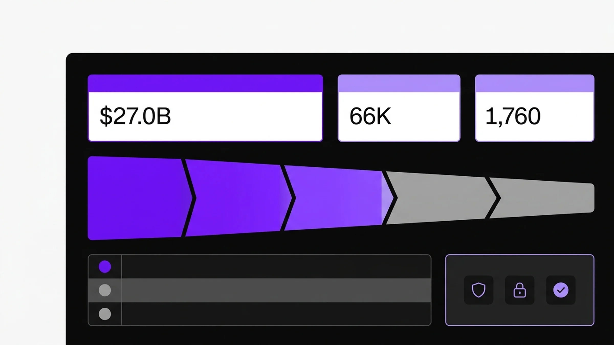
A high-converting B2B SaaS dashboard: clear data hierarchy, embedded trust signals, and role-aware navigation designed to close deals, not just display features.
How to Audit Your B2B SaaS Design
Before investing in a full redesign, run this audit:
The 7-second test. Show your product to someone who has never seen it. After 7 seconds, ask: "What does this product do, and who is it for?" If they can't answer, your design is failing the first evaluation gate.
The trust signal inventory. List every trust signal in your product (security badges, client logos, compliance marks, data handling disclosures). If you have fewer than five, you're losing deals during evaluation.
The navigation stress test. Give a new user a task that requires navigating three levels deep. Watch where they get stuck. Every point of confusion is a retention leak.
The competitor comparison. Put your product next to your two main competitors. Which one looks most like a serious enterprise tool? If it's not yours, you know where to start.
Our services include full design audits with specific, prioritized fixes for each of these areas.
Actionable Takeaways
Remove one navigation item. Whatever your current top-level nav has, cut the least-used item. Clarity increases immediately.
Add trust signals to your onboarding flow. Don't wait for the marketing page. Embed security and compliance signals inside the product at every step where a user inputs sensitive data.
Design one role-specific view. Pick your most important user type and design their dashboard as if the product was built only for them. Then expand from there.
Fix your empty states. Every blank screen in your product is a churn moment. Replace them with specific next actions, even if it's just "Add your first item."
Run a 7-second test this week. Find someone outside your team, show them your product for 7 seconds, and listen. What they say will tell you more than a month of analytics. Need a professional audit instead? We can do that too.
Sources: Forrester B2B UX Research, Gartner SaaS Buyer Behavior Report, Nielsen Norman Group B2B Usability, McKinsey Design Value Study
FAQ
What is B2B SaaS design?
B2B SaaS design is the practice of designing software products sold to businesses, with specific focus on trust-building, multi-user workflows, role-based interfaces, and complex information architecture. It differs from B2C design primarily in the buyer psychology: B2B buyers optimize for risk reduction and ROI, not desire.
Why does B2B SaaS design matter for sales?
Design is evaluated before a single sales conversation happens. Enterprise buyers research tools, watch demos, and start free trials without ever talking to sales. Your product's design is your first and often only chance to establish credibility during that self-serve evaluation phase.
What's the difference between B2B and B2C SaaS design?
B2C design optimizes for emotional engagement and fast conversion. B2B design optimizes for trust, confidence, and multi-stakeholder approval. B2C products can afford playful, expressive design. B2B products need to signal stability, depth, and professionalism first.
How do I improve trust signals in my SaaS product?
Add security badges (SOC 2, GDPR, ISO 27001) near data input points. Include recognizable client logos in your onboarding flow. Show data handling disclosures at contract and payment steps. Make your team visible through an about page with real faces and credentials.
What navigation pattern works best for B2B SaaS?
A structured sidebar with 4-6 top-level items works best for complex B2B tools. Use contextual sub-navigation inside each section rather than exposing all options globally. Avoid hamburger menus for desktop-first B2B products — they hide context and slow power users down.
How many users does the average B2B SaaS buying committee have?
According to Gartner, the average B2B software purchase involves 6-10 stakeholders. This means your product will be evaluated by people with different roles, different technical levels, and different priorities. Role-based design that serves each stakeholder's job-to-be-done significantly improves evaluation outcomes.
How long does it take to redesign a B2B SaaS product?
A focused redesign of a core flow (onboarding, dashboard, key feature) typically takes 3-6 weeks for a senior design team. A full product redesign with a design system takes 8-16 weeks. The return on that investment compounds: better conversion, lower churn, faster sales cycles.
What design system should I use for a B2B SaaS product?
Build a custom design system rather than shipping a stock component library. Generic component libraries are recognizable to buyers and signal low investment. A custom system built on your brand's tokens (color, typography, spacing) creates the consistent, premium feel that converts enterprise buyers. See our services for design system work.
How do I know if my B2B SaaS design is hurting my conversion?
Run a 7-second test with people outside your company. Check your trial-to-paid conversion rate against industry benchmarks (typically 15-25% for B2B SaaS). If your conversion is below benchmark and your product works, design is usually the lever. A professional audit identifies exactly where the friction is.
How much does B2B SaaS design cost?
Costs vary by scope. A design audit starts around $1,500-3,000. A dashboard redesign runs $5,000-15,000. A full product redesign with design system work ranges from $15,000 to $50,000 or more. These numbers look different when measured against the revenue impact of improved conversion. See our pricing for current rates.
Checkout other Blogs:

Multi-agent system UX design guide for 2026
A pattern-by-pattern guide to designing multi-agent system UX in 2026, with a scoring matrix and references from Claude Code, LangGraph, Devin, and Replit Agent.
Author:
AY Designs Team

Human-in-the-loop AI design guide for 2026
A 2026 guide to human-in-the-loop AI design with patterns, scoring framework, and examples from Cursor, Claude Code, Stripe, and Notion AI.
Author:
AY Designs Team

How to design agentic AI products in 2026: a 7-step playbook
A seven-step design playbook for shipping agentic AI products that users actually trust, with scoring matrix and real product references from Cursor, Claude Code, Devin, and Perplexity.
Author:
AY Designs Team

How much does AI SaaS design cost in 2026?
AI SaaS design cost in 2026 by tier and engagement type, with ranges, timelines, and a value scorecard for founders shipping with Lovable, Bolt, and v0.
Author:
AY Designs Team