
"AI-generated dashboard" means two different things in 2026. Some products generate the dashboard layout from a user prompt (PostHog Max, Cursor, Vercel v0). Others generate the data, insights, or visualizations on the fly while the user works. The strongest examples do both, and the result looks closer to an AI collaborator than a static admin surface.
This roundup covers the seven products doing the most credible work on AI-generated dashboard surfaces. Each entry is scored on density, clarity, aesthetic, and customization, and each comes with the pattern worth lifting before your next release.
TL;DR, the strongest AI-generated dashboard pattern in 2026 is PostHog Max: type a question, get a real chart component, edit it like any other, save it to a dashboard. AI generates real artefacts, not chat history.
AI-generated dashboard design examples: a brief overview
PostHog: Best AI-generated analytics dashboard, Max AI composes real charts from natural language.
Vercel v0: Best AI-generated dashboard scaffolder, generates production-quality React dashboards from a prompt.
Cursor: Best AI-generated code dashboard, agent mode generates and edits dashboards as code.
OpenAI Platform: Best AI-generated usage dashboard, native AI surfacing of usage patterns and anomalies.
Anthropic Console: Best AI-generated prompt dashboard, generated outputs alongside usage and limits.
Replicate: Best AI-generated model dashboard, prediction outputs and history land in one canvas.
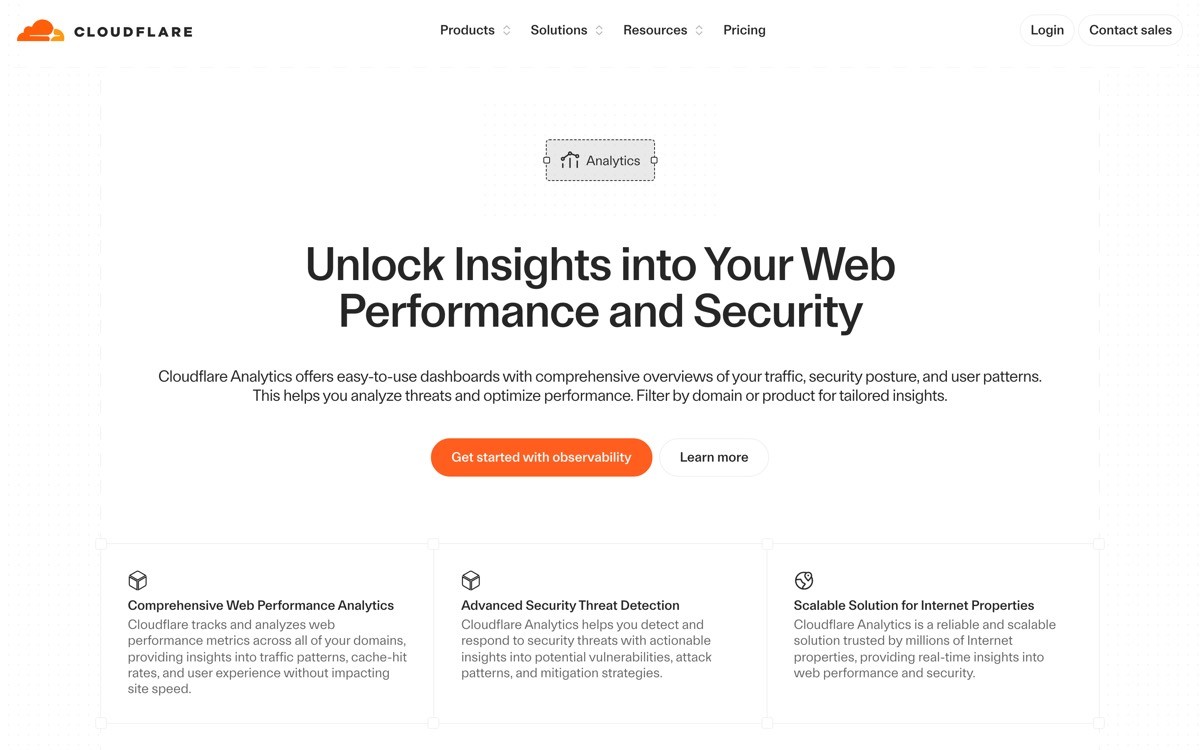
Cloudflare AI: Best AI-generated infra dashboard, AI Gateway analytics generated alongside the rest of the platform.
Product | Information density | Clarity | Aesthetic | Customization | Score (/20) |
|---|---|---|---|---|---|
PostHog | 5 | 4 | 4 | 5 | 18 |
Vercel v0 | 4 | 5 | 5 | 5 | 19 |
Cursor | 4 | 4 | 5 | 5 | 18 |
OpenAI Platform | 4 | 5 | 4 | 3 | 16 |
Anthropic Console | 3 | 5 | 5 | 3 | 16 |
Replicate | 4 | 4 | 5 | 4 | 17 |
Cloudflare AI | 5 | 4 | 4 | 5 | 18 |
1. PostHog, best AI-generated analytics dashboard
PostHog Max is a natural-language insight composer that turns a typed question into a real chart component on the user's dashboard. The user describes the question, Max generates the underlying query, runs it, drops the result into the canvas, and the user can then edit, filter, and save the chart like any other PostHog insight.
The pattern worth stealing is the treatment of AI output as native artefacts. Most natural-language dashboards return a chat reply or a one-off chart preview. PostHog returns the same insight component the user would build manually, with full edit affordances. That distinction is the difference between an AI feature people use once and one they use weekly.

Key strengths
Natural-language input that produces real, editable chart components
Generated charts inherit the same affordances as manually built ones
Query explainer surfaces the SQL, so users learn the underlying model
Dashboards remain shareable and editable like any other PostHog surface
AI sits where the canvas is, not behind a separate route
Dark theme handles dense generated data without losing hierarchy
Best for
Product analytics teams that want AI to compose dashboards alongside humans
Founders shipping analytics features who want a strong "AI as canvas tool" reference
Pricing
Generous free tier
Paid plans usage-based, AI features included on most tiers
Pros
The clearest example of AI-generated charts that feel native to the dashboard
Users learn the data model through the query explainer
Cons
Expects users to learn intent phrasing, occasional refinement on complex queries
2. Vercel v0, best AI-generated dashboard scaffolder
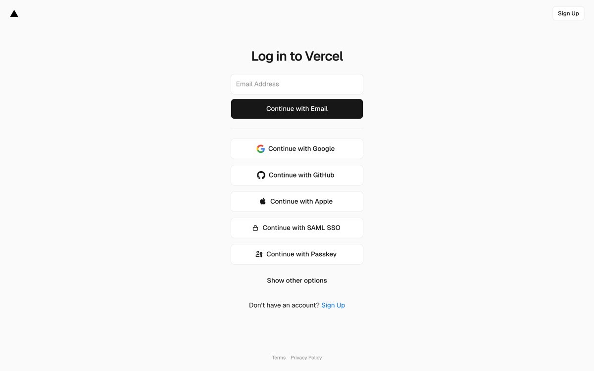
Vercel v0 is a code generation tool that turns a prompt into a production-quality React dashboard, including Tailwind styling, shadcn components, and the chart libraries needed for live data. The user types a description, v0 returns a real dashboard component with edit affordances, and the result drops straight into the user's codebase.
The pattern worth stealing is the bridge between prompt and code. v0 does not just render a preview. It produces real, idiomatic React the team can ship and maintain. For dashboard scaffolding, that turns weeks of frontend work into hours. The output is opinionated about layout, hierarchy, and component selection, which is exactly what most v1 dashboards need.
Key strengths
Generates production-quality React dashboards from a single prompt
Output is opinionated about layout and component selection
shadcn and Tailwind defaults that look professional out of the box
Iterative refinement through follow-up prompts
Code is idiomatic and ready to ship to a real codebase
Supports light and dark themes by default
Best for
Founders and engineers shipping v1 dashboards in days, not weeks
Teams that need a strong starting layout before customising
Pricing
Free tier with monthly generation limits
Paid plans for higher generation volume
Pros
The fastest way to ship a credible v1 dashboard in 2026
Output quality high enough that designers can iterate on it instead of starting over
Cons
Opinionated defaults mean teams with custom design systems need to swap components
3. Cursor, best AI-generated code dashboard
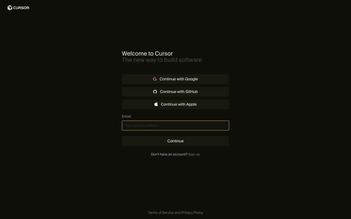
Cursor is an AI-first code editor where agent mode can generate and modify entire dashboard surfaces inside the user's codebase. The user describes the dashboard they need, the agent reads the existing project, generates the components, runs the build, and surfaces the changes as a diff for review.
The pattern worth stealing is "agent generates, human reviews diff." Cursor does not just produce code. It edits files in place and presents the result as a pull-request-style diff inside the editor. For dashboards built into existing apps, that workflow beats every other code-generation pattern in 2026.
Key strengths
Agent generates dashboard code directly inside the user's codebase
Diffs presented in the editor for human review
Reads existing project conventions before generating
Runs builds and reports failures inline
Calm dark theme as default
Keyboard-driven everywhere
Best for
Teams generating dashboard code inside an existing app, not a greenfield project
Engineers who want generated code that fits their stack, not template output
Pricing
Free tier with usage caps
Paid plans start at $20 per month
Pros
The strongest reference for agent-generated code with diff review
Translates to almost any product where the agent edits user content
Cons
Agent quality depends on prompt specificity, vague prompts produce vague code
4. OpenAI Platform, best AI-generated usage dashboard
OpenAI Platform surfaces usage patterns, anomalies, and recommendations inside the developer console using AI generation itself. The dashboard does not just show numbers. It explains them, surfaces unexpected spikes, and proposes next actions in plain language alongside the underlying metrics.
The pattern worth stealing is AI-generated explanation alongside raw data. The user is not forced to choose between numbers and narrative. The narrative lives next to the chart, the chart stays clickable, and the user can drill in or out without losing context. It is a simple pattern that most usage dashboards still miss.
Key strengths
AI-generated explanations alongside raw usage data
Anomaly detection surfaces inside the existing dashboard
Recommendations in plain language with one-click drill-in
Calm sidebar IA that scales to wide product surface
Activity feed treated as a first-class component
Restrained accent color, used only on primary actions
Best for
Developer console dashboards with high daily usage
Teams shipping usage and billing surfaces that need explanation alongside data
Pricing
Pay-as-you-go API pricing, no dashboard fee
Pros
One of the cleanest references for AI-generated narrative alongside metrics
The activity-feed-plus-explanation pattern translates well to any usage dashboard
Cons
The AI features stay subtle, products selling on AI prominence will need to be louder
5. Anthropic Console, best AI-generated prompt dashboard
Anthropic Console is the developer surface for the Claude API, and the playground is essentially an AI-generated dashboard inside the surface. The user constructs a prompt, the model generates the output, and the output sits inside the same canvas as the prompt, the tool calls, the system message, and the usage metadata.
The pattern worth stealing is the unified prompt-output canvas. Most prompt playgrounds split input and output across panels or windows. Anthropic keeps everything in one frame, which makes iteration faster and the AI-generated output feel like a real artefact rather than a chat reply.
Key strengths
Unified prompt-and-output canvas
Tool calls and system message visible alongside the AI output
Usage and rate limits readable without switching context
Workbench supports rapid iteration without losing prompt history
Calm typography, accent color used only on the primary action
Three-panel IA that resists feature inflation
Best for
AI products with a try-it surface that doubles as a dashboard
Teams designing prompt playgrounds or model evaluation surfaces
Pricing
Pay-as-you-go API pricing, no dashboard fee
Pros
One of the cleanest playground-as-dashboard references in 2026
The unified canvas pattern transfers to any AI tool with a try-it surface
Cons
Light on evals and monitoring out of the box, larger teams layer extra tooling
6. Replicate, best AI-generated model dashboard
Replicate is a model-hosting platform where every model page doubles as an AI-generated dashboard. The user runs the model, the prediction lands in the page, and prediction history accumulates inline. The same surface handles model description, live playground, API examples, and version metadata.
The pattern worth stealing is the live playground inside the dashboard. Most model marketplaces separate the try surface from the ops surface. Replicate fuses them so the user can run, monitor, and ship from one canvas. AI-generated outputs do not feel like a side feature, they are the dashboard's primary content.
Key strengths
Live playground inside each model page
Prediction history surfaces inline alongside the live runner
API examples rendered in real code, copy-paste ready
Version metadata visible without leaving the page
The same surface serves discovery, testing, and ops
Calm typography and accent-only color use
Best for
Model-hosting and AI-API products that want to unify try and ops
Teams designing AI marketplace or model-detail surfaces
Pricing
Pay-per-prediction pricing
Free credits for new accounts
Pros
The clearest example of try-and-ops on one canvas
Translates to any product with a per-unit detail page
Cons
The pattern only works when each unit is self-contained
7. Cloudflare AI, best AI-generated infra dashboard
Cloudflare AI Gateway and Workers AI ship inside the broader Cloudflare dashboard, and the AI-generated content shows up where it fits: usage analytics summarized in plain language, cost forecasts generated alongside billing, and anomaly detection inside the existing observability surface. The AI does not have its own dashboard. It contributes to every dashboard.
The pattern worth stealing is the way AI-generated content lives inside the existing IA. Cloudflare's shell handles thirty-plus products, and the AI Gateway surfacing reuses every primitive (analytics, logs, billing, settings) the rest of the platform uses. New AI features land as additions, not as a separate "AI section."
Key strengths
AI-generated content surfaces inside existing observability and billing surfaces
Shared shell pattern keeps thirty-plus products navigable
Per-product analytics inherit a common chart language
Dark theme treated as default, color used only for state
Search bar surfaces resources across all products including AI
New AI features can land without IA redesign
Best for
Multi-product platforms adding AI-generated features to existing dashboards
Teams that need a reference for AI living inside a wider IA
Pricing
Free tier across most products
AI usage billed per request
Pros
Strongest reference for AI-generated content inside a multi-product dashboard
Avoids the "AI section ghetto" problem most platforms hit
Cons
Visual style is intentionally calm, founders looking for AI prominence should look elsewhere
How to choose the right AI-generated dashboard pattern for your product
1) Are you generating the dashboard or the dashboard's content?
If you are generating the dashboard layout itself (scaffolding, code, layout from prompt), Vercel v0 and Cursor are the strongest references. The pattern is prompt-to-code with an iterative refinement loop. If you are generating the content inside an existing dashboard (charts, summaries, recommendations), PostHog and OpenAI Platform are the right references. The pattern is AI inside the data path, output as native artefacts.
2) Should the AI output be editable like a manual artefact?
Yes, in almost every case. PostHog Max charts can be edited like any other PostHog insight. Cursor's generated code is real code the user can modify. The pattern that fails is one-shot AI output the user cannot adjust. If the AI generates a chart, make it editable. If it generates code, make it part of the codebase. AI that produces artefacts users can iterate on outperforms AI that produces chat replies.
3) Are you serving developers or operators?
Developer-focused dashboards (Cursor, v0, Anthropic Console, OpenAI Platform) lean into code, playgrounds, and unified canvases. Operator-focused dashboards (Stripe-style, Cloudflare-style) lean into job-segmented IA and AI generated alongside metrics. The wrong reference for the wrong audience makes the dashboard feel templated regardless of how much AI it ships.
4) How quickly does the AI output need to be reviewable?
If the user needs to ship the AI output to production (code, infra changes, customer messages), use Cursor's diff review pattern. If the user is exploring (charts, prompts, predictions), use PostHog and Anthropic's unified-canvas pattern. The review surface matters as much as the generation quality, because nobody ships AI output they cannot easily inspect.
If you have picked your AI-generated dashboard pattern but want a design partner to turn it into a profitable, human-grade product, that is what AY Design does. We help AI product teams ship dashboards where the AI feels like a collaborator, not a sparkle icon, with hierarchy and IA that age well past the next model release. Book a design audit to see what to ship next.
FAQ
What is an AI-generated dashboard?
An AI-generated dashboard is a dashboard where AI either generates the layout itself (prompt-to-code), generates the content inside it (charts, summaries, recommendations), or both. PostHog Max, Vercel v0, and Cursor are the leading references in 2026, each handling a different version of the pattern. The defining trait is that AI produces real artefacts users can edit and ship, not chat history.
Can I generate a full dashboard with a single prompt?
Yes, with Vercel v0 you can prompt a production-quality React dashboard in one shot, then refine with follow-up prompts. The output uses shadcn components, Tailwind styling, and idiomatic React the team can ship to production. For most v1 dashboards, this turns weeks of frontend work into hours.
What is the difference between AI-generated charts and AI-summarized data?
AI-generated charts (PostHog Max) compose new visualizations from a natural-language question. AI-summarized data (OpenAI Platform, Vercel) takes existing charts and writes a plain-language explanation alongside them. Both patterns are valid, and the strongest dashboards in 2026 use both: generated charts for composition, summarized data for interpretation.
Should AI generation live in a separate dashboard tab?
No. Every product in this list integrates AI generation into the existing canvas, not a separate tab. PostHog Max is invoked from the dashboard canvas. Cursor's agent edits inside the editor. Cloudflare AI surfaces inside the existing observability shell. The "AI tab" pattern is one of the strongest predictors of an AI feature that nobody uses.
What is the best tool to scaffold an AI dashboard quickly?
Vercel v0 is the fastest path to a production-quality dashboard scaffold in 2026, especially for React and shadcn stacks. Cursor is the strongest choice when the dashboard lives inside an existing codebase, because the agent reads project conventions before generating. For non-code natural-language composition, PostHog Max is the benchmark.
How do I make sure AI-generated dashboards do not look templated?
Start with a strong IA decision (one hero, job-segmented nav) before generation, then use the AI to produce the components inside that structure. Templated dashboards usually fail at the IA layer, not the visual layer. If the foundation is right, AI-generated components will land where they belong. If the foundation is wrong, AI will produce the same templated layout faster.
Can AI-generated dashboards handle enterprise complexity?
Yes, when the AI generates content inside an existing IA shell. Cloudflare AI is the strongest reference for enterprise-scale AI-generated dashboards, because the AI does not require a separate IA, it inherits the existing one. The pattern that fails at enterprise scale is one-shot prompt-to-dashboard generation without ongoing maintenance. The pattern that scales is AI-as-collaborator inside a designed shell.
Are AI-generated dashboards replacing designers?
No. They are replacing the wireframe and scaffold stage. The IA decisions, hierarchy, and product opinion that make a dashboard work still need a designer. AI tools speed up the production work, but the strategic decisions (which hero, which nav, which empty states) still drive whether the dashboard succeeds. The combination of AI generation plus designer judgment is the pattern winning in 2026.
Checkout other Blogs:

Multi-agent system UX design guide for 2026
A pattern-by-pattern guide to designing multi-agent system UX in 2026, with a scoring matrix and references from Claude Code, LangGraph, Devin, and Replit Agent.
Author:
AY Designs Team

Human-in-the-loop AI design guide for 2026
A 2026 guide to human-in-the-loop AI design with patterns, scoring framework, and examples from Cursor, Claude Code, Stripe, and Notion AI.
Author:
AY Designs Team

How to design agentic AI products in 2026: a 7-step playbook
A seven-step design playbook for shipping agentic AI products that users actually trust, with scoring matrix and real product references from Cursor, Claude Code, Devin, and Perplexity.
Author:
AY Designs Team

How much does AI SaaS design cost in 2026?
AI SaaS design cost in 2026 by tier and engagement type, with ranges, timelines, and a value scorecard for founders shipping with Lovable, Bolt, and v0.
Author:
AY Designs Team