
Looking at "AI landing pages" right now is one of the easiest ways to get stuck. Half the category looks like the same dark hero, glowing gradient, and generic "Build faster with AI" headline. The other half is genuinely interesting work that pushes brand and conversion at the same time.
This guide picks seven AI landing pages worth studying for design inspiration in 2026, scored on hero impact, narrative clarity, design polish, and brand fit. For each one we name the specific moves you can steal: the hero pattern, the proof structure, the typography choice, the interaction. The goal is not "go copy these," it is "see what category-leading actually looks like so you can stop shipping the same dark gradient."
TL;DR: Anthropic and Linear-adjacent product pages set the bar for clarity and restraint; Cursor and v0 show how a developer audience responds to dense, technical inspiration; Perplexity and Lovable show how to communicate a category-defining product in a single scroll.
Best AI landing page inspiration: a brief overview
Anthropic: Best for editorial restraint, narrative-driven layout, and trust signals.
OpenAI: Best for product-first storytelling at category-defining scale.
Cursor: Best for developer-audience pages that lean into demo and density.
Lovable: Best for showing a "vibe-coded" product without looking AI-built.
Bolt: Best for product demo as hero, with the build experience as the pitch.
v0: Best for component-led layouts that signal "made by Vercel" without saying it.
Perplexity: Best for explaining a new category in a single scroll without overloading the reader.
Site | Key inspiration | Standout move | Audience |
|---|---|---|---|
Anthropic | Editorial restraint, brand-first | Typography-led hero, no demo | Enterprise, researchers |
OpenAI | Product-first storytelling | Tabbed product navigation in hero | Consumer plus business |
Cursor | Dense developer messaging | Inline code as hero asset | Engineers |
Lovable | Vibe-coded product polish | Live prompt input above the fold | Non-technical founders |
Bolt | Demo-as-hero | The product is the hero, not a screenshot | Engineers and builders |
v0 | Component-led layout | Generated UI examples scroll | Engineers, designers |
Perplexity | Category explanation in one scroll | Search bar as hero CTA | Consumer plus researcher |
Scoring: how the 7 AI landing pages stack up
Each page is scored 1 to 5 on hero impact (first-3-seconds clarity), narrative (how the scroll tells a story), polish (typography, spacing, motion), and brand fit (how strongly the page reads as the brand and not a template).
Site | Hero impact | Narrative | Polish | Brand fit | Score |
|---|---|---|---|---|---|
Anthropic | 5 | 5 | 5 | 5 | 20 |
OpenAI | 4 | 5 | 5 | 5 | 19 |
Cursor | 5 | 4 | 5 | 5 | 19 |
Lovable | 5 | 4 | 4 | 4 | 17 |
Bolt | 4 | 4 | 4 | 4 | 16 |
v0 | 4 | 4 | 5 | 5 | 18 |
Perplexity | 5 | 4 | 4 | 4 | 17 |
1. Anthropic, best AI landing page for editorial restraint
Anthropic's homepage is an editorial-feeling landing page that sells a frontier AI lab through typography, whitespace, and selective product reveals rather than demos. It is the cleanest example of "design as trust signal" in the category, and the page most often referenced when founders ask for an "Anthropic-style" redesign.
What makes it inspiration-worthy: the page resists the temptation to show off. There is no animated gradient, no looping product demo, no "AI-powered" stamp. The serif headline, two-column body, and product cards do the lifting. For B2B founders selling to careful buyers, this is the template to study.

What to steal
Serif display headline as the visual anchor, no glow or gradient
Two-column body copy that reads like a magazine, not a marketing page
Product cards as the second screen, not the hero
High-contrast palette with one accent color, restrained motion
Footer-as-sitemap that signals organizational depth
Who should steal this pattern
B2B AI products selling to enterprise or research buyers
Founders who want their site to feel like a publication, not a pitch
Where it could be stronger
Light on social proof above the fold for buyers who need it
Restraint can read as "for insiders" to first-time visitors
2. OpenAI, best AI landing page for product-first storytelling
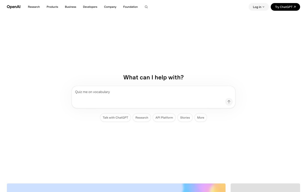
OpenAI's homepage is a category-defining landing page that uses tabbed navigation and full-bleed product imagery to walk visitors through ChatGPT, the API, and enterprise offerings without forcing them down one path. It is the strongest example of a multi-product AI homepage that does not feel like a directory.
The inspiration here is sequencing. The page is built for three different audiences (consumer, developer, enterprise) and uses tabs and section depth to give each one a real story instead of a "choose your path" button. The typography and editorial spacing keep the page feeling premium even when the product surface is wide.
What to steal
Tabbed product navigation in the hero for multi-product brands
Full-bleed product imagery that doubles as proof
Section dividers that change palette per audience
Editorial typography mixed with bold product names
Heavy use of high-quality original photography over stock
Who should steal this pattern
Multi-product AI companies with distinct buyer segments
Platforms whose homepage must serve consumer and B2B at once
Where it could be stronger
Density can overwhelm if you have not earned the brand recognition
Hard to replicate without an in-house design team
3. Cursor, best AI landing page for developer audiences
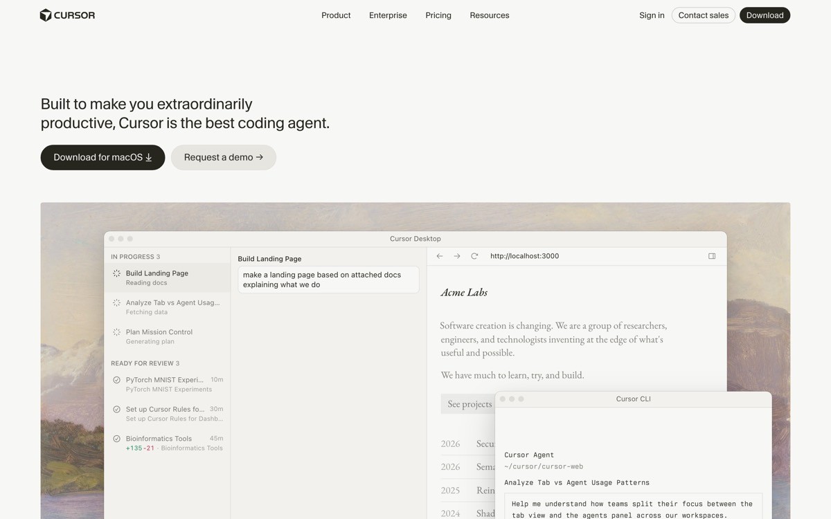
Cursor's homepage targets engineers and respects them. The hero shows the editor in action, the second section drops directly into inline code with an AI suggestion overlay, and the rest of the page is testimonials and feature density. There is no fluff, no "transform your workflow" copy, just product.
The inspiration: when your audience is technical, density is respect. Developer-focused AI tools that bury the product behind three rotating gradients lose trust in the first 4 seconds. Cursor shows the product immediately and lets the screenshots do the convincing.
What to steal
Product UI as the hero asset, no abstract illustration
Inline code with realistic content (not "function foo()")
Developer-quote testimonials with name and company logo
Tight feature grid that lists capabilities without spin
Dark mode default with high-contrast accent
Who should steal this pattern
Developer tools, AI coding assistants, dev infra products
Any product whose primary buyer respects "show me, do not tell me"
Where it could be stronger
Less useful as a template for non-technical audiences
Dense product imagery requires high-quality original screenshots
4. Lovable, best AI landing page for non-technical builder audiences
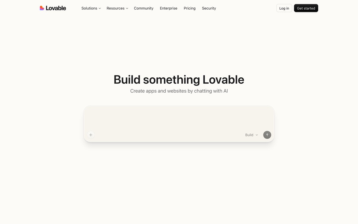
Lovable's homepage is built for non-technical founders who want to "vibe code" a SaaS app, and the page nails the tone: warm palette, friendly typography, and a live prompt input above the fold so visitors can try the product without signing up. It is one of the few AI builder pages that does not feel like a developer tool wearing a marketing hat.
The inspiration is audience fit. Most AI builders use the same dark-hero-with-code-snippet pattern even when their buyer is a marketer or founder who does not write code. Lovable rebuilt the convention from scratch for its actual audience, and the page reflects that.
What to steal
Live prompt input above the fold that runs without auth
Warm, accessible palette instead of generic AI dark mode
Friendly typography that signals "non-technical welcome"
Showcase gallery of community-built apps as social proof
One-sentence value prop in plain English, not jargon
Who should steal this pattern
AI tools targeting founders, marketers, or operators who are not engineers
Products with a sandbox-style demo that works without signup
Where it could be stronger
Less authoritative-feeling for enterprise buyers
Community gallery can be a maintenance burden
5. Bolt, best AI landing page for demo-as-hero
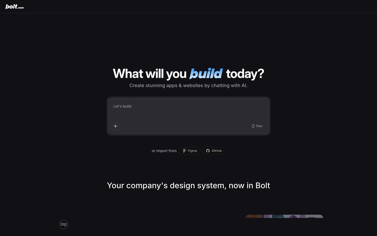
Bolt's homepage skips the screenshot-as-hero pattern and puts the actual product in the hero: a prompt input that builds a working app live. The rest of the page is examples, testimonials, and pricing, but the first impression is "this is what the product does, try it now."
The inspiration is courage. Most AI products show a static screenshot or a looping demo video because the live product is too slow or unreliable. Bolt's bet is that the product is fast and impressive enough to be the hero, and the conversion lift from "try before signup" is real.
What to steal
Functional product in the hero, not a screenshot
Example prompts as one-click starters to lower the cold-start cost
Sticky CTA that updates based on user interaction
Showcase grid of community projects as living proof
Plain-text feature list, no glow or icons
Who should steal this pattern
AI tools with a fast, reliable, demoable core product
Founders willing to invest in performant hero infrastructure
Where it could be stronger
Hero performance has to be world-class or it hurts more than it helps
Hard to translate to products with slow or asynchronous outputs
6. v0, best AI landing page for component-led layouts
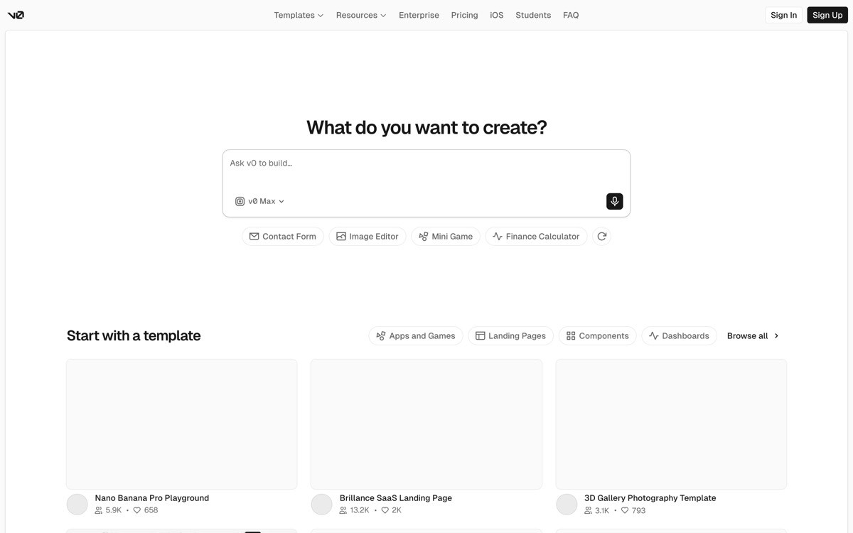
v0 by Vercel uses a scroll-driven layout of generated UI examples to show the product in action. The hero is a single input plus a wall of generated component examples that scroll horizontally. It is one of the cleanest examples of "the output is the marketing" in the category.
The inspiration: when your product generates visual assets, your landing page should be a gallery of those assets. v0 does not need to explain what it generates because the page itself is a continuous stream of examples. Brand fit is automatic because every example uses the same restrained Vercel palette.
What to steal
Output gallery as the primary scroll experience
Single input plus one-click example prompts
Quiet brand voice that lets the work speak
Generous whitespace around each example
Subtle motion that signals "this is alive" without distracting
Who should steal this pattern
AI tools that generate visual or design output (UI, illustrations, mockups)
Products with a strong existing brand that should stay quiet
Where it could be stronger
Requires a steady stream of high-quality output examples
Less useful for tools whose output is text or data
7. Perplexity, best AI landing page for explaining a new category
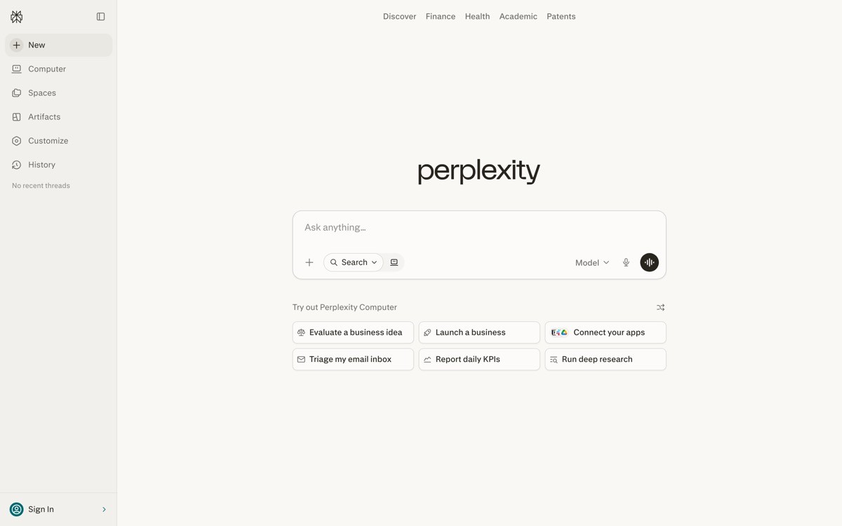
Perplexity's homepage explains "answer engine" in a single scroll without ever feeling like a glossary. The hero is a working search bar (the product itself), and the rest of the page walks through use cases, comparisons, and proof. It is the clearest example of a category-defining homepage that does not assume the visitor knows the category.
The inspiration is pacing. Founders explaining new categories tend to either over-explain (a 3000-word essay above the fold) or under-explain ("the future of X" with no detail). Perplexity threads the needle by letting the product be the explanation and using copy to layer on context.
What to steal
Product (search bar) as hero, copy as supporting context
"How it is different from Google" comparison block
Use-case cards that show real queries and answers
Recognizable logos in social proof for category trust
Quiet hero with attention on the input field
Who should steal this pattern
Founders explaining a new category (answer engines, AI search, AI agents)
Products that must position against a known incumbent
Where it could be stronger
Heavy reliance on the search bar interaction; weaker if the visitor does not try it
Comparison sections can age quickly as the incumbent evolves
How to choose the right AI landing page inspiration for your project
1) Who is your real audience: engineer, marketer, or enterprise buyer?
Engineers respond to Cursor and v0's density. Non-technical founders respond to Lovable's warm tone. Enterprise buyers respond to Anthropic's editorial restraint. Pick inspiration that matches your buyer's reading style, not the inspiration that wins design awards.
2) Is your product demoable in 4 seconds?
If yes, steal Bolt's or Perplexity's "product-as-hero" pattern. If no, steal Cursor's "annotated screenshot as hero" pattern. Forcing a slow product into a live-demo hero is the single most common mistake on AI landing pages, and it costs conversion.
3) Are you category-defining or category-following?
Category-defining: borrow from Perplexity's comparison-led scroll or Anthropic's editorial trust signals. Category-following: borrow from Cursor or v0's "show density, prove capability" approach. The first group has to teach; the second has to differentiate.
4) Do you have the design team to execute the inspiration?
Anthropic's restraint requires a serious typography and editorial hand. Bolt's live demo requires hero-tier engineering performance. v0's gallery requires a steady stream of beautiful outputs. Pick inspiration whose execution cost matches your team, not whose end result you envy.
If you have picked your inspiration but want a design partner to actually ship a landing page at this level, that is what AY Design does. We help founders and product teams turn AI-built MVPs and reference designs into profitable, human-grade landing pages, dashboards, and brand systems. Book a design audit to see how close your current page is to the inspiration you want.
FAQ
What is the best AI landing page design inspiration in 2026?
Anthropic, OpenAI, Cursor, and Perplexity set the bar for AI landing page design inspiration in 2026. Anthropic for editorial restraint, OpenAI for multi-product storytelling, Cursor for developer-facing density, and Perplexity for category-defining clarity. The right reference depends on your audience.
Where can I find AI landing page design inspiration?
The strongest sources are AI category leaders' own homepages: Anthropic, OpenAI, Cursor, Lovable, Bolt, v0, and Perplexity. Curated galleries like Mobbin, Land-book, Pageflows, and SaaSPages also collect AI landing pages by pattern. Study the leaders first, then look at galleries for breadth.
What makes a great AI landing page?
A great AI landing page communicates the product in 4 seconds, shows the actual output instead of describing it, and avoids the templated "dark hero plus gradient plus AI-powered" pattern. The best examples in 2026 share three traits: editorial-grade typography, real product demos in the hero, and restrained motion.
Why do most AI landing pages look the same?
Most AI landing pages look the same because they are generated by the same templates, builders, and Figma kits. The dark-hero-with-purple-gradient pattern has become category shorthand for "we make AI things." The differentiating move in 2026 is to design against the default: lighter palettes, editorial typography, and real product imagery.
Should an AI startup use a dark theme landing page?
Not by default. Dark themes signal "AI" lazily and are now generic. Anthropic, Lovable, and Perplexity all use lighter or neutral palettes and stand out because of it. Use dark mode if it is true to your brand or product, not because the category demands it.
What is the best AI landing page hero pattern?
The strongest hero pattern in 2026 is "product-as-hero": a working input or live demo that lets the visitor try the product immediately. Bolt and Perplexity both use this pattern. The fallback is annotated product UI (Cursor) for products whose live demo is too slow or asynchronous.
Should I use AI to generate my landing page design?
Use AI to generate the first draft, then hire a designer to make it actually convert. AI generators produce templated outputs that look identical to thousands of other AI startups. The differentiation that makes pages like Anthropic and Cursor work comes from design judgment, not generation.
What is the difference between AI landing page examples and AI landing page inspiration?
AI landing page examples are real pages currently in the wild that you can study and reference. AI landing page inspiration is the broader pool of patterns, moves, and ideas drawn from those examples. Examples are what you screenshot; inspiration is what you internalize before you start designing.
How long should an AI landing page be in 2026?
The strongest AI landing pages in 2026 run between six and twelve scrolling sections, depending on audience. Consumer AI pages (Pi, Character.AI) trend shorter because the value is obvious in the hero. Enterprise AI pages (Anthropic, OpenAI) trend longer because they need to layer in product depth, trust signals, and segment-specific messaging.
Are AI landing page inspiration galleries useful?
Yes, but only as a starting point. Galleries like Mobbin, Land-book, Pageflows, and SaaSPages are useful for breadth, but they rarely teach you why a page works. Pair gallery browsing with deeper study of three to five reference pages where you read every section and articulate the move the designer is making.
How do I avoid copying inspiration too literally?
Translate the move into your own context before you sketch. If Anthropic uses a serif headline to signal editorial trust, ask yourself what your audience trusts and which type signals that, instead of defaulting to the same serif. The shortcut to looking like a knockoff is copying the surface; the shortcut to looking original is copying the intent.
Checkout other Blogs:

Multi-agent system UX design guide for 2026
A pattern-by-pattern guide to designing multi-agent system UX in 2026, with a scoring matrix and references from Claude Code, LangGraph, Devin, and Replit Agent.
Author:
AY Designs Team

Human-in-the-loop AI design guide for 2026
A 2026 guide to human-in-the-loop AI design with patterns, scoring framework, and examples from Cursor, Claude Code, Stripe, and Notion AI.
Author:
AY Designs Team

How to design agentic AI products in 2026: a 7-step playbook
A seven-step design playbook for shipping agentic AI products that users actually trust, with scoring matrix and real product references from Cursor, Claude Code, Devin, and Perplexity.
Author:
AY Designs Team

How much does AI SaaS design cost in 2026?
AI SaaS design cost in 2026 by tier and engagement type, with ranges, timelines, and a value scorecard for founders shipping with Lovable, Bolt, and v0.
Author:
AY Designs Team