
Most AI landing page roundups stop at the obvious picks (Anthropic, OpenAI, Cursor) and call it a day. The more useful sources of stealable moves are the second tier: products that are not household names but are nailing one specific pattern (hero, proof, demo, narrative, palette) at a level worth borrowing.
This guide pulls seven AI landing page examples to steal from in 2026, from voice and video tools (ElevenLabs, Runway, Suno) to meeting AI (Granola, Cleft) to conversational AI (Pi, Character.AI). Each entry includes a score, the specific move worth stealing, and what to avoid copying.
TL;DR: ElevenLabs and Runway are the best examples of how to sell a creative AI tool without resorting to "AI-powered" stamps; Granola and Cleft show how to make a productivity AI feel premium; Pi and Character.AI show how consumer AI products earn warmth.
Best AI landing pages to steal from: a brief overview
ElevenLabs: Best example of audio AI marketing without sounding generic. Steal the voice picker hero and the use-case sequencing.
Runway: Best example of video AI as editorial cinema. Steal the full-bleed video hero and the case-study scroll.
Suno: Best example of music AI as a creator product. Steal the "play a generated example in the hero" pattern.
Granola: Best example of meeting AI that feels Apple-quality. Steal the calm palette and product UI sequencing.
Cleft: Best example of indie AI product with serious brand polish. Steal the typography and the use of motion.
Pi: Best example of consumer AI that feels warm and human. Steal the conversational hero and the soft palette.
Character.AI: Best example of consumer AI playing as a social product. Steal the gallery-first hero and creator-led proof.
Site | Stealable move | Best for | Brand tone |
|---|---|---|---|
ElevenLabs | Voice picker hero with live preview | Audio AI, voice tools | Premium, technical |
Runway | Full-bleed video hero with quiet copy | Creative AI, video tools | Cinematic, editorial |
Suno | Generated example as hero asset | Music AI, creator tools | Playful, modern |
Granola | Apple-style product UI sequencing | Productivity AI, B2B | Calm, premium |
Cleft | Indie brand polish via typography | Indie AI, voice notes | Editorial, intentional |
Pi | Conversational hero, soft palette | Consumer AI, companion apps | Warm, human |
Character.AI | Creator-led gallery as hero | Consumer AI, social AI | Playful, creator-first |
Scoring: how the 7 AI landing pages stack up
Each example is scored 1 to 5 on hero impact, narrative clarity, design polish, and brand fit. Brand fit measures how distinct the page feels in the AI category, not how technically correct the design is.
Site | Hero impact | Narrative | Polish | Brand fit | Score |
|---|---|---|---|---|---|
ElevenLabs | 5 | 4 | 5 | 5 | 19 |
Runway | 5 | 4 | 5 | 5 | 19 |
Suno | 4 | 4 | 4 | 5 | 17 |
Granola | 4 | 5 | 5 | 5 | 19 |
Cleft | 4 | 4 | 5 | 5 | 18 |
Pi | 4 | 4 | 4 | 5 | 17 |
Character.AI | 4 | 3 | 4 | 4 | 15 |
1. ElevenLabs, best AI landing page example for voice AI
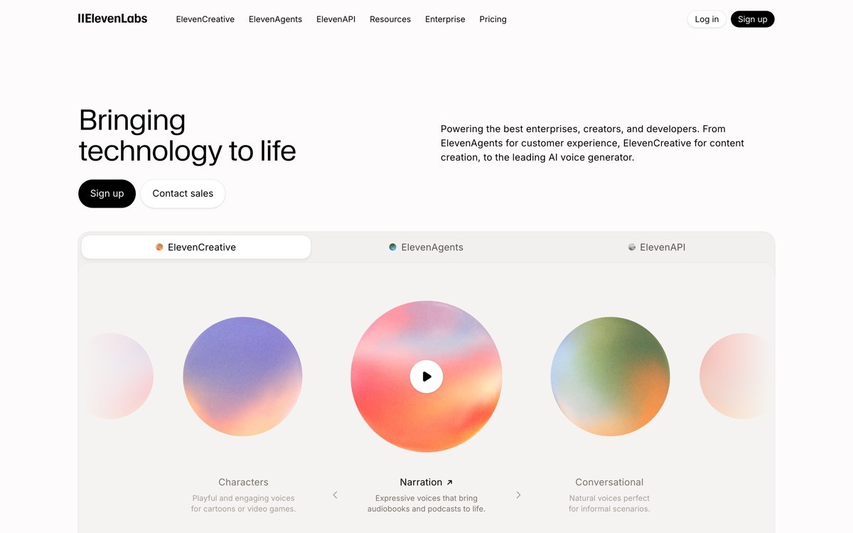
ElevenLabs' homepage sells a voice AI platform through a voice picker hero, live audio previews, and use-case sequencing for media, gaming, accessibility, and enterprise. It is one of the strongest examples of "the product is the marketing" in a category where most competitors lean on stock illustration.
The hero lets you pick a voice and play a sample without signing up. The scroll then sequences by audience: indie creators, studios, enterprises. Each section uses real voice samples as proof, not testimonial quotes. This is the cleanest "try it in the hero" pattern for audio products.
Steal this
Voice picker (or equivalent product input) above the fold
Live audio previews instead of testimonial blocks
Use-case sequencing by audience segment
Clean typography with high-contrast accent color
Enterprise CTA in the same nav as creator CTA, audience-aware
Best for
Audio AI, voice cloning, dubbing, accessibility tools
Any AI product whose output is easy to sample in the browser
Avoid copying
The depth of use cases; do not bolt on segments you do not actually serve
Multi-tier nav unless you have distinct buyer segments
2. Runway, best AI landing page example for video AI
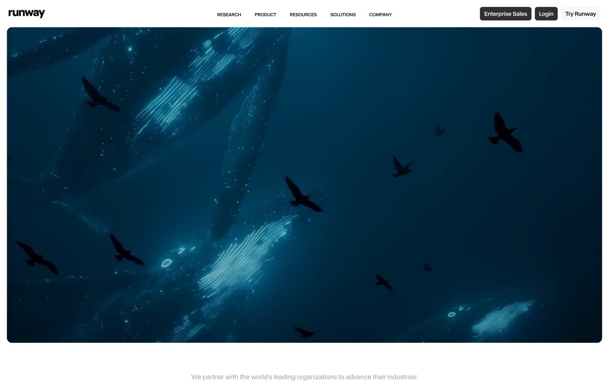
Runway's homepage uses full-bleed video and editorial copy to position generative video as a creative tool, not a tech demo. The hero is a quiet, slow-motion video reel; the body is a sequence of director quotes, case studies, and feature blocks framed in cinematic language.
The lesson is restraint. Most video AI sites stuff the hero with chaotic montage and "AI-powered" tags. Runway treats its homepage like a film studio's portfolio: quiet, confident, and assumes the visitor wants to see real work, not feature lists.
Steal this
Full-bleed video hero, no overlay text fighting the visual
Editorial copy framing the product as a tool, not a feature stack
Director and studio quotes instead of generic testimonials
Case study scroll showing real production work
Cinematic palette: deep blacks, single accent, premium serif
Best for
Creative AI products (video, image, animation) selling to professionals
Products with high-quality client work to display
Avoid copying
The pure visual approach if you have no real case studies yet
Full-bleed video without performance optimization can tank LCP
3. Suno, best AI landing page example for music AI
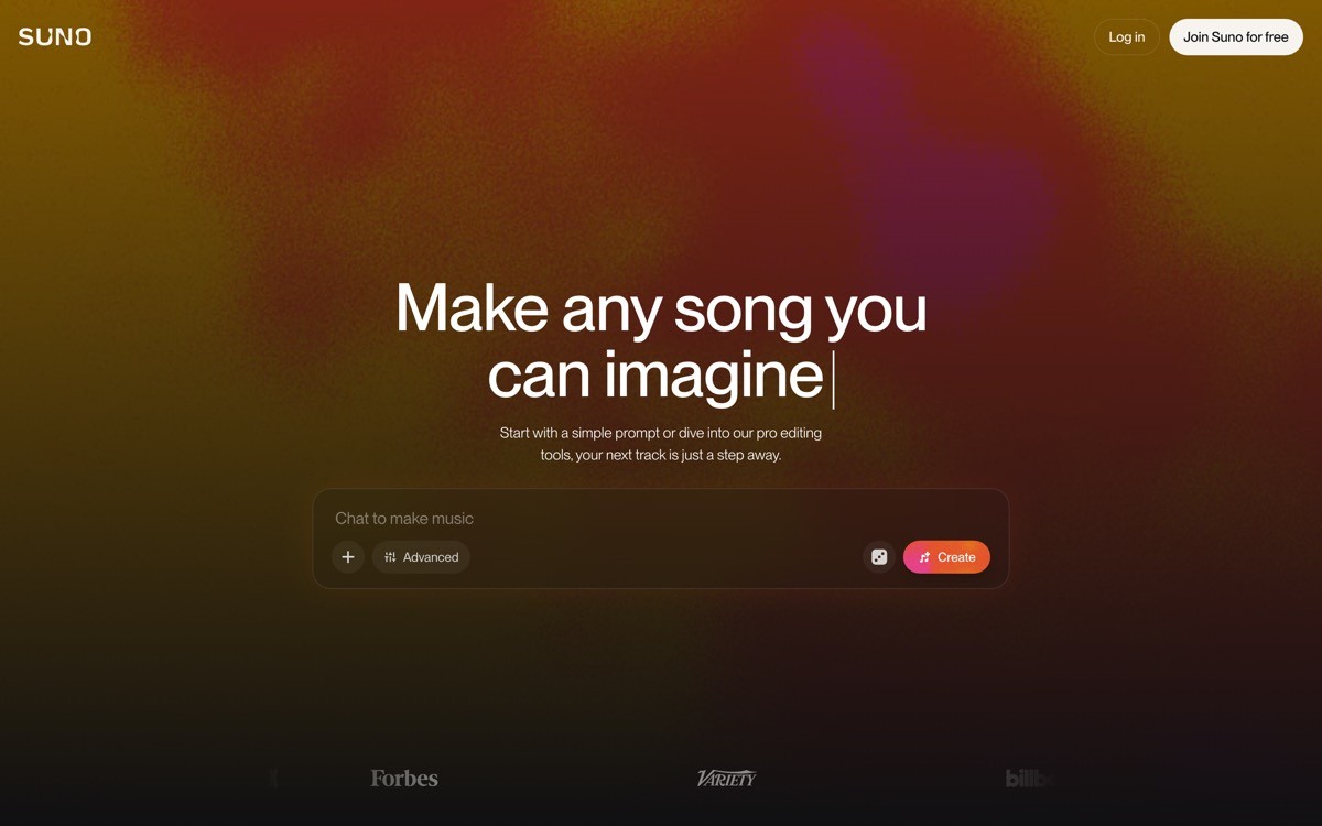
Suno's homepage sells music generation by playing a generated track in the hero with a waveform animation. The scroll layers in genres, creator stories, and a community gallery. It is the most "creator-product" landing page in the AI category right now.
The move worth stealing is auto-playing a brand-safe generated example. Most AI music products ask you to sign up before you can hear anything; Suno commits to "here is what we make, in 5 seconds" and lets the audio do the convincing.
Steal this
Generated example as hero asset (audio, video, or visual)
Waveform or progress animation that doubles as visual interest
Genre or category cards that act as fast-route CTAs
Creator showcase with real names and counts
Playful but not childish palette and typography
Best for
Music AI, podcast AI, audio creation tools
Consumer creative AI with a strong "play to understand" element
Avoid copying
Auto-play with sound on desktop without a clear mute affordance
Genre cards if your audience is one specific niche
4. Granola, best AI landing page example for productivity AI
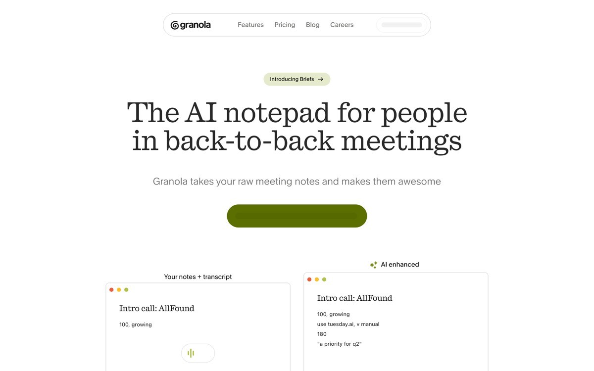
Granola's homepage sells an AI meeting note-taker with a calm, Apple-adjacent palette, generous whitespace, and product UI that scrolls into focus as you move down the page. It is the cleanest example of "AI for work" that does not feel like enterprise SaaS.
The move is taste. Granola's page reads like a consumer product even though the buyer is a knowledge worker, and that contrast is why the page converts. Productivity AI startups copying Notion or Linear pages should also study Granola for an alternative reference.
Steal this
Calm, neutral palette with one warm accent
Product UI scroll that demonstrates flow without a video
Quiet, confident copy with no "10x your meetings" claims
Press logos placed below the hero, not as the headline
Editorial typography with a hand-crafted feel
Best for
Productivity AI, meeting AI, knowledge-worker tools
B2B products whose buyer values taste and craft
Avoid copying
The restraint if you have a feature-led pitch that needs density
Heavy product UI scroll if your product UI is not yet polished
5. Cleft, best AI landing page example for indie polish
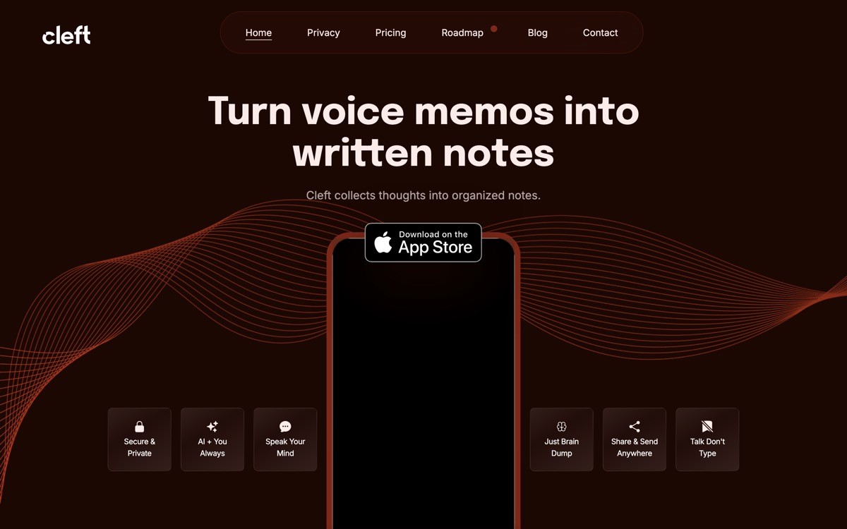
Cleft's homepage sells an indie AI voice-note product with serious editorial polish: a careful serif, considered motion, and one strong illustration set. It is the rare indie AI page that does not look like a Notion template wearing a marketing hat.
The lesson is that brand can be the differentiator for a small product in a crowded category. Cleft cannot out-feature ChatGPT or Otter, but it can feel like a thing made by a person, and the page communicates that in 4 seconds.
Steal this
Bold serif headline with hand-crafted feel
Single illustration or motif used consistently throughout
Subtle motion that signals quality (cursor, hover, scroll cues)
Short, opinionated copy in the founder's voice
Pricing that reads like a indie product, not a SaaS
Best for
Indie AI products that compete on taste, not feature scope
Solo or small-team founders selling directly to consumers or creators
Avoid copying
The indie-brand feel if your buyer is enterprise
Heavy custom illustration if you cannot maintain the asset set
6. Pi, best AI landing page example for warm consumer AI
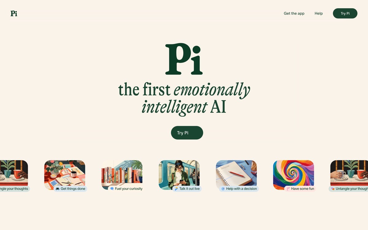
Pi (by Inflection) positions itself as a personal AI with a soft palette, conversational typography, and a hero that opens a chat directly with the assistant. It is the strongest example of a consumer AI landing page that does not try to look like ChatGPT.
The lesson is tone. Most chatbot landing pages copy the OpenAI aesthetic (dark hero, minimalist input box). Pi went the opposite way: warm tones, friendly copy, and an emotional hook in the headline. For consumer AI brands, that contrast is a competitive advantage.
Steal this
Soft, warm palette in a category dominated by cold dark themes
Conversational headline that talks to the user, not at them
Chat preview as hero, with example prompts
Quiet motion on the chat bubble to suggest "alive"
Use-case cards framed emotionally (think, vent, plan)
Best for
Consumer AI assistants, companion apps, journaling tools
Any AI product where emotional positioning beats feature lists
Avoid copying
The emotional framing if your buyer is a developer or operator
Warm palette without enough contrast for accessibility
7. Character.AI, best AI landing page example for social AI
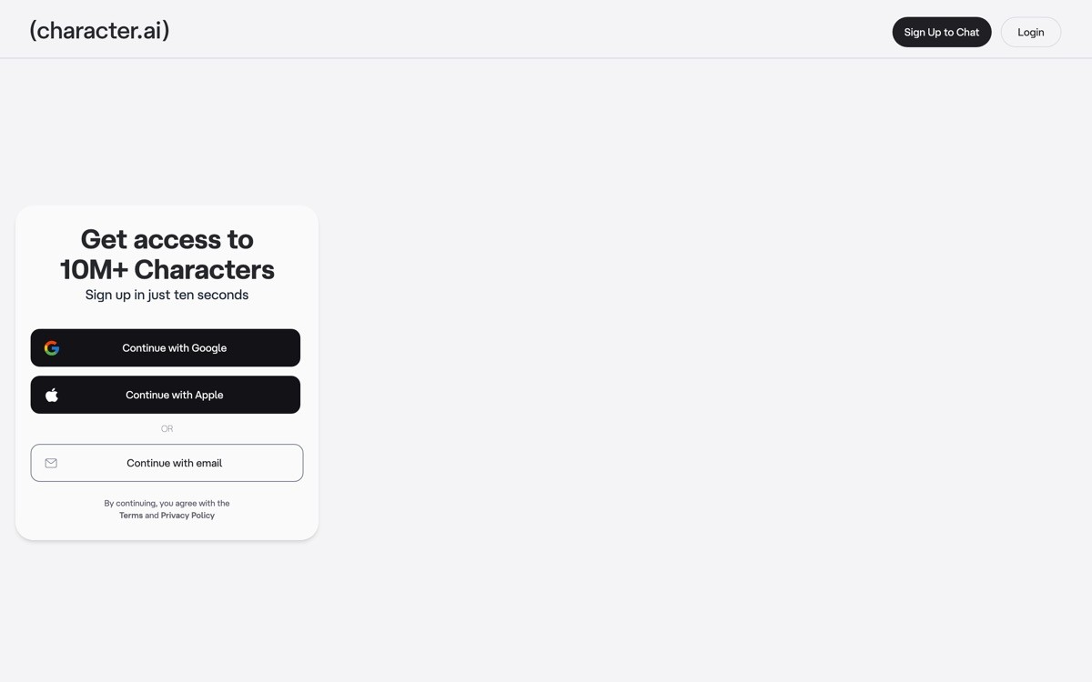
Character.AI's homepage is a gallery-first landing page where the hero is a grid of user-created characters with usage counts. The page treats the product as a social platform, not a tool, which is why it converts a consumer audience that would bounce off a "chat with AI" pitch.
The move is positioning. Character.AI is technically a chatbot; the landing page sells it as a social network for talking to fictional and historical figures. The hero gallery makes "what does this product do" obvious in 2 seconds without any explanatory copy.
Steal this
Gallery of user content as the hero, with engagement counts
Category tags (Anime, History, Games) acting as discovery filters
Sign-up CTA hidden behind a tap on any character
Creator credit on every gallery card
Mobile-first layout that scales to desktop without losing the grid
Best for
Consumer AI with a creator or community layer
Social AI products with a strong UGC element
Avoid copying
The gallery-first hero if you do not have meaningful UGC volume
Hiding the value prop entirely behind the gallery on the first paint
How to actually steal from these AI landing page examples
1) Steal the pattern, not the pixels
Copying ElevenLabs' colors and gradient will not save your page; copying ElevenLabs' "try the product in the hero" pattern with your own product will. Patterns transfer across brands and categories. Pixels do not.
2) Match the example to your audience, not your taste
If your buyer is a developer, study Cursor and v0, not Granola. If your buyer is a consumer, study Pi and Character.AI, not Anthropic. Steal from pages whose audience overlaps with yours, even if the page you wish you had is the one that does not.
3) Only copy patterns you can sustain
Runway's case study scroll requires real case studies. Character.AI's hero gallery requires real UGC. Cleft's hand-crafted brand requires a designer with taste. Pick stealable moves you can actually maintain in three months.
4) Combine two patterns from different examples
The best AI landing page in 2026 is probably "ElevenLabs hero plus Granola scroll plus Cleft typography." Single-source copying produces pages that look like cover bands. Two-source combinations produce pages that feel original.
If you have picked your inspiration but want a design partner to actually steal these patterns well, that is what AY Design does. We help founders and product teams take AI-built MVPs, Lovable apps, and reference designs and turn them into profitable, human-grade landing pages, dashboards, and brand systems. Book a design audit to see which of these patterns would lift your conversion the most.
FAQ
What are the best AI landing page examples in 2026?
The best AI landing page examples in 2026 are ElevenLabs, Runway, Suno, Granola, Cleft, Pi, and Character.AI. Each one nails a specific pattern: ElevenLabs for product-in-the-hero, Runway for cinematic restraint, Granola for productivity polish, Pi for warmth, and Character.AI for gallery-led positioning.
What can I steal from an AI landing page example?
Steal patterns, not pixels. Specifically: the hero pattern (live demo, gallery, voice picker), the proof structure (case studies, audio samples, creator counts), the typography choice (serif vs sans, weight, scale), the palette logic (warm vs cool, accent count), and the section sequencing (audience-first vs feature-first).
Why are AI landing pages so similar?
AI landing pages look similar because most teams copy the OpenAI or Anthropic aesthetic without adapting it. The category default (dark hero, gradient glow, generic "AI-powered" copy) gets reused across thousands of sites. Examples like Pi, Granola, and Cleft stand out specifically because they design against the default.
What is a good AI landing page hero pattern?
The strongest AI landing page hero patterns in 2026 are: live product input (Bolt, Perplexity, ElevenLabs), full-bleed product output (Runway, Suno, Character.AI), and quiet editorial typography (Anthropic, Granola, Cleft). Pick the pattern that matches your product's demoability and your audience's reading style.
Should I steal from AI landing pages or hire a designer?
Steal patterns to brief your designer, then let the designer execute. Showing a designer "I want to feel like ElevenLabs and read like Granola" is a much better brief than "make me an AI landing page." The references compress weeks of back-and-forth into one shared reference.
How many AI landing page examples should I study?
Five to seven is the sweet spot. Studying too few biases your design toward one reference. Studying too many produces decision paralysis. Pick three references that match your audience and two that stretch your taste, then start designing.
What is the best AI landing page for consumer products?
Pi and Character.AI are the strongest examples for consumer AI landing pages in 2026. Pi shows how warmth and emotional positioning beats generic chatbot framing. Character.AI shows how a gallery-first hero positions a chatbot as a social product, which converts a wider consumer audience.
What is the best AI landing page for B2B products?
Anthropic, Granola, and Cursor are the strongest examples for B2B AI landing pages in 2026. Anthropic for enterprise restraint, Granola for productivity polish, and Cursor for developer-facing density. Pick by buyer: enterprise leaders study Anthropic, knowledge workers study Granola, engineers study Cursor.
How do I steal a hero pattern without stealing the brand?
Rebuild the pattern with your own type, palette, and product. ElevenLabs' "voice picker hero" is a pattern (pickable product input plus live preview). Implementing that pattern with your typography, your color system, and your product is the move. Copying ElevenLabs' actual font, gradient, and component spacing produces a knockoff.
What is the worst pattern on AI landing pages right now?
The "dark hero plus purple gradient plus AI-powered tag" pattern is the worst-aged convention on AI landing pages in 2026. It signals nothing specific about the product, hurts brand recall, and looks identical to thousands of other pages. The examples in this list win partly because they design against this default.
Should AI landing pages auto-play media in the hero?
Yes if the media is muted, performant, and adds informational value (Runway's video, Suno's waveform). No if it auto-plays sound, blocks the hero render, or distracts from the primary CTA. The rule of thumb: auto-play is fine when the visitor would have clicked play anyway.
How often should I refresh my AI landing page references?
Every three to six months. The AI category is moving fast enough that pages aging six months can already feel dated, and competitor refreshes often happen quarterly. Treat reference-gathering as an ongoing design habit rather than a pre-redesign sprint.
Checkout other Blogs:

Multi-agent system UX design guide for 2026
A pattern-by-pattern guide to designing multi-agent system UX in 2026, with a scoring matrix and references from Claude Code, LangGraph, Devin, and Replit Agent.
Author:
AY Designs Team

Human-in-the-loop AI design guide for 2026
A 2026 guide to human-in-the-loop AI design with patterns, scoring framework, and examples from Cursor, Claude Code, Stripe, and Notion AI.
Author:
AY Designs Team

How to design agentic AI products in 2026: a 7-step playbook
A seven-step design playbook for shipping agentic AI products that users actually trust, with scoring matrix and real product references from Cursor, Claude Code, Devin, and Perplexity.
Author:
AY Designs Team

How much does AI SaaS design cost in 2026?
AI SaaS design cost in 2026 by tier and engagement type, with ranges, timelines, and a value scorecard for founders shipping with Lovable, Bolt, and v0.
Author:
AY Designs Team