
The AI category in 2026 has a brand identity problem. Every new startup launches with a similar logo (a single geometric shape, a generic sans, a gradient option), a similar voice (we are reinventing X), and a similar color palette (dark, with a glow). At launch it looks modern. A quarter later, it is forgettable.
This guide pulls apart the seven AI startup brand identities that are actually shaping the visual direction of the category in 2026. We break each one down by wordmark, palette, typographic choice, voice, and the specific patterns you should steal for your own brand redesign.
TL;DR: Anthropic and OpenAI set the institutional bar, Perplexity and ElevenLabs define the new utility brand archetype, Runway and Suno bring creative identity into a technical category, and Granola shows how a small AI product brand can punch far above its size.
AI startup brand identities: a brief overview
Anthropic: Best editorial AI brand. Serif typography, cream surfaces, calm voice.
OpenAI: Best institutional AI brand. Restrained wordmark, near-monochrome palette, broad recognition.
Perplexity: Best utility AI brand. Functional palette, plain wordmark, product is the brand.
ElevenLabs: Best multi-product AI brand. One identity carrying voice, dubbing, agents, music.
Runway: Best creative AI brand. Editorial wordmark and reel-style identity for media generation.
Suno: Best music AI brand. Energetic palette and motion language built around audio output.
Granola: Best small AI brand. Cream-and-serif productivity identity that out-styles every enterprise peer.
Brand | Identity archetype | Standout asset | Voice |
|---|---|---|---|
Anthropic | Editorial | Custom serif, cream canvas | Calm, considered, research-led |
OpenAI | Institutional | Restrained sans, monochrome palette | Authoritative, neutral, platform |
Perplexity | Utility | Plain wordmark, search input is the brand | Direct, plainspoken, functional |
ElevenLabs | Multi-product | Shared wordmark and component grammar | Confident, product-led, neutral |
Runway | Creative | Editorial wordmark, reel-style identity | Filmic, considered, artistic |
Suno | Music-energy | Bold color, audio-led motion | Energetic, playful, output-focused |
Granola | Cream-productivity | Warm serif headline, real product screenshots | Quiet, useful, designer-grade |
Scoring the 7 AI startup brand identities
Each brand is scored 1 to 5 on four dimensions, total out of 20. Clarity is whether the brand instantly signals what the product does. AI-tell-distinctiveness is whether the brand avoids the category template look. Conversion-orientation is whether the brand drives the business goals on its surfaces, not just expresses taste. Brand strength is memorability at thumbnail size and recall after a week.
Product | Clarity | AI-tell-distinctiveness | Conversion-orientation | Brand strength | Score |
|---|---|---|---|---|---|
Anthropic | 5 | 5 | 4 | 5 | 19 |
OpenAI | 5 | 4 | 5 | 5 | 19 |
Perplexity | 5 | 5 | 5 | 4 | 19 |
ElevenLabs | 4 | 4 | 4 | 5 | 17 |
Runway | 4 | 5 | 4 | 5 | 18 |
Suno | 5 | 4 | 4 | 5 | 18 |
Granola | 5 | 5 | 4 | 5 | 19 |
1. Anthropic, best editorial brand identity for an AI research lab
Anthropic's brand identity is built around a custom serif (a tuned Tiempos), cream and off-white surfaces, and a calm, research-led voice. The wordmark sits low key, never competing with the prose around it.

The voice is the strongest part of the identity. Anthropic writes like a research institution that respects its reader. Posts, papers, careers pages, and the Claude product all share the same tone, which compounds trust every time you encounter the brand.
Patterns to steal
Pair a single distinctive serif with a quiet neutral sans; use weight for hierarchy
Pick a non-default canvas color (cream, off-white) to break out of the category
Write everything (homepage, blog, careers, product copy) in the same voice
Let the wordmark sit small; let typography and prose do the brand work
Treat research, careers, and product as equally branded surfaces, not afterthoughts
Common mistakes to avoid
Adopting the cream-serif aesthetic without writing the editorial content to fill it
Letting calmness slide into vagueness about what the product does
Forking the voice for marketing posts that need to sound urgent
2. OpenAI, best institutional brand identity for a platform company
OpenAI's brand identity is institutional by design. A restrained sans wordmark, a near-monochrome palette, off-white surfaces, and a quiet authority that reads more like a research institute than a venture-backed startup.
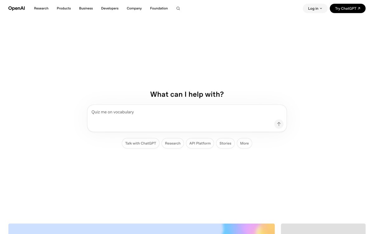
The system carries across ChatGPT, the API platform, enterprise, and policy content under one mark. The product names (ChatGPT, Sora) get their own distinct typographic identities while still feeling part of the family, which is the hardest brand architecture problem in the category.
Patterns to steal
Use restraint as a brand statement; let the wordmark stay small and confident
Build a near-monochrome palette and choose one accent for product launches only
Give each major product a typographic identity while keeping the parent mark constant
Treat policy, safety, and research as branded surfaces that build long-term trust
Use institutional pacing on every surface; avoid hype copy entirely
Common mistakes to avoid
Letting product sub-brands forget the parent mark in their launch art
Slipping into marketing-speak that breaks the institutional voice
Treating restraint as license to be visually forgettable
3. Perplexity, best utility brand identity for an AI answer engine
Perplexity's identity is utility-first. A simple wordmark, a functional palette, a search input that is the brand symbol, and a plainspoken voice that promises answers, not magic.
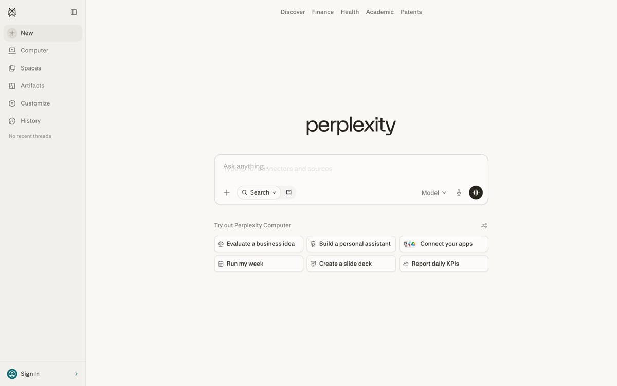
The brand bets on the product being recognizable enough that the identity does not need to push. The result is a brand that fades politely into the experience, which is exactly the right move for a tool people use dozens of times a day.
Patterns to steal
Make the primary product interaction (input, button, prompt) part of the brand identity
Choose a plain, legible wordmark that holds up at favicon size
Use a functional palette; do not over-style what users will see hundreds of times
Write copy in a plainspoken voice; avoid metaphor and slogan-language
Let the brand recede inside the product to make the product feel reliable
Common mistakes to avoid
Mistaking restraint for absence and ending up with a forgettable mark
Letting marketing pages reintroduce brand styling the product deliberately strips
Forgetting brand guidelines for paid media where utility brands often look weakest
4. ElevenLabs, best multi-product brand identity for a voice AI startup
ElevenLabs runs a multi-product brand identity that has to host voice generation, dubbing, conversational agents, and music under one wordmark. The system relies on a calm dark surface, a confident sans wordmark, and a shared component grammar across products.
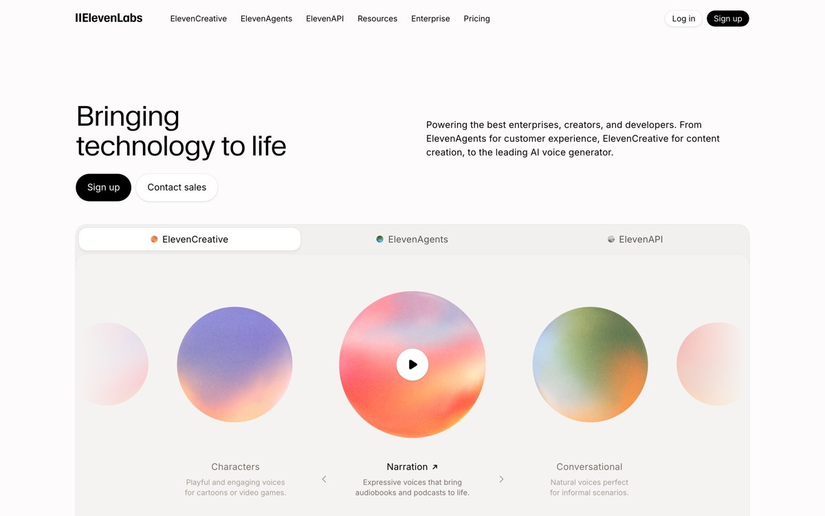
The identity does not push aggressive personality. It pushes consistency. Tiles, audio players, and product navigation all share the same internal language, which makes ElevenLabs feel like one company even when it ships four different surfaces in a quarter.
Patterns to steal
Use one wordmark across the portfolio; differentiate by content and color accent, not by lockup
Standardize a shared product grammar (tiles, players, demos) for cross-product brand legibility
Choose a calm canvas (dark or light) that gives different products room to breathe
Use restraint when the brand has to carry many products; aggressive personality breaks at scale
Let the wordmark sit identical at every entry point; readers remember repetition
Common mistakes to avoid
Letting one product line dominate the brand expression so peers feel like add-ons
Forking the system per product team without central design review
Overusing brand color until it dilutes itself across every surface
5. Runway, best creative brand identity for a generative media tool
Runway's brand identity is editorial in the way a film studio is editorial. A confident wordmark, a calm palette, and a brand expression that treats outputs (videos, images, edits) as the primary visual.
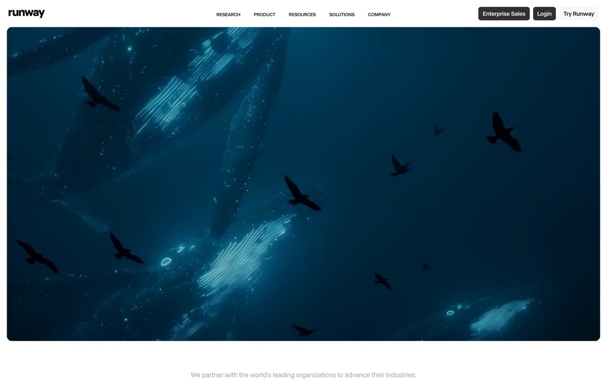
The brand sits comfortably alongside film and design references rather than other AI startups, which gives Runway a creative-class positioning that the rest of the category has not earned. Captions, type pairings, and pacing all reinforce the studio aesthetic.
Patterns to steal
Position your brand against an adjacent industry (film, publishing, music) instead of against other AI startups
Treat your generated outputs as primary brand assets; caption them like a curator would
Pick a wordmark that would not look out of place in a film credit roll or a museum catalog
Use editorial type pairings to suggest a creative-class positioning
Keep brand pacing calm even when the product is generative and motion-heavy
Common mistakes to avoid
Overplaying the editorial aesthetic until the brand stops explaining the product
Letting marketing assets show cherry-picked outputs that mislead first-time users
Forgetting accessibility on a media-heavy brand surface
6. Suno, best music brand identity for a generative audio tool
Suno's brand identity uses bold color, expressive type, and a motion language built around audio output. The brand feels confident and creative, which is exactly the right cue for a product whose entire job is creative generation.
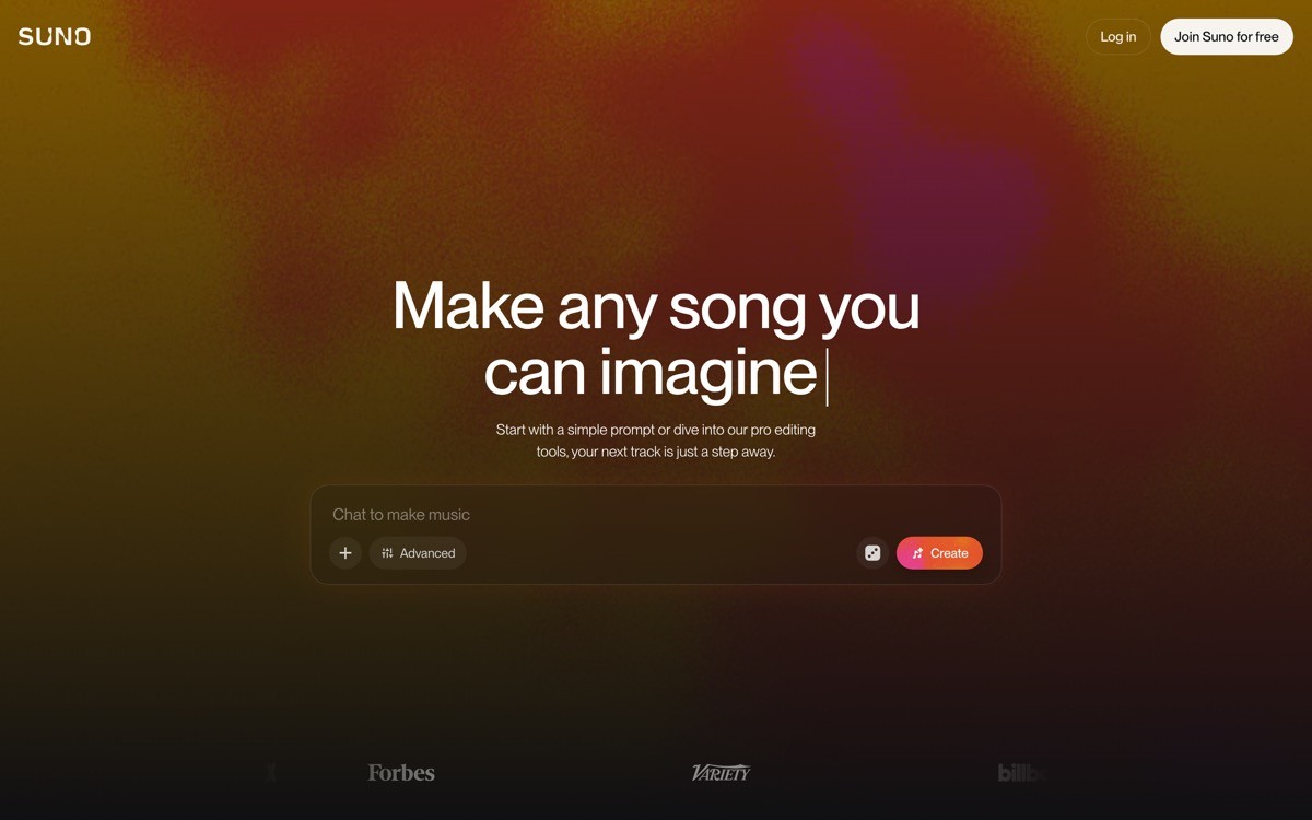
The wordmark is energetic without being childish, and the palette pulls from music and entertainment rather than the SaaS-purple defaults of the broader AI category. The brand reads as something musicians might actually want associated with their work.
Patterns to steal
Match brand energy to the energy of the product output (calm for productivity, energetic for music)
Pull color references from the adjacent creative industry, not from the AI category default
Build a motion language tied to the product (audio waveforms, beat-led transitions)
Use confident type pairings; the brand should feel like it belongs on a creative artifact
Let community outputs be a primary brand surface; users will share what they make
Common mistakes to avoid
Going so energetic the brand reads as a toy instead of a tool
Overusing motion until the brand stops working at static thumbnail size
Forgetting the marketing surfaces (press, careers) that demand calmer expression
7. Granola, best small AI brand identity for a focused productivity product
Granola's brand identity punches above its weight. A warm cream canvas, a tuned serif headline, soft product screenshots, and a quiet wordmark together make a small AI startup feel like a designer-grade product company.
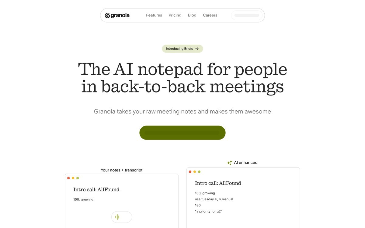
The brand reads as considered, almost European in restraint, and avoids every category cliche. No glow, no orb, no 3D illustration. Real product screenshots, real outcomes, real prose. The result is a small AI brand that competes visually with much larger productivity peers.
Patterns to steal
Pick a warm canvas and a tuned serif headline to look like a designer-grade product company
Use real product screenshots as primary brand visuals; skip 3D and glow effects
Keep the wordmark small and confident; let layout and prose do the brand work
Write copy in a quiet, useful voice that signals craft
Design every surface (press, status page, release notes) to the same standard as the homepage
Common mistakes to avoid
Forking the brand the moment a second product ships
Letting screenshots get out of date and undermine the considered look
Stretching the warmth aesthetic into use cases where decisiveness is the right tone
How to choose a brand identity direction for your AI startup
1) What energy does your product output have?
Match brand energy to product energy. Productivity and research products (Granola, Anthropic) earn from calm. Creative and generative products (Runway, Suno) earn from confident energy. Utility products (Perplexity) earn from restraint. A brand identity that mismatches the product energy will feel performative on every surface.
2) Are you building one product or a portfolio?
Single product brands (Granola, Cursor, Perplexity) can lean into a strong, narrow identity. Multi-product brands (ElevenLabs, OpenAI, Anthropic) need a parent identity disciplined enough to host children. Designing the parent identity for a portfolio you do not yet have is wise; redesigning it later because product 2 broke the system is expensive.
3) Who is your primary audience?
Developer audiences read dark surfaces, monospace accents, and IDE chrome as credible (Cursor, v0, Vercel). Consumer audiences read warm palettes and rounded geometry as approachable (Lovable, Granola). Enterprise audiences read restrained institutional brands as safe (OpenAI, Anthropic). Pick one and design with conviction.
4) Which adjacent industry do you want to be compared to?
The strongest brand identities in this list position themselves against an adjacent industry, not just against other AI startups. Anthropic competes with research institutions, Runway with film studios, Granola with designer productivity tools. Picking an industry-adjacent reference point makes your brand legible and harder to copy.
If your AI startup brand identity is still a Figma file with a wordmark and a gradient, that is the moment to bring in a design partner who builds real systems. AY Design builds AI startup brand identities that hold up at product scale, across marketing, product, and recruiting surfaces. Book a design audit to see what your brand is missing.
FAQ
What is an AI startup brand identity?
An AI startup brand identity is the shared expression of wordmark, type, color, voice, and motion that makes the company recognizable across every surface. The best AI brand identities (Anthropic, OpenAI, Perplexity) carry consistently from research papers to product UI to release notes, without forking.
Which AI startup has the best brand identity in 2026?
Anthropic, OpenAI, Perplexity, and Granola tie at the top of our scoring at 19 out of 20 in 2026. Anthropic wins on editorial brand, OpenAI on institutional reach, Perplexity on utility, and Granola on small-team craft. The right reference depends on what your product is selling.
Why do most AI startup brand identities look the same?
Most AI startups ship the same template because the design defaults (dark glow gradient, single geometric mark, generic sans) are fast and feel modern at launch. The pattern is fragile; by the next funding round the brand reads as generic. The brands in this list each broke the template in a deliberate, specific direction.
Should an AI startup use a custom wordmark or a generic typeface?
A custom or carefully tuned wordmark holds up better than a generic typeface, especially at favicon and social-card size. You do not need a full custom typeface (most early stage AI startups should not invest there), but the wordmark itself should be unique. Anthropic, OpenAI, and Runway all use distinct, tuned wordmarks.
What colors should an AI startup brand identity avoid in 2026?
The category default of dark backgrounds with purple-blue glow gradients is the strongest tell of an undifferentiated AI brand in 2026. Brands that picked warm canvases (Anthropic, Granola, Lovable) or restrained palettes (OpenAI, Perplexity) stand out by default. Avoid the gradient orb hero unless your brand has a real reason to use it.
Does an AI startup brand identity need a mascot or illustration system?
Most AI startup brand identities do not need a mascot. The exceptions are consumer brands that want extra warmth (Replit) or creative brands that need a memorable visual hook. If you cannot articulate why a mascot exists beyond decoration, skip it; the brand reads stronger without one.
How long does it take to build an AI startup brand identity?
A focused AI startup brand identity (wordmark, type system, color, voice, core components) typically takes four to eight weeks with a senior designer and an engineer. Larger portfolio brands (ElevenLabs, Vercel) usually evolve over 12 to 18 months as products ship and the system gets stress-tested.
What is the biggest mistake AI startups make with their brand identity?
The biggest mistake is treating the brand identity as a launch asset instead of a long-term system. The launch logo gets reused everywhere; the launch voice never gets documented; the launch palette breaks the second a new product ships. The brands that age well treat the identity as a living system, not a one-time deliverable.
How should an AI startup brand identity evolve as the company grows?
The brand identity should harden, not soften, as the company grows. Anthropic, OpenAI, and Vercel all show the same pattern: the wordmark gets quieter, the voice gets more institutional, the palette gets more restrained. Counter-intuitive but consistent. Startups that get louder as they grow tend to look like they are compensating for shrinking conviction.
What role does motion play in an AI startup brand identity?
Motion is a brand asset in 2026. Suno uses audio-led transitions, Runway uses film-like pacing, Anthropic uses almost no motion at all, and that restraint reads as a brand signal in itself. Pick a motion stance (energetic, calm, none) and stick to it across every surface. Inconsistent motion is one of the easiest ways to make a brand feel cheap.
Should small AI startups copy big AI startup brand identities?
Copying the surface of a big AI brand (Anthropic's serif, OpenAI's restraint) without the underlying substance (research output, broad adoption) is the most common small-AI brand failure. Granola shows the alternative: pick a distinct, considered direction that suits a small team's actual content and execute it with discipline. Originality beats imitation at small scale.
Checkout other Blogs:

Multi-agent system UX design guide for 2026
A pattern-by-pattern guide to designing multi-agent system UX in 2026, with a scoring matrix and references from Claude Code, LangGraph, Devin, and Replit Agent.
Author:
AY Designs Team

Human-in-the-loop AI design guide for 2026
A 2026 guide to human-in-the-loop AI design with patterns, scoring framework, and examples from Cursor, Claude Code, Stripe, and Notion AI.
Author:
AY Designs Team

How to design agentic AI products in 2026: a 7-step playbook
A seven-step design playbook for shipping agentic AI products that users actually trust, with scoring matrix and real product references from Cursor, Claude Code, Devin, and Perplexity.
Author:
AY Designs Team

How much does AI SaaS design cost in 2026?
AI SaaS design cost in 2026 by tier and engagement type, with ranges, timelines, and a value scorecard for founders shipping with Lovable, Bolt, and v0.
Author:
AY Designs Team