
Design systems at AI startups are doing more work than design systems usually do. They have to flex across a research site, a product UI, a developer docs surface, and at least one marketing landing page, often under a brand still in motion. Most fail. A few do this with so much polish that the entire company benefits.
This guide breaks down seven AI startup design systems worth studying in 2026. We focus on the parts you can actually see on the public surface: typography choices, color systems, component patterns, and the discipline that carries the brand from marketing into the product without breaking.
TL;DR: Anthropic and Vercel run the most considered design systems in the category, OpenAI and Cursor model how to scale a system across audiences, and Lovable, ElevenLabs, and Replit show how brand systems flex for consumer, multi-product, and developer surfaces.
AI startup design systems: a brief overview
Anthropic: Best editorial design system. Custom serif, cream surfaces, and prose-first components.
Vercel: Best engineering-led design system. Geist typeface, monochrome with bold accents, used across every property.
OpenAI: Best multi-audience system. Same wordmark and grid across ChatGPT, API, and Enterprise.
Cursor: Best IDE-continuous system. Marketing surface looks like the product, on purpose.
Lovable: Best consumer warmth system. Pastel palette and rounded geometry as a category-breaking tell.
ElevenLabs: Best portfolio system. One language across voice, dubbing, agents, and music.
Replit: Best developer playfulness system. Distinct mascot energy without giving up technical credibility.
Design system | System type | Distinctive trait | Strongest surface |
|---|---|---|---|
Anthropic | Editorial | Custom serif, prose-first components | Research and homepage |
Vercel | Engineering-led | Geist, monochrome plus bold accent | Docs, dashboard, v0 |
OpenAI | Multi-audience | Single grid, multiple audience rails | Homepage and product family |
Cursor | IDE-continuous | Marketing matches editor surface | Landing and editor UI |
Lovable | Consumer warmth | Pastel palette, rounded geometry | Marketing and onboarding |
ElevenLabs | Portfolio | Shared component grammar across products | Multi-product navigation |
Replit | Developer playfulness | Mascot brand plus technical credibility | Editor and community |
Scoring the 7 AI startup design systems
Each system is scored 1 to 5 on four dimensions for a total out of 20. Clarity is whether the system makes the brand instantly recognizable. AI-tell-distinctiveness is whether the system avoids the dark-glow-gradient category template. Conversion-orientation is whether the system supports the business goals on every surface, not just the homepage. Brand strength is how memorable the system is at thumbnail size.
Product | Clarity | AI-tell-distinctiveness | Conversion-orientation | Brand strength | Score |
|---|---|---|---|---|---|
Anthropic | 5 | 5 | 4 | 5 | 19 |
Vercel | 5 | 4 | 5 | 5 | 19 |
OpenAI | 5 | 4 | 5 | 4 | 18 |
Cursor | 5 | 4 | 5 | 4 | 18 |
Lovable | 4 | 5 | 5 | 4 | 18 |
ElevenLabs | 4 | 4 | 4 | 5 | 17 |
Replit | 4 | 4 | 4 | 5 | 17 |
1. Anthropic, best editorial design system for an AI research company
Anthropic's design system is built around a custom serif (Tiempos, with bespoke tuning), cream surfaces, and prose-first components. The system reads more like a publishing house than a typical AI startup.

Buttons sit quiet, body text owns the page, and section breaks rely on whitespace and rule lines rather than gradient dividers. The same grammar carries through to research papers, the Claude product, and the careers site, which makes Anthropic feel like one company across every surface.
Patterns to steal
Lead the system with a single distinctive type pairing (one serif, one neutral sans) and use weight to do hierarchy
Use cream or off-white as the primary canvas to reset the eye away from the category default
Treat long-form prose as a first-class component, not an afterthought
Standardize on quiet buttons; let copy do the persuasion
Apply the same system to recruiting and research pages, not just marketing
Keep motion almost invisible; calm pacing reads as confidence
Common mistakes to avoid
Adopting the serif aesthetic without writing the editorial content to back it up
Letting the calm system dilute conversion paths on commercial pages
Mixing too many heading sizes; the rhythm relies on restraint
2. Vercel, best engineering-led design system for a platform company
Vercel's design system is anchored by Geist, the company's open-source typeface, a tight monochrome palette, and a single bright accent that switches between marketing surfaces and product UI. It feels like a system built by engineers who care about typography.

The system extends across the dashboard, the docs, the v0 sub-brand, and the marketing site without breaking, which is the hardest part of building a design system at this scale. The components feel like the same family even when they serve very different surfaces.
Patterns to steal
Invest in a custom typeface, or pick one that scales from headline to code block
Use a near-monochrome palette with one strong accent for CTAs and status
Ship the system as an open-source package (Geist, Geist UI) so it is consistent and inspectable
Carry the system into developer docs, not just marketing
Let sub-brands (like v0) inherit type and color rather than invent their own
Treat the dashboard as a marketing surface with its own brand discipline
Common mistakes to avoid
Investing in a typeface without a clean way to apply it across third-party tools
Allowing sub-brands to fork the system into incompatible directions
Treating docs as a place where the brand can be ignored
3. OpenAI, best multi-audience design system for a platform with many buyers
OpenAI's design system has to carry ChatGPT consumers, API developers, and enterprise buyers under one brand. It does this with a near-monochrome canvas, off-white surfaces, and a single grid that flexes across audience rails.
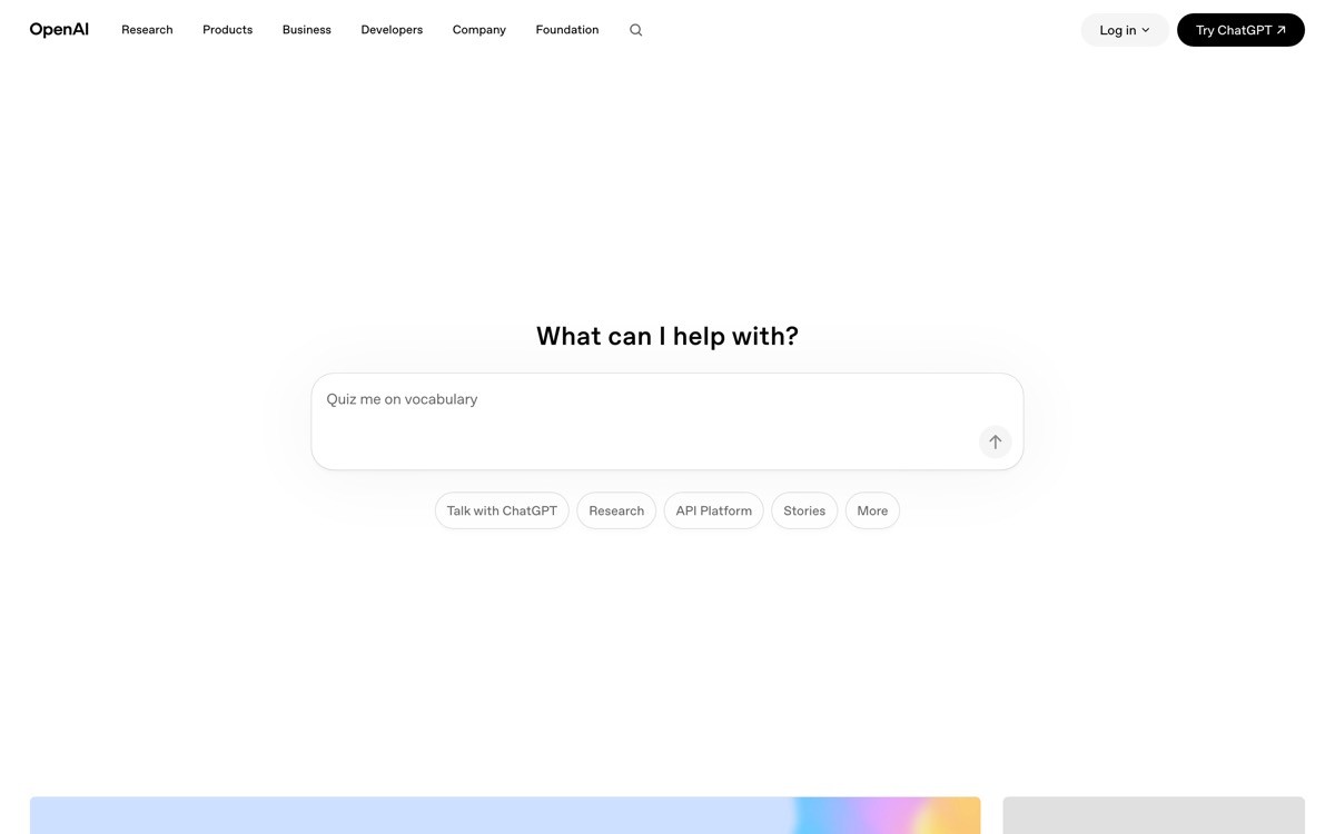
The components feel like cousins of Apple's marketing system, in the best sense: heavy use of restraint, a small number of card variants, and a wordmark that carries the brand without ever competing with the product art. The system reads as institutional, on purpose.
Patterns to steal
Define a small number of card and tile variants and reuse them religiously across audiences
Use the same grid for consumer and enterprise pages; vary content, not structure
Treat the wordmark as the brand center; avoid over-illustrating around it
Adopt institutional restraint when the buyer set is broad
Keep blog and announcement pages on the same system, not a forked Medium-style template
Common mistakes to avoid
Letting the consumer surface drift toward heavy illustration while the developer surface stays austere
Adding too many card variants until the system becomes a swatch of components without a grammar
Treating restraint as license to be visually forgettable
4. Cursor, best IDE-continuous design system for a developer tool
Cursor's design system is intentionally continuous from marketing into the editor. The marketing surface borrows IDE chrome, monospace accents, and the same dark surface the product runs on, so the brand never has to context-switch.
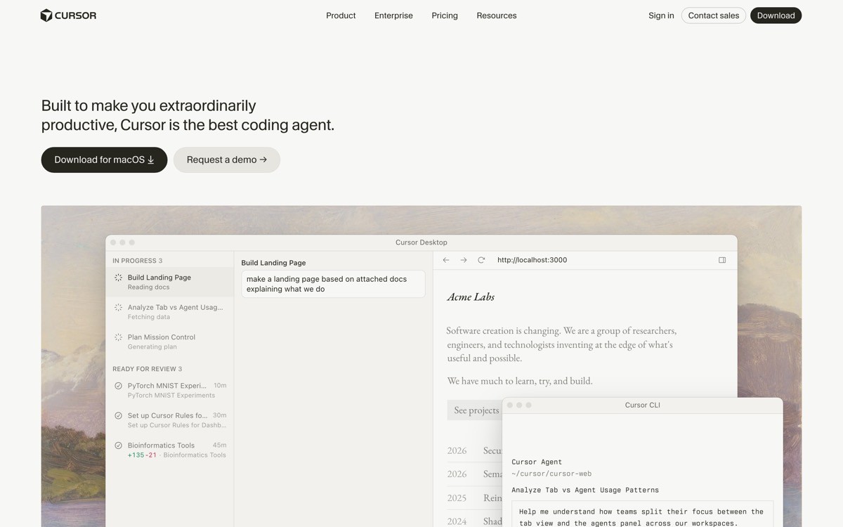
The system stays tight on type and color but flexes on density. Marketing pages are spacious to breathe; the editor is dense because developers prefer it that way. The shared brand language carries the trust from the homepage into daily product use.
Patterns to steal
Borrow product chrome (panes, monospace, status badges) into your marketing surface
Use density as a flex point: spacious on marketing, dense in product
Pick one accent color and use it consistently across CTA, focus rings, and selection states
Let the product be the screenshot; do not invent stylized fake UIs
Carry the wordmark and type into installer screens, settings, and onboarding
Common mistakes to avoid
Letting marketing get glossy enough that it sets expectations the product cannot match
Forgetting light-mode users when the brand defaults to dark
Skipping the small surfaces (release notes, install screens) where the brand quietly proves itself
5. Lovable, best consumer warmth design system for an AI app builder
Lovable's design system is built to feel approachable in a category that defaults to cold and technical. Pastel palettes, rounded geometry, a friendly wordmark, and warm photography of real people using the product.
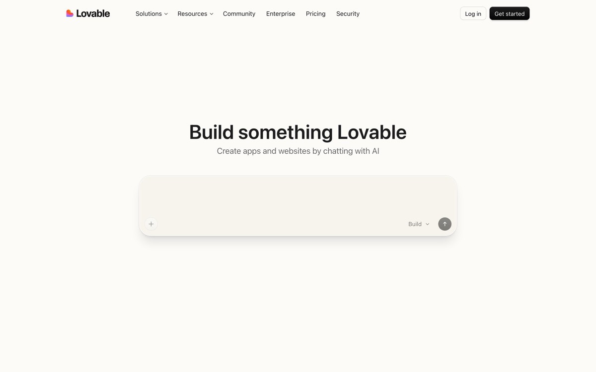
The system carries from the marketing site into the in-product builder without losing personality. Buttons, inputs, and panel chrome share the same rounded language, and the community gallery uses the same card pattern as the marketing logos strip, which keeps the brand legible everywhere.
Patterns to steal
Pick a palette that contrasts the category default; warm against cold, light against dark
Use rounded geometry consistently across components for a recognizable shape language
Let the community gallery use the same card system as marketing, so the brand reads as one
Pick a friendly wordmark that feels at home on both a marketing hero and a product header
Use warm, real photography sparingly to differentiate from stock and 3D render defaults
Common mistakes to avoid
Letting warmth turn into childishness on developer-facing surfaces
Forgetting accessibility contrast when the palette goes pastel
Allowing the product UI to fork from the marketing system once usage gets complex
6. ElevenLabs, best portfolio design system for a multi-product AI startup
ElevenLabs' design system is built to carry several products (voice, dubbing, agents, music) under one brand. The system uses a shared grid, a single dark surface, and a consistent inline audio player component that ties every product to the same brand grammar.
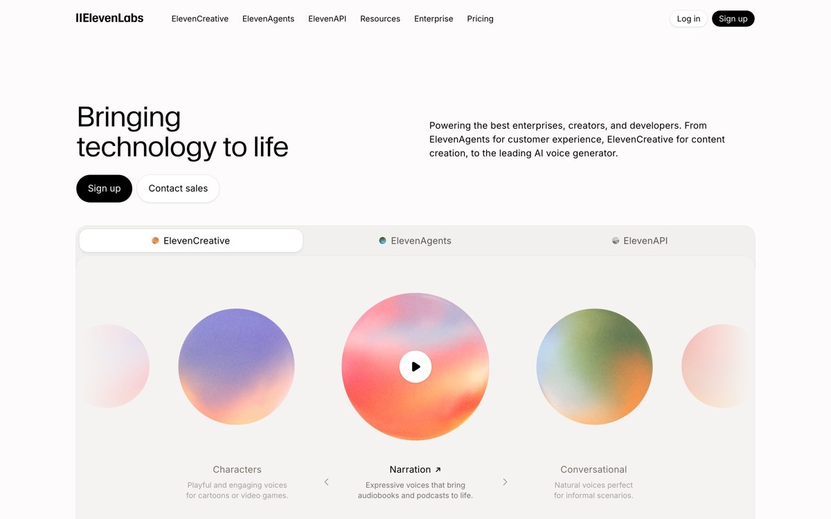
The components feel calm enough to host different product workloads without competing for attention. Typography is restrained, the wordmark sits quietly, and product tiles use the same internal hierarchy, which makes the multi-product homepage feel like a curated catalog instead of a stitched set of micro-sites.
Patterns to steal
Define one product tile component and reuse it across the portfolio
Standardize a single media player or demo component that every product can drop in
Keep the wordmark identical across products; differentiate by content, not by logo lockup
Use consistent typography weights across the portfolio so the brand reads as one
Let dark surface and shared grid do the unifying work when products vary in workflow
Common mistakes to avoid
Letting one product (voice) dominate the system so the others feel like spinoffs
Forking the system per product team without a central design guild
Skipping the small components (search, breadcrumbs) that make a portfolio feel real
7. Replit, best developer playfulness design system for a coding platform
Replit's design system mixes serious developer credibility with mascot-style brand personality. The wordmark, the rounded radius on components, and the use of color all push toward warmth, while the product itself stays dense and capable.
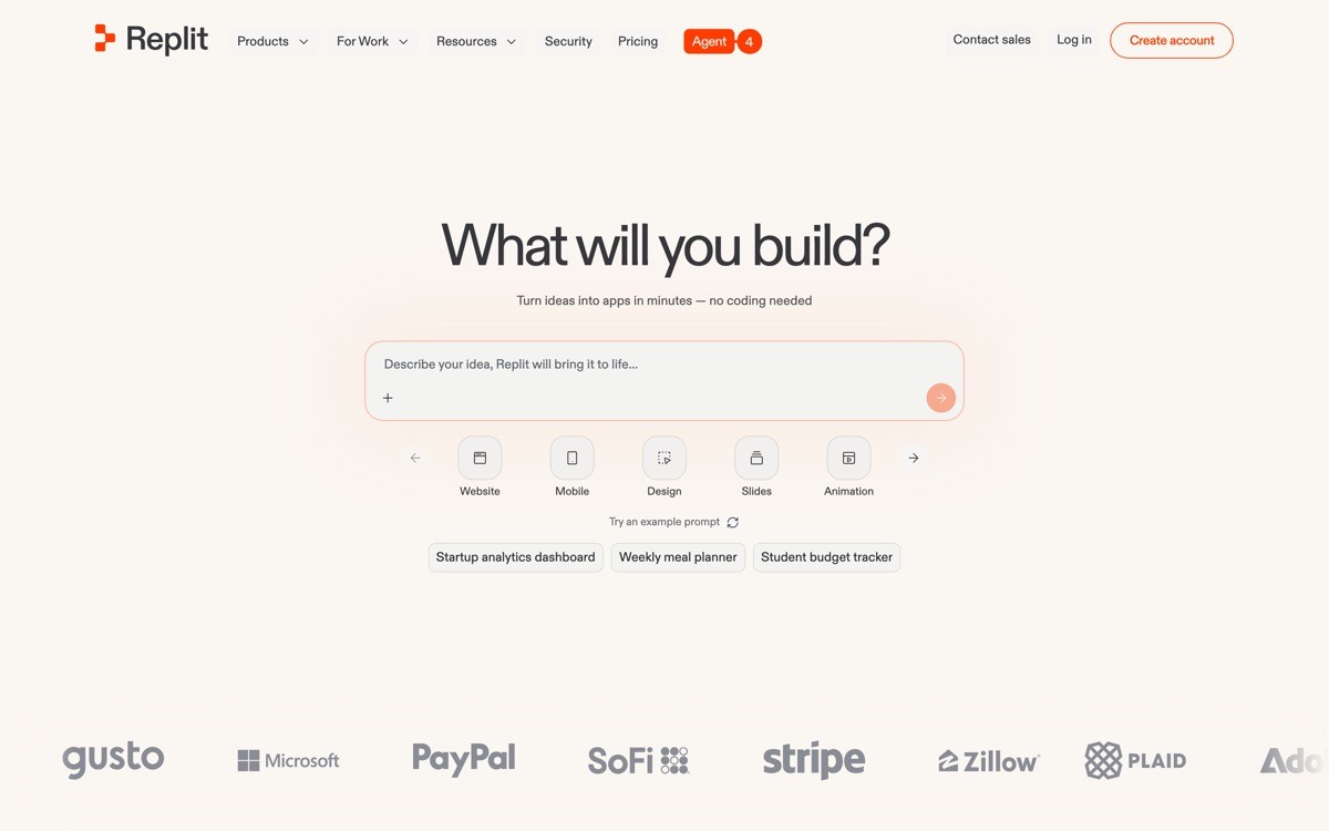
The brand carries into the IDE, the agent surface, and the community pages, with the same color and shape language threading through each. The result is a developer tool that does not feel like every other developer tool, which is rare.
Patterns to steal
Introduce one brand-personality element (mascot, illustration, brand color) and apply it everywhere
Use rounded radii consistently to soften the default developer-tool aesthetic
Let community surfaces (templates, profiles, projects) inherit the same brand grammar as the editor
Keep product density high; let the brand do the warmth so the product does not have to
Make brand color a usable status color, not just a decoration
Common mistakes to avoid
Letting playfulness undermine credibility on enterprise or pricing pages
Overusing the mascot until it becomes wallpaper
Failing to apply the brand color to focus and selection states inside the product
How to choose a design system direction for your AI startup
1) How much editorial weight does your brand carry?
If your company publishes research, essays, or long-form opinion (Anthropic, Mistral), build the system around editorial typography and prose components. If your value lives in product surface (Cursor, Lovable, Vercel), build the system around product chrome and component reuse. The mismatch (editorial brand without editorial content, or product brand without product surface) is the most common mistake.
2) How many products will the system have to host in 18 months?
Single product startups (Cursor, Granola, Lovable) can run a system with three or four core components. Portfolio startups (ElevenLabs, OpenAI, Vercel) need a tile/card grammar and a shared media component from day one. Trying to scale a single-product system into a portfolio later is more expensive than building for portfolio early.
3) Will the system carry into the product, or only the marketing site?
Cursor, Replit, and Vercel run the same system across marketing and product, which compounds brand value every release. If your product team uses a different design system from marketing, you are paying for two brands. Pick one and enforce it through tokens shared between the marketing site and the product codebase.
4) How aggressively do you need to break the category template?
If the category default is dark glow gradient, your differentiation is either editorial (Anthropic) or warm consumer (Lovable). Pick one direction with conviction. A timid hybrid system that does both halfway reads as confused, and confused brands do not earn trust.
If your AI startup design system feels like a Tailwind template plus a wordmark, that is the moment to build something real. AY Design builds AI startup design systems that carry from marketing into the product, with tokens, components, and brand discipline that compound. Book a design audit to see where your current system is leaking.
FAQ
What is an AI startup design system?
An AI startup design system is the shared set of typography, color, components, motion, and voice that carries a brand across marketing pages, product UI, docs, and recruiting surfaces. The best examples (Anthropic, Vercel, OpenAI) use the same system on every surface, so the brand reads as one company.
Which AI startup has the best design system in 2026?
Anthropic and Vercel tie for the strongest AI startup design systems in 2026 at 19 out of 20. Anthropic wins on editorial brand strength, Vercel wins on engineering discipline and cross-property reuse. OpenAI and Cursor follow closely at 18.
Should an AI startup build a custom typeface?
A custom typeface is worth it when the brand needs a distinctive voice and the team can maintain it (Vercel's Geist, Anthropic's Tiempos pairing). Most AI startups should not invest there until the brand has shipped a stable v2 of its identity. A licensed typeface used with discipline beats a custom typeface used inconsistently.
How is an AI startup design system different from a regular SaaS design system?
AI startup design systems usually have to carry the brand across more audiences (consumer, developer, enterprise) and more product types (model API, chat product, dashboards, generated outputs) than a typical SaaS. The discipline is the same, but the surface count is higher, so component reuse and token discipline matter more.
Should the marketing site and the product use the same design system?
Yes when feasible. Cursor, Vercel, and Replit all run shared systems across marketing and product, and the brand reads as one company. If the marketing team uses Figma and the product team uses a Tailwind starter kit, you are paying for two brands. Share tokens and components across both at the codebase level.
What design tokens should an AI startup standardize first?
Standardize color (background, surface, text, accent), typography (one display, one body, one mono), spacing scale, radius scale, and shadow scale before anything else. Component tokens come after. Most AI startups invent components before tokens, then end up rebuilding the system in year two.
How big should the design team be to build a system like Vercel or Anthropic?
You do not need a 30 person design team; Vercel and Anthropic both scaled with small, senior, design-and-engineering teams. The first version of an AI startup design system usually takes two designers and an engineer about six weeks. Discipline matters more than headcount.
What is the biggest mistake AI startups make with their design system?
The biggest mistake is letting the marketing brand and the product brand drift apart. The marketing site goes editorial, the product goes utility, and customers experience two different companies. Set tokens that both teams share, and review every surface against the system on a recurring cadence.
How do AI startup design systems compare to traditional SaaS design systems?
AI startup design systems carry more variance per surface than traditional SaaS systems. A single AI brand often has to host a research paper, a chat UI, a generated-output gallery, and a developer API console. The discipline is the same as enterprise SaaS, but the component count and the audience pluralism are higher, so portable tokens and shared primitives matter even more.
Should an AI startup open-source its design system?
Open-sourcing is worth it when the system supports a developer audience that will adopt and extend it (Vercel's Geist UI). Most AI startups should not open-source on day one because maintaining a public component library is real engineering work. Ship the internal system first; consider open-sourcing once the system has stabilized and the team has bandwidth to support outside contributors.
What are the most important components to define first in an AI startup design system?
Start with type, color, spacing, and the four most-used product primitives: button, input, card, and dialog. Once those are stable, layer in product-specific components (chat bubble, code block, audio player, generated-output tile) and marketing-specific components (hero, feature row, pricing tile). Building component libraries before tokens is the most common version of getting it backward.
Checkout other Blogs:

Multi-agent system UX design guide for 2026
A pattern-by-pattern guide to designing multi-agent system UX in 2026, with a scoring matrix and references from Claude Code, LangGraph, Devin, and Replit Agent.
Author:
AY Designs Team

Human-in-the-loop AI design guide for 2026
A 2026 guide to human-in-the-loop AI design with patterns, scoring framework, and examples from Cursor, Claude Code, Stripe, and Notion AI.
Author:
AY Designs Team

How to design agentic AI products in 2026: a 7-step playbook
A seven-step design playbook for shipping agentic AI products that users actually trust, with scoring matrix and real product references from Cursor, Claude Code, Devin, and Perplexity.
Author:
AY Designs Team

How much does AI SaaS design cost in 2026?
AI SaaS design cost in 2026 by tier and engagement type, with ranges, timelines, and a value scorecard for founders shipping with Lovable, Bolt, and v0.
Author:
AY Designs Team