
Every AI startup is launching with the same recipe right now. Dark hero, gradient orb, three-word headline, a demo video, a logo strip nobody recognizes. The category looks like a single Figma file with the brand names swapped.
The best AI startup websites in 2026 break that pattern. They sound like a real company, they show the product working before the fold, and they treat the homepage like a sales call, not a moodboard. This guide pulls apart seven of the strongest examples, scores them on clarity, conversion, and brand strength, and gives you the patterns to steal for your own redesign.
TL;DR: Anthropic and OpenAI set the bar for editorial trust, Perplexity and Cursor show how to lead with product, and ElevenLabs, Lovable, and Mistral prove that personality still wins when the category is crowded.
Best AI startup websites in 2026: a brief overview
Anthropic: Best editorial homepage. Reads like a serif-and-numbers research lab that happens to sell an API.
OpenAI: Best product-led homepage. Three audiences, three rails, no scroll lost to fluff.
Perplexity: Best demo-as-hero. The search box is the hero unit, not a screenshot of it.
Cursor: Best developer-trust homepage. Specific benchmarks, real logos, working video, no enterprise gloss.
Lovable: Best AI-native consumer homepage. Builds in your browser before you have an account.
ElevenLabs: Best multi-product homepage. Treats the home as a router, not a brochure.
Mistral: Best European confident-minimal homepage. Quiet typography, sharp positioning, zero gradient soup.
Website | Page type | What makes it work | Standout pattern |
|---|---|---|---|
Anthropic | Editorial homepage | Serif typography, research-led navigation, calm pace | Featured essay above CTA |
OpenAI | Multi-audience portal | Splits ChatGPT, API, and Enterprise into three clear rails | Audience switcher in hero |
Perplexity | Product-as-hero | Search input is the homepage, not a screenshot of one | Live demo in hero unit |
Cursor | Developer-trust homepage | Benchmark numbers, logo wall of real eng teams, video first | Inline product video |
Lovable | AI-native consumer homepage | App-in-the-page builder before login | Pre-auth product try |
ElevenLabs | Multi-product portal | Voice, dubbing, agents and music routed clearly from home | Product tile grid |
Mistral | Minimalist research homepage | Confident European minimalism, dense product menu, no fluff | Two-column research and products split |
Scoring the 7 best AI startup websites
Each site is scored 1 to 5 on four dimensions, then totaled out of 20. Clarity is whether a first-time visitor understands what the company does in under five seconds. AI-tell-distinctiveness is how strongly the site avoids the template look every AI startup ships with. Conversion-orientation is whether the homepage funnels you to an action (signup, demo, API key, contact). Brand strength is the typography, voice, and design system carrying a recognizable identity.
Product | Clarity | AI-tell-distinctiveness | Conversion-orientation | Brand strength | Score |
|---|---|---|---|---|---|
Anthropic | 5 | 5 | 4 | 5 | 19 |
OpenAI | 5 | 4 | 5 | 4 | 18 |
Perplexity | 5 | 5 | 5 | 4 | 19 |
Cursor | 5 | 4 | 5 | 4 | 18 |
Lovable | 4 | 5 | 5 | 4 | 18 |
ElevenLabs | 4 | 4 | 4 | 5 | 17 |
Mistral | 4 | 5 | 3 | 5 | 17 |
1. Anthropic, best editorial homepage for an AI research lab
Anthropic's homepage is the website of an AI startup that decided not to look like one. It uses a warm cream background, a custom serif headline, and treats the hero as a featured essay rather than a CTA stack.

The navigation foregrounds Claude, the API, research, and a careers tab that sits as a peer to the product, signaling the company is hiring out of credibility not desperation. The pacing is slow on purpose. You can read this homepage and feel calm, which is rare in a category where most homepages assault you with motion.
Patterns to steal
Lead the hero with a featured piece of writing or research, not a generic value prop
Use a custom serif or editorial sans to break out of the default Inter-on-black look
Cream or off-white backgrounds reset the eye after every other AI site
Calm vertical rhythm: lots of whitespace, no auto-play video
Treat careers as a top-level nav item, not a footer link
Use real prose for product descriptions, not feature-card bullet soup
Common mistakes to avoid
Copying the cream and serif aesthetic without backing it with real essays or research
Going so calm that the primary CTA disappears below the fold
Forgetting a clear path to Claude.ai for non-developer visitors
2. OpenAI, best multi-audience homepage for a platform company
OpenAI is a multi-audience portal that successfully serves consumers, developers, and enterprise buyers from a single homepage. The hero splits cleanly into ChatGPT, the API platform, and Enterprise, each with its own copy track and CTA.
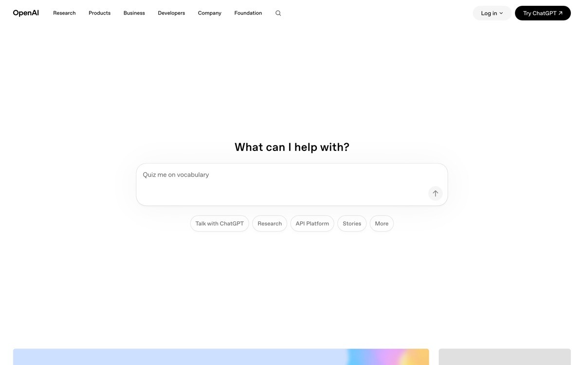
The site uses a near-monochrome palette with a soft off-white background, sans-serif typography, and surfaces product news as discrete tiles rather than a single rotating hero. Nothing autoplays. The product range is huge but the homepage never feels overwhelming because each audience has its own scroll lane.
Patterns to steal
If you serve more than one buyer, split the hero by audience instead of trying to write one headline for all of them
Use a content grid for product news to keep the homepage feeling current without a blog detour
Stick to one or two type sizes per section; let the hierarchy do the work
Use product names (ChatGPT, Sora, API) as navigation, not abstract feature labels
Keep the global nav short, push everything else into a clear footer sitemap
Common mistakes to avoid
Splitting audiences in the hero but then merging them again on every section below
Letting product launches replace the primary positioning line above the fold
Underestimating the footer; OpenAI's is a real sitemap, not a courtesy
3. Perplexity, best product-as-hero homepage for an AI search startup
Perplexity puts the product itself in the hero. The search input is functional, not a screenshot, and you can ask it a question before you scroll. That single decision separates this homepage from every competitor that opens with a video of the product.
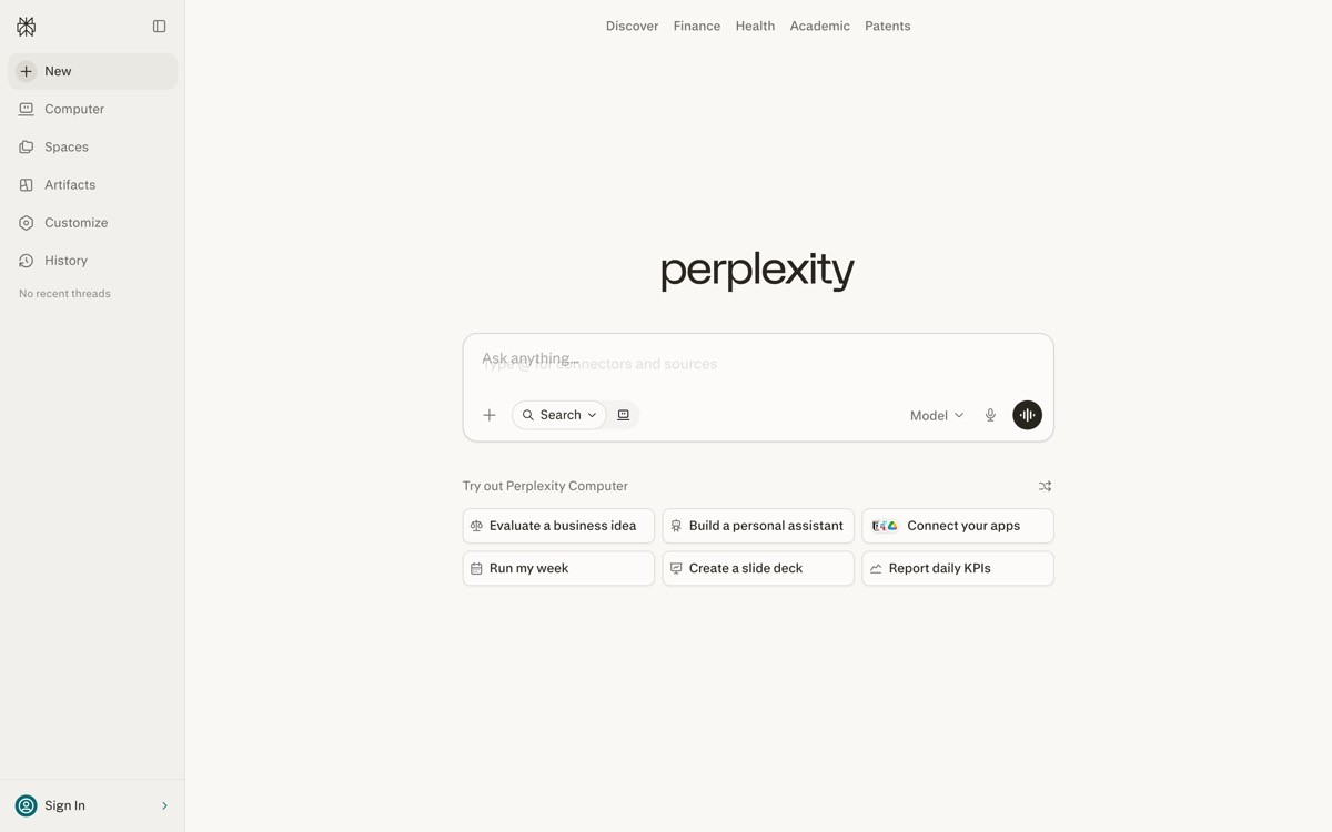
The supporting design is deliberately quiet. A simple wordmark, a dark or light surface depending on theme, and feature sections that read like a product tour rather than a marketing rant. The homepage is the funnel. You go from curious to query in one click.
Patterns to steal
If your product is text-input based, put the real input in the hero, not a screenshot
Strip the hero of every distraction that isn't the primary action
Make the headline a question or a prompt suggestion, not a slogan
Show three or four real example queries underneath as social proof of capability
Keep the navigation to four items max so the hero owns the screen
Common mistakes to avoid
Putting a fake demo input that opens a signup modal instead of working
Forgetting to ship a mobile experience where the input still works without an account
Burying the API and enterprise plans so deep that buyers can't find them
4. Cursor, best developer-trust homepage for an AI coding tool
Cursor's homepage is built for developers who have already heard the hype and are checking if the product is real. It leads with a video of the editor in use, then drops into benchmark numbers, customer logos, and a hands-off install path.
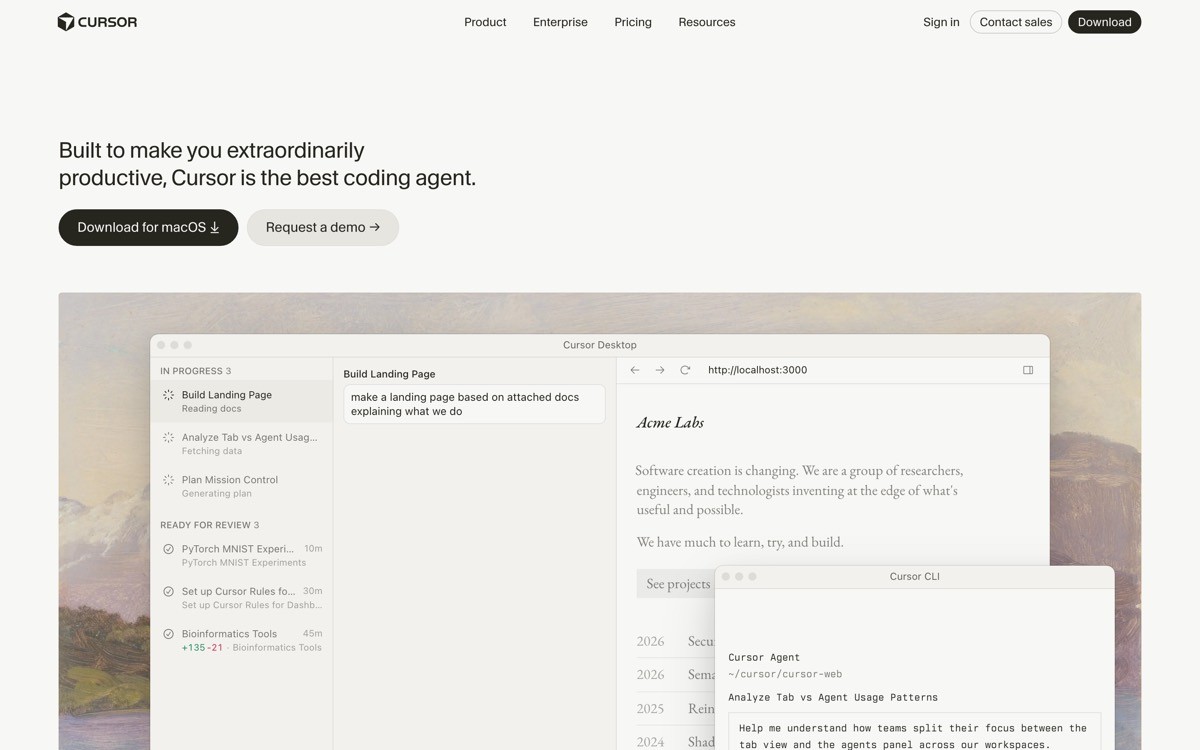
The visual language is closer to a serious code editor than a SaaS marketing site. Monospace accents, dark IDE-style screenshots, and a logo wall of engineering teams developers respect. The CTA is download, not contact sales, which signals the buyer is the user.
Patterns to steal
Lead with a product video, but make it real footage, not a motion-graphics render
Anchor credibility with benchmark numbers (speed, acceptance rate, time saved) under the fold
Build a logo wall from teams your audience actually respects, not enterprise names they don't recognize
Make the primary CTA a download or signup, not a contact form
Match the homepage typography to the product surface so the brand feels continuous
Common mistakes to avoid
Showing benchmark numbers without a source or methodology link
Using stock developer photography under the product video
Forgetting an enterprise tier when the homepage clearly converts solo developers
5. Lovable, best AI-native consumer homepage for a vibecoding platform
Lovable's homepage lets you build an app before you sign up. The hero is a prompt box, the action is type and submit, and the result is a working preview. That moves the activation moment from inside the product to the homepage itself.
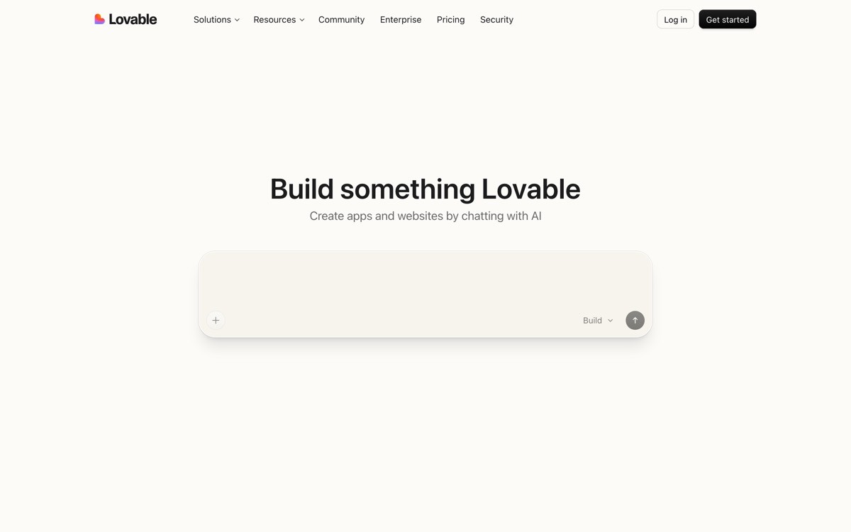
The supporting design uses warm pastels and rounded geometry, a deliberate counterweight to the dark-mode default that dominates the AI tooling category. Below the hero there is a gallery of community apps, a feed of remix-ready projects, and pricing that you can read without clicking into a separate page.
Patterns to steal
Let the hero do real product work before the visitor authenticates
Use color and warmth to differentiate when every competitor has gone dark-mode
Show a live community gallery to prove the platform is in use and full of remixable starting points
Surface pricing on the homepage; do not make people hunt
Tie the brand voice to outcomes (build, ship, launch) rather than to the model
Common mistakes to avoid
Letting the in-hero builder fail silently if the prompt is empty or weird
Cluttering the community gallery with low-effort builds that hurt the brand
Hiding the limitations of the free tier inside a sign-up flow
6. ElevenLabs, best multi-product homepage for a voice AI startup
ElevenLabs runs a portfolio of voice products from a single homepage, and the design treats the home as a router rather than a brochure. Voice generation, dubbing, conversational agents, and music each get their own tile and demo with consistent typography and a shared component system.
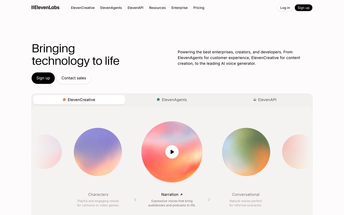
The brand is anchored by a confident wordmark, a calm dark surface, and inline audio players that let you hear the product without leaving the page. The result feels less like a marketing site and more like a curated product catalog.
Patterns to steal
Treat the homepage as a portfolio router when you have more than two products
Use inline media players to prove output quality without forcing a signup
Keep a single, calm visual system across every product tile so the brand reads as one company
Use specific use cases (audiobooks, dubbing, agents) as section labels rather than feature names
Show a developer entry point alongside the consumer one
Common mistakes to avoid
Letting one product line dominate the homepage so the others feel like afterthoughts
Using stock audio samples that do not show off the model's actual range
Mixing brand systems across products until the homepage feels like four sites stitched together
7. Mistral, best European minimalist homepage for an AI research startup
Mistral's homepage is a study in confident European minimalism. A flat orange-tinted palette, a custom monospace-accented logo, and a near-typographic layout that uses size and weight instead of color and motion.
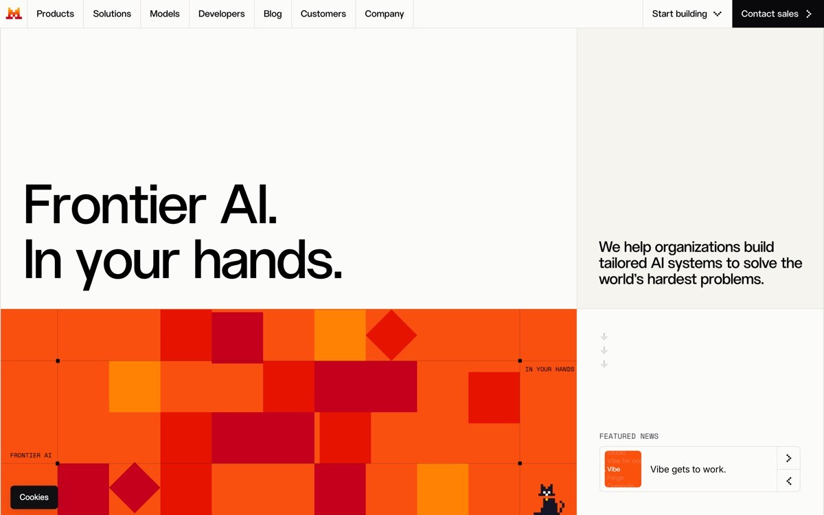
The site routes visitors to research, products (Le Chat, La Plateforme), and enterprise without animation, gradient mesh, or generated illustrations. It reads as serious, regional, and unwilling to chase the same dark-mode-glow look as every Silicon Valley peer.
Patterns to steal
Use a single accent color with restraint; let typography carry the brand
Name your products distinctly (Le Chat, La Plateforme) and treat them as proper nouns in the nav
Build the homepage with weight, size, and rhythm; skip the gradients
Anchor credibility with research papers and benchmarks placed near the hero, not in the footer
Let the locale show in the language, naming, and pacing
Common mistakes to avoid
Going so minimal the homepage stops explaining what the products actually do
Hiding the API and pricing behind a contact form when the buyer is a developer
Treating restraint as an excuse for vague positioning
How to choose what to copy for your own AI startup website
1) What is your buyer's level of category awareness?
If your buyer already knows the category and just needs to evaluate you (Cursor, Perplexity), put the product in the hero. If your buyer is still being educated (Anthropic, Mistral), lead with narrative and proof, then route to product. Pick one and design accordingly. A homepage trying to do both ends up doing neither.
2) Do you have one product or a portfolio?
Single product startups (Cursor, Lovable, Perplexity) should make the hero the product. Portfolio startups (OpenAI, ElevenLabs, Anthropic) should treat the homepage as a router with clean audience or product lanes. Forcing a portfolio company into a single-product hero buries half your revenue.
3) Are you converting end users, developers, or enterprise buyers?
End-user conversion needs a working demo and pricing on the homepage. Developer conversion needs benchmarks, docs links, and a real install path. Enterprise conversion needs case studies, security signals, and a calm pacing. Most AI startups try to convert all three with the same hero and lose all three.
4) How aggressively do you need to break the AI template?
If you are entering a crowded category, the template look is the enemy. Anthropic, Lovable, and Mistral each picked a distinct anti-template direction (editorial, pastel-warm, European minimal). Pick a direction with conviction. A safe gradient hero in 2026 is invisible.
If you have looked at these seven sites and realized your homepage is still doing the gradient-orb thing, that is the moment to bring in a design partner. AY Design redesigns AI startup websites that founders built with templates or AI builders, into pages that look like a real company. Book a design audit to see what to fix first on your homepage.
FAQ
What makes an AI startup website different from a regular SaaS website?
An AI startup website usually has to do three jobs a normal SaaS site doesn't: prove the model actually works, signal trust around safety and accuracy, and serve a fragmented buyer pool (consumers, developers, enterprise) from one URL. That is why the best examples lean on live demos in the hero, research and benchmark links, and clear audience splits.
Which AI startup has the best website in 2026?
Anthropic and Perplexity tie for the best AI startup website in 2026 by our scoring, both at 19 out of 20. Anthropic wins on editorial brand strength while Perplexity wins on conversion through the product-as-hero pattern. The right answer depends on which problem your homepage needs to solve.
Why do so many AI startup websites look the same?
Most AI startups ship the same template because they use the same starter kits, the same dark-mode component libraries, and the same gradient-orb illustration packs. The look is fast to deploy but invisible in a crowded category. The sites in this list each broke the template in a different direction.
Should an AI startup homepage have a video?
Video works when it is real product footage, not a motion-graphics explainer. Cursor's homepage video is effective because you see the editor doing work; a render of abstract shapes is not. If the video can be replaced by a screenshot without losing meaning, you do not need the video.
Is dark mode required for an AI startup website?
Dark mode is not required and is becoming a tell. Lovable, Anthropic, and Mistral all chose warm or light palettes specifically to differentiate from the dark-mode-glow default. The right palette is the one that fits your brand and contrasts the category, not the one that matches the screenshot of every YC launch post.
How long should an AI startup homepage be?
Long enough to convert the most common buyer in one read, not longer. Cursor and Perplexity get away with short, dense pages because their buyer is technical and decisive. OpenAI runs longer because it routes three audiences. Length is a function of buyer complexity, not a virtue.
Should the homepage include pricing?
Yes if your buyer is self-serve and price-aware (Lovable, Cursor, Perplexity). The friction of clicking into a separate pricing page costs conversions. Enterprise-only AI startups can defer pricing, but they should signal a price band or "talk to sales" path clearly above the fold.
What is the biggest mistake AI startups make on their websites?
The biggest mistake is treating the homepage as a moodboard for the model instead of a sales tool for the company. Gradient orbs, three-word headlines, and autoplay particle backgrounds look modern for a quarter and dated by the next funding round. The sites that age well lead with product, proof, and prose.
How often should an AI startup redesign its website?
The strongest AI startup websites in 2026 are rebuilt when positioning changes or the product reshapes, not on a calendar. Plan for a meaningful homepage refresh every nine to twelve months at growth stage, because the category is moving that fast. Treat the homepage as a living surface that compounds value, not a launch artifact.
Checkout other Blogs:

Multi-agent system UX design guide for 2026
A pattern-by-pattern guide to designing multi-agent system UX in 2026, with a scoring matrix and references from Claude Code, LangGraph, Devin, and Replit Agent.
Author:
AY Designs Team

Human-in-the-loop AI design guide for 2026
A 2026 guide to human-in-the-loop AI design with patterns, scoring framework, and examples from Cursor, Claude Code, Stripe, and Notion AI.
Author:
AY Designs Team

How to design agentic AI products in 2026: a 7-step playbook
A seven-step design playbook for shipping agentic AI products that users actually trust, with scoring matrix and real product references from Cursor, Claude Code, Devin, and Perplexity.
Author:
AY Designs Team

How much does AI SaaS design cost in 2026?
AI SaaS design cost in 2026 by tier and engagement type, with ranges, timelines, and a value scorecard for founders shipping with Lovable, Bolt, and v0.
Author:
AY Designs Team