
Most AI startup landing pages in 2026 are written by the same prompt. "Build a hero with a gradient, a three-word headline, a logo strip, and a CTA that says Get Started." The result: a category of pages that all blur together in a buyer's tab graveyard.
The pages in this guide do not look like that. Each one solves a specific conversion problem (developer trust, consumer activation, enterprise credibility, multi-product clarity) with a deliberate structure. We pulled the seven strongest examples, scored them, and broke down what makes each one work and where founders get the copy wrong.
TL;DR: Lovable and Bolt activate buyers inside the hero, Cursor and v0 win developer trust with proof not promise, and Perplexity, Runway, and Granola each model how to brand a single feature into a recognizable identity.
Best AI startup landing pages: a brief overview
Lovable: Best in-hero product try. The page is the product before you sign up.
Bolt: Best vibecoding landing. Prompt-to-app in a single scroll, with the loop visible.
v0: Best developer-design page. Real component output, real prompts, no fake render.
Cursor: Best video-led developer landing. Editor footage as the hero, benchmarks as proof.
Perplexity: Best search-as-hero landing. The product is the page, the page is the product.
Runway: Best generative media landing. Treats the page like a reel, not a brochure.
Granola: Best AI feature landing. One job, one promise, one beautiful page.
Landing page | Page type | Why it converts | Standout pattern |
|---|---|---|---|
Lovable | Vibecoding consumer LP | Activates the buyer before any auth gate | Pre-auth product try |
Bolt | Vibecoding developer LP | Shows the full prompt-to-deploy loop above the fold | End-to-end demo in hero |
v0 | AI design tool LP | Renders real component output instead of stock screenshots | Live component gallery |
Cursor | Developer trust LP | Real editor footage and benchmarks build technical credibility | Inline video plus benchmark wall |
Perplexity | Search product LP | Functional search box is the hero | Working input as hero unit |
Runway | Generative video LP | Sample outputs play as a curated reel | Reel-style demo grid |
Granola | Productivity AI LP | Single promise (meetings to notes) executed with restraint | One-feature focus page |
Scoring the 7 best AI startup landing pages
Each page is scored 1 to 5 across four dimensions, total out of 20. Clarity is whether the page tells you what it does in five seconds. AI-tell-distinctiveness is whether the page avoids the gradient-orb category template. Conversion-orientation is how aggressively the page funnels you to one action. Brand strength is type, tone, and design system carrying a recognizable identity.
Product | Clarity | AI-tell-distinctiveness | Conversion-orientation | Brand strength | Score |
|---|---|---|---|---|---|
Lovable | 5 | 5 | 5 | 4 | 19 |
Bolt | 4 | 4 | 5 | 4 | 17 |
v0 | 5 | 4 | 5 | 4 | 18 |
Cursor | 5 | 4 | 5 | 4 | 18 |
Perplexity | 5 | 5 | 5 | 4 | 19 |
Runway | 4 | 5 | 4 | 5 | 18 |
Granola | 5 | 4 | 5 | 5 | 19 |
1. Lovable, best in-hero product try for an AI app builder
Lovable's landing page is the product. You type what you want to build into the hero, hit submit, and watch a working app appear without registering. That single design decision turns the landing page from a marketing surface into an activation surface.
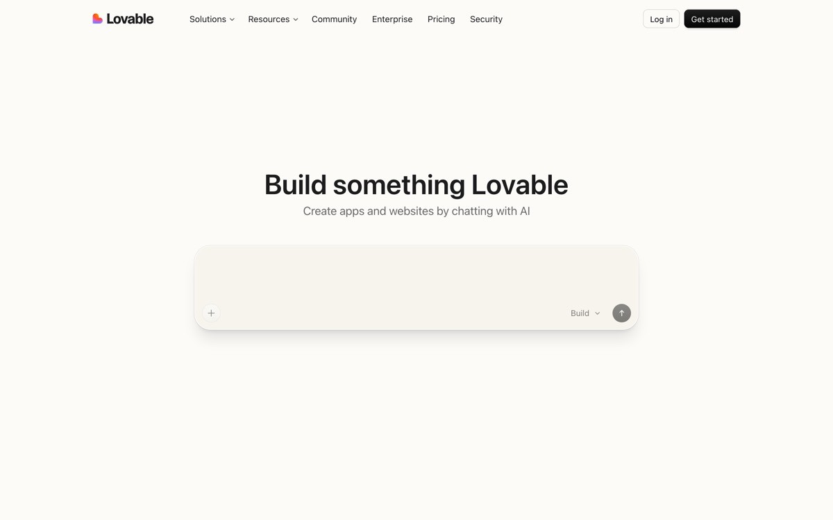
The surrounding design is warm and pastel against a clean off-white background, with rounded geometry and a friendly wordmark. The page does not waste a section on "trusted by" enterprise logos. It uses the community gallery as proof, which is more credible for the indie founder buyer.
Patterns to steal
Make the hero the actual product, not a screenshot
Use a community gallery instead of an enterprise logo wall when your buyer is solo or indie
Skip the cold dark mode if your audience is non-technical builders
Put pricing directly on the page so the visitor never has to click a separate tab
Tie the brand voice to outcomes (build, ship, launch) rather than to the model behind it
Common mistakes to avoid
Letting the in-hero builder fail or stall on weird prompts; it kills trust immediately
Padding the page with feature-card sections that distract from the demo
Hiding free-tier limits behind the signup flow
2. Bolt, best vibecoding landing for a prompt-to-deploy tool
Bolt's landing page is the full loop made visible. The hero shows the prompt-to-app moment, the subsequent sections show deploy, share, and edit, and the entire scroll feels like watching a teammate build something live.
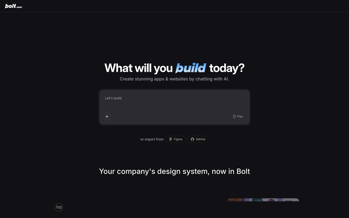
The visual language leans into a darker, more technical surface than Lovable, signaling the developer-leaning buyer. The brand uses a tight wordmark and electric accent colors to punctuate sections, but never lets the brand pattern obscure the product flow.
Patterns to steal
Show the full product loop, not just one moment, when your value is end-to-end
Use accent colors to highlight CTAs and progress states, not to decorate
Signal buyer fit through palette choice; darker surfaces lean developer, lighter ones lean consumer
Treat the page scroll as a narrative, not a feature dump
Show real example projects below the demo to expand the perceived capability surface
Common mistakes to avoid
Trying to show every step of a long loop on a single page without pacing
Using stock developer photography when a screenshot would do more work
Forgetting a mobile demo path; many vibecoders evaluate on phone first
3. v0, best developer design page for an AI generation tool
v0's landing page renders real component output, not stock UI. The hero shows a prompt and the actual generated React code and visual result, and the rest of the page is a live gallery of recent components built by users.
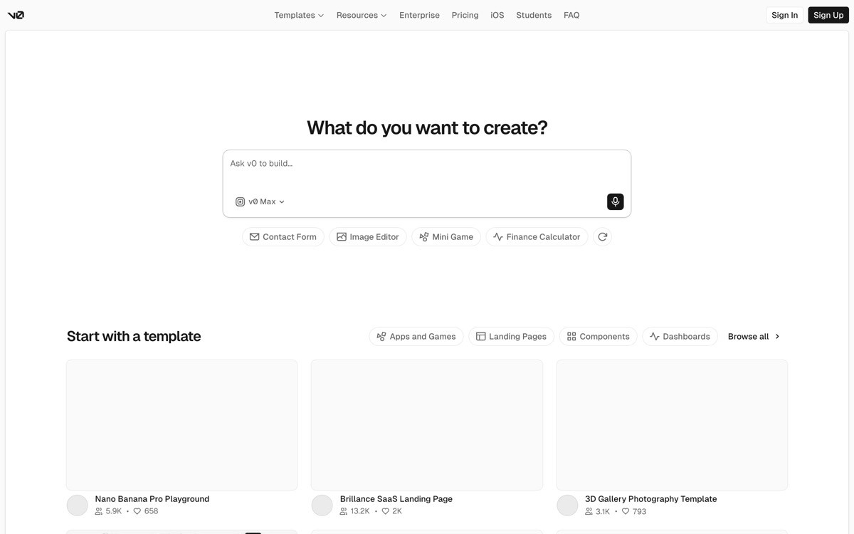
The brand sits inside Vercel's broader design system, which means the page reads as a coherent member of a family rather than a one-off. Typography is restrained, the palette is near-monochrome with one accent, and the screenshots are real product, not marketing renders.
Patterns to steal
Show real product output, not designer-rendered fake screenshots
If your product generates code, show the code; do not hide it under a mockup
Use a live community feed of outputs to prove the capability without case studies
Inherit type and color from a parent design system if you have one; do not invent a new look for every sub-brand
Keep the primary CTA above the fold and repeated at every major section break
Common mistakes to avoid
Showing curated outputs that the average user will not get on their first prompt
Letting the gallery overshadow the prompt input that drives the actual conversion
Mixing typography or color rules from a parent brand inconsistently
4. Cursor, best video-led landing for an AI coding tool
Cursor's landing page opens with a real video of the editor in use, not a motion-graphics render. Under the video the page drops into benchmark numbers, customer logos of engineering teams developers respect, and a download CTA.
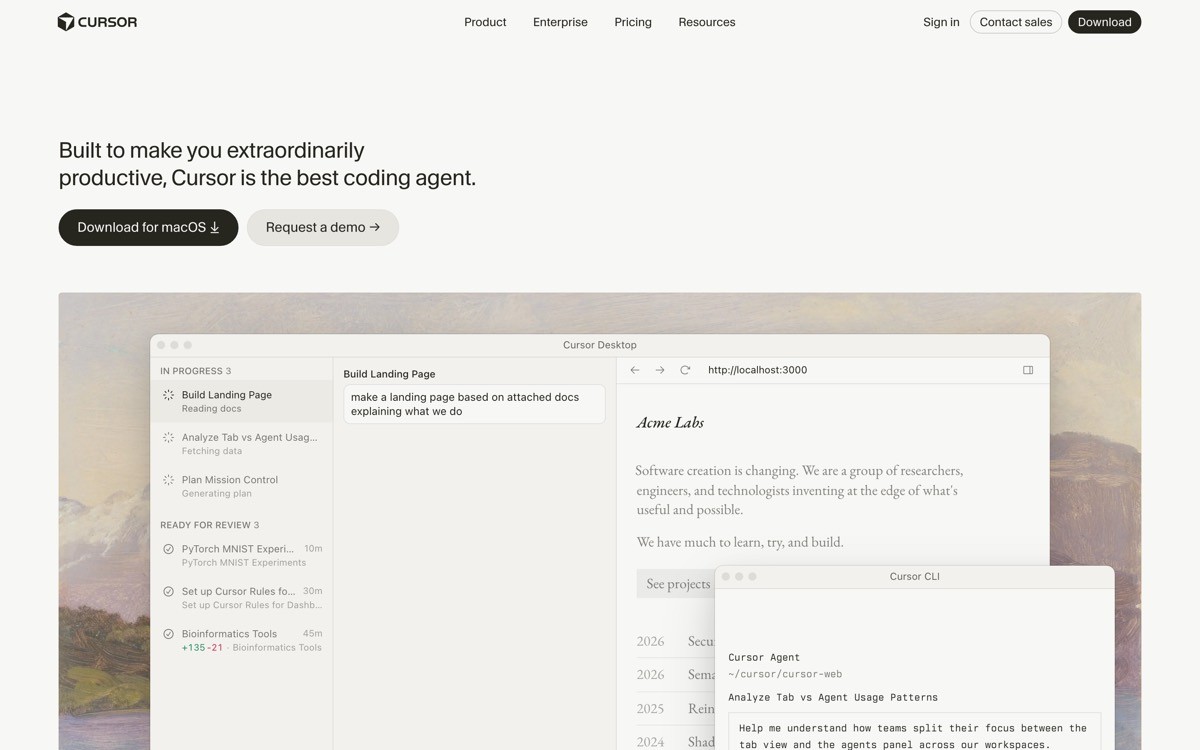
The brand language matches the product. Monospace accents, IDE-dark screenshots, and a wordmark that looks at home in a developer toolbar. There is no "AI-powered" badge anywhere. The page assumes you already know what the category is.
Patterns to steal
Lead with a real product video; avoid motion-graphics explainers
Place benchmarks (speed, acceptance, time saved) under the fold with methodology footnotes
Build a logo wall from teams your buyer respects, not enterprise names they do not recognize
Match the marketing palette to the product surface for visual continuity
Use download as the primary CTA when the buyer is the user
Common mistakes to avoid
Posting benchmarks without a source, methodology, or date
Using stock developer photography under the product video
Forgetting an enterprise tier when the page clearly converts solo developers
5. Perplexity, best search-as-hero landing for an AI answer engine
Perplexity's landing page treats the search box as the only thing above the fold that matters. The input is real, the page accepts a query before you authenticate, and the supporting design quietly steps out of the way.
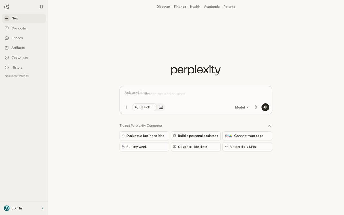
The brand uses a calm dark or light surface, a minimal wordmark, and example queries underneath as social proof of capability. The page does the same job as a demo video while letting the user choose the question.
Patterns to steal
If your product is input-based, put a real input in the hero
Surface three or four real example queries underneath as capability proof
Skip the autoplay video; the input is the demo
Keep the navigation to four items so the hero owns the screen
Show a "for developers" entry point quietly for the second-tier buyer
Common mistakes to avoid
Faking the input so it opens a signup modal on first character
Forgetting to make the example queries one-click runnable
Hiding enterprise pricing so deep it cannot be found by procurement
6. Runway, best generative media landing for a creative AI tool
Runway treats its landing page like a reel. The hero is a curated grid of model outputs, video samples loop quietly, and the brand carries a confident editorial wordmark that nods more to a film studio than a SaaS company.
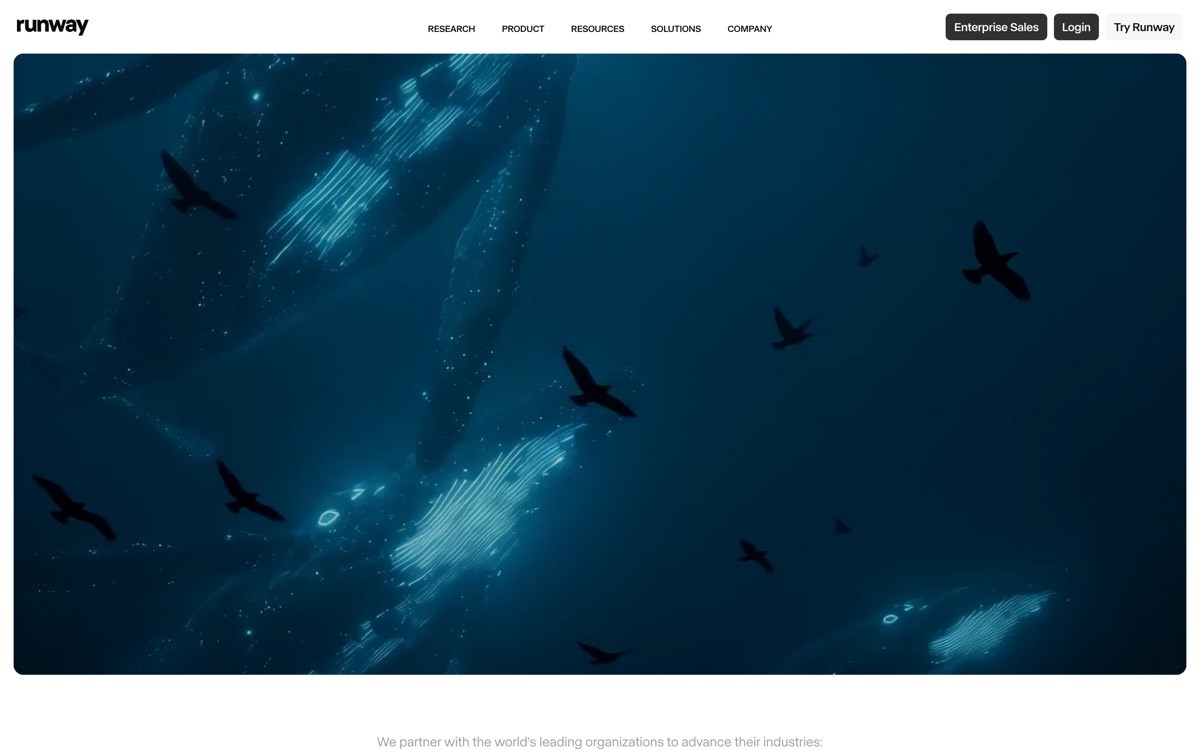
The page is dense with media, but the pacing is calm. Captions name the model and the use case, the brand sits in the corner, and a single CTA pulls toward signup. It reads like the showroom of a film tool, not a marketing site.
Patterns to steal
If your product is media output, lead with a curated reel of real outputs
Caption each sample with the model and the use case to teach capability
Use editorial type and a calm palette to position the brand above the "AI startup" baseline
Keep CTAs few and bold; do not let the reel get diluted by navigation
Show a clear creator and enterprise split so each buyer knows where to land
Common mistakes to avoid
Showing only the best-case outputs that do not match what a first-time user gets
Using heavy autoplay video on mobile that breaks the experience
Forgetting alt text and captions for accessibility on a media-heavy page
7. Granola, best AI feature landing for a single-job product
Granola's landing page does one thing: it sells a product that turns your meeting audio into a clean set of notes. The hero shows the before-and-after, the value prop is one sentence, and the page never tries to be more than that.
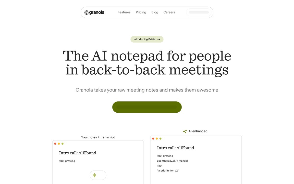
The brand uses a warm cream surface, a gentle serif headline, and product screenshots that look like the real Mac app. No 3D illustration, no glow, no abstract spheres. The page feels considered, the way a productivity tool should.
Patterns to steal
If your product has one job, write one headline and one CTA
Use a before-and-after layout to make the value visible at a glance
Pick a warm, considered palette to differentiate from cold AI tooling defaults
Treat product screenshots as the primary visual; skip 3D and glow effects
Surface platform availability (Mac, Windows, web) clearly above the fold
Common mistakes to avoid
Stretching a single-job product across multiple new use cases on the same page
Adding feature-bloat sections that make the page feel like a Notion doc
Forgetting the platform availability and creating support tickets you did not need
How to choose what to copy for your own AI startup landing page
1) What is the primary conversion event?
If the conversion is signup and trial (Lovable, Cursor, Perplexity), put product action in the hero. If the conversion is enterprise contact, lead with case studies and credibility, then route to a form. The page structure should be designed backward from the conversion event, not forward from the brand moodboard.
2) Can your product do meaningful work pre-authentication?
If yes, do it in the hero (Lovable, Perplexity, v0). Pre-auth product engagement is the highest-converting pattern in the category right now. If your product requires onboarding before any value, use video plus benchmark proof instead (Cursor, Bolt).
3) Is your buyer technical, consumer, or enterprise?
Technical buyers want benchmarks, code, and a download path. Consumer buyers want a try-it-now demo and pricing on the page. Enterprise buyers want case studies, security badges, and a calm pacing. Trying to serve all three on one landing page leads to a hero that converts none of them.
4) Do you have a single product or a portfolio?
Single-product startups (Granola, Cursor, Lovable) should let one feature dominate the page. Portfolio companies should land each product on its own dedicated page and use the homepage as a router. Mixing the two destroys the focus that drives conversion.
If you have looked at these seven and realized your landing page is doing too many jobs for too many buyers, that is the cue for a redesign. AY Design rebuilds AI startup landing pages from messy multi-buyer templates into focused, single-CTA pages that move metrics. Book a design audit to see what to fix first.
FAQ
What makes an AI startup landing page convert better in 2026?
The highest-converting AI landing pages in 2026 either let the user try the product before signup or lead with real product video and verified benchmarks. The pattern that no longer converts is a static hero with a gradient orb and a three-word headline. Buyers have seen that page a hundred times in the last quarter.
Should an AI startup landing page have a video in the hero?
Video works when it is real product footage, like Cursor and Bolt. Motion-graphics explainers and abstract render videos add page weight without adding signal. If the video can be replaced with a screenshot without losing meaning, skip the video.
How long should an AI startup landing page be?
Long enough to address the buyer's main objection once, not longer. Cursor and Granola get away with short, dense pages because the buyer is decisive. Pages that try to overcome every objection end up reading as defensive and convert worse than tight pages that just show the product working.
Do AI startup landing pages need a logo strip?
A logo strip works only if the logos are recognizable to your specific buyer. Cursor uses engineering team logos that developers respect; a generic Fortune 500 logo strip reads as filler. If you do not have the right logos yet, replace the strip with a community gallery or a benchmark wall.
Should AI landing pages use dark mode by default?
Dark mode is a category tell in 2026. Lovable, Granola, and Anthropic deliberately chose warm or light palettes to break the pattern. Pick the palette that fits your buyer (developers tolerate dark, consumers prefer warm) and your brand, not the one that matches every other launch.
What is the right hero for an AI tool that needs onboarding before it works?
If your tool cannot demo in-hero, lead with a real product video plus benchmark proof, like Cursor. The combination of footage and verified numbers does the job a live demo would, without forcing the visitor through a fake interaction.
Should I put pricing on my AI landing page?
Yes if your buyer is self-serve (Lovable, Cursor, v0). Hiding pricing adds a click and signals "talk to sales," which kills consumer and indie conversions. Enterprise-only AI startups can defer pricing but should still signal a price band or clear sales path on the page.
What is the biggest mistake on AI startup landing pages?
The biggest mistake is treating the page as a brand surface instead of a conversion surface. Gradient orbs, three-word headlines, autoplay particle backgrounds, and "we are reinventing X" copy all look modern for a quarter and feel dated by the next round. Pages that age well lead with the product working.
How often should an AI startup redesign its landing page?
The landing pages in this list are not redesigned on a calendar; they are redesigned when conversion stops moving or when the product changes shape. Most AI startups should expect a meaningful landing page rework every six to nine months in 2026, because the buyer's category awareness is changing that fast. Treat the page as a living surface, not a launch asset.
Should the landing page match the product UI?
Yes when feasible. Cursor and Vercel run shared brand systems across marketing and product, so the landing page and the editor feel like one company. If marketing uses a Figma kit and product uses a Tailwind starter, the brand splits and the user feels the gap on activation day. Share tokens between both surfaces.
Are A/B tests still worth running on AI startup landing pages?
A/B tests work for narrow questions (button color, headline phrasing) but they cannot tell you whether the page structure is right for your buyer. Most AI startup conversion gains in 2026 come from rebuilding the hero (product try, real video, working input) rather than from testing copy variants on a broken structure.
Checkout other Blogs:

Multi-agent system UX design guide for 2026
A pattern-by-pattern guide to designing multi-agent system UX in 2026, with a scoring matrix and references from Claude Code, LangGraph, Devin, and Replit Agent.
Author:
AY Designs Team

Human-in-the-loop AI design guide for 2026
A 2026 guide to human-in-the-loop AI design with patterns, scoring framework, and examples from Cursor, Claude Code, Stripe, and Notion AI.
Author:
AY Designs Team

How to design agentic AI products in 2026: a 7-step playbook
A seven-step design playbook for shipping agentic AI products that users actually trust, with scoring matrix and real product references from Cursor, Claude Code, Devin, and Perplexity.
Author:
AY Designs Team

How much does AI SaaS design cost in 2026?
AI SaaS design cost in 2026 by tier and engagement type, with ranges, timelines, and a value scorecard for founders shipping with Lovable, Bolt, and v0.
Author:
AY Designs Team