
Agent UIs are the hardest interface problem in AI software. The model is non-deterministic, the task takes minutes instead of seconds, the buyer needs to trust steps they cannot watch in real time, and most of the work happens off-screen. Slap a chat window on top of an agent loop and the experience falls apart at the first ambiguous tool call.
The agent UIs winning in 2026 solve this with a small set of shared patterns: a transparent step list, a stop-and-edit affordance at every checkpoint, scoped previews of what the agent is about to touch, and a clear visual separation between "model is thinking" and "agent is doing." Here are seven AI agent interfaces worth pulling apart, and the UX moves you can borrow for your own agent product.
TL;DR, if you only steal one pattern, copy Claude or Cursor: show the agent's plan as a live, editable step list before it touches anything, and give the user a one-click stop at every checkpoint.
Best AI agent UIs: a brief overview
Anthropic Claude: Best conversational agent UI, treats artifacts as first-class output.
OpenAI ChatGPT: Best mass-market agent UI, sets the baseline for tool-using chat.
Cursor: Best coding agent UI, shows file diffs as the primary surface.
Perplexity: Best research agent UI, citations are the proof layer.
v0: Best generative UI agent, treats the rendered preview as the conversation.
Lovable: Best app-building agent UI, prompt-then-preview loop as the entire pitch.
Granola: Best meeting agent UI, real-time transcription with human-in-the-loop edits.
Product | Agent pattern that stands out | Primary surface | Trust mechanism |
|---|---|---|---|
Anthropic Claude | Artifacts panel beside chat | Conversation + artifact pane | Visible reasoning, editable artifacts |
OpenAI ChatGPT | Tool calls rendered inline | Chat thread | Tool result expansion, source links |
Cursor | Inline file diffs and accept/reject | Editor + agent sidebar | Diff preview before file write |
Perplexity | Sourced answer with citation pills | Answer card | Inline source chips, follow-up suggestions |
v0 | Generated preview is the message | Preview canvas + chat | Live render, fork and iterate |
Lovable | Prompt then preview app loop | App preview + chat | Visible build steps, rollback per turn |
Granola | Live transcript with augmented notes | Note canvas + transcript | Human-editable, visible source spans |
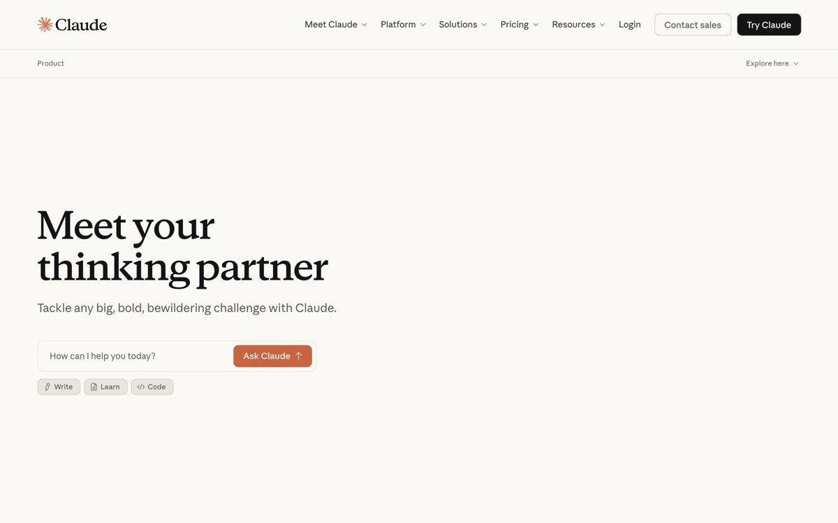
1. Anthropic Claude, best conversational agent UI
Claude's agent UI is the strongest 2026 example of treating output as a first-class object. When the agent produces a document, a piece of code, a table, or an SVG, it appears in an artifact pane next to the conversation instead of getting buried in the chat scroll. The conversation stays focused on dialogue, and the artifact stays focused on the work product, which solves the single hardest problem in chat-based agents: long outputs destroying the conversation thread.
What is notable in 2026 is how the artifact pane handles iteration. The user can edit the artifact directly, ask Claude to refine it, fork it into a new version, or extract it into a downloadable file. The agent's role shifts from "generator" to "collaborator on a shared object," and the UI makes that shift legible.
Key strengths
Artifacts panel separates conversation from work product, no scroll-bloat
Direct editing of artifacts with refinement prompts in one flow
Version forking and history visible without leaving the conversation
Calm visual hierarchy that does not compete with the user's content
Mobile experience preserves the artifact pattern with a panel switcher
Best for
AI agents that produce documents, code, or structured artifacts as primary output
Products where the buyer wants to iterate on the output, not just receive it
Patterns to lift
Separate conversation from work product into two panes, not one scrolling thread
Make artifacts directly editable with the conversation focused on intent
Show version history without forcing the user into a separate page
Common mistakes founders make in this area
Cramming long outputs into the chat thread, which makes earlier turns unreachable
Treating the artifact as read-only, which forces users into copy-paste workflows
Cons of this approach
Two-pane layouts demand careful responsive design, weak mobile execution breaks the pattern
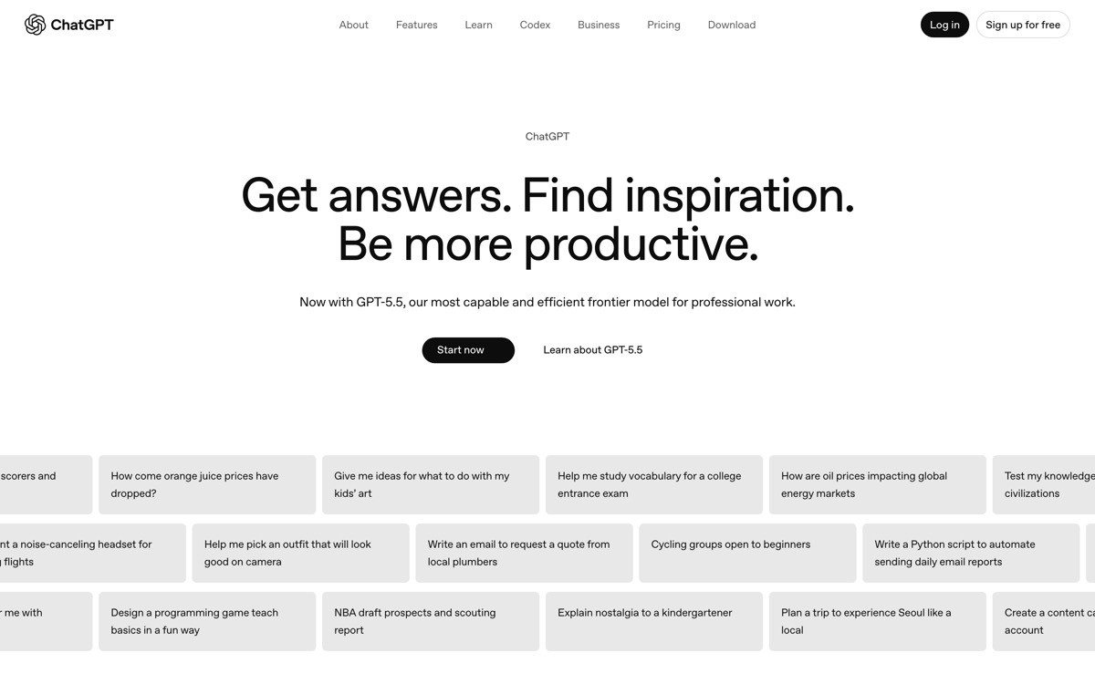
2. OpenAI ChatGPT, best mass-market agent UI
ChatGPT's agent UI is the most-used chat interface in software and the implicit template for the category. The strength is restraint: a clean thread, inline tool-call cards that expand on demand, a model picker that does not interrupt the flow, and a memory and persona system that runs in the background. The mass-market buyer never has to think about model selection, tool routing, or prompt engineering to get useful output.
What is notable in 2026 is how ChatGPT layers agent capabilities (search, code execution, image generation, voice) into the same thread without fragmenting the interface. Each tool call gets its own card, but the conversation stays a conversation. That layering is harder than it looks: most challenger UIs split tools into separate tabs and lose the unified context.
Key strengths
Single conversation thread holds search, code, image, and voice tool calls
Tool result cards expand and collapse without breaking thread flow
Memory and personas run as invisible context layers, not configuration burden
Model picker present but quiet, defaults handle 90 percent of users
Cross-platform consistency between web, native app, and voice surface
Best for
Mass-market AI agents with consumer, team, and enterprise buyers in one UI
Products that need to add agent capabilities without breaking existing chat patterns
Patterns to lift
Render every tool call as a collapsible inline card, not a separate view
Hide model selection behind a quiet picker, not a prominent header
Treat memory and personas as background context, not user-facing settings
Common mistakes founders make in this area
Pushing tool selection onto the user, when the agent should route automatically
Hiding tool calls entirely, which removes the trust signal that the agent did real work
Cons of this approach
Heavy chat threads can hide important agent actions, scroll discipline is required
3. Cursor, best coding agent UI
Cursor's agent UI is the textbook example of "show the diff, then ask permission" for coding agents. When the agent edits a file, the change appears as a diff inside the editor, with accept and reject controls per hunk. The agent's plan is visible in a sidebar, file references are clickable, and tool calls (search, terminal, file write) appear as inline actions instead of opaque events.
What is notable in 2026 is how the agent sidebar handles long-running tasks. The user can see the plan, watch steps complete, click into intermediate file changes, and stop the agent mid-run without losing context. That stop-and-resume affordance is the single biggest reason developers trust Cursor with multi-step tasks, and most coding-agent challengers still hide the plan and ask for blanket consent.
Key strengths
Inline diff view with per-hunk accept and reject, no blanket consent
Agent plan visible in sidebar with live step completion
Stop-and-resume affordance keeps long-running tasks under user control
Tool calls (terminal, search, file write) render as inspectable inline actions
File references are clickable, jumping the user directly to the change
Best for
Coding agents and developer-tool products with file-modification surfaces
Agents that run multi-step tasks the user needs to supervise but not babysit
Patterns to lift
Show file diffs before any write, with per-hunk control
Render the agent's plan as a live, editable step list, not a black box
Add a one-click stop at every checkpoint, not just at the start
Common mistakes founders make in this area
Asking for blanket consent at the start of a multi-step run, which trains users to either accept everything or distrust the agent
Hiding intermediate tool calls behind a single "agent is working" spinner
Cons of this approach
Diff-heavy UI requires careful design for long files, naive implementations overwhelm the user
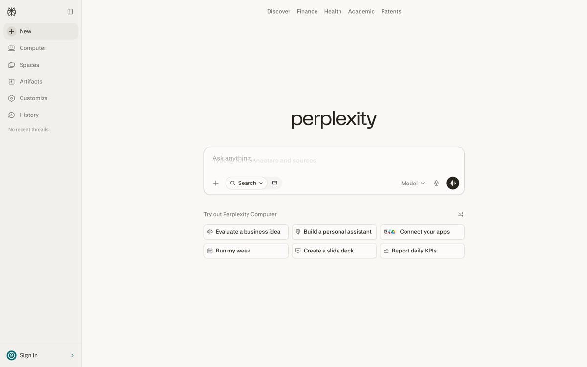
4. Perplexity, best research agent UI
Perplexity's agent UI is the strongest 2026 example of treating citations as the primary trust mechanism. Every answer renders with inline source pills, follow-up suggestions, and a clear visual separation between "agent's summary" and "where the agent got it." The buyer never has to ask "is this real," because the proof layer is built into the answer card.
What is notable is the follow-up rail. After every response, Perplexity surfaces the next likely questions, which keeps the buyer in a research flow instead of bouncing back to a search engine. That sounds small, but it converts one-shot search into a session, and turns a single answer into a research trail that builds context across turns.
Key strengths
Inline citation pills tied to every claim, visible at first glance
Follow-up question rail converts search into research session
Source preview on hover, no full page reload to verify a claim
Answer formatting prioritises scannable bullets over walls of prose
Search bar persists in the interface, the primary action never disappears
Best for
Research, knowledge, and information-retrieval agents
Products that compete on factual trust and citation transparency
Patterns to lift
Attach citations to specific claims, not to the whole answer in a footer
Add a follow-up rail to keep buyers in the agent's flow
Preview sources on hover so verification does not interrupt the session
Common mistakes founders make in this area
Dumping sources into a footnote section, which removes the per-claim trust signal
Ending answers without a next-step prompt, killing the session before it starts
Cons of this approach
Citation density slows reading for buyers who just want a quick answer
5. v0, best generative UI agent
v0 is the clearest 2026 example of an agent UI where the rendered output is the conversation. When the user describes a component, v0 generates the JSX, renders the preview, and treats the preview itself as the next message in the thread. The buyer iterates by typing changes ("make the card darker, add a CTA") and watching the rendered component update, which collapses the design and code loop into one surface.
What is notable is the forking model. Every prompt creates a new version of the component, and the user can branch, compare, and revert without losing earlier work. That treats agent output the way Figma treats canvases: as branched artifacts, not throwaway responses. For generative UI agents the pattern is now the default, and v0 is the cleanest version.

Key strengths
Rendered preview acts as the primary message, not a side panel
Version forking with branch comparison, mirrors design-tool workflow
Code and preview switch with one tap, neither hidden behind a setting
Component handoff to Next.js or other React projects in one paste
Prompt iteration is fast, no full-page reload between turns
Best for
Generative UI agents and AI-built component tools
Products where the buyer wants to iterate visually, not via code review
Patterns to lift
Render the agent's output as the conversation surface when output is visual
Treat every prompt as a fork, not a destructive edit
Make code and preview equally accessible, not one as the default
Common mistakes founders make in this area
Treating each new prompt as a destructive edit, which loses earlier work
Hiding the underlying code, which blocks the technical buyer from trusting the output
Cons of this approach
Preview-as-conversation only works when render times are fast, slow agents break the pattern
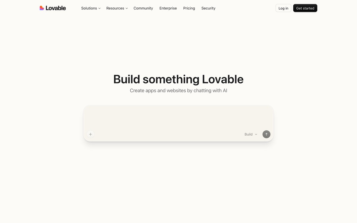
6. Lovable, best app-building agent UI
Lovable's agent UI is the 2026 reference for prompt-to-app loops. The interface is split between a chat column and a live preview of the app being built, with visible build steps as the agent provisions files, installs dependencies, and pushes changes. The buyer types a request, the app rebuilds, and the preview updates, which makes the entire build process feel like a conversation with the running product.
What is notable is the rollback affordance per turn. Every prompt creates a checkpoint, and the buyer can revert to any earlier turn without losing the conversation context. That gives non-technical founders permission to experiment, which is the entire value proposition. Most "vibecoded" SaaS challengers still treat agent output as forward-only, which is why their UX feels brittle.
Key strengths
Chat-plus-preview split that surfaces the agent's work in real time
Per-turn rollback gives non-technical buyers permission to experiment
Visible build steps make agent failures legible instead of mysterious
One-click publish path from preview to live app, no separate deploy flow
Friendly micro-copy that names what the agent is doing in plain language
Best for
App-building and vibecoded SaaS agents aimed at non-technical founders
Agents whose output is a running product, not a document
Patterns to lift
Surface every build step in human language, not log output
Treat every prompt as a checkpoint with one-click rollback
Pair the chat surface with a live preview, both equally visible
Common mistakes founders make in this area
Treating the agent's actions as forward-only, with no path back when a turn breaks the app
Surfacing raw logs instead of human-readable step descriptions
Cons of this approach
Split-view UI is hard to translate to mobile, where preview real estate is scarce
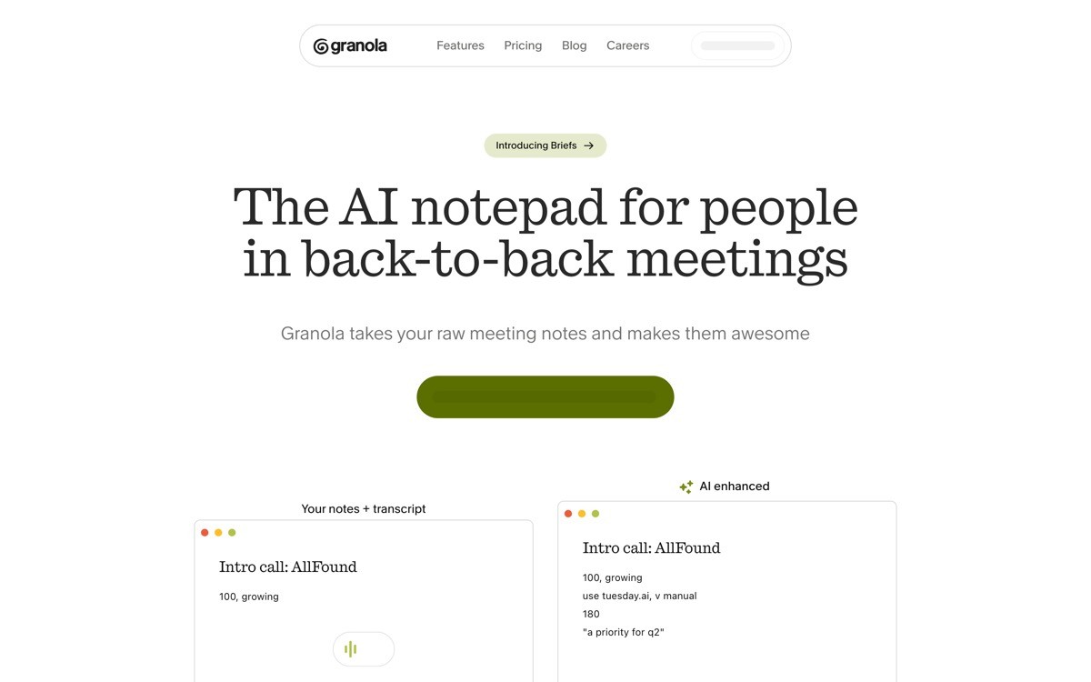
7. Granola, best meeting agent UI
Granola's agent UI is the best 2026 example of human-in-the-loop AI for ambient tasks. The interface is a note canvas plus a live transcript, where the user types raw notes during a meeting and the agent augments them in place with structure, summary, and action items. The agent never "owns" the document, the human always does, which is the inversion of how most meeting-AI tools work.
What is notable is the trust pattern. Every agent-generated line is visually distinct from user-typed content, and the user can edit any AI suggestion as plain text without breaking the agent context. The transcript stays visible as a source layer, so the user can verify any claim back to the moment it was said. That source-spans-to-output trace is one of the strongest agent UX patterns shipped in 2026.
Key strengths
Human-typed notes and AI augmentations live in the same canvas, with clear visual separation
Transcript stays visible as a verifiable source layer
Every AI suggestion is editable as plain text, no special mode required
Post-meeting summary inherits the live notes, no duplicate processing step
Privacy and storage copy visible at the point of capture, not buried in settings
Best for
Ambient AI agents that augment human work rather than replace it
Meeting, research, and writing tools where the human is the source of truth
Patterns to lift
Visually distinguish AI-generated content from user content without locking it
Keep the raw source (transcript, document, screenshot) visible as a verification layer
Treat the human as the document owner, not the agent
Common mistakes founders make in this area
Treating AI output as the canonical document, which removes the user's ownership
Hiding the source layer (transcript, raw notes) and forcing users to trust without verification
Cons of this approach
Human-in-the-loop UIs require both UX rigour and clear permissions, hard to ship as a v1
How to choose the right agent UI pattern for your product
1) Is your agent's output a document, a running product, or a workflow?
If the output is a document or artifact (text, code, design, table), copy Claude's artifact-pane pattern. If the output is a running product (apps, components), copy Lovable's prompt-plus-preview pattern or v0's preview-as-message pattern. If the output is a workflow over existing files or systems (Cursor for code, Granola for notes), use the side-by-side inspection pattern with per-step accept controls. Mixing models confuses the buyer about who owns the work.
2) How long does a single agent run last?
Short runs (seconds, single turn) tolerate a chat-only UI like ChatGPT. Medium runs (minutes, multi-step) need a visible plan with checkpoints (Cursor, Lovable). Long runs (hours, autonomous) need plan, checkpoints, stop controls, and a notification system so the user can leave the surface and come back. Designing for the wrong duration is the single biggest reason agent UIs feel either over-engineered or under-trusted.
3) What does the buyer fear most about agents?
Developer buyers fear destructive file changes, so they need per-hunk diffs (Cursor). Research buyers fear hallucination, so they need inline citations (Perplexity). Non-technical buyers fear breaking the app, so they need rollback (Lovable). Knowledge workers fear losing context, so they need source spans (Granola). The trust mechanism should match the fear, not the category convention.
4) Is the agent autonomous or collaborative?
Autonomous agents (the user kicks off and walks away) need a strong plan view, progress notifications, and an inspectable history of actions. Collaborative agents (the user iterates turn by turn) need fast feedback loops, per-turn checkpoints, and direct editing of the agent's output. Trying to ship one UI for both modes usually produces an interface that is too noisy for collaboration and too quiet for autonomy.
If you have picked your agent pattern but the UI still feels templated, the fix is rarely more features. It is information hierarchy, real product art, and a surface designed around the trust mechanism your buyer actually needs. AY Design redesigns AI agent products for founders shipping with Lovable, Bolt, v0, and Cursor who need their interface to feel unicorn-grade, not templated. Book a design audit and we will tell you which of these patterns fits your buyer and what to redesign first.
FAQ
What is an AI agent UI?
An AI agent UI is the interface through which a user instructs, supervises, and inspects an AI agent that takes multi-step actions. It is more than a chat window: it usually includes a plan view, tool-call rendering, output artifacts, and per-step controls so the user can trust and steer a non-deterministic system. Strong examples in 2026 include Claude, Cursor, Perplexity, v0, Lovable, and Granola.
Which AI agent has the best UI in 2026?
For document and artifact output, Claude's artifact pane is the strongest pattern. For coding agents, Cursor's inline diff plus plan sidebar is the reference. For research, Perplexity's citation-first answer card leads the category. The "best" depends on the agent's output type, the buyer's fear, and how long a single run lasts.
Should an AI agent UI always be a chat window?
No. Chat is the default for conversational agents (ChatGPT, Claude), but visual-output agents (v0, Lovable) work better when the preview is the primary surface. File-editing agents (Cursor) work better when the editor is primary and chat is a sidebar. Picking chat-by-default is the most common AI agent UX mistake in 2026.
How do I show an agent's plan to the user?
Render the plan as a live, editable step list with each step labelled in plain language, not log output. Show step completion in real time, allow the user to edit upcoming steps, and surface a stop control at every checkpoint. Cursor and Lovable both do this well, and the pattern is now the table stakes for any multi-step agent.
How do I make an agent UI feel trustworthy?
Match the trust mechanism to the buyer's fear: inline diffs for code agents, citations for research agents, rollback for app-building agents, source spans for note-taking agents. Make the agent's actions inspectable, reversible, and editable, and visually separate AI-generated content from user content. Trust comes from visible scaffolding, not from confident copy.
Should the user see every tool call the agent makes?
Yes, but render tool calls as collapsible inline cards rather than dumping logs. The user should be able to glance and confirm the agent did real work, then expand a card if they want to inspect inputs and outputs. Hiding tool calls entirely creates a black-box agent the user cannot trust at scale.
How do I handle long-running agent tasks in the UI?
Show a persistent plan view with real-time step completion, add notifications for completion or failure, and let the user leave the page and return without losing context. Treat the agent's run as a first-class object in the product, not a transient chat thread. ChatGPT, Claude, and Cursor all approach this differently, and Cursor's plan sidebar is the cleanest pattern for developer audiences.
Should agent UIs be different on mobile?
The pattern should be the same, but the layout almost always changes. Two-pane layouts collapse to a panel switcher, preview surfaces shrink to fit, and stop controls move to the bottom thumb zone. Trying to ship the same desktop layout on mobile is the single biggest reason agent UIs feel broken on small screens.
Checkout other Blogs:

Multi-agent system UX design guide for 2026
A pattern-by-pattern guide to designing multi-agent system UX in 2026, with a scoring matrix and references from Claude Code, LangGraph, Devin, and Replit Agent.
Author:
AY Designs Team

Human-in-the-loop AI design guide for 2026
A 2026 guide to human-in-the-loop AI design with patterns, scoring framework, and examples from Cursor, Claude Code, Stripe, and Notion AI.
Author:
AY Designs Team

How to design agentic AI products in 2026: a 7-step playbook
A seven-step design playbook for shipping agentic AI products that users actually trust, with scoring matrix and real product references from Cursor, Claude Code, Devin, and Perplexity.
Author:
AY Designs Team

How much does AI SaaS design cost in 2026?
AI SaaS design cost in 2026 by tier and engagement type, with ranges, timelines, and a value scorecard for founders shipping with Lovable, Bolt, and v0.
Author:
AY Designs Team