
A futuristic AI dashboard is not a glowing gradient and a chart that animates on load. It is a surface that treats AI as a first-class participant in the work, not a feature behind a sparkle icon. The user does not press an "AI" button. The dashboard already knows what is happening, surfaces the right next action, and lets the human approve, edit, or override.
Most "futuristic" dashboards in 2026 are still skeuomorphic chat panels strapped onto admin grids. The seven products below earn the label by changing the IA, not the visual style. They show what an AI-native workspace looks like when the agents, the metrics, and the controls share one coherent surface.
TL;DR, the strongest futuristic pattern in 2026 is PostHog Max: ask a question in natural language, the dashboard generates the insight, the chart lands in the canvas, and you keep working without ever leaving the surface.
Best futuristic AI dashboard designs: a brief overview
PostHog: Best AI-native analytics dashboard, natural-language insight generation that lands as real components.
Cloudflare: Best multi-product AI control plane, AI Gateway and Workers AI integrated alongside the rest of the network.
Vercel: Best AI-aware developer dashboard, deployment observability with AI assist inside the data path.
Cursor: Best agent-driven coding surface, agent mode as a primary work pattern alongside the editor.
LangSmith: Best LLM ops dashboard, traces and evals treated as the future of debugging AI apps.
Weights and Biases: Best ML and LLM experimentation dashboard, run comparisons that feel ten years ahead.
Replicate: Best model-as-a-service dashboard, prediction history and live model surfaces as one canvas.
Product | Information density | Clarity | Aesthetic | Customization | Score (/20) |
|---|---|---|---|---|---|
PostHog | 5 | 4 | 4 | 5 | 18 |
Cloudflare | 5 | 4 | 4 | 5 | 18 |
Vercel | 4 | 5 | 5 | 4 | 18 |
Cursor | 4 | 5 | 5 | 4 | 18 |
LangSmith | 5 | 4 | 4 | 4 | 17 |
Weights and Biases | 5 | 4 | 4 | 5 | 18 |
Replicate | 4 | 4 | 5 | 4 | 17 |
1. PostHog, best AI-native analytics dashboard
PostHog is a product analytics platform whose Max AI feature changes what a dashboard is. The user types a question in plain English ("show me weekly active users by plan, split by signup source"), and PostHog generates the query, runs it, drops the chart into the canvas as a first-class insight, and lets the user save it. The natural-language layer is not a sidebar, it is the dashboard composer.
The futuristic move worth studying is the treatment of AI output as real components. Most dashboards that bolt on natural-language query throw the result into a chat bubble. PostHog drops it into the canvas as the same chart component the user would build manually, with the same edit handles, filters, and save options. That is the pattern: AI generates real artefacts, not chat history.

Key strengths
Natural-language insight generation that produces real components
AI Max sits where the canvas is, not behind a separate route
Generated charts inherit the same edit affordances as manual ones
Query explainer surfaces what the AI did, so users learn the underlying SQL
Dashboards remain editable and shareable like any other PostHog surface
Dark theme handles dense data without losing hierarchy
Best for
Product analytics teams that want AI to compose dashboards alongside humans
Founders shipping AI products who want a strong reference for AI as a canvas tool
Pricing
Generous free tier
Paid plans start at usage-based pricing, AI features included on most tiers
Pros
The clearest example of AI-as-composer rather than AI-as-chat
Generated artefacts feel native, not bolted on
Cons
Natural-language queries occasionally need refinement, expect a learning curve on intent phrasing
2. Cloudflare, best multi-product AI control plane
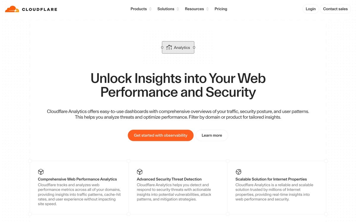
Cloudflare's dashboard manages a sprawling product family (network, security, DNS, Workers, AI Gateway, Workers AI, R2, D1, Queues) without collapsing under its own weight. The futuristic angle is the way AI Gateway and Workers AI sit alongside the rest of the platform as first-class products, not as a separate "AI section." The user navigates by job, and AI shows up where it fits.
The IA lesson is composability. Each Cloudflare product gets its own shell, but they share the same global nav, the same account switcher, and the same observability primitives. Adding AI Gateway did not require a new dashboard, just a new product card in the existing system. That is what future-proof IA looks like.
Key strengths
AI Gateway and Workers AI sit alongside legacy products in the global nav
Shared shell pattern keeps thirty-plus products navigable
Per-product observability inherits a common chart language
Settings, billing, and account live in predictable places across products
Dark theme treated as default, color used only for state
Search bar surfaces resources across all products
Best for
Multi-product platforms adding AI capabilities to an existing IA
Teams that need a reference for "how does AI live next to non-AI features"
Pricing
Free tier across most products
Per-product paid tiers, AI usage billed per request
Pros
Strongest mainstream reference for a multi-product AI control plane
Avoids the "AI section ghetto" problem most platforms run into
Cons
The visual style is intentionally calm, founders looking for "wow factor" should look elsewhere
3. Vercel, best AI-aware developer dashboard
Vercel's dashboard treats AI as part of the deployment pipeline rather than a side feature. The observability surface uses AI to summarize log anomalies, the analytics surface uses AI to explain traffic patterns, and the build logs surface uses AI to propose fixes. None of these live in a "AI" tab. They show up where the developer is already looking.
The pattern worth stealing is "AI inside the data path." Vercel does not ship a chat panel. When the user opens a failing build, the AI summary is right there, next to the log. When the user opens analytics, AI explanation lives next to the chart. The future is not a sidebar agent, it is contextual AI inside existing components.
Key strengths
AI log summarization inside the build surface, not a separate route
AI analytics explanations alongside charts
Command bar handles deep navigation with AI-aware suggestions
Dark and light themes both production-quality
Calm typography that scales from solo dev to enterprise
Empty states function as onboarding for first-time users
Best for
Developer-tool SaaS adding AI without rebuilding the IA
Teams shipping AI features that need to feel native, not bolted on
Pricing
Free Hobby tier
Pro plans start at $20 per user per month
Pros
Best mainstream reference for AI-in-the-data-path patterns
The contextual AI placement pattern translates to almost any vertical SaaS
Cons
The AI features are intentionally quiet, products selling on AI prominence will need to be louder
4. Cursor, best agent-driven coding surface
Cursor is an AI-first code editor where the dashboard is the editor and the agent is a real participant in the work. Agent mode takes a goal in natural language, reads the codebase, edits files, runs commands, and reports back. The user does not switch contexts. The surface treats the agent as a coworker, not a chat box.
The futuristic move is the IA hierarchy: editor first, agent inline, settings out of the way. Most "AI coding" tools ship a chat panel and call it agent mode. Cursor lets the agent edit files in place, then surfaces the diff for human review inside the editor. That is what agent UX looks like when it grows up.
Key strengths
Agent mode as a primary work pattern alongside inline completion
Diffs presented in the editor for human review, not in a separate window
Usage and billing surfaces strip to the data the user actually needs
Calm dark theme as default
Keyboard-driven everywhere
The work surface and the dashboard are one
Best for
AI products where an agent and a human share the same workspace
Teams designing agent UX who need a reference for "agent inside the canvas"
Pricing
Free tier with usage caps
Paid plans start at $20 per month
Pros
The strongest mainstream example of an agent that edits the canvas, not a chat panel
The diff-in-editor pattern is now the benchmark for AI code review UX
Cons
The editor-as-dashboard pattern only works when the work surface is obvious
5. LangSmith, best LLM ops dashboard
LangSmith is an LLM observability platform whose dashboard treats traces and evals as the future of debugging AI apps. Each LLM call becomes a tree the developer can inspect: prompt in, model response, tool calls, latency, cost, and an eval score. The surface is dense, but the hierarchy makes it readable, and the eval-first IA is exactly where AI debugging is heading.
The futuristic angle is the assumption baked into the product: LLM apps are non-deterministic, so debugging is statistical, not single-trace. LangSmith treats every run as a sample, surfaces distributions and regressions, and makes evals a first-class workflow alongside prompts. Most AI teams will land on this pattern by 2027.
Key strengths
Trace tree as the primary debugging surface
Evals treated as first-class alongside prompts and datasets
Latency, cost, and quality metrics live in the same surface
Dataset and eval versioning baked into the IA
Dark theme handles dense trace data without losing hierarchy
Sharing and replay surfaces designed for team review
Best for
Teams shipping LLM apps that need real observability beyond a chat log
AI products designing eval and trace surfaces for their own users
Pricing
Free tier with monthly trace limits
Paid plans scale with trace volume
Pros
The clearest mainstream reference for what LLM observability looks like
The eval-first workflow is the future of AI app debugging
Cons
The surface area assumes the user already understands LLM tracing, onboarding could be heavier
6. Weights and Biases, best ML and LLM experimentation dashboard
Weights and Biases is a machine learning experimentation platform whose dashboard has been ten years ahead of most SaaS surfaces for a long time. Run comparisons, hyperparameter sweeps, evaluation tables, and shared reports all sit inside one composable surface. The LLM Studio additions extend the same pattern to prompt and chain experimentation.
The futuristic pattern is the report-as-document model. A W and B report is a real document with charts, tables, prose, and live data, sharable like a Notion page. The dashboard does not end when the user wants to publish. The same surface handles internal review, external sharing, and post-mortem. That is the future of analytics deliverables.
Key strengths
Reports treated as live, shareable documents alongside the run dashboard
Run comparisons with parallel coordinate plots, a category benchmark
LLM Studio integrates prompt and chain experiments into the same surface
Dataset and artifact versioning are first-class
Customizable layouts users can save and share
Dark theme handles dense experimentation data
Best for
ML and LLM teams that need to compare experiments and share results across the org
Founders building analytics or experimentation surfaces who want a strong reference
Pricing
Free tier for personal projects
Team plans start in the low double-digits per user per month
Pros
The strongest reference for "reports as live documents" in the analytics space
The composable layout pattern translates cleanly to any analytics product
Cons
The surface area is wide, smaller teams will use a fraction of the IA
7. Replicate, best model-as-a-service dashboard
Replicate is a model-hosting platform where every model has its own page that doubles as a dashboard. The model page shows the model description, a live playground, prediction history, API examples, and version metadata. The future-feeling move is the way the same surface serves discovery, testing, and ops: the user can browse, run, monitor, and ship from one canvas.
The pattern worth stealing is the live playground inside the dashboard. Most model-hosting platforms separate the "try" surface from the "ops" surface. Replicate fuses them, so the user can run a model, see the prediction land, check the latency, and then jump to the API call all from one page.
Key strengths
Live playground inside each model page
Prediction history surfaced inline alongside the model
API examples rendered in real code, copy-paste ready
Version metadata visible without leaving the page
Calm typography and accent-only color use
The same surface serves discovery and ops
Best for
Model-hosting and AI-API products that want to unify try and ops
Teams designing "AI tool detail pages" that need to feel like dashboards
Pricing
Pay-per-prediction pricing
Free credits for new accounts
Pros
The clearest example of try-and-ops on one canvas
The model-page-as-dashboard pattern transfers cleanly to any AI marketplace
Cons
The pattern only works when each unit (model, agent, tool) is self-contained
How to choose the right futuristic pattern for your AI dashboard
1) Is your AI a feature or the canvas?
If AI is a feature inside an existing product (analytics, deployment, multi-product platform), copy Vercel and Cloudflare: AI lives inside the data path, not in a separate tab. If AI is the canvas itself (analytics composer, agent workspace, model runner), copy PostHog, Cursor, and Replicate: the AI participates in the work surface and produces real artefacts, not chat history.
2) Are you debugging or shipping?
LLM apps need observability surfaces that look more like LangSmith and Weights and Biases than traditional logging dashboards. If your users are debugging non-deterministic systems, the right futuristic pattern is trace-tree plus eval-first IA. If your users are shipping deterministic deployments, the right pattern is project-first IA with AI assist in the data path (Vercel).
3) How do you handle agent output?
The benchmark in 2026 is "agent edits the canvas, human reviews the diff." Cursor pioneered the pattern in code, but it transfers to any product where the agent acts on user content. If you are shipping agent UX, do not bolt on a chat panel. Let the agent modify the work surface and surface the change for human approval inside the existing IA.
4) Can your IA absorb new AI products without a redesign?
Cloudflare's strength is that adding AI Gateway and Workers AI did not require a new dashboard. The IA already handled "one more product in the family." If your roadmap includes shipping multiple AI features over the next two years, design the shell to absorb them. The fastest way to look dated in 2026 is to bolt every new AI feature onto a separate tab.
If you have picked your futuristic pattern but want a design partner to ship it as a profitable, human-grade product, that is what AY Design does. We help AI product teams turn agent UX, AI-in-data-path patterns, and natural-language canvases into dashboards that feel ahead of the curve without losing the buyer. Book a design audit to see what to ship next.
FAQ
What makes an AI dashboard feel futuristic in 2026?
A futuristic AI dashboard treats AI as a participant in the work, not a feature behind a sparkle icon. The defining traits are AI inside the data path, agents that edit the canvas (not just chat about it), natural-language inputs that produce real artefacts, and an IA that can absorb new AI products without a redesign. Visual style alone does not make a dashboard futuristic.
What is AI in the data path?
AI in the data path means AI suggestions, summaries, or explanations show up inside the component the user is already looking at (a log row, a chart, a dispute card), not in a separate "AI" tab or chat panel. Vercel, Stripe, and PostHog all use this pattern, and it is the strongest signal of an AI-native dashboard in 2026.
What is the difference between a chat sidebar and an agent canvas?
A chat sidebar is a chat interface bolted onto an existing dashboard, where the user asks the AI to do something and the AI replies in text. An agent canvas lets the AI act directly on the work surface (edit a file, generate a chart, modify a record) and surfaces the change for the user to review. Cursor and PostHog are the strongest examples of the agent-canvas pattern.
What is the best futuristic dashboard for an LLM application?
LangSmith is the strongest reference for LLM application observability in 2026, with trace trees, eval-first workflows, and dataset versioning baked into the IA. Weights and Biases is the second-strongest reference, especially if the team also runs ML training or hyperparameter sweeps alongside LLM evals.
Should an AI dashboard have a chat panel?
Only if the chat is the primary work surface. For dashboards where the primary work is operational (monitoring, shipping, managing), a chat panel almost always loses to AI inside the data path. The chat panel pattern is a dated UX choice in 2026 unless the product is a chat product.
How do I design an AI dashboard that does not look dated in two years?
Build the IA shell to absorb new AI products without a redesign. Cloudflare's strength is exactly this. Treat AI capabilities as first-class products inside the existing nav, share observability and settings primitives across them, and avoid the "AI section ghetto" where every AI feature gets a separate tab. If new AI features fit the existing shell, the dashboard ages well.
What is the role of natural language in a futuristic AI dashboard?
Natural language is most powerful when it produces real artefacts, not chat history. PostHog Max is the benchmark: ask a question, the dashboard generates a real chart component the user can edit and save. If the natural-language layer is just a chat box that returns text, it is not futuristic, it is a glorified search bar.
Do futuristic AI dashboards need dark themes and glowing gradients?
No. Most of the dashboards in this list use restrained color palettes, calm typography, and accent color only for state. Visual style is a weak signal of "futuristic." The strong signals are IA, agent UX, and AI placement inside the data path. A calm light-theme dashboard with the right IA looks more future-proof than a glowing dark gradient on top of a chart wall.
Checkout other Blogs:

Multi-agent system UX design guide for 2026
A pattern-by-pattern guide to designing multi-agent system UX in 2026, with a scoring matrix and references from Claude Code, LangGraph, Devin, and Replit Agent.
Author:
AY Designs Team

Human-in-the-loop AI design guide for 2026
A 2026 guide to human-in-the-loop AI design with patterns, scoring framework, and examples from Cursor, Claude Code, Stripe, and Notion AI.
Author:
AY Designs Team

How to design agentic AI products in 2026: a 7-step playbook
A seven-step design playbook for shipping agentic AI products that users actually trust, with scoring matrix and real product references from Cursor, Claude Code, Devin, and Perplexity.
Author:
AY Designs Team

How much does AI SaaS design cost in 2026?
AI SaaS design cost in 2026 by tier and engagement type, with ranges, timelines, and a value scorecard for founders shipping with Lovable, Bolt, and v0.
Author:
AY Designs Team