
Minimalism in an AI dashboard is not a vibe choice. It is a workload decision. The buyer logs in with one job, has thirty seconds, and either finds the next action or closes the tab. A minimalist AI dashboard removes everything that does not help them do that job, then trusts the remaining hierarchy to carry the weight.
Most AI products go the other way. They cram every metric, every agent, every chat surface into one screen, then call it a "command center." The dashboards we picked here do the opposite. Each one earns its restraint with a clear primary job, a calm grid, and AI features that show up where they help rather than where they impress.
TL;DR, the strongest minimalist AI dashboard pattern in 2026 is Linear's: one column of cards, no chart soup, AI suggestions inline with the work, and a command bar that replaces half the navigation.
Best minimalist AI dashboard designs: a brief overview
Linear: Best minimalist work dashboard, single-column IA with AI inline where the user is already typing.
Vercel: Best minimalist developer dashboard, project list as hero with everything else one click deeper.
Stripe: Best minimalist operational dashboard, one revenue hero metric and calm density underneath.
Anthropic Console: Best minimalist AI API dashboard, three panels and a playground, nothing else fighting for attention.
Resend: Best minimalist email API dashboard, one chart, one log, one button to send.
Cursor: Best minimalist AI coding surface, the editor is the dashboard, settings stay out of the way.
OpenAI Platform: Best minimalist model dashboard, usage and limits readable at a glance with no decorative noise.
Product | Information density | Clarity | Aesthetic | Customization | Score (/20) |
|---|---|---|---|---|---|
Linear | 5 | 5 | 5 | 4 | 19 |
Vercel | 4 | 5 | 5 | 4 | 18 |
Stripe | 5 | 5 | 4 | 4 | 18 |
Anthropic Console | 3 | 5 | 5 | 3 | 16 |
Resend | 3 | 5 | 5 | 3 | 16 |
Cursor | 4 | 4 | 5 | 4 | 17 |
OpenAI Platform | 4 | 5 | 4 | 3 | 16 |
1. Linear, best minimalist work dashboard
Linear is a project tracker that treats the dashboard as a quiet planning surface, not a metrics wall. The primary screen is a single column of work cards organised by user job (My Issues, Active Cycle, Inbox), with AI assistance pulled into the issue creation flow itself rather than sat in a separate "AI" tab.
The reason this works is restraint at the IA layer. Most teams would ship a four-quadrant overview with burndown charts, velocity, and an AI chat panel. Linear ships one column, an obvious next action, and a Cmd+K command bar that handles the other 80% of navigation. The result feels closer to a focused doc than a traditional admin panel.
Key strengths
Single-column work-first IA, no decorative metric tiles
AI title and description generation inline with the issue editor
Command bar replaces secondary navigation almost entirely
Typography hierarchy carries the layout, not borders or background colors
Empty states designed as next-action prompts, not blank zones
Dark and light themes both treated as production surfaces
Best for
Product and engineering teams that need a planning surface, not a reporting surface
Founders who want a dashboard that earns trust by what it leaves out
Pricing
Free tier for small teams
Paid plans start around $8 per user per month, AI features included on standard plans
Pros
Clearest example of "work first, metrics second" minimalism in the SaaS dashboard space
AI features land where the user is already typing, not behind a separate route
Cons
Light on built-in reporting, teams that want analytics-heavy dashboards will outgrow it
2. Vercel, best minimalist developer dashboard
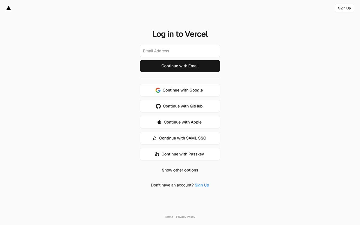
Vercel is a deployment platform whose dashboard treats the project list as the only thing that matters when the user lands. The buyer logs in, sees what shipped and what broke, and gets to the next action in two clicks. Everything else (analytics, observability, AI assist, billing) lives one route deeper.
The minimalism shows up in how Vercel resists feature shelf inflation. The home view is the project list. Each card carries deployment status, the last commit, and the production URL. Nothing else competes for attention until the user opens a project, and even then the layout uses density only where the user benefits from comparison.
Key strengths
Project-first home view, no metric tiles fighting the list
Cmd+K command bar handles deep navigation and keeps the surface clean
AI assist (logs, observability) layered into the data path, not bolted on
Calm typography and color palette with restrained accent use
Empty states function as onboarding for first-time users
Dark theme treated as a default, not a preference
Best for
Infrastructure and developer-tool SaaS where the user logs in to act, not study
Teams that want a benchmark for the "ship-first, study-second" pattern
Pricing
Free Hobby tier
Pro plans start at $20 per user per month
Pros
The clearest mainstream example of a project-first dashboard hierarchy
Translates cleanly to any platform or infra SaaS that ships objects users care about
Cons
Requires real product opinion about which actions matter most, harder than shipping a generic grid
3. Stripe, best minimalist operational dashboard
Stripe is a payments platform whose dashboard turns a deeply complex product into a calm operational surface. Revenue lives in the hero. Below it, the page is segmented by the operator's job (balance, payouts, disputes, customers). Each section is dense, but minimalism carries through restraint in color, spacing, and the absence of decorative chart styling.
What makes Stripe a minimalist study even though the surface area is huge: hierarchy. The dashboard never shows two visual elements of equal weight. One number is the headline, two or three are supporting, the rest live in tables that are designed for scanning. The AI features inside Radar and Billing insights surface as suggestions inside the relevant flow, not on a separate tab.
Key strengths
Revenue hero metric sized to be the first eye-target
Job-segmented IA, not data-type IA
AI suggestions placed inside flows (disputes, billing) rather than separate routes
Tables designed for scanning, not styled like marketing
Restrained color palette, accents used only for state
Global search in the nav, not buried in a modal
Best for
Operational SaaS with a primary money or status metric
Teams shipping a dashboard buyers open daily, not weekly
Pricing
Free to use, transaction-based fees
Pros
Best public reference for hierarchy that scales to dozens of subroutes
AI integration is invisible until it is useful, a pattern worth copying
Cons
The minimalism is earned by a huge design team, smaller teams will need to reduce scope first
4. Anthropic Console, best minimalist AI API dashboard
Anthropic Console is the developer surface for the Claude API, and the dashboard is intentionally narrow. Three panels (Workbench, Usage, Settings), a prompt playground that takes most of the screen, and clear visibility of usage and rate limits. There is no chart wall, no decorative gradient, no nudge toward a feature the user did not ask for.
The lesson here is scope discipline. An AI API dashboard could carry twenty modules: evals, prompt history, model comparison, fine-tuning, batch jobs, observability. Anthropic ships the smallest viable surface, then lets the playground do the work. For a buyer testing a prompt, that is the right job sequence.
Key strengths
Three-panel IA, nothing else competing for the user's attention
Playground takes the main canvas, treated as the primary job
Usage and rate limits readable in two glances
Calm typography, accent color used only on the primary action
Settings and API keys live where the user expects them
Empty workbench states function as quick-start prompts
Best for
AI infrastructure products with a narrow developer job (test, ship, monitor)
Founders shipping a v1 dashboard who want a strong scope-discipline reference
Pricing
Pay-as-you-go API pricing, no dashboard fee
Pros
One of the cleanest references for an AI API dashboard that resists feature inflation
The playground-as-primary-job pattern translates well to any AI tool with a try-it surface
Cons
Light on evals and monitoring out of the box, larger teams layer on extra tooling
5. Resend, best minimalist email API dashboard
Resend is a developer-first email API whose dashboard is the smallest viable version of an analytics surface. One chart (sends over time), one log (recent deliveries with status), one primary action (send a test email). The home screen tells the user whether the integration is healthy and what to do if it is not, then stops.
The minimalism is reinforced by typography: the brand uses one typeface, two weights, and a high-contrast palette. The dashboard does not feel sparse because every element is doing work. AI features like deliverability suggestions surface as inline notes inside the log, not as a separate insights tab.
Key strengths
One chart, one log, one primary action on the home view
Typography and palette do the design work, not decorative elements
Deliverability insights surface inline in the log
Empty states designed as setup checklists
Settings and API keys readable in one click
Dark theme treated as default
Best for
Developer-API SaaS with one core delivery metric
Teams that want a benchmark for "smallest viable dashboard"
Pricing
Free tier with monthly send limits
Paid tiers start around $20 per month
Pros
The clearest example of a single-metric, single-log home view that still feels complete
Typography-led minimalism transfers cleanly to other developer tools
Cons
Built for a narrow job, products with broader needs cannot copy the surface area as-is
6. Cursor, best minimalist AI coding surface
Cursor is an AI-first code editor where the dashboard is the editor. Settings, usage, and account management live one route deeper in a calm settings shell, but the primary surface stays the file, the AI tab, and the chat panel. There is no dashboard home view fighting the editor for attention.
The minimalism move worth stealing is the refusal to build a separate "AI dashboard." Cursor treats inline completion and the agent mode as the dashboard. Usage and billing surfaces are stripped to the data the user needs (this month's spend, this month's accepted tokens) and nothing else.
Key strengths
The editor is the dashboard, no competing home view
AI usage surfaced inline, not in a separate panel
Settings shell strips to the essentials
Calm color palette, dark theme as default
Keyboard-driven everywhere
Empty states are project templates, not blank canvas
Best for
AI products where the workspace and the dashboard are the same surface
Teams who want a strong reference for "do not build a dashboard if you do not need one"
Pricing
Free tier with usage caps
Paid plans start at $20 per month
Pros
The strongest mainstream example of editor-as-dashboard minimalism
Forces a useful product question: do users need a dashboard, or do they need the work surface?
Cons
The pattern only works when the product has one obvious work surface
7. OpenAI Platform, best minimalist model dashboard
OpenAI Platform is the developer console for the OpenAI API, and the dashboard hits a useful minimalism balance: enough density to be informative, no decorative noise. The home view surfaces usage, limits, and the recent activity feed. Model selection, playground, and fine-tuning sit in clearly labelled tabs that do not compete for attention.
The interesting design tension is that an AI API dashboard has a lot of necessary surface area (models, usage, billing, organization, evals). OpenAI handles it with calm typography, restrained accent color, and a sidebar that resists icon-only inflation. The minimalism is not about removing features, it is about refusing to decorate them.

Key strengths
Usage and limits readable in two glances on the home view
Sidebar IA carries a wide product without icon-only collapse
Restrained accent color, used only on primary actions
Playground is a single, focused surface
Activity feed treated as a real component, not a sidebar afterthought
Light theme handles density without feeling busy
Best for
Wide AI products that cannot trim feature surface but can trim visual noise
Teams shipping a developer console with usage and billing as primary jobs
Pricing
Pay-as-you-go API pricing, no dashboard fee
Pros
The clearest example of minimalism through restraint rather than removal
The activity-feed pattern translates well to any developer or infra console
Cons
The wide IA still needs a confident designer, the surface area is unforgiving for a v1
How to choose the right minimalist pattern for your AI dashboard
1) Is your buyer here to act, or to study?
If the user logs in to ship, deploy, send, or close a ticket, copy Vercel and Linear: project-first or work-first IA, with metrics one click deeper. If the user logs in to monitor money or status, copy Stripe: one hero metric, job-segmented sections underneath. Mixing the two on the same home view is the most common reason "minimalist" dashboards end up cluttered.
2) Should the dashboard exist at all?
Cursor's answer is no, the editor is the dashboard. If your product has one obvious work surface, run the Cursor test: can usage, billing, and settings live in a quiet shell while the work surface stays the primary screen? If yes, do not ship a separate home view. The cleanest minimalist dashboard is the one you do not build.
3) How wide does the IA need to be?
Anthropic Console and Resend get away with three to four panels. OpenAI Platform and Stripe carry ten or more. If your scope is closer to the latter, do not try to look like Anthropic: copy OpenAI's restraint-not-removal approach (calm typography, accent only on primary actions, no icon-only sidebar collapse). Minimalism that hides the surface area is worse than density that respects hierarchy.
4) Where does AI live on the surface?
Every dashboard in this list integrates AI inside the user's existing flow rather than in a "magic" tab. If you are tempted to ship an "AI insights" route, ask whether the suggestion can show up where the user is already working (the issue editor, the log row, the dispute card). Inline beats separate every time for minimalist patterns.
If you have picked your pattern but want a design partner to turn the spec into a profitable, human-grade product, that is what AY Design does. We help founders and AI product teams ship dashboards that earn trust through restraint, not decoration. Book a design audit to see what to cut first.
FAQ
What is a minimalist AI dashboard?
A minimalist AI dashboard is a product surface that removes everything not directly helping the user complete their primary job, then trusts typography, spacing, and hierarchy to carry the remaining content. It usually shows one or two hero data points, segments the rest by user job rather than data type, and integrates AI suggestions inline with the existing flow.
Why are minimalist dashboards trending in AI products in 2026?
AI products generate more data and more potential surfaces than any previous SaaS category, which makes restraint a competitive advantage. Products like Linear, Vercel, and Stripe show that a calm home view drives more daily usage than a metric wall, and AI-native teams are following the pattern because dashboard fatigue is now a real conversion blocker.
What is the difference between a minimalist dashboard and a sparse dashboard?
A minimalist dashboard removes noise but keeps every element working. A sparse dashboard removes both noise and substance, leaving the user without enough information to act. The test is whether you can explain what each remaining element does for the user. If yes, it is minimalist. If not, it is sparse.
How many metrics should a minimalist AI dashboard show?
One hero metric and two to four supporting metrics is the sweet spot for most operational AI dashboards. Stripe and Resend both follow this pattern. Linear and Vercel go further by showing no metrics on the home view at all, replacing them with a list of work or projects. The right number depends on whether the buyer is here to act or to study.
Should AI features have their own dashboard tab?
Usually no. Every product in this list integrates AI suggestions inside the relevant flow (issue editor, dispute card, log row) instead of a separate AI tab. A dedicated AI tab signals that the AI is a side-feature, not a real part of the product, and almost always loses to inline AI on usage metrics.
What is the best minimalist dashboard for a developer-tool SaaS?
Vercel is the strongest mainstream reference for developer-tool dashboards in 2026. The project-first IA, two-click depth to common actions, and Cmd+K command bar form a pattern that translates cleanly to any infrastructure, deployment, or platform SaaS. Linear is the second-strongest reference if the user job is closer to planning than shipping.
How do I make a dense dashboard feel minimalist?
Use hierarchy, not removal. Restrain the color palette, use one or two type weights, give the primary action room to breathe, and avoid styling tables like marketing components. OpenAI Platform and Stripe both carry wide product surfaces while still reading as minimalist, because every visual decision serves the hierarchy.
Can a minimalist dashboard work for enterprise AI products?
Yes, but the pattern has to respect the surface area. Enterprise AI products usually have wide IA needs (multi-tenant, RBAC, audit, evals), so the right reference is OpenAI Platform or Stripe rather than Linear or Anthropic Console. The minimalism comes from visual restraint, not from cutting features the buyer needs.
Checkout other Blogs:

Multi-agent system UX design guide for 2026
A pattern-by-pattern guide to designing multi-agent system UX in 2026, with a scoring matrix and references from Claude Code, LangGraph, Devin, and Replit Agent.
Author:
AY Designs Team

Human-in-the-loop AI design guide for 2026
A 2026 guide to human-in-the-loop AI design with patterns, scoring framework, and examples from Cursor, Claude Code, Stripe, and Notion AI.
Author:
AY Designs Team

How to design agentic AI products in 2026: a 7-step playbook
A seven-step design playbook for shipping agentic AI products that users actually trust, with scoring matrix and real product references from Cursor, Claude Code, Devin, and Perplexity.
Author:
AY Designs Team

How much does AI SaaS design cost in 2026?
AI SaaS design cost in 2026 by tier and engagement type, with ranges, timelines, and a value scorecard for founders shipping with Lovable, Bolt, and v0.
Author:
AY Designs Team