Most AI mobile apps in 2026 still look like a chat textarea bolted onto a marketing landing page. The keyboard takes up half the screen, the output is a wall of monospaced text, and any interaction beyond typing a prompt feels like an afterthought. That gap, between what AI can do and what the mobile surface lets users feel, is where the next wave of differentiation lives.
This guide looks at seven AI mobile apps worth studying as design references in 2026. The picks include the obvious incumbents like ChatGPT and Claude, plus the less obvious specialists like Granola, Cleft, and Pi that are pushing patterns the chat-first apps still ignore. The focus is on input ergonomics, output rendering, and the small interactions that make AI feel like a real mobile product.
TL;DR, ChatGPT and Claude set the chat baseline, Perplexity and Pi push expressive output and voice, and Granola and Cleft show how vertical AI apps can outdesign general-purpose chat by focusing on a single workflow.
Best mobile AI app design examples: a brief overview
ChatGPT mobile: Best baseline reference for chat-first AI apps with strong voice, image, and document inputs.
Claude mobile: Best example of restrained chat UI that prioritizes long-form output legibility on a small screen.
Perplexity mobile: Best at rendering AI answers with structure, citations, and follow-up affordances built in.
Granola: Best vertical AI app for meeting notes, designed around a single workflow instead of a general chat.
Pi: Best voice-first AI app with a conversational tone optimized for ambient mobile use.
Character.AI: Best example of persona-driven AI design with a feed-like discovery surface.
Cleft: Best voice-to-note AI app built around capture and review, not chat.
App | Design pattern | Pricing | Platforms |
|---|---|---|---|
ChatGPT mobile | Chat-first with voice, image, and file inputs as primary affordances | Free tier, Plus from around $20 per month | iOS, Android, Web |
Claude mobile | Restrained chat UI tuned for long-form reading and editing | Free tier, Pro from around $20 per month | iOS, Android, Web |
Perplexity mobile | Structured answer rendering with citations, threads, and follow-ups | Free tier, Pro from around $20 per month | iOS, Android, Web |
Granola | Vertical AI for meeting notes with single-workflow focus | Free tier with limits, paid from around $18 per month | macOS, iOS |
Pi | Voice-first conversational AI tuned for ambient use | Free tier, subscription tier on request | iOS, Android, Web |
Character.AI | Persona-driven chat with a feed-like discovery surface | Free tier, c.ai+ from around $9.99 per month | iOS, Android, Web |
Cleft | Voice-to-note capture with AI-structured review | Free tier with limits, paid tier from around $10 per month | iOS, macOS |
1. ChatGPT mobile, best baseline reference for chat-first AI
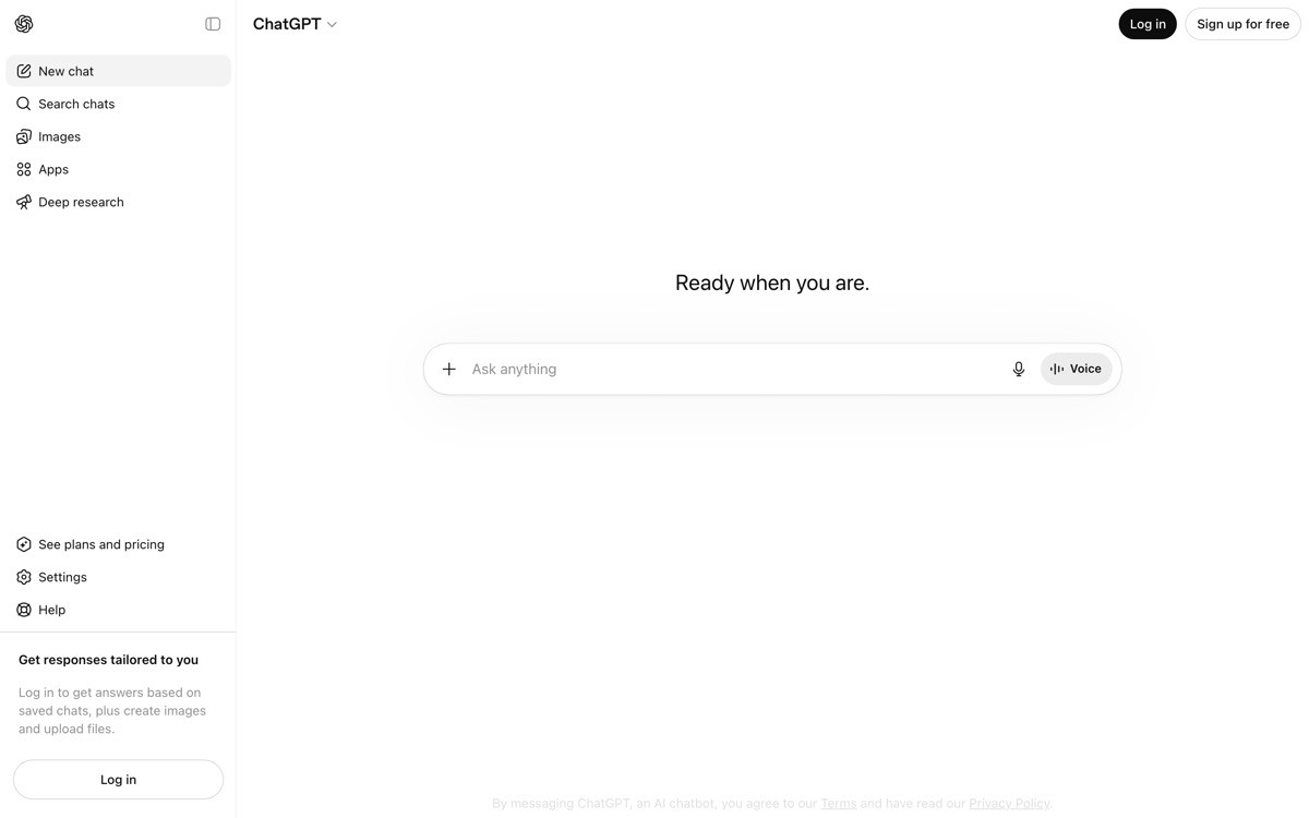
ChatGPT mobile is the AI app every founder benchmarks against, mostly because it sets the floor for what users now expect from a chat-first interface. The input bar handles text, voice, photo, and file uploads from a single composer, and the voice mode is one of the few in the category that actually works in real-world conditions like noisy commutes and meeting rooms.
What makes the app a useful reference is the discipline around defaults. The home screen leads with a clean prompt input rather than a model picker, and history is one tap away rather than the loud sidebar most chat apps copy from the web. The voice mode in particular is worth studying, the orb visualization replaces the keyboard entirely and makes the conversation feel like a call instead of a chat.
Key strengths
Unified input bar with text, voice, photo, and file capture in one composer
Advanced voice mode with an orb visualization that replaces the keyboard cleanly
Image input handled with a dedicated camera shortcut, not buried under attachments
History and projects accessible without cluttering the main thread surface
Custom GPTs and tools integrated without forcing a model picker upfront
Notifications and shortcuts that let the app behave like a real iOS or Android citizen
Best for
Founders setting the design baseline for any chat-first AI mobile app
Teams studying voice mode patterns that work outside of demo conditions
Product designers learning how to defer model and tool complexity until needed
Pricing
Free tier with access to the standard model
ChatGPT Plus from around $20 per month with access to advanced models, voice, and tools
Team and Enterprise tiers with shared workspaces and admin controls
Pros
Voice mode is the reference implementation for hands-free AI on mobile
Input composer handles multimodal capture better than almost any competitor
Defaults make the app feel calm despite a huge surface area
Cons
Output rendering is still mostly plain text with limited structure
Tool and GPT discovery can feel buried for new users who do not know the ecosystem
2. Claude mobile, best long-form chat UI

Claude mobile is the strongest example of restraint in the chat-first category. The interface strips most of the chrome other apps pile on, and the result is one of the few mobile AI clients where reading a long response does not feel hostile. Type hierarchy, line height, and code-block rendering are all tuned for the small screen rather than ported from a web layout.
The distinctive design choice is treating long-form reading as a first-class surface. Most chat apps optimize for short turns, then break when the model returns a multi-page response. Claude's mobile reading experience makes long outputs comfortable to scan, copy, and reference, which matters because the model itself is regularly used for research, writing, and analysis tasks that produce dense replies.
Key strengths
Typography tuned for long-form reading on small screens
Code blocks with syntax highlighting and easy copy actions
Projects and conversations organized without the noisy sidebar pattern from web apps
File and image inputs handled through a clean attachment flow
Artifacts surface as inline cards that the user can expand or save
Settings and model picker hidden until intentionally surfaced
Best for
Founders building AI apps where reading long outputs is part of the core workflow
Teams studying how restraint can be a competitive advantage in a crowded category
Designers looking for a reference on typography and code rendering on mobile
Pricing
Free tier with limits on messages and models
Claude Pro from around $20 per month with priority access and higher limits
Team and Enterprise tiers on request
Pros
One of the cleanest mobile reading experiences for AI output
Restraint makes the app feel calmer than louder competitors
Artifacts pattern is a useful reference for any AI app that returns structured content
Cons
Discovery of advanced features is sometimes too quiet, leaving users unsure what the app can do
Voice and multimodal input lag the leaders in raw feature breadth
3. Perplexity mobile, best structured answer rendering
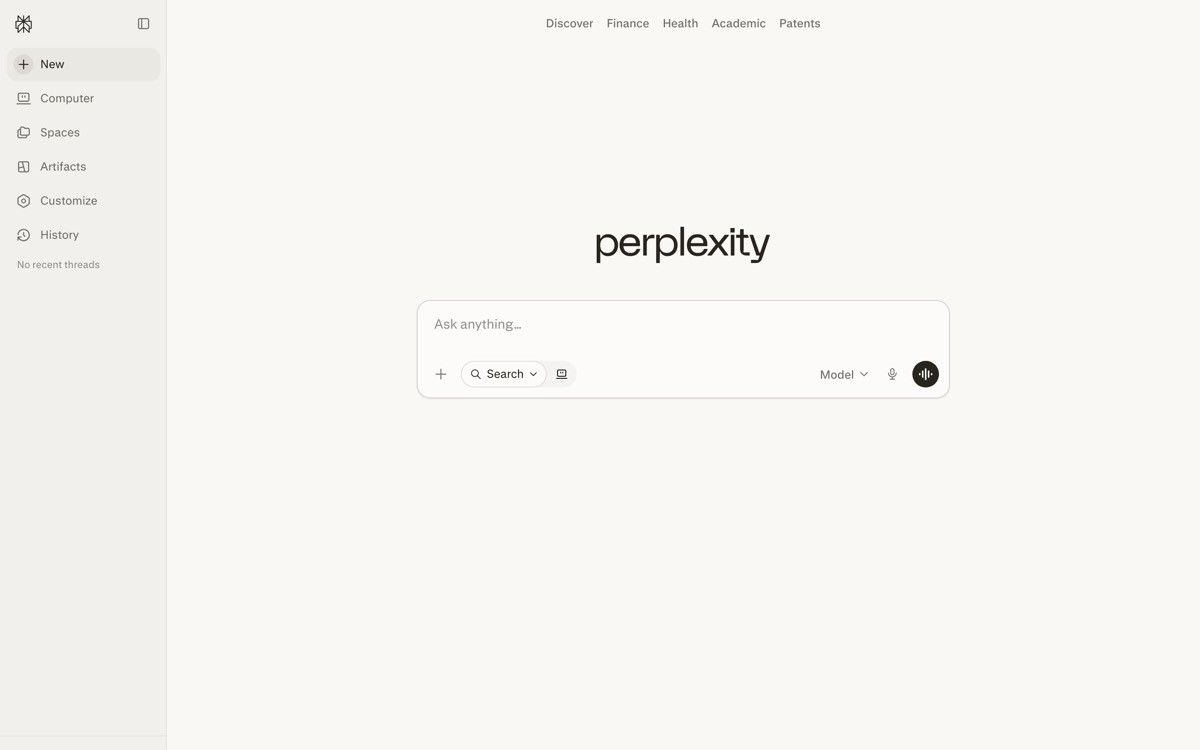
Perplexity mobile treats the answer as a designed object rather than a chat bubble. Responses arrive with citations inline, related follow-up prompts at the bottom, and source cards that expand to the underlying article. It is one of the few AI apps where the output itself feels like a product surface, not the residue of an API response.
The distinctive design choice is the threading model. Each answer becomes a thread that the user can continue or fork, and the discover tab functions like a feed of new topics rather than a settings page. For founders building AI search or research tools, this is the reference implementation for how to render structured AI output on a small screen.
Key strengths
Inline citations with expandable source cards directly in the answer
Follow-up prompts surfaced at the bottom of every answer to extend the thread
Discover tab as a feed of trending topics, not a marketing page
Spaces feature lets users group related threads with shared context
Voice mode and shortcut integration for ambient queries
Strong handling of long answers with collapsible sections and structured headings
Best for
Founders building AI search, research, or retrieval-heavy apps
Teams that need a reference for citation rendering on mobile
Product designers exploring how to make AI answers feel like a designed surface
Pricing
Free tier with unlimited basic search
Perplexity Pro from around $20 per month with advanced models and file uploads
Enterprise tier with team controls and security features
Pros
Best-in-class citation and source rendering on mobile
Threading model is more useful than the linear chat pattern for research
Discover feed is an underrated activation engine other AI apps rarely copy
Cons
Discover feed quality varies by region and language
Some users find the answer-first UI less flexible for open-ended brainstorming
4. Granola, best vertical AI app for meeting notes
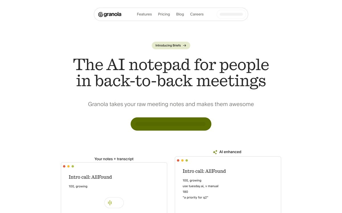
Granola is a notetaking app that uses AI to transform live meeting audio plus the user's own raw notes into a structured summary. The mobile app is one of the cleanest examples of a vertical AI product, the UI is designed around a single workflow, capture during a meeting and review after, rather than a general-purpose chat surface.
The distinctive design choice is treating the user's typed notes as the spine of the AI output. Most meeting AI apps generate a generic summary the moment audio stops. Granola instead enhances what the human wrote, which produces notes that feel personal and reviewable. The mobile app extends this to on-the-go capture, with a recording surface that gets out of the way and a review experience tuned for thumbs.
Key strengths
Single-workflow product surface with no general chat distraction
AI enhances user-typed notes instead of replacing them with a generic summary
Capture flow optimized for in-meeting use with minimal UI noise
Review surface designed for mobile reading with clean structure
Folder and template system for repeated meeting types
Strong sync with the macOS desktop app for cross-device continuity
Best for
Founders building vertical AI apps where a single workflow beats a general chat
Designers studying how to use AI to enhance human input rather than replace it
Teams looking for a reference on capture-and-review surface design
Pricing
Free tier with limits on meeting count per month
Paid tier from around $18 per month with unlimited meetings and templates
Team and Business plans with shared workspaces on request
Pros
One of the strongest references for vertical AI product design
The notes-first model produces noticeably more useful output than generic summarizers
Capture and review surfaces both feel native to mobile, not ported from desktop
Cons
No Android client at time of writing limits the addressable mobile audience
The single-workflow focus means it does not flex outside of meeting use cases
5. Pi, best voice-first AI app

Pi is a personal AI from Inflection AI that leans hard into voice as the primary interaction model. The mobile app opens directly into a voice-first conversation surface, with a calm visual layer and a model tuned for warm, conversational replies. Even when typed, the responses feel like spoken language, which makes the app useful for ambient and emotional support contexts that the productivity-focused chat apps struggle to serve.
The distinctive design choice is restraint around features. Pi does not try to be a research tool, a code assistant, or a productivity app. The product scope is intentionally narrow, and the mobile UI reflects that with no model picker, no tools menu, and no marketing surface. For founders considering a focused, voice-first AI product, this is the cleanest reference in the category.
Key strengths
Voice-first conversation surface tuned for ambient mobile use
Conversational tone calibrated for warmth rather than productivity
Calm visual layer with minimal UI chrome
Strong response cadence that mimics human turn-taking
Cross-platform availability across iOS, Android, and the web
Memory of past conversations surfaced contextually, not as a settings page
Best for
Founders building focused, voice-first AI products
Teams studying how to design AI for emotional or ambient use cases
Designers exploring restrained product surfaces in an over-featured category
Pricing
Free tier with full access to core conversation features
Subscription tier with extended features on request
No team or enterprise plan, the product is consumer-first by design
Pros
One of the few AI apps where voice feels like the intended channel, not a feature
Restrained scope makes the product feel calm in a noisy category
Conversational tone is genuinely different from productivity-tuned competitors
Cons
Narrow scope means it is not a fit for research, coding, or productivity workflows
Inflection AI's strategic pivots have created some uncertainty around the product's long-term roadmap
6. Character.AI, best persona-driven AI design
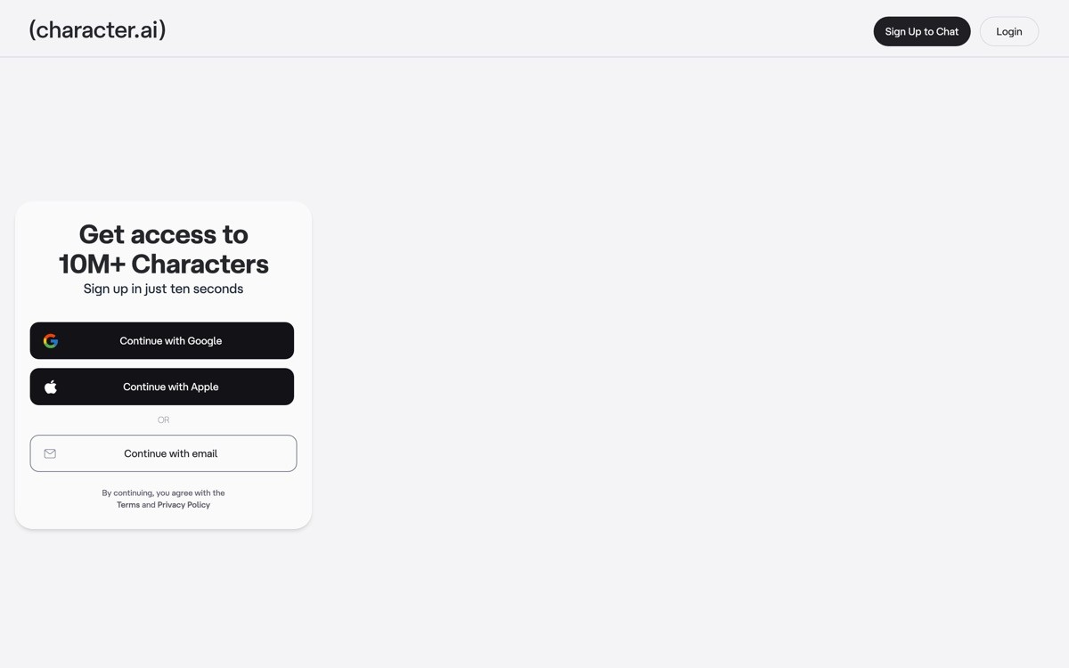
Character.AI is a chat app built around personas, where the user picks from thousands of community-created characters or builds their own. The mobile app is one of the most interesting design references in the consumer AI category, the home surface looks more like TikTok or Instagram than a chat app, with a feed of recommended characters and trending categories at the top.
The distinctive design choice is using a feed pattern to make AI discovery feel native to mobile. The conversation surface itself is conventional, but the discovery and persona-switching pattern is unusual and worth studying. For founders building AI products with multiple agents, characters, or use cases, this is the strongest reference for how to make multi-agent selection feel like browsing rather than configuration.
Key strengths
Feed-based discovery surface that feels native to mobile
Persona switching designed for casual exploration, not power-user configuration
Community-created characters surfaced with social proof signals
Voice mode integrated with persona-specific voices
Memory and relationship features that build continuity across sessions
Strong handling of safety prompts without breaking the conversational tone
Best for
Founders building consumer AI apps with multiple agents or personas
Teams studying how to use feed patterns to make AI discovery feel social
Designers exploring how to build community signals into an AI surface
Pricing
Free tier with full access to community characters
c.ai+ subscription from around $9.99 per month with priority access and exclusive features
No enterprise tier, the product is consumer-only
Pros
One of the most distinct discovery surfaces in the AI category
Feed pattern is rare and worth studying for any multi-agent AI product
Voice and persona integration is unusually well-executed
Cons
Consumer-only positioning limits relevance for B2B AI founders
Content quality varies widely across community-created characters
7. Cleft, best voice-to-note AI app
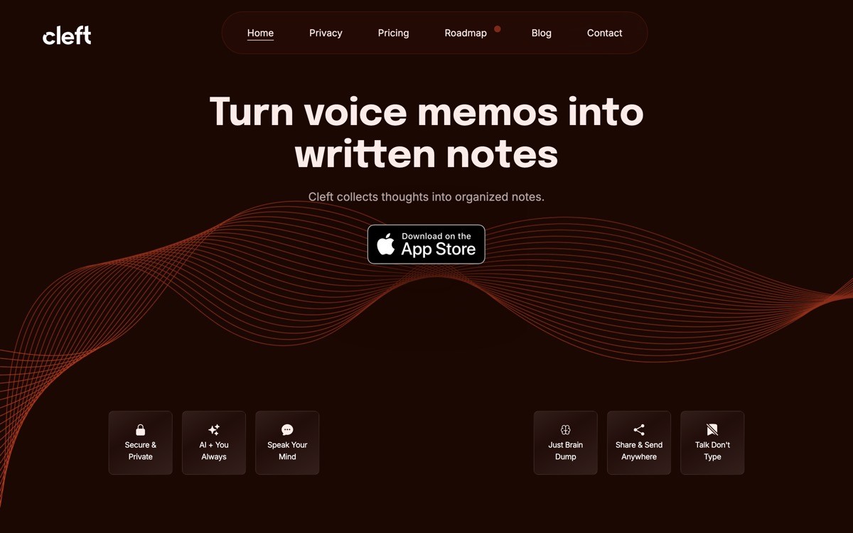
Cleft is a voice-to-note AI app built around capture, structure, and review rather than chat. The mobile experience opens directly into a record button, with no prompt input, no model picker, and no setup wizard. After a user finishes a recording, the AI structures it into headings, action items, and quotes that can be edited, searched, and shared.
The distinctive design choice is making capture the only first-screen action. For people who think out loud, the friction of typing into a chat app is the actual problem. Cleft removes that friction entirely, then layers structure on top after the fact. For founders building AI apps where the input is the bottleneck, this is the cleanest reference example for what a capture-first surface should look like.
Key strengths
Single-button capture flow with no prompt input on the main surface
AI-structured output with headings, action items, and quotable sections
Strong search across all past recordings
Editable transcript with timestamped audio review
macOS app that mirrors the mobile capture and review experience
Privacy-respecting model that keeps notes user-owned
Best for
Founders building capture-first AI products where typing is the bottleneck
Designers studying how to remove input chrome from an AI mobile app
Teams that want a reference for voice-to-structure pipelines on mobile
Pricing
Free tier with limits on recording minutes per month
Paid tier from around $10 per month with extended limits and full structure features
No team plan currently, the product is individual-first
Pros
One of the cleanest capture-first AI apps on mobile
Structured output is genuinely useful rather than a generic transcript
Single-button surface is rare and worth studying
Cons
No Android client limits reach
The narrow scope means it does not replace a general AI assistant for users who want one app for everything
How to choose a mobile AI design pattern for your product
1) Is your product general-purpose or vertical?
If you are building a general-purpose AI assistant, ChatGPT and Claude set the bar and you should not deviate too far from chat-first conventions. If you are building a vertical AI app, Granola and Cleft show that single-workflow design beats a general chat surface for adoption and retention.
2) Is text input the right primary affordance?
For productivity workflows, text is still the default. For ambient, emotional, or capture-heavy contexts, voice is often a better primary affordance. Pi and Cleft both deliberately strip the text composer from the main surface, and the result is a product that feels different from the chat-first crowd.
3) How structured is your AI output?
If your output is mostly conversational, the chat bubble pattern from ChatGPT is fine. If your output includes citations, structured data, or multi-section answers, study Perplexity and Claude for how to render structure without making the surface feel busy. Plain-text replies will undersell the work the model is doing.
4) Does your product have multiple agents, personas, or use cases?
If yes, Character.AI is the strongest reference for how to use a feed-based discovery pattern rather than a configuration screen. Most multi-agent AI products fail because the agent picker feels like a settings menu instead of a discovery surface.
5) What is the ratio between input length and output length?
If the user types a short prompt and reads a long response, optimize the reading surface like Claude. If the user records or types long input and skims a short structured output, optimize the review surface like Granola or Cleft. The wrong ratio between input and output design is the most common reason a mobile AI app feels off without anyone being able to say why.
If you are designing or rebuilding a mobile AI product and the patterns above are clearer than the implementation, that is where a design partner helps. AY Design works with founders shipping AI tools, runs mobile design audits against references like these, and redesigns the surface for input, output, and the small interactions that decide whether the app feels native. Book a design audit to compare your current surface against the patterns that matter for your category.
FAQ
What is the best mobile AI app design example to study in 2026?
ChatGPT mobile is the baseline reference for chat-first AI app design in 2026, while Perplexity sets the bar for structured answer rendering and Granola shows how vertical AI apps should be designed. The right reference depends on whether your product is general or vertical, and whether your output is conversational or structured.
Should an AI mobile app be voice-first or text-first?
Voice-first works for ambient, emotional, and capture-heavy products where typing is the bottleneck. Pi and Cleft are the strongest references for this pattern. Text-first remains the default for productivity workflows because users still need precise control over their input, which voice does not yet reliably provide.
What makes a mobile AI app feel native rather than ported from the web?
Native-feeling AI apps optimize input ergonomics for the keyboard and microphone, render output for the small screen rather than reusing a web layout, and use platform conventions like sheets, haptics, and shortcuts. ChatGPT and Claude both feel native in different ways, ChatGPT through its multimodal composer and Claude through its long-form typography.
How do I design output rendering for an AI app on mobile?
Treat the answer as a designed surface, not a chat bubble. Perplexity is the cleanest reference for structured output with inline citations, follow-up prompts, and expandable sources. For long-form responses, study Claude's typography and code rendering. Plain-text replies are the easiest way to undersell a strong model.
Is a vertical AI app better than a general AI chat app?
For most founders shipping in 2026, a vertical AI app is the more defensible play. Granola and Cleft both beat general chat apps for their specific workflows because the surface is designed around one job, not a thousand. General chat apps are dominated by foundation model labs and competing on the same surface is a hard fight.
Which mobile AI app has the best voice mode?
ChatGPT's advanced voice mode is the reference implementation for hands-free AI on mobile, with strong handling of real-world conditions and a clean orb visualization that replaces the keyboard. Pi is the strongest pure voice-first competitor and worth studying if your product centers on ambient or emotional use cases.
How do I design discovery for a multi-agent AI mobile app?
Use a feed-based discovery pattern rather than a configuration screen. Character.AI is the clearest reference, with a home surface that feels like a content app and persona switching that feels like browsing. Founders shipping multi-agent products through a settings-style picker consistently underperform feed-driven competitors.
Do I need a native designer to ship a mobile AI app?
Yes, mobile AI apps almost always need native iOS or Android design work because the input ergonomics, output rendering, and platform integrations are too specific to ship from a web template. An AI-product design agency with native mobile experience will help you avoid the most common pitfalls, like web-styled chat bubbles that ignore platform conventions.
Checkout other Blogs:

Multi-agent system UX design guide for 2026
A pattern-by-pattern guide to designing multi-agent system UX in 2026, with a scoring matrix and references from Claude Code, LangGraph, Devin, and Replit Agent.
Author:
AY Designs Team

Human-in-the-loop AI design guide for 2026
A 2026 guide to human-in-the-loop AI design with patterns, scoring framework, and examples from Cursor, Claude Code, Stripe, and Notion AI.
Author:
AY Designs Team

How to design agentic AI products in 2026: a 7-step playbook
A seven-step design playbook for shipping agentic AI products that users actually trust, with scoring matrix and real product references from Cursor, Claude Code, Devin, and Perplexity.
Author:
AY Designs Team

How much does AI SaaS design cost in 2026?
AI SaaS design cost in 2026 by tier and engagement type, with ranges, timelines, and a value scorecard for founders shipping with Lovable, Bolt, and v0.
Author:
AY Designs Team