
Modern SaaS landing pages in 2026 do a different job than they did three years ago. They have to convert traffic that increasingly arrives pre-educated through ChatGPT and Perplexity. They have to load fast on mobile, look unicorn-grade on a 15-inch laptop, and still explain a complex product in under thirty seconds. The bar has moved.
The teams that get this right are the obvious ones (Linear, Stripe, Vercel) and a handful of newer category leaders (Cursor, Lovable, Granola) that ship landing pages with opinions, not templates. This guide breaks down seven of the best modern SaaS landing page examples in 2026, with the specific patterns to steal, the design moves that signal product confidence, and the mistakes to avoid on your own page.
TL;DR, Linear and Vercel set the bar for modern SaaS landing pages in 2026 with quiet, product-led design. For pricing pages study Stripe and Notion. For category-creator energy look at Cursor and Lovable. For ambient, brand-led marketing pages look at Framer.
Best modern SaaS landing page examples: a brief overview
Linear: Best for quiet, product-led landing pages that show without telling.
Vercel: Best for developer-platform landing pages that mix density with motion.
Stripe: Best for pricing page architecture and trust signal layering.
Notion: Best for use-case-led landing pages that target multiple personas.
Cursor: Best for AI-product landing pages that compress one bold claim into the hero.
Lovable: Best for landing pages that demo the product directly in the hero.
Framer: Best for ambient, brand-led marketing pages with motion as primary medium.
Example | Key strength | Page type | Pattern to steal |
|---|---|---|---|
Linear | Restrained design that shows product confidence | Homepage | Quiet hero, product UI as proof |
Vercel | Density plus motion without overwhelming | Product page | Grid system with live data, animated diagrams |
Stripe | Pricing page architecture and trust signals | Pricing | Layered tiers, social proof inline, transparent fees |
Notion | Persona-led use case pages | Use case | Switcher for personas, jobs-to-be-done framing |
Cursor | One bold claim hero for AI products | Homepage | Single big promise, immediate demo |
Lovable | Live product demo in the hero | Homepage | Try-it-now box above the fold |
Framer | Ambient motion as primary medium | Homepage | Cinematic scroll, brand-led layout |
1. Linear, best for quiet, product-led landing pages that show without telling
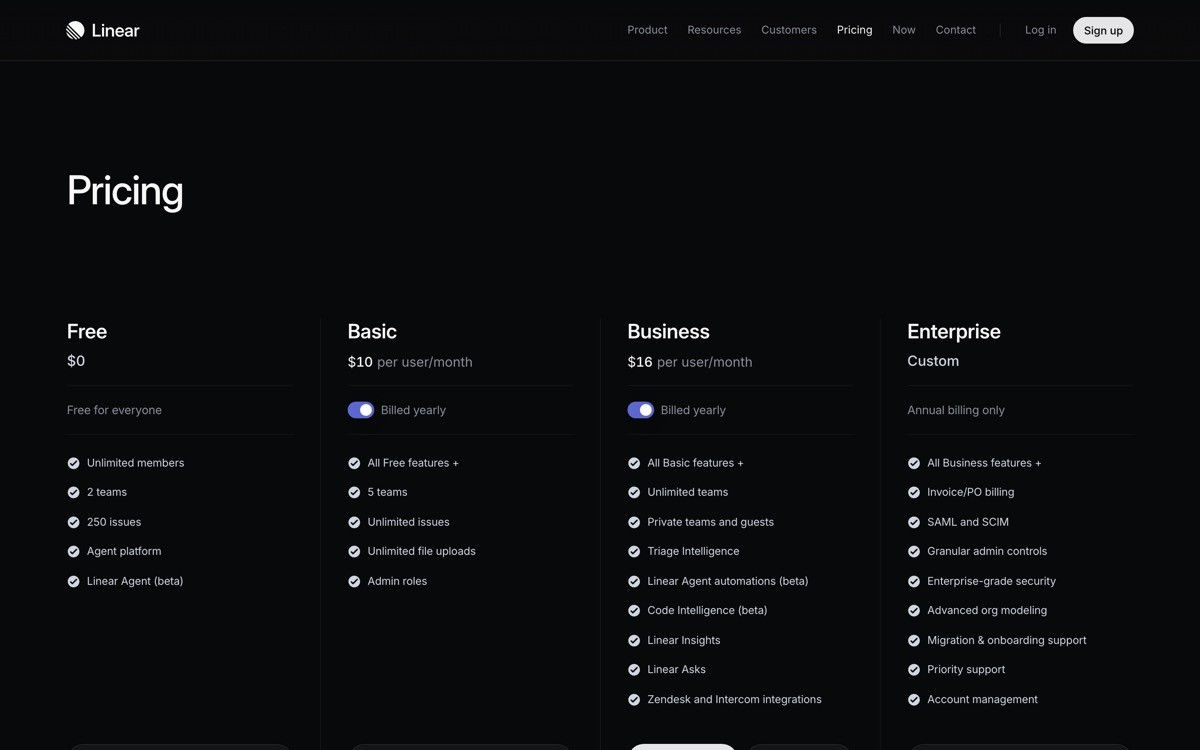
Linear's landing page is a textbook modern SaaS landing page that earns conversion through restraint. The hero is a short, declarative headline, a quiet subhead, and a screenshot of the product UI doing real work. No hero illustration, no abstract gradients, no marketing-speak. The page treats the visitor like a serious operator who recognizes good design when they see it.
What makes it notable is the discipline. Most SaaS landing pages keep adding content to the hero because every stakeholder wants their feature represented. Linear strips back. The product is the proof, and the layout simply gives it room to breathe.
Patterns to steal
Hero structure: headline plus subhead plus one CTA plus product UI screenshot, nothing more
Typography-led layout with generous whitespace
Sections that each carry exactly one idea, demonstrated with UI
Dark mode treatment that signals product seriousness
Subtle motion only on hover, never on scroll for its own sake
Common mistakes to avoid
Stuffing the hero with feature lists, awards, and logos all at once
Using hero illustrations instead of real product UI when the product is the differentiator
Adding motion to every section instead of letting layout do the work
2. Vercel, best for developer-platform landing pages that mix density with motion
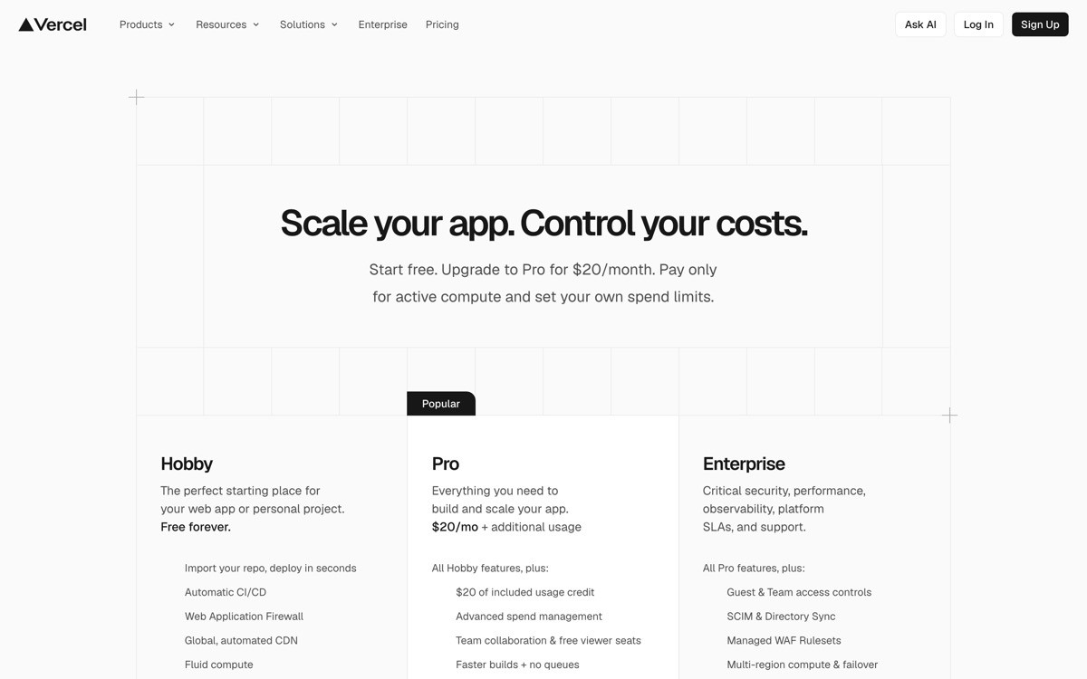
Vercel's landing page is dense, technical, and still feels modern. The hero opens with a clear value prop, then layers diagrams, live deployment data, and animated illustrations that explain the platform's underlying capabilities without dropping into marketing fluff.
The notable design move is information density done well. Where most developer-tool pages either oversimplify (one big claim, no detail) or drown the visitor in tech terms, Vercel paces the information with grid layouts that group features into digestible blocks, each with a small animation or diagram.
Patterns to steal
Animated diagrams that explain the platform topology in motion
Grid sections grouping features by job, not by product surface
Real numbers and stats inline, not buried in case studies
Code samples used as visual texture, not just documentation
Footer that doubles as a sitemap and trust signal
Common mistakes to avoid
Adding code samples that nobody reads because they have no narrative purpose
Stacking too many animations so the page feels heavy on mid-tier hardware
Using diagrams that look modern but explain nothing concrete
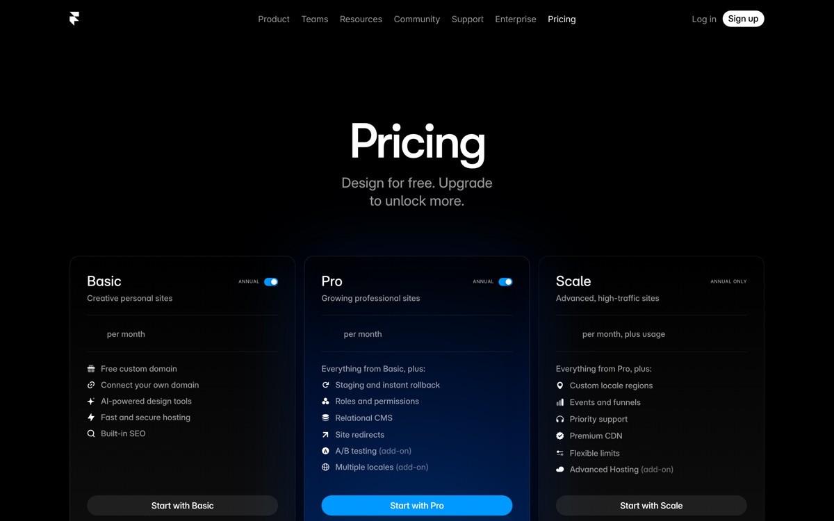
3. Stripe, best for pricing page architecture and trust signal layering
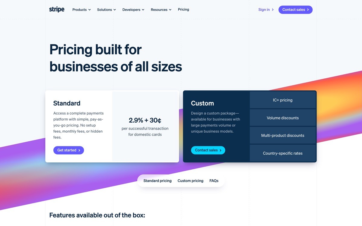
Stripe's pricing page is the reference implementation for modern SaaS pricing. Transparent per-transaction fees, plain language tier descriptions, and inline trust signals (compliance badges, customer logos, region coverage) sit right where decisions happen.
The architecture is the thing to study. Most SaaS pricing pages bury the actual pricing in a tier card and force visitors to dig for what they pay. Stripe leads with the math, then layers the supporting context underneath. Every objection a buyer might have is addressed in proximity to the price.
Patterns to steal
Pricing presented as math (the actual fee structure) before tier cards
Trust signals inline with pricing, not bottom of the page
Plain language descriptions of what each tier unlocks
Calculator widget for usage-based pricing transparency
FAQ section directly below pricing answering real buying objections
Common mistakes to avoid
Hiding pricing behind "Contact sales" without a clear reason
Listing features in tier cards without explaining what they unlock
Placing social proof at the page bottom where it does no decision support
4. Notion, best for use-case-led landing pages that target multiple personas
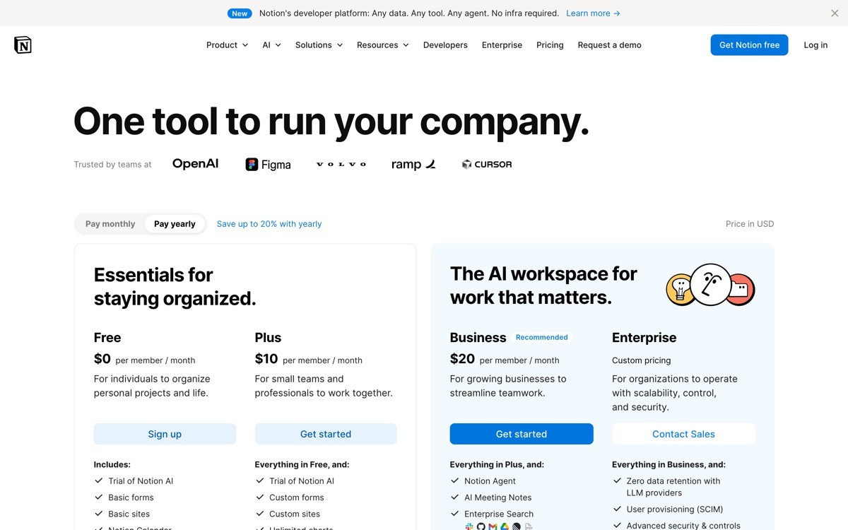
Notion's marketing site is a masterclass in handling a horizontal product through dedicated use case pages. The homepage stays product-led and broad, then a network of vertical landing pages (for engineering, for design, for HR, for product) speaks directly to each persona's job to be done.
The design pattern that makes this work is the persona switcher and the consistent template across use case pages. Each page leads with the persona's actual problem, shows the product solving it with real screenshots, and finishes with persona-specific social proof. The visitor never feels like they landed on a generic page.
Patterns to steal
Dedicated landing pages per persona or use case, not generic homepage variants
Job-to-be-done framing in each hero (what the persona is trying to accomplish)
Persona-specific social proof, not the same logo bar everywhere
Consistent template across use case pages for fast scanning across the site
Internal links that route visitors to the right vertical from the homepage
Common mistakes to avoid
Building one homepage that tries to speak to every persona at once
Using the same logo bar and testimonials on every persona page
Treating use case pages as SEO bait without real differentiation per page
5. Cursor, best for AI-product landing pages that compress one bold claim into the hero
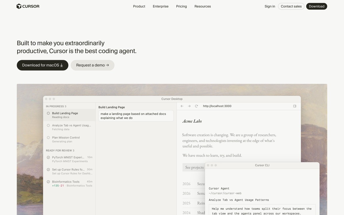
Cursor's landing page is the modern AI-product playbook. One bold claim in the hero, a downloadable installer one click away, and a sequence of short, focused sections that each show the AI doing concrete work in the editor. No abstract "AI-powered" hero illustration, no model name dropping.
The notable move is what is missing. There is no exhaustive feature list, no comparison table against other editors, no testimonial wall stacked above the fold. The page assumes the visitor came because they already heard the pitch, and the only job left is to convert them into a download.
Patterns to steal
One bold claim hero, not a feature inventory
Download or sign-up CTA visible in the first viewport on every device
Short sections each demonstrating one capability with real product UI
Implicit positioning against competitors through demos, not comparison tables
Footer that stays minimal and trusts the visitor to navigate
Common mistakes to avoid
Listing every AI feature in the hero so nothing stands out
Adding model name dropping ("powered by GPT-4") instead of showing outcomes
Burying the install or sign-up CTA below the fold
6. Lovable, best for landing pages that demo the product directly in the hero
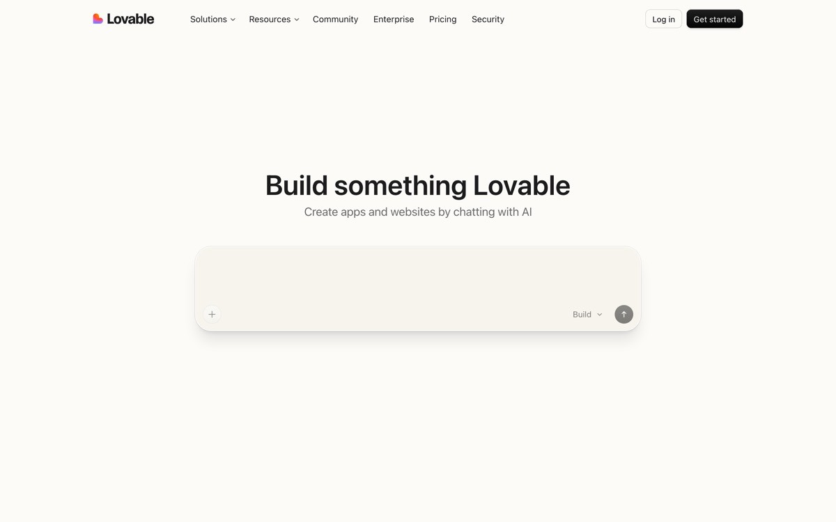
Lovable's landing page collapses the gap between marketing and product. The hero is an input box where visitors can describe an app they want to build, and the product generates it on the spot. There is no "watch demo" video, no "request a trial" form. The page is the demo.
This is the modern AI-product landing page pattern at its most aggressive. It only works when the product is fast, impressive in five seconds, and lossless to onboarding through the hero box, but when those conditions are met, the conversion lift is significant.
Patterns to steal
Hero that is the product, not a screenshot of the product
Frictionless input flow that delivers value in under thirty seconds
Examples below the input as inspiration, not as marketing copy
Sign-up gating only after the visitor sees the magic
Social proof through a gallery of public builds, not testimonial blocks
Common mistakes to avoid
Putting a fake demo widget in the hero that does not actually work
Gating the demo behind sign-up before showing the value
Cluttering the hero around the input box so the focal point gets lost
7. Framer, best for ambient, brand-led marketing pages with motion as primary medium
Framer's marketing site treats motion and brand as primary design materials, not garnish. The page uses cinematic scroll, layered video, and typography-led layouts to build a brand experience that signals "this tool can ship sites like this." The page is a portfolio piece for the product itself.
This works because Framer is a design tool. Visitors expect the marketing site to be a demo of the platform's capability, and the team delivers. For other SaaS products this level of ambient design can backfire if the underlying product is functional rather than aesthetic, but the playbook is worth studying.
Patterns to steal
Motion used to demonstrate capability, not just decorate
Typography as a hero element with custom weight and spacing
Layered video and animation tied to scroll position
Brand-led sections that prioritize feeling over feature inventory
Performance-conscious motion that holds up on mobile
Common mistakes to avoid
Copying the motion style without matching the underlying brand voice
Layering animations that destroy page performance on mid-tier devices
Treating motion as a substitute for clear positioning
How to apply these patterns to your own SaaS landing page
1) Pick a single primary job for the page
The biggest reason modern SaaS landing pages underperform is that they try to do four jobs in one viewport (convert, educate, brand-build, retarget). Pick one.
If the page exists to convert cold traffic to sign-up, follow Cursor or Lovable.
If the page exists to convert pre-educated traffic from content, follow Linear.
If the page exists to support sales conversations, follow Stripe.
If the page exists to convert across personas, follow Notion's use-case-led model.
2) Decide whether the product or the brand is the hero
Product-led pages (Linear, Vercel, Cursor) use real UI as the hero asset. Brand-led pages (Framer) use motion and typography. Pick the lever that matches your product reality.
If your UI is the differentiator, show it. Skip the illustration.
If your product is functional and not aesthetically distinctive, lead with the brand and explain the outcome.
3) Strip before you add
Every example in this list earns conversion through restraint. Before adding another section, kill the weakest one. Modern SaaS landing pages in 2026 reward the team willing to leave whitespace alone.
4) Test the page on a slow phone
Cinematic motion that runs perfectly on a Macbook Pro can collapse on a 200-dollar Android. Every example above performs because performance is part of the design brief, not an afterthought.
If you have a clear sense of the patterns you want to apply but need a design partner to ship a landing page that matches the bar set by Linear, Vercel, or Cursor, that is what AY Design does. We help founders and product teams ship AI-built SaaS landing pages that do not look AI-built, with conversion-led patterns and modern motion. Book a design audit to see what to fix first.
FAQ
What makes a modern SaaS landing page good in 2026?
A modern SaaS landing page in 2026 is good when it converts traffic, loads fast on mobile, and signals product confidence through restraint rather than feature density. The strongest examples (Linear, Vercel, Stripe, Cursor) lead with real product UI, clear positioning, and motion that demonstrates capability rather than decorates the page.
What is the best SaaS landing page hero pattern in 2026?
The best SaaS landing page hero pattern in 2026 is a short, declarative headline, a quiet subhead, a single CTA, and either a real product UI screenshot or a live demo widget. Cursor and Linear show this pattern at its most disciplined, while Lovable pushes it further by making the hero itself the product demo.
Should a SaaS landing page have a hero illustration or product UI?
Product UI almost always converts better than hero illustration when the product is the differentiator. Hero illustrations earn their place on landing pages for products where the underlying UI is generic, but for category-leading SaaS in 2026 the move is to show real UI doing real work.
How long should a modern SaaS landing page be?
A modern SaaS landing page in 2026 is as long as the buying decision requires, no longer. Self-serve products converting cold traffic (Cursor, Lovable) keep the page short and dense. Considered B2B purchases (Stripe, Vercel) earn longer pages because they layer trust signals, technical depth, and persona-specific sections.
Should SaaS landing pages use dark mode or light mode?
Dark mode signals product seriousness and works well for developer tools, design tools, and AI products (Linear, Vercel, Cursor). Light mode reads as approachable and works better for productivity, collaboration, and broad SMB tools (Notion, Stripe). Many modern SaaS sites ship both and let visitor preference decide.
How do AI-product landing pages differ from traditional SaaS landing pages?
AI-product landing pages in 2026 increasingly collapse the gap between marketing and product, with the hero often acting as a live demo (Lovable) or a single bold claim followed by an immediate install CTA (Cursor). Traditional SaaS landing pages still rely on screenshots, testimonials, and feature sections, while AI-product pages assume the visitor wants to try the product in under thirty seconds.
What is the biggest mistake on modern SaaS landing pages?
The biggest mistake is stuffing the hero with feature lists, awards, logos, and motion all at once, which dilutes every signal and conveys product insecurity. The strongest modern SaaS landing pages earn conversion through restraint, leaving the hero with one claim, one CTA, and one piece of product proof.
How fast should a modern SaaS landing page load?
A modern SaaS landing page in 2026 should reach a first contentful paint under 1.5 seconds and a fully interactive state under 3 seconds on a mid-tier mobile device. The examples above all stay inside this range despite heavy motion, because the design teams treat performance as part of the brief rather than a post-launch optimization.
Checkout other Blogs:

Multi-agent system UX design guide for 2026
A pattern-by-pattern guide to designing multi-agent system UX in 2026, with a scoring matrix and references from Claude Code, LangGraph, Devin, and Replit Agent.
Author:
AY Designs Team

Human-in-the-loop AI design guide for 2026
A 2026 guide to human-in-the-loop AI design with patterns, scoring framework, and examples from Cursor, Claude Code, Stripe, and Notion AI.
Author:
AY Designs Team

How to design agentic AI products in 2026: a 7-step playbook
A seven-step design playbook for shipping agentic AI products that users actually trust, with scoring matrix and real product references from Cursor, Claude Code, Devin, and Perplexity.
Author:
AY Designs Team

How much does AI SaaS design cost in 2026?
AI SaaS design cost in 2026 by tier and engagement type, with ranges, timelines, and a value scorecard for founders shipping with Lovable, Bolt, and v0.
Author:
AY Designs Team