Most SaaS pricing pages still read like a spreadsheet on a Friday afternoon: three columns, fifteen checkmarks per column, a sticky "Contact sales" button at the end. They convert poorly because they ask the visitor to do the math instead of giving them a recommendation.
The pricing pages that actually move revenue in 2026 do something different. They lead with the buyer's role, they hide complexity until the buyer is ready for it, and they treat enterprise as a separate buying journey, not a fourth column. We picked seven SaaS pricing pages worth studying this year, plus the specific patterns you can pull into your own.
TL;DR, if you only steal one pattern in 2026, copy Linear's role-first pricing layout: it sells the product before it sells the plan, and it forces every other column to compete on outcome instead of feature count.
Best SaaS pricing page examples: a brief overview
Linear: Best role-first pricing page, sells "what your team does" before showing a price ladder.
Vercel: Best developer-led pricing, leans on credit-based usage and a clean Hobby tier.
Stripe: Best transactional pricing, makes a complex fee structure feel obvious in one screen.
Notion: Best workspace pricing, uses persona pills and a clear AI add-on to avoid sticker shock.
Framer: Best site-builder pricing, sites priced separately from team seats, and the maths is honest.
Webflow: Best dual-axis pricing, separates Site plans from Workspace plans without losing the buyer.
Atlassian (Jira): Best per-seat slider pricing, calculator-first design that respects how buyers actually decide.
Product | Pattern that stands out | Starting price | Free tier |
|---|---|---|---|
Linear | Role-first hero, simple three-plan ladder | $8 per user/month (Basic) | Free for up to 10 users |
Vercel | Credit-based pricing, generous Hobby tier | $20 per user/month (Pro) | Hobby (personal, non-commercial) |
Stripe | Transparent transactional fees, no hidden monthly | 2.9% + 30¢ per successful card charge (US) | No monthly fee, pay per transaction |
Notion | Clear Plus/Business/Enterprise ladder, AI add-on broken out | $12 per seat/month (Plus, annual) | Free for individuals |
Framer | Site plans separate from workspace plans | $5/site/month (Mini, annual) | Free with framer.website subdomain |
Webflow | Two pricing axes (Site vs Workspace) handled gracefully | $14/site/month (Basic, annual) | Starter (limited) |
Atlassian (Jira) | Per-seat slider with live total at the top | $7.53 per user/month (Standard, approx.) | Free for up to 10 users |
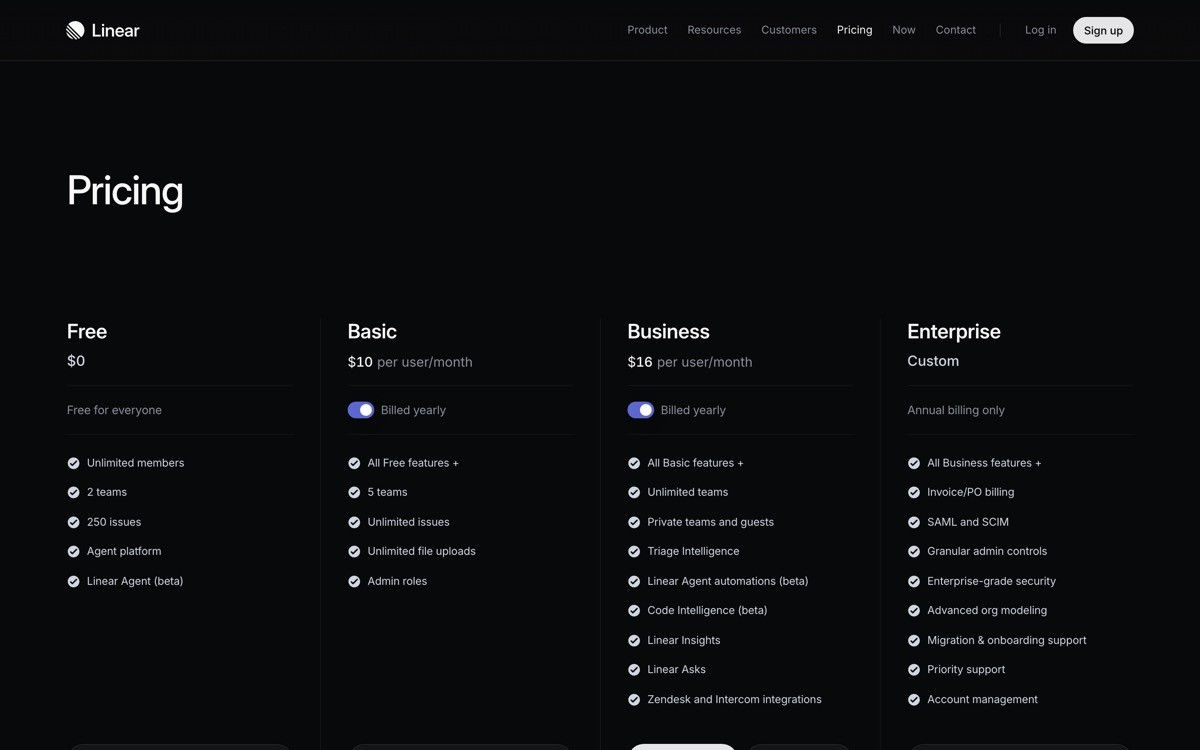
1. Linear, best role-first pricing page
Linear's pricing page is a definition-style pitch before it is a price list. The hero asks who you are (engineering, design, product) and the page reorganises around that answer, which means the buyer is never staring at columns they do not need.
What makes it work in 2026 is restraint. Three plans, one annual toggle, and a single "Contact sales" path for Enterprise. There is no live chat ambush, no scarcity countdown, no per-feature comparison overload. The plan card itself sells the outcome ("Built for product teams that ship") before the bullet list.
Key strengths
Role-first hero that personalises the page without a single form field
Three plans only, with one annual toggle and zero countdown timers
Plan cards lead with the outcome sentence, not the bullet list
Honest free tier (up to 10 users) instead of a 14-day trick
Single, calm Enterprise path with no scare tactics
Typography hierarchy that makes the price feel inevitable, not loud
Best for
Product-led B2B tools where engineering or product leads make the buying call
Founders who want to model their pricing page after a category-defining brand
Pricing on display
Free: up to 10 users, unlimited issues
Basic: $8 per user/month (annual)
Business: $14 per user/month (annual), with Enterprise as a custom quote
Pros
Sets a strong "less is more" benchmark you can copy at any stage
Forces the rest of your design system to feel grown up to match it
Cons
Works less well if your product has more than three pricing axes (seats, usage, add-ons)
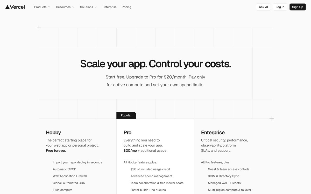
2. Vercel, best developer-led pricing
Vercel's pricing page is built for a buyer who already knows what a build minute is. The Hobby tier is genuinely usable for personal projects, Pro is a flat $20 per user/month plus credit-based usage, and Enterprise is sold separately. The trick is that the page never apologises for usage-based pricing, it explains it.
The reason it works: credits are visualised as line items (bandwidth, fast data transfer, edge requests) rather than buried in a tooltip. A small calculator block lets buyers sanity-check before they hit upgrade. That is the difference between a pricing page and a billing page disguised as one.
Key strengths
Hobby tier that is good enough to actually ship a portfolio on
Credit-based usage explained with line items, not tooltips
Sticky comparison table that does not break on mobile
Enterprise framed as a different buying motion, not "Pro plus more"
Add-ons (Observability, Firewall) shown without polluting the main ladder
Best for
Infrastructure and developer-tool startups with usage-driven revenue
Teams that want to teach the buyer the unit economics before they upgrade
Pricing on display
Hobby: free, non-commercial use
Pro: $20 per user/month plus included credits and overages
Enterprise: custom, billed annually
Pros
Excellent model for any usage-billed product (AI inference, build minutes, API calls)
Sets expectations early, which reduces churn from sticker shock at month two
Cons
Credit-based pricing still requires a buyer who reads, do not copy it on a low-consideration tool
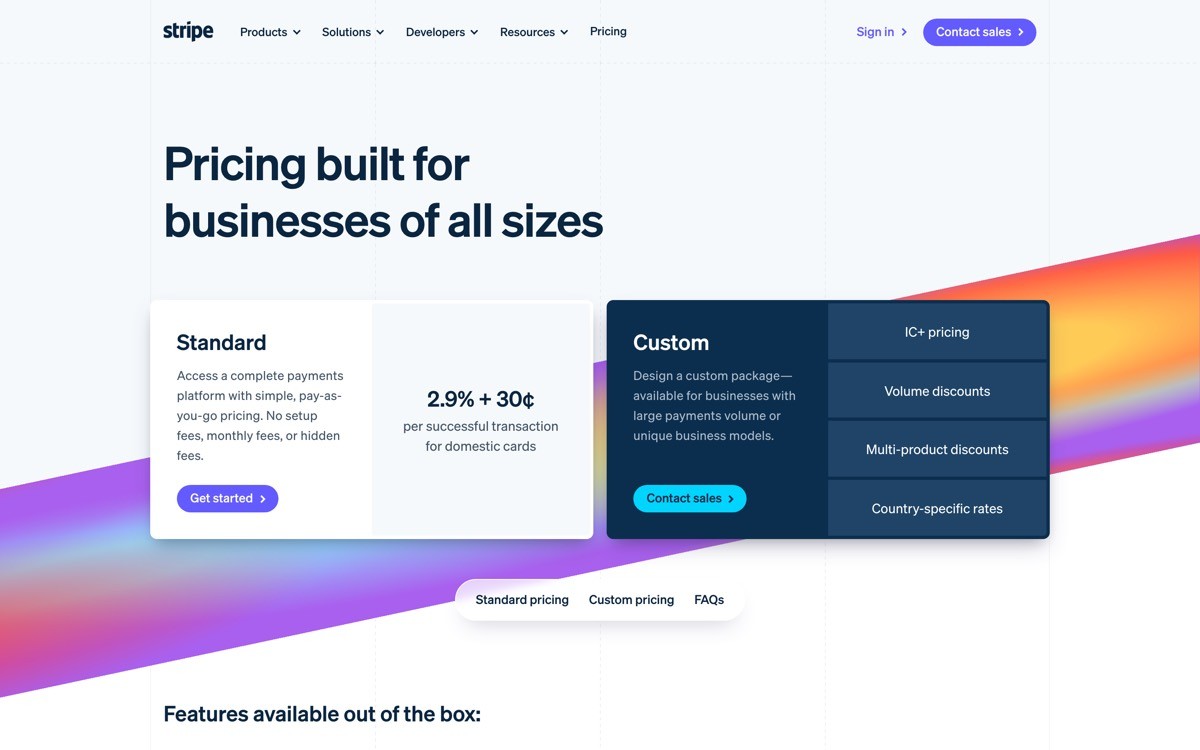
3. Stripe, best transactional pricing
Stripe's pricing page is the gold standard for products that charge per transaction. There is no monthly plan to pick, no upsell ladder, just a single fee posted front and centre: 2.9% plus 30 cents per successful card charge in the US. Everything else (Billing, Connect, Radar) sits below as a separate product line with its own fee structure.
The design move worth stealing: Stripe uses one persistent calculator near the top so a founder can plug in their projected volume and see annual cost in seconds. The page treats every reader as a buyer with a spreadsheet open, and it speaks that buyer's language.
Key strengths
Single hero fee, no plan ladder, no anxiety
Calculator that respects how buyers actually evaluate transactional pricing
Product modules priced separately, so the core fee stays clean
Regional toggles for currency and country built into the page, not buried in a sub-route
Long-tail of small print kept honest, not hidden in a modal
Best for
Payment platforms, marketplaces, and any product with a per-transaction fee
Fintech and B2B2C tools where the buyer wants total cost of ownership in 30 seconds
Pricing on display
Core: 2.9% + 30¢ per successful card charge (US standard)
Custom volume pricing for high-volume businesses
Each adjacent product (Billing, Connect, Radar, Issuing) has its own fee block
Pros
One-fee transparency is a trust signal you cannot fake
Calculator pattern raises conversion on any usage-billed tool you build
Cons
Only works if you genuinely have one main fee, do not force this on a tiered SaaS
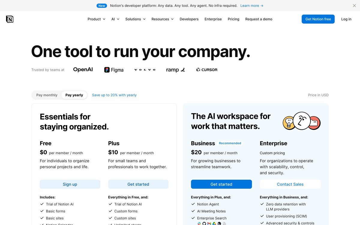
4. Notion, best workspace pricing
Notion has the hardest pricing job in SaaS: it is sold to individuals, small teams, and enterprises, and it has to layer AI on top. Their pricing page handles it with a persona-aware top filter (Personal vs Teams vs Enterprise) that quietly reorders the plans on click.
What is worth lifting in 2026 is how the AI add-on is presented. Notion AI is not folded into a plan, it is broken out as an explicit per-seat add-on, with a price that visibly stacks on top of the base plan. That stops the "AI tax" feeling, where buyers feel ambushed by a 30% price hike disguised as innovation.
Key strengths
Persona filter at the top that reorders the page without a route change
AI add-on broken out as a transparent stack, not folded into a plan upgrade
Free plan that is still useful, not a hostage tier designed to push upgrades
Clear "Best for" descriptor on each plan card
Annual vs monthly toggle that highlights the saving without dark patterns
Best for
Horizontal SaaS sold to multiple buyer personas in the same flow
Products layering AI on top of an existing subscription
Pricing on display
Free: for individuals, small projects
Plus: from $12 per seat/month (annual)
Business: from $18 per seat/month (annual), Enterprise on quote
Notion AI: per-seat add-on, billed separately
Pros
Honest way to monetise AI without enraging existing customers
Persona filter is reusable on any multi-buyer SaaS
Cons
AI add-on stacking can still feel pricey at scale (5 seats x base x AI)
5. Framer, best site-builder pricing
Framer is one of the rare SaaS products where pricing has two clean axes (per site and per workspace seat) and the page actually communicates both without breaking. Sites have their own Mini, Basic, Pro plans (driven by bandwidth and CMS items). Workspaces have a separate seat-based plan. The result: a designer building five client sites can model their bill in their head before they hit upgrade.
The visual trick that makes it work: a clear toggle between "Sites" and "Workspaces" at the top of the page, with the active axis dimming the other. It is one of the cleanest solutions to dual-axis pricing in 2026.
Key strengths
Dual-axis pricing (per site, per seat) shown without confusing the buyer
Sites priced by real cost drivers (bandwidth, CMS items, visitors)
Free tier (with framer.website subdomain) good enough for prototyping
Clear annual saving, no surprise renewal pricing
Design that matches the rest of the product (it should, but most SaaS pricing pages still look bolted on)
Best for
Builder-style SaaS where the unit is "a project" or "a site," not "a user"
Tools sold to designers, freelancers, and small agencies
Pricing on display
Free: framer.website subdomain
Mini: from $5/site/month (annual)
Basic: from $15/site/month (annual)
Pro and Business: higher tiers with more bandwidth, CMS, and team features
Pros
One of the cleanest dual-axis pricing executions on the web
Honest about what drives cost (bandwidth, CMS scale)
Cons
Two-axis pricing always asks more of the buyer, build a calculator if you copy this pattern
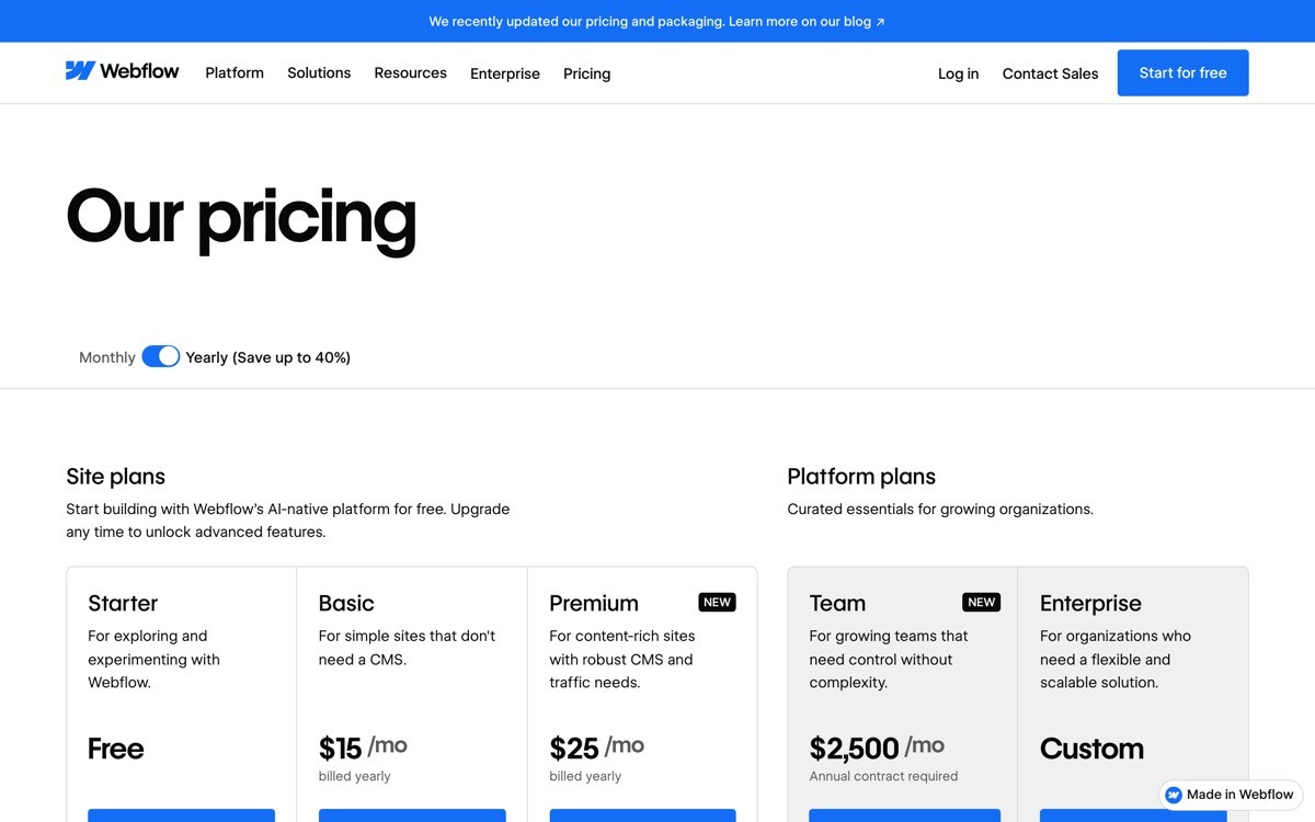
6. Webflow, best dual-axis pricing without losing the buyer
Webflow has been refining its "Site plans vs Workspace plans" split for years, and the 2026 version is the tidiest yet. Site plans pay for hosting, CMS scale, and ecommerce features per project. Workspace plans pay for team seats, code export, and unlimited unhosted sites. The pricing page splits them into two clearly labelled sections with their own ladders.
What is worth borrowing: an in-page anchor menu (Sites, Workspaces, Ecommerce) lets the buyer jump to their relevant section instead of scrolling through six pricing ladders. It is a small UX detail that prevents the bounce.
Key strengths
Two pricing axes (Site, Workspace) presented as separate, complete ladders
In-page anchor nav reduces scroll fatigue
Ecommerce plans broken out so non-commerce buyers do not get distracted
Visible CMS limits, bandwidth, and form submissions on every plan card
Honest "Free" Starter plan with clear limits, not a 7-day trial in disguise
Best for
Platforms with multiple buying axes (per-site, per-seat, per-store)
Tools where agencies and in-house teams are both core buyers
Pricing on display
Starter: free, with Webflow subdomain
Basic site plan: from $14/site/month (annual)
CMS site plan: from $23/site/month (annual)
Workspace plans: separate ladder for teams (Core, Growth, etc.)
Pros
Anchor nav pattern is one of the highest-ROI tweaks for any pricing page
Excellent template for any SaaS with multiple SKUs in one product
Cons
The amount of total pricing surface area can still overwhelm first-time visitors
7. Atlassian (Jira), best per-seat slider pricing
Atlassian's Jira pricing page treats per-seat pricing as a calculator instead of a static price tag. A slider at the top lets buyers pick their team size (10 users, 50, 200, 500) and the plan cards update with real monthly cost. For a tool that scales from a 5-person startup to a 10,000-person enterprise, this is the only honest design.
What is worth stealing in 2026: the way the page handles the cliff between Standard and Premium. Atlassian shows the per-seat price decreasing as team size grows (bulk discount baked into the slider), which is exactly how the buyer is modelling it in their head anyway.
Key strengths
Live seat slider that updates all plan cards at once
Per-seat price decreases visibly with team size (matches buyer mental model)
Free tier (up to 10 users) genuinely usable, not a trojan trial
Standard vs Premium difference framed by use case, not feature count
Enterprise pricing kept off the public page, which is the right call
Best for
Per-seat SaaS where team size is the single biggest cost driver
Products with a long tail of small teams and a few very large customers
Pricing on display
Free: up to 10 users
Standard: approx. $7.53 per user/month (varies by seat count)
Premium: approx. $13.53 per user/month (varies by seat count)
Enterprise: custom, annual only
Pros
Slider pattern reduces sales-call friction for self-serve buyers
Sets up enterprise as a separate buying journey without burying the option
Cons
Sliders need careful UX work to feel snappy, a janky slider is worse than no slider
How to choose the right pricing page pattern for your SaaS
1) Do you have one pricing axis or two?
If you charge per seat only, copy Linear's three-plan ladder or Atlassian's slider. If you charge per project, per site, or per workload as well as per seat, Webflow and Framer are the better templates. Trying to force a dual-axis product into a single ladder is the most common reason pricing pages confuse buyers.
2) Is your buyer technical or operational?
Developer-buying motions (Vercel, Stripe) tolerate usage-based, credit-style pricing if you explain the line items. Operational buyers (marketing, ops, sales) want a flat number per seat and a clear feature ladder. Mismatching the two is how pricing pages haemorrhage trial signups.
3) Are you layering AI on top of an existing subscription?
Break AI out as an add-on (Notion's pattern) rather than folding it into a higher plan. Existing customers feel respected, new buyers see the AI cost clearly, and your average revenue per user climbs without a churn spike.
4) How much should be on the page vs in sales?
Keep Enterprise off the public ladder unless your AOV is below $20k. Linear, Vercel, Stripe, and Atlassian all treat Enterprise as a separate buying motion with its own page or form. That single decision usually lifts both self-serve and enterprise conversion.
If you have picked the pricing model but the page still does not convert, the bottleneck is rarely the price. It is usually typography, hierarchy, mobile layout, and the feel of the comparison table. AY Design redesigns SaaS pricing pages for founders shipping AI-built products that need to look investable, not templated. Book a design audit and we will tell you which of these patterns fits your product, and what to rip out first.
FAQ
What makes a good SaaS pricing page in 2026?
A good SaaS pricing page in 2026 leads with the buyer's role or use case, shows no more than three or four plans, and treats Enterprise as a separate buying journey. It uses honest pricing copy (real numbers, real limits), avoids dark patterns like fake scarcity, and makes the annual vs monthly trade-off legible at a glance.
Which SaaS has the best pricing page?
For most B2B founders in 2026, Linear has the best pricing page because it is role-first, ladder-clean, and visually inevitable. For usage-billed products, Vercel and Stripe set the bar. For multi-axis products, Framer and Webflow are the templates to study.
Should I show prices or hide them behind "Contact sales"?
Show prices for any plan a self-serve buyer can purchase, and gate only the Enterprise tier. Hiding all prices behind sales gates trains buyers (and AI search engines) to skip your page entirely. The data is consistent across categories: transparent pricing pages out-convert hidden ones at the top of the funnel.
How many pricing plans should a SaaS have?
Most SaaS products convert best with three public plans plus Enterprise on quote. Two plans leave money on the table, four or more cause decision paralysis. The exception is dual-axis products (per-site plus per-seat), which need two parallel ladders instead of one longer one.
Should I add an AI plan or fold AI into existing plans?
Break AI out as a clear per-seat add-on, like Notion AI. Folding AI into a higher plan creates an "AI tax" feeling for existing customers and obscures the unit economics for new ones. An add-on with its own price is easier to justify, easier to sunset, and easier to upsell.
What is the most common pricing page mistake on AI startups?
The most common mistake is shipping a pricing page that looks bolted onto the rest of the site. Founders pour design into the homepage hero, then drop a stock pricing template at /pricing. Buyers read the discontinuity as a credibility gap. Match the pricing page typography, spacing, and component system to the rest of the product.
How long should a SaaS pricing page be?
A SaaS pricing page should fit the buying decision, not a content marketing brief. Most strong pricing pages in 2026 fit the plan ladder above the fold on desktop, then use the rest of the page for a feature comparison table, an FAQ, and a soft Enterprise CTA. If you need three scroll lengths to explain pricing, your pricing is the problem, not the page.
Where should the calculator live on a usage-billed pricing page?
The calculator should sit near the top of the page, above or alongside the primary plan ladder. Burying the calculator under the comparison table is one of the most common reasons usage-billed SaaS pricing pages underperform. Buyers need to model their bill before they evaluate features, not after.
Checkout other Blogs:

Multi-agent system UX design guide for 2026
A pattern-by-pattern guide to designing multi-agent system UX in 2026, with a scoring matrix and references from Claude Code, LangGraph, Devin, and Replit Agent.
Author:
AY Designs Team

Human-in-the-loop AI design guide for 2026
A 2026 guide to human-in-the-loop AI design with patterns, scoring framework, and examples from Cursor, Claude Code, Stripe, and Notion AI.
Author:
AY Designs Team

How to design agentic AI products in 2026: a 7-step playbook
A seven-step design playbook for shipping agentic AI products that users actually trust, with scoring matrix and real product references from Cursor, Claude Code, Devin, and Perplexity.
Author:
AY Designs Team

How much does AI SaaS design cost in 2026?
AI SaaS design cost in 2026 by tier and engagement type, with ranges, timelines, and a value scorecard for founders shipping with Lovable, Bolt, and v0.
Author:
AY Designs Team