
Activation, not signup, is the metric that decides whether your SaaS survives the first 90 days. Most founders shipping with Lovable, Bolt, or v0 obsess over hero sections and pricing pages, then drop users into a half-finished setup screen that looks like a wireframe. The drop-off is brutal, and the analytics dashboard usually tells you about it three weeks too late.
This guide breaks down seven SaaS onboarding flows worth studying in 2026, with screenshots and the specific design patterns that drive their first-session activation rates. The picks span B2B prosumer tools, communication apps, and design platforms, so you can borrow the right pattern for your category instead of cargo-culting the wrong one.
TL;DR, Linear and Superhuman set the modern bar for keyboard-first prosumer onboarding, Notion and Figma show how to onboard a team without losing the individual, and Loom and Pitch demonstrate how to make the first artifact the activation event itself.
Best SaaS onboarding examples: a brief overview
Linear: Best opinionated onboarding for prosumer tools that want to teach a workflow, not a feature list.
Notion: Best at letting a single user expand into a team without forcing a flow switch.
Loom: Best at making the first action the activation moment, with the artifact created in under two minutes.
Figma: Best multiplayer onboarding for tools where collaboration is the product.
Slack: Best at admin-led onboarding that still feels good for the second user invited.
Superhuman: Best high-touch onboarding for premium SaaS that justifies a real human handoff.
Pitch: Best template-driven onboarding for tools where a blank canvas kills activation.
Tool | Onboarding pattern | Pricing | Platforms |
|---|---|---|---|
Linear | Opinionated prosumer setup with keyboard-first signals from screen one | Free tier, paid from around $8 per user per month | Web, macOS, Windows, Linux, iOS, Android |
Notion | Solo-to-team progression with templates and AI-generated workspaces | Free personal tier, paid from around $10 per user per month | Web, macOS, Windows, iOS, Android |
Loom | Single-action activation, the first recording is the aha moment | Free tier, paid from around $12.50 per user per month | Web, macOS, Windows, Chrome extension, iOS, Android |
Figma | Multiplayer-first onboarding with live collaboration sessions | Free tier, paid from around $15 per editor per month | Web, macOS, Windows, iOS, Android |
Slack | Admin-led workspace setup with progressive invite prompts | Free tier, paid from around $7.25 per user per month | Web, macOS, Windows, Linux, iOS, Android |
Superhuman | High-touch human onboarding session before product access | Paid from around $30 per user per month, no free tier | Web, macOS, Windows, iOS, Android |
Pitch | Template gallery as first screen, blank-state avoided by default | Free tier, paid from around $20 per user per month | Web, macOS, Windows, iOS, Android |
1. Linear, best opinionated onboarding for prosumer tools

Linear is a project management tool whose onboarding is engineered to teach a workflow rather than a feature inventory. From the first screen, the product signals that keyboard shortcuts, tight defaults, and an opinionated workflow are the value proposition. The onboarding sequence walks new users through creating a workspace, picking a team identifier, and seeing their first issue rendered in the canonical list view within roughly 90 seconds.
What makes Linear distinctive is the refusal to show every option. Most project tools ask new users to pick a methodology, configure custom fields, and choose a view, all before the first real piece of work. Linear hides almost all of that behind a sensible default and trusts the user to discover settings later. The result is a first session that feels like using a finished product, not configuring one.
Key strengths
Sub-90-second time to first issue created
Keyboard shortcut hints surfaced inline during onboarding, not buried in a settings page
Workspace setup, team picker, and first issue all in a single linear flow with no detours
Opinionated defaults for cycles, statuses, and priorities that mirror how high-performing engineering teams actually work
Slack and GitHub integrations offered at the right moment, after the user has felt the product
Mobile and desktop apps mirror the web onboarding state, so switching surfaces never resets progress
Best for
Founders building prosumer or developer-leaning SaaS where the workflow itself is the product
Teams that want to study how opinionated defaults reduce setup friction without limiting power
Product designers looking for a reference on how to teach a keyboard-first interface without a tutorial overlay
Pricing
Free tier for small teams with limited members and issues
Standard paid plan from around $8 per user per month, billed annually
Business and Enterprise tiers with SSO and advanced controls on request
Pros
Onboarding flow is one of the few in B2B SaaS that genuinely feels designed, not assembled
Strong example of teaching a workflow through use, not through tooltips
Defaults are aggressive enough that even a solo user can produce a working board in minutes
Cons
The opinionated approach can frustrate teams that want to customize before they understand the model
Less obvious how to translate the pattern to data-heavy or admin-heavy categories
2. Notion, best solo-to-team onboarding
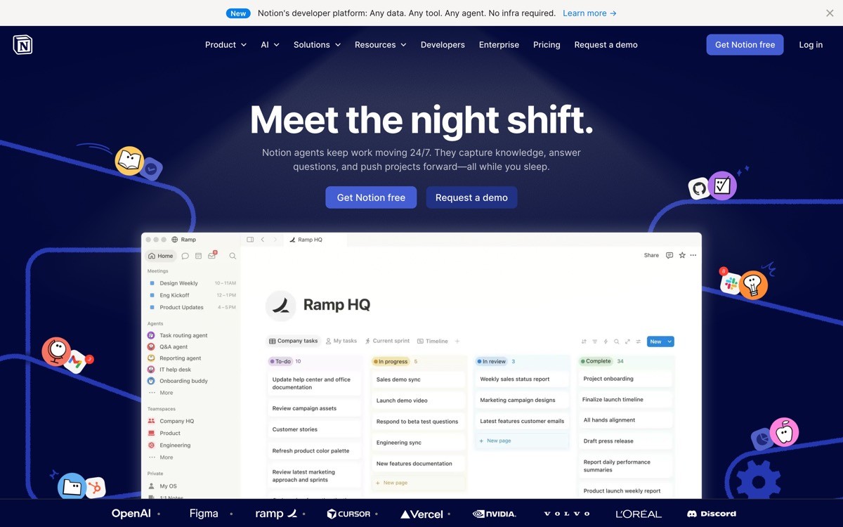
Notion is a workspace tool whose onboarding solves a problem most B2B products fumble, the transition from a single user exploring the tool to a team adopting it. The first session feels like a personal note app, with a quick template picker and AI-generated workspaces that pre-fill content based on what the user describes. Invites and team mode appear later, when the user has reasons to add others, not before.
The distinctive move is treating the solo workspace as a real product surface rather than a placeholder until billing. Notion ships meaningful templates for product specs, meeting notes, OKRs, and personal CRM, so even a single user gets value in the first session. When the team invite prompt finally appears, it is contextual and tied to a specific document, which is why the conversion to multi-seat plans is notoriously high.
Key strengths
AI workspace generation that pre-fills a structure based on a one-line description
Template gallery surfaced during onboarding, not buried in a help center
Solo workspace treated as a first-class experience, not a trial mode
Contextual team invite prompts that fire when collaboration is the obvious next step
Tutorial content embedded as editable pages, so the user learns by editing real content
Cross-platform parity across web, desktop, and mobile
Best for
SaaS founders whose product can serve both individuals and teams, where forcing a team flow too early kills activation
Product teams studying how to use AI generation to skip blank-state setup
Tools that want to delay billing prompts until the user has felt sustained value
Pricing
Free Personal plan with unlimited pages for individuals
Plus plan from around $10 per user per month for small teams
Business and Enterprise tiers with advanced permissions and audit logs
Pros
AI generation removes the blank-state problem that kills most workspace tools
Solo-to-team progression model is the cleanest in the category
Template variety makes the product feel relevant in the first ten minutes regardless of role
Cons
Surface area is large enough that some new users still feel lost after the initial flow
AI-generated workspaces can produce structure that feels generic without further editing
3. Loom, best single-action activation
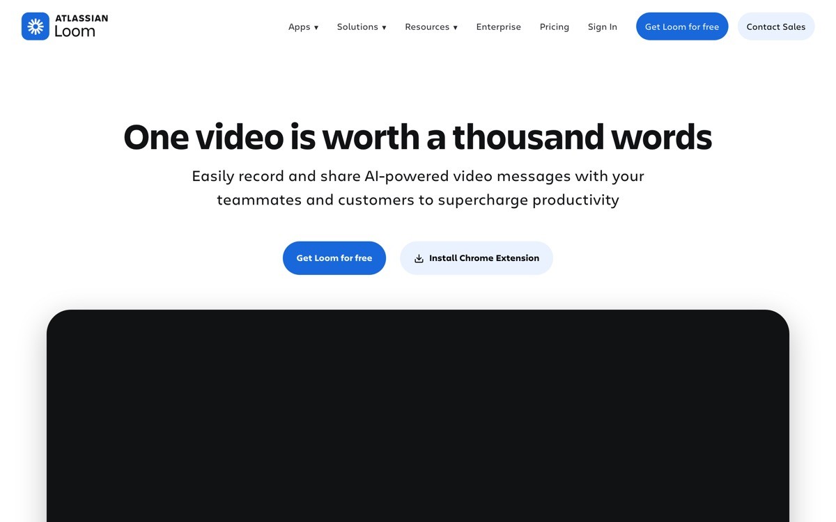
Loom is an async video tool whose onboarding is built around one truth: the activation event is recording the first video, and everything else is friction. Signup, extension install, and permissions are sequenced so that the user is recording within roughly two minutes. The product even prompts the user to make a quick test recording before any team invite, settings, or library setup appears.
The distinctive design choice is treating the first recording as the demo. There is no in-product tour, no checklist, no skippable splash. The recording UI itself is the tutorial, and the share screen after the recording is where Loom shows off the viewer experience, comments, and emoji reactions. By the time the user thinks about inviting a teammate, they have already shared a video with one.
Key strengths
Time to first artifact under two minutes, including extension install
Permissions flow designed to fail gracefully on common browser blocks
No checklist or tour overlay, the product itself is the demo
Share screen after the first recording doubles as the viral loop
Cross-platform desktop apps mirror the browser extension flow
Library and team features deferred until after the first recording is shared
Best for
SaaS where the core action is fast to perform and the artifact is the hook
Founders studying how to compress activation into a single sequence
Tools with a built-in viral loop where the shared artifact recruits the next user
Pricing
Free Starter plan with limits on video length and library size
Business plan from around $12.50 per user per month
Enterprise tier with SSO, advanced security, and custom analytics
Pros
One of the cleanest examples of activation by first artifact in B2B SaaS
Permissions and extension flow are notably better than most browser-based recording tools
The viral loop is baked into the product surface, not bolted on as a referral program
Cons
The pattern only works when the core action is genuinely fast, it does not translate to tools with multi-step setup
Teams that want a structured library experience first will find the onboarding light on organization
4. Figma, best multiplayer onboarding
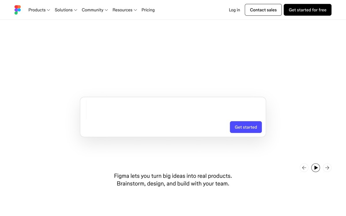
Figma is a design tool whose onboarding is one of the strongest examples of multiplayer-first product design. New users land in a file with sample content already loaded, and within the first session the product nudges them toward inviting a collaborator, because the magic of Figma is watching multiple cursors move in the same file. The invite prompt is contextual, often appearing when the user starts editing a frame or commenting.
The distinctive move is treating real-time presence as part of the onboarding payload, not a feature shown later. Figma also runs scheduled live community sessions where new users can drop into a real file with other designers, which makes the product feel inhabited from day one. For tools where collaboration is the core value, this is the clearest reference pattern in the market.
Key strengths
Sample file pre-loaded so the canvas is never empty
Contextual invite prompts tied to specific actions like commenting and editing
Live community sessions baked into the onboarding flow for new accounts
Auto-save and history visible from the first edit, removing the fear of breaking the file
Team workspace setup appears once the user has worked with at least one other person
FigJam cross-sell handled inline, not in a separate marketing surface
Best for
Founders building products where collaboration is the core differentiator
Teams studying how to design contextual invite prompts that convert
SaaS where the empty state would otherwise kill first-session value
Pricing
Free Starter plan with limits on files and collaborators
Professional plan from around $15 per editor per month
Organization and Enterprise tiers with advanced design system controls
Pros
Multiplayer onboarding is best-in-class and worth studying for any collaborative SaaS
Sample content removes the blank-canvas problem that haunts most design tools
Live sessions are an underrated activation engine that other categories rarely copy
Cons
For solo users who never invite a collaborator, the onboarding feels less tailored
Power features like variants and components are deferred until much later, which can frustrate experienced designers
5. Slack, best admin-led onboarding
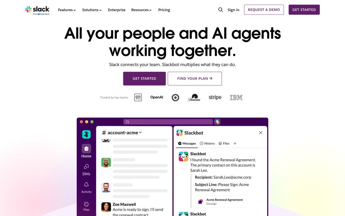
Slack is a messaging tool whose onboarding has to solve a harder problem than most, the experience differs sharply between the admin creating a workspace and the second user joining one. The admin flow guides workspace naming, channel setup, and the first invite batch, while the joining flow surfaces only the channels relevant to that user and quietly teaches the keyboard shortcuts that make the product fast.
The distinctive design choice is the asymmetry. Most B2B tools use the same onboarding for everyone, which leaves the second user with a confusing setup wizard. Slack splits the experience cleanly, and the result is one of the few tools where invited users actually stick around. Workspace defaults around notifications and channel structure are also tuned so the experience does not feel noisy on day one.
Key strengths
Distinct admin and joiner onboarding flows tuned to each role
Default notification settings tuned to avoid overwhelming new joiners
Progressive invite prompts based on workspace activity
Channel setup defaults that scale from a five-person team to a hundred-person company without restructuring
App marketplace surfaced after core messaging is established, not before
Huddles and Canvas features introduced contextually in the first week
Best for
SaaS where adoption depends on second and third users having a smooth experience, not just the buyer
Founders studying how to differentiate admin flows from joiner flows
Tools where notification defaults are part of the product, not a settings page
Pricing
Free tier with message history and integration limits
Pro plan from around $7.25 per user per month
Business Plus and Enterprise Grid tiers with compliance and SSO features
Pros
Asymmetric onboarding for admins and joiners is rare and worth copying
Notification defaults set a quiet baseline that most B2B tools get wrong
Channel structure recommendations actually help small teams set up correctly the first time
Cons
The flow is now heavy enough that initial workspace setup takes longer than newer competitors
App marketplace can feel overwhelming once it is finally surfaced
6. Superhuman, best high-touch onboarding
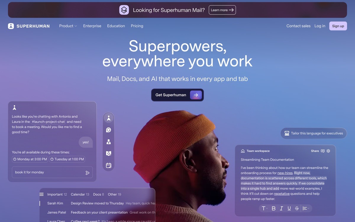
Superhuman is a premium email client whose onboarding includes a real 30-minute session with a human specialist before the user gets full product access. The session covers keyboard shortcuts, inbox triage workflow, and personal setup, and the user leaves the call already proficient. It is unusual in modern B2B, where most onboarding is fully self-serve, and it is the clearest demonstration that high-touch onboarding can still be a competitive moat.
The distinctive part is not the human, it is the pricing model that supports it. At roughly $30 per user per month with no free tier, Superhuman can fund a real specialist for every signup and still keep margins healthy. The session also doubles as a qualification step, weeding out users who would not get value and reducing churn. For founders building premium prosumer SaaS, this is the reference example for justifying a human touchpoint at scale.
Key strengths
Live 30-minute onboarding session with a Superhuman specialist before full product access
Session covers keyboard shortcuts, triage workflow, and personal inbox setup
Qualification function reduces churn by filtering out poor fit users early
Premium pricing model makes the high-touch flow economically viable
Follow-up resources tuned to the specific workflows each user adopted in the session
Mobile app onboarding mirrors the desktop workflow taught in the call
Best for
Premium prosumer SaaS where the ACV supports a real human onboarding cost
Founders studying how to use onboarding as a churn-prevention mechanism, not just an activation one
Tools where the product is genuinely faster than alternatives and the user needs to be trained to feel the difference
Pricing
Paid from around $30 per user per month, billed annually
Team plans with shared workflows and admin controls on request
No free tier, the cost structure is part of the qualification model
Pros
One of the few credible examples of high-touch onboarding in modern SaaS
Specialist call drives faster activation than any self-serve tour could achieve
Doubles as qualification, churn, and brand affinity in a single touchpoint
Cons
Only economically viable at premium price points
Specialist availability can create signup delays during growth spikes
7. Pitch, best template-driven onboarding
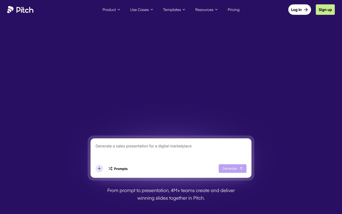
Pitch is a collaborative presentation tool whose onboarding skips the blank canvas entirely. The first screen after signup is a template gallery sorted by use case, pitch deck, sales proposal, team update, and product roadmap. Picking a template loads a fully designed deck the user can edit, and the AI assistant offers to rewrite a few slides based on a short brief.
The distinctive move is treating the blank state as a design failure. For tools where the empty canvas is intimidating, presentations, design, writing, the activation rate is usually a function of how quickly the first artifact appears. Pitch front-loads that with a template picker that feels curated rather than overwhelming, and the AI rewrite makes the deck feel personal in the first session.
Key strengths
Template gallery as the first post-signup screen, no blank canvas detour
Templates sorted by use case rather than visual style, which matches how users actually pick
AI rewrite assistant offered immediately after template selection
Team workspace setup deferred until after the first deck is created
Real-time collaboration introduced contextually when the user adds a second editor
Brand kit setup nudged in the second session, not forced upfront
Best for
SaaS in categories where the blank canvas kills activation
Founders studying how to use AI generation to make a template feel personal
Tools that need to deliver a finished-looking artifact in the first session to compete with established incumbents
Pricing
Free Starter plan with unlimited presentations and limited collaborators
Pro plan from around $20 per user per month
Business and Enterprise tiers with advanced brand controls and analytics
Pros
One of the best examples of template-first onboarding in modern SaaS
AI rewrite makes the artifact feel personal without forcing the user to write from scratch
Collaboration introduced at the right moment, not forced upfront
Cons
Heavy template reliance can mean some users never learn to build from a blank slide
Less effective for highly specialized industries where generic templates do not match the use case
How to choose the right onboarding pattern for your SaaS
1) Is your activation event a single action or a multi-step workflow?
If a single action defines value, copy the Loom pattern. Strip the flow until the user is performing that action within two minutes, and treat the artifact itself as the demo. If activation requires a multi-step workflow, study Linear, where opinionated defaults compress setup without removing power.
2) Are you onboarding individuals, teams, or both?
If both, Notion is the reference. Treat the solo experience as a real product, not a trial, and defer team invites until they are contextual. If you are admin-first like most B2B tools, study Slack's asymmetric flow so the second user does not get the buyer's setup wizard.
3) Does your category have a blank-state problem?
For presentations, design, and writing tools, the empty canvas is the biggest activation killer. Pitch and Figma both solve this with pre-loaded content, templates, or sample files. If your category has this problem, build a template gallery before you build a tour.
4) Can your pricing fund a human touchpoint?
Superhuman shows that high-touch onboarding works when ACV supports it. If your blended price is below roughly $20 per user per month, self-serve is the only viable path. Above that, a real human session can compress activation and pre-empt churn.
5) What does your second user need that your first user does not?
This is where most teams ship a broken onboarding without realizing it. The buyer fills out the wizard, the invited teammate hits a confusing welcome screen, and adoption stalls. Study Slack and Figma for how the invited user gets a different, lighter, more contextual flow.
If you have a sense of which pattern fits but the actual build keeps shipping flat, that is where a design partner earns its keep. AY Design works with founders shipping AI-built SaaS, runs onboarding audits against patterns like the ones above, and redesigns the flow with a focus on first-session activation, not just signup. Book a design audit to see which pattern your product is closest to, and what needs to change before your next launch.
FAQ
What is the best SaaS onboarding example to study in 2026?
Linear and Superhuman are the two most cited reference examples for modern SaaS onboarding in 2026. Linear is the benchmark for opinionated, keyboard-first prosumer onboarding, and Superhuman is the benchmark for premium high-touch onboarding with a live specialist session. The right reference depends on your pricing model and category.
What is a good time to first value for SaaS onboarding?
A good time to first value for B2B SaaS in 2026 is under three minutes for single-action products and under ten minutes for multi-step workflows. Loom and Linear are the cleanest references at the low end. For more configuration-heavy tools, focus on shrinking the time to the first useful artifact, not the first click.
Should I use a product tour or skip straight into the product?
Skip the product tour whenever possible. Modern onboarding examples like Linear, Loom, and Figma rely on opinionated defaults, sample content, and contextual prompts instead of tour overlays. Tours are a sign that the underlying flow needs more design work, not that the product needs more guidance.
How do I onboard the second user, not just the admin?
Build a separate onboarding flow for invited users, with lighter defaults and contextual help instead of a setup wizard. Slack and Figma are the strongest references for asymmetric onboarding. The buyer's flow optimizes for configuration, the second user's flow optimizes for first-session participation.
What is the difference between activation and onboarding?
Onboarding is the sequence of screens and prompts from signup to first action, while activation is the moment the user has experienced enough value to come back. Good onboarding compresses the time to activation. Great onboarding makes activation feel like the natural next step rather than the goal of a tutorial.
Is template-driven onboarding better than blank-state onboarding?
For categories with a strong blank-state problem like presentations, design, writing, and project management, template-driven onboarding consistently outperforms blank states. Pitch and Notion are the clearest references. Templates only fail when they are too generic for the user's actual use case.
How do I design onboarding for an AI-built SaaS without it looking templated?
Start by removing the default setup wizard generated by your AI builder. Replace it with an opinionated, single-purpose first session that produces one specific artifact, then layer settings and team features after that artifact exists. If you need a design partner, an AI-product design agency can take the AI-built shell and turn the onboarding into a flow that does not signal its origins.
Should I run onboarding research before redesigning the flow?
Yes, but keep it cheap. Record five new-user sessions, watch them in full, and note where they hesitate, scroll, or leave. Most onboarding redesigns fix the wrong screen because the team optimized the funnel they could measure instead of the moment that actually broke trust.
Checkout other Blogs:

Multi-agent system UX design guide for 2026
A pattern-by-pattern guide to designing multi-agent system UX in 2026, with a scoring matrix and references from Claude Code, LangGraph, Devin, and Replit Agent.
Author:
AY Designs Team

Human-in-the-loop AI design guide for 2026
A 2026 guide to human-in-the-loop AI design with patterns, scoring framework, and examples from Cursor, Claude Code, Stripe, and Notion AI.
Author:
AY Designs Team

How to design agentic AI products in 2026: a 7-step playbook
A seven-step design playbook for shipping agentic AI products that users actually trust, with scoring matrix and real product references from Cursor, Claude Code, Devin, and Perplexity.
Author:
AY Designs Team

How much does AI SaaS design cost in 2026?
AI SaaS design cost in 2026 by tier and engagement type, with ranges, timelines, and a value scorecard for founders shipping with Lovable, Bolt, and v0.
Author:
AY Designs Team