
AI dashboards in 2026 are a new design surface. Token usage, model selection, latency, cost-per-call, agent traces, and prompt history all need to coexist on a single screen without overwhelming the operator. The teams shipping these dashboards are inventing patterns on the fly, and most of them are figuring out the same lessons the hard way.
This guide breaks down seven AI dashboard design patterns through real examples from the dashboards operators actually use every day (Vercel, OpenAI, Anthropic, Cursor, Stripe, PostHog, Cloudflare). For each one, we cover what the pattern does well, the design moves to steal, and the common mistakes that pull AI dashboards toward chaos.
TL;DR, the seven patterns that define modern AI dashboards in 2026 are usage as the homepage metric, token cost transparency, model selector in context, agent trace timelines, prompt history as memory, log streaming with filter chips, and quota meters with predictive forecasting.
Best AI dashboard design patterns: a brief overview
Vercel: Best for usage-as-homepage dashboards that lead with the operator's primary metric.
OpenAI: Best for token cost transparency and per-model breakdowns.
Anthropic: Best for clean API key management and quota meters that age well.
Cursor: Best for in-product AI usage panels that stay out of the way.
Stripe: Best for AI-adjacent analytics dashboards with disciplined hierarchy.
PostHog: Best for AI agent trace timelines and event-led debugging.
Cloudflare: Best for AI gateway dashboards that combine cost, latency, and routing.
Example | Key pattern | Dashboard type | Pattern to steal |
|---|---|---|---|
Vercel | Usage as the homepage metric | Platform analytics | Lead with the metric that pays the bill |
OpenAI | Token cost transparency | API usage | Per-model breakdown with cost math |
Anthropic | Quota meters and key management | API console | Clear quota progress and tier signaling |
Cursor | In-product AI usage panel | In-product widget | Glanceable usage without leaving the work |
Stripe | Hierarchy in analytics density | Financial dashboard | Headline metric, then drill-down, then table |
PostHog | Agent trace timelines | Event analytics | Timeline view with step-level detail |
Cloudflare | AI gateway routing dashboard | Infrastructure | Latency, cost, model routing in one view |
1. Vercel, best for usage-as-homepage dashboards that lead with the operator's primary metric
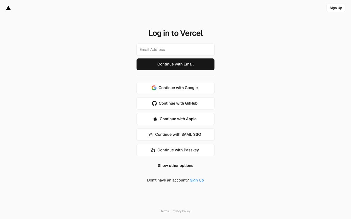
Vercel's dashboard is a platform analytics dashboard built around one principle: the homepage shows the metric the operator pays for. Bandwidth, function invocations, build minutes, and serverless usage are visible at a glance, with the current billing cycle as the default time range. The operator never has to dig to know where they are.
What makes this pattern notable for AI dashboards is the discipline of choosing a single homepage metric. Most AI dashboards default to showing everything, then ask the operator to figure out which number matters. Vercel inverts that.
Patterns to steal
Pick the metric that ties to billing and put it at the top of the homepage
Default to the current billing period as the time range
Show quota progress against the current plan inline
Use sparkline charts for trend over the period without occupying a full chart slot
Surface a single CTA when the operator approaches a usage limit
Common mistakes to avoid
Showing every metric the platform tracks on the homepage so nothing is the focal point
Defaulting to "last 7 days" when the billing cycle is monthly, forcing manual switching
Hiding quota progress behind a separate "billing" page
2. OpenAI, best for token cost transparency and per-model breakdowns
OpenAI's usage dashboard is the reference implementation for token cost transparency. Cost is broken down by model, by API key, and by day. Operators can trace exactly which model and which workload generated the spend, which is the question every AI dashboard has to answer.
The notable design move is treating the model selector as a first-class dimension. Every chart, every table, every filter respects the model breakdown. This is what most AI dashboards still get wrong by lumping all model usage into a single "API spend" line.
Patterns to steal
Cost broken down by model, by API key, and by workload
Per-model cost-per-call math visible in the table view, not buried in tooltips
Daily granularity with the ability to zoom in to hourly
Free credit balance and paid spend separated visually
CSV export available for finance teams
Common mistakes to avoid
Showing total spend without per-model breakdown
Hiding cost-per-call inside chart tooltips
Mixing free and paid credit usage in a single balance figure
3. Anthropic, best for clean API key management and quota meters that age well
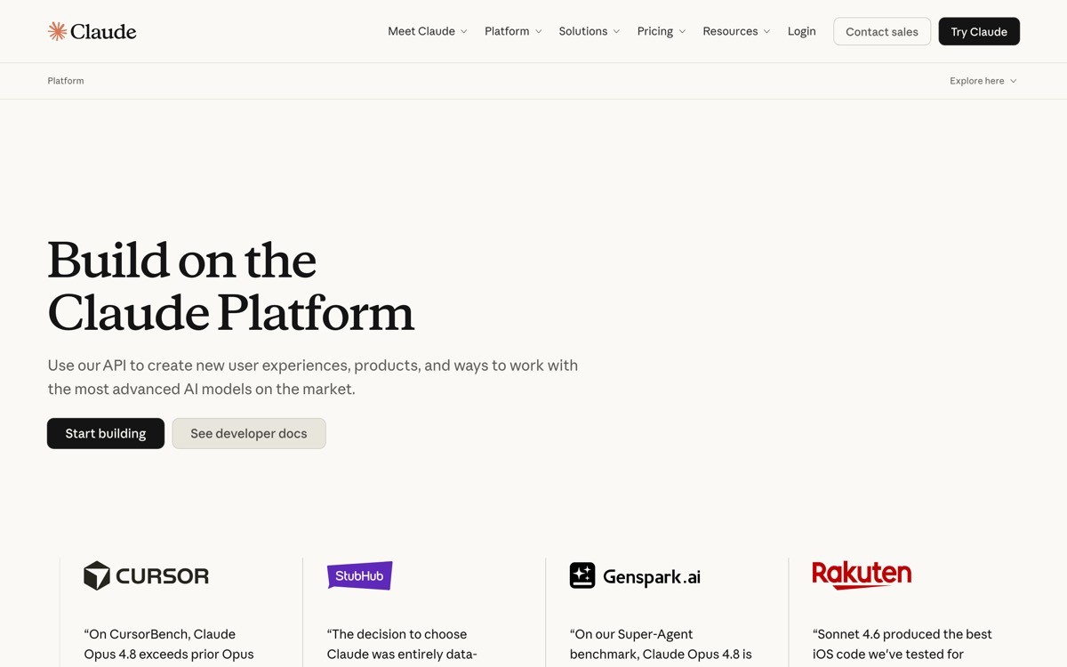
Anthropic's API console takes a quieter approach. The dashboard treats quota meters, key management, and usage as a clean utility surface, with hierarchy built around what the developer actually needs to do (create a key, see remaining quota, check current tier).
The pattern that stands out is the quota meter. It is large enough to be readable at a glance, sits at the top of the relevant page, and shows current tier alongside next-tier requirements. Most AI dashboards bury this behind a "billing" tab, forcing the developer to context switch out of the work surface.
Patterns to steal
Large, readable quota meter on the dashboard home
Current tier and next-tier requirements shown together
Clean API key management with named keys and usage scoping
Utility-first layout that does not try to be a marketing dashboard
Consistent typography hierarchy that holds up as the product grows
Common mistakes to avoid
Treating the API console like a marketing surface with hero copy
Burying quota progress behind a separate billing screen
Letting unnamed, unscoped API keys accumulate in the key list
4. Cursor, best for in-product AI usage panels that stay out of the way
Cursor's in-product AI usage panel is a different kind of dashboard. It lives inside the editor, surfaces token usage, model selection, and remaining quota at a glance, and never asks the developer to leave the work surface to check.
This pattern matters because the dominant AI dashboard surface in 2026 is no longer the standalone web console. It is the in-product panel that appears next to the actual work. Cursor sets the bar for how to do this without disrupting flow.
Patterns to steal
Glanceable usage panel inside the work surface, not a separate page
Model selector with cost and capability signaling per option
Subtle quota progress indicator near the input
Settings and billing accessible from the panel but never the focal point
Keyboard shortcuts for the most common actions
Common mistakes to avoid
Adding a full dashboard inside the product when a small panel would do
Hiding the model selector behind multiple clicks
Showing quota progress only when the user is about to hit a limit
5. Stripe, best for AI-adjacent analytics dashboards with disciplined hierarchy
Stripe's dashboard is not an AI dashboard, but it is the reference implementation for analytics density done with discipline. The pattern is consistent across every page: one headline metric, contextual drill-down charts below, then a transaction table at the bottom for granular inspection.
AI dashboards in 2026 keep reinventing this hierarchy badly. Stripe shows how to do it cleanly. The headline number answers "how are we doing right now." The chart answers "how is it trending." The table answers "what happened specifically." Operators always know where to look for the question they have.
Patterns to steal
Single headline metric at the top of every dashboard page
Contextual chart immediately below the headline, not in a separate tab
Table at the bottom for granular drill-down
Consistent layout across pages so navigation becomes muscle memory
Filter chips that persist across the page hierarchy
Common mistakes to avoid
Showing four headline metrics so none of them functions as the focal point
Putting charts on one page and tables on another, forcing context switching
Letting page-to-page layouts drift so navigation becomes inconsistent
6. PostHog, best for AI agent trace timelines and event-led debugging

PostHog's event view, applied to AI agent traces, is the pattern most AI observability tools are converging on. A timeline shows the agent's sequence of steps (tool calls, model invocations, reasoning blocks) with timestamps, latency, and cost per step. Drilling into a step expands the full prompt, response, and metadata.
This is the right pattern for debugging non-trivial AI workflows. Most early AI dashboards treated calls as flat rows in a log table, which collapses the time and causality dimensions that matter most for agent debugging.
Patterns to steal
Timeline view with one row per agent step, ordered by time
Latency and cost per step visible inline on the timeline
Click to expand a step into full prompt, response, and metadata
Filter by tool, model, or step type from chips above the timeline
Comparison view across multiple runs of the same workflow
Common mistakes to avoid
Treating agent traces as flat log rows instead of a timeline
Hiding per-step cost and latency behind tooltips
No way to compare runs of the same workflow side by side
7. Cloudflare, best for AI gateway dashboards that combine cost, latency, and routing
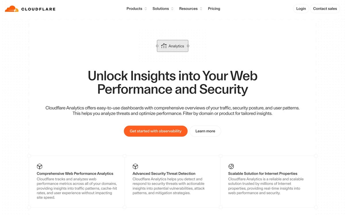
Cloudflare's AI gateway dashboard combines three dimensions most AI dashboards keep separate: cost per provider, latency per model, and request routing across providers. The result is a single view that answers the operator's actual question: which provider should we route to right now, and what is it costing us.
The pattern that stands out is treating model routing as a first-class dashboard concern. Most AI dashboards still assume the operator picks one provider and stays there. In production, AI workloads in 2026 increasingly route across providers, and the dashboard has to reflect that reality.
Patterns to steal
Provider routing visualized alongside cost and latency
Failover and fallback configuration visible from the dashboard
Per-provider quota tracking in one place
Cache hit rate as a first-class metric for AI gateway operators
Audit log of routing decisions for debugging
Common mistakes to avoid
Showing cost without latency, or latency without cost
Treating each provider as a separate dashboard tab
Hiding cache hit rate where only infra teams find it
How to apply these AI dashboard patterns to your product
1) Decide what the operator pays you to solve
Every great AI dashboard answers one primary operator question on the homepage. Decide what yours is before you design a single chart.
If the operator pays for usage, lead with the Vercel pattern.
If the operator pays for token cost, lead with the OpenAI pattern.
If the operator pays for routing intelligence, lead with the Cloudflare pattern.
If the operator pays to debug agents, lead with the PostHog pattern.
2) Pick where the dashboard lives
The dashboard is no longer always a separate web console. For developer-tool AI products, the in-product panel (Cursor) often outperforms the standalone dashboard.
If the operator works inside another tool, build a panel there.
If the operator works across multiple AI workloads, build a standalone console.
Many products need both, and the design challenge is keeping them consistent.
3) Lead with hierarchy, not density
The Stripe pattern (headline metric, contextual chart, drill-down table) holds up across AI dashboards because it matches how operators actually think (what is happening, how is it trending, what specifically caused it). Apply it to every page.
4) Make cost and quota visible without context switching
Cost and quota are the two most checked numbers on any AI dashboard. They should never live behind a "billing" tab. Vercel, Anthropic, and Cursor all show this directly in the work surface.
If you have a clear sense of the AI dashboard pattern you want to apply but need a design partner to ship a dashboard that matches the bar set by Vercel, OpenAI, or PostHog, that is what AY Design does. We help AI product teams ship dashboards that look unicorn-grade, not templated. Book a design audit to see what to fix first.
FAQ
What are the most important AI dashboard design patterns in 2026?
The most important AI dashboard design patterns in 2026 are usage as the homepage metric, token cost transparency with per-model breakdown, in-context quota meters, in-product usage panels, hierarchical analytics (headline metric, chart, table), agent trace timelines, and AI gateway routing views. Vercel, OpenAI, Anthropic, Cursor, Stripe, PostHog, and Cloudflare each set the reference for one of these patterns.
How should an AI dashboard show token cost?
An AI dashboard should show token cost broken down by model, by API key, and by workload, with cost-per-call visible inline rather than buried in tooltips. OpenAI's usage dashboard is the reference implementation, separating free credits from paid spend and offering CSV export for finance teams.
Should an AI dashboard be a standalone web app or an in-product panel?
The dominant AI dashboard surface in 2026 is increasingly the in-product panel that lives next to the work, with the standalone web console used for billing, admin, and cross-workload analytics. Cursor's in-product AI usage panel is the reference for the panel pattern, while Vercel and OpenAI show how the standalone console should look.
What is the best layout for an AI usage dashboard?
The best layout for an AI usage dashboard leads with the primary billing metric at the top, shows the trend chart immediately below, and offers a granular table at the bottom for drill-down. Stripe established this hierarchy for financial dashboards, and the best AI dashboards in 2026 apply it directly.
How should an AI dashboard handle multiple models?
An AI dashboard should treat model selection as a first-class dimension across every chart, table, and filter. OpenAI breaks down spend per model on every view, while Cloudflare extends this to routing intelligence by combining cost and latency per provider in a single dashboard.
How do I design an AI agent trace dashboard?
Design an AI agent trace dashboard as a timeline view with one row per step, latency and cost visible inline, and click-to-expand detail for the full prompt, response, and metadata. PostHog's event view applied to agent traces is the closest pattern available in 2026, and many AI observability tools are converging on this layout.
What is the biggest mistake in AI dashboard design?
The biggest mistake in AI dashboard design is showing every metric on the homepage so none of them functions as the focal point. The strongest AI dashboards pick a single primary metric (usage, cost, latency, or quota) and lead with it, with everything else available through drill-down.
How should AI dashboards show quota and rate limits?
AI dashboards should show quota and rate limits with a large, readable meter on the dashboard home, current tier and next-tier requirements together, and a clear CTA when the operator approaches the limit. Anthropic and Vercel both handle this well, while many newer AI dashboards still bury quota behind a separate billing tab.
Checkout other Blogs:

Multi-agent system UX design guide for 2026
A pattern-by-pattern guide to designing multi-agent system UX in 2026, with a scoring matrix and references from Claude Code, LangGraph, Devin, and Replit Agent.
Author:
AY Designs Team

Human-in-the-loop AI design guide for 2026
A 2026 guide to human-in-the-loop AI design with patterns, scoring framework, and examples from Cursor, Claude Code, Stripe, and Notion AI.
Author:
AY Designs Team

How to design agentic AI products in 2026: a 7-step playbook
A seven-step design playbook for shipping agentic AI products that users actually trust, with scoring matrix and real product references from Cursor, Claude Code, Devin, and Perplexity.
Author:
AY Designs Team

How much does AI SaaS design cost in 2026?
AI SaaS design cost in 2026 by tier and engagement type, with ranges, timelines, and a value scorecard for founders shipping with Lovable, Bolt, and v0.
Author:
AY Designs Team