
Most AI product dashboards in 2026 fail in the same way: they ship a generic chart grid, scatter the AI feature behind a "magic" button somewhere in the sidebar, and let the user figure out what to do with it. The output looks like every other admin panel, except the founder shows it on Demo Day and calls it a "command centre."
The dashboards worth copying do the opposite. They make the primary decision obvious within the first screen, they sequence information by user job not data type, and they treat AI suggestions as first-class UI instead of a chat sidebar bolted on. We picked seven dashboards (and AI product surfaces) to study this year, plus the patterns you can lift before your next release.
TL;DR, if you only steal one pattern in 2026, copy Vercel: clear primary action above the metrics, dense but hierarchical data underneath, and zero "magic" buttons that hide the actual control.
Best AI dashboard examples: a brief overview
Vercel: Best developer dashboard, project-first IA with clear deployment status as the hero.
Stripe: Best operational dashboard, treats revenue as the headline metric with calm density underneath.
Cursor: Best AI coding dashboard, integrates AI completions and usage into the editor surface itself.
Cloudflare: Best multi-product dashboard, handles 30+ products in one shell without a navigation collapse.
OpenAI Platform: Best AI API dashboard, model and usage data sequenced for developers.
Anthropic Console: Best AI safety-aware dashboard, clarity-first IA with usage and limits visible.
PostHog: Best analytics dashboard for AI products, AI-assisted insight generation built into the surface.
Product | Pattern that stands out | Primary user job | AI integration approach |
|---|---|---|---|
Vercel | Project-first IA, deployment status hero | Ship and monitor deployments | AI assist in logs and observability |
Stripe | Revenue hero, calm density | Track revenue and resolve issues | AI in Radar (fraud) and Billing insights |
Cursor | AI in the editor, not a sidebar | Write and edit code with AI assist | Inline completions, agent mode, tab |
Cloudflare | Multi-product shell that scales to 30+ products | Manage network, security, AI services | AI Gateway and Workers AI as first-class |
OpenAI Platform | Model-first IA, usage and limits transparent | Build and ship API integrations | Native (it is an AI API dashboard) |
Anthropic Console | Safety-aware IA, clear usage and rate limits | Test prompts, monitor usage, manage keys | Native, with prompt playground built in |
PostHog | AI-assisted insight generation, natural-language query | Analyse product usage and ship insights | Max AI as a query and insight copilot |
1. Vercel, best developer dashboard
Vercel's dashboard is the dev-tool benchmark in 2026: project-first IA, deployment status as the hero, and a calm command bar that opens with the keyboard. The buyer logs in, sees what shipped, sees what broke, and gets to the next action in two clicks.
What works is the way Vercel resists the "every metric on the home screen" temptation. The dashboard knows the user is here to ship, not to study, so it surfaces the deployment list first and tucks analytics, observability, and AI assist into clearly labelled sub-routes. The information density is high, but the hierarchy is louder.
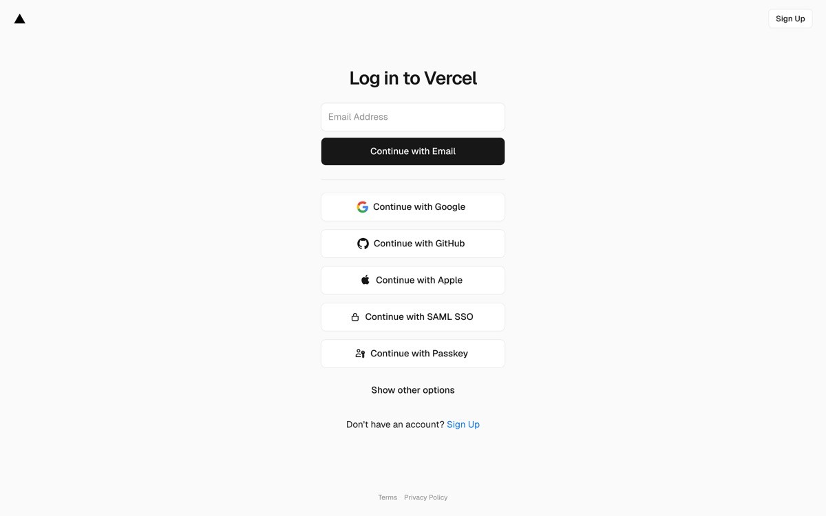
Key strengths
Project-first IA, deployment status above all metrics
Keyboard-driven command bar (Cmd+K) as a first-class interaction
Observability and AI assist layered into the data, not bolted on as separate apps
Dark and light themes both production-quality, not afterthought
Empty states designed as onboarding, not error screens
Calm typography and spacing that scales from one project to hundreds
Best for
Developer-tool SaaS where the user logs in to do a job, not to study a chart
Founders who want a dashboard that earns demo-day applause from technical buyers
Density profile
High data density, low visual noise
Status indicators (green, yellow, red) used sparingly and consistently
Navigation depth: two clicks to the most common action
Pros
The clearest "ship-first, study-second" dashboard pattern in 2026
Easy to translate to any infra, deployment, or platform SaaS
Cons
Requires deep product opinion (which actions matter most), which is harder than shipping a generic chart grid
2. Stripe, best operational dashboard
Stripe's dashboard turns a deeply complex product (payments, billing, treasury, identity, issuing) into a calm operational surface. Revenue lives in the hero. Below it, the page is segmented by the operator's job: balance, payouts, disputes, customers. Every section is dense, but the page never feels heavy because hierarchy carries it.
The design move worth stealing is the way Stripe handles AI without making it a feature. Radar (fraud) and Billing insights both surface AI suggestions inside the existing flow (dispute resolution, churn risk, invoice anomalies) instead of in a "magic" tab. The buyer never has to remember to use AI; it shows up when it is relevant.
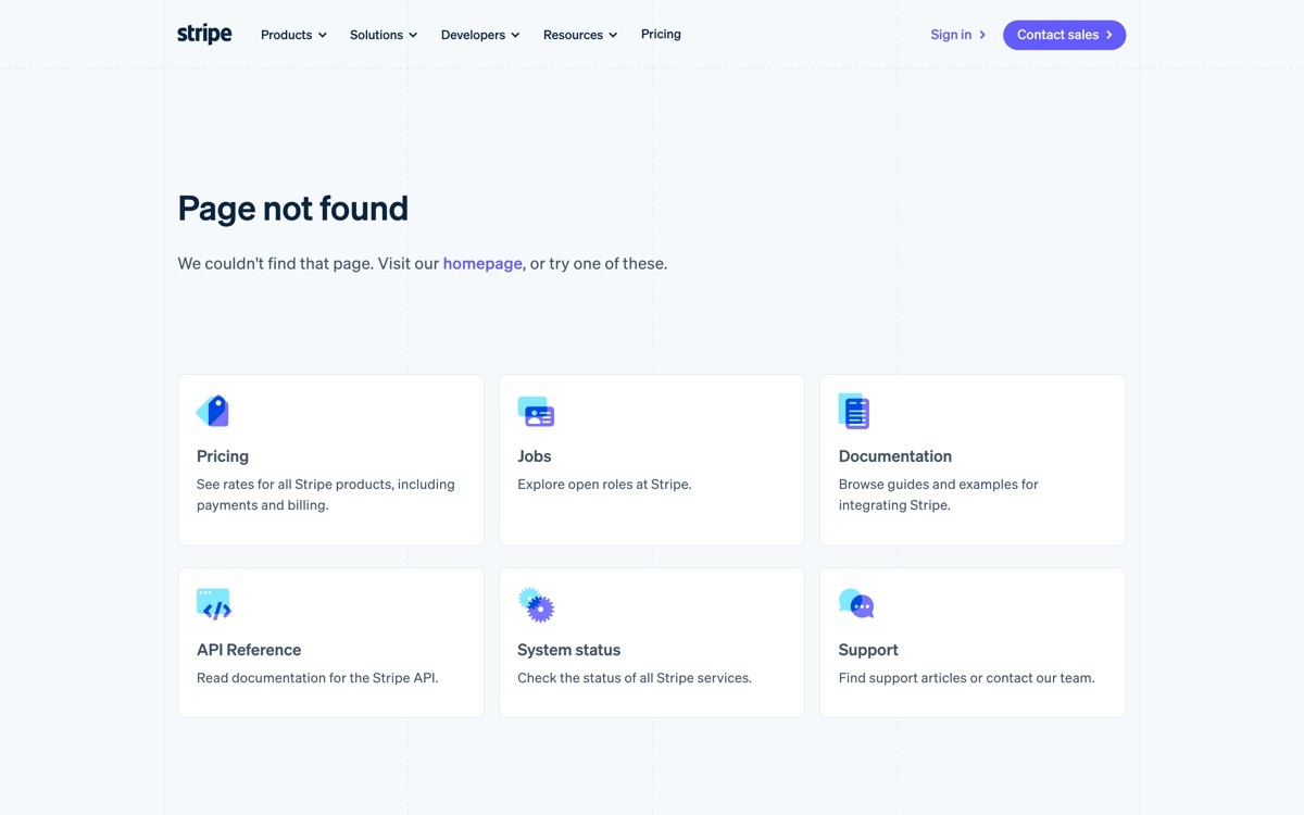
Key strengths
Revenue hero metric, sized to be the first thing the eye lands on
Job-segmented IA (balance, payouts, disputes, customers) rather than data-type IA
AI suggestions integrated inside the relevant flow, not a separate tab
Search built into the global nav, not a hidden modal
Test mode and live mode kept visibly distinct without a context-switch tax
API and dashboard share design language, no jarring transition
Best for
Operational SaaS sold to revenue, finance, and ops teams
Products with many surfaces (payments, billing, identity, etc.) under one shell
Density profile
Very high data density, almost no decorative chrome
Charts limited to where they support a decision, not for visual rhythm
Navigation depth: most actions one or two clicks from home
Pros
Sets the bar for operational SaaS density without the noise
AI-in-flow pattern is one of the highest-ROI lifts for any AI product
Cons
Hierarchy this strong requires careful product copywriting and IA work, not just visual design
3. Cursor, best AI coding dashboard
Cursor is the dashboard that is not a dashboard. The "control surface" lives inside the editor itself: AI suggestions appear inline, tab completion is the primary AI interaction, agent mode is a panel that does not steal focus, and usage shows up in a calm status bar. It is the strongest example in 2026 of treating AI as ambient rather than modal.
The design choice worth stealing: Cursor never asks the user to "open AI" or "trigger AI." The AI is present in the surface the user is already in. Most AI product dashboards still bury their AI behind a chat sidebar; Cursor's pattern shows the alternative.
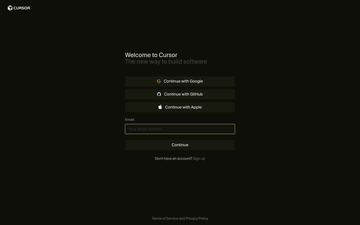
Key strengths
AI is in the editor, not a separate panel or tab
Tab completion as the primary AI interaction, low cognitive cost
Agent mode as a non-modal panel that does not steal focus
Usage and rate limits in a calm status bar, not a popup
Settings and project management kept lightweight, never the main job
Keyboard-first interaction at every layer
Best for
AI products where the user's primary workflow is an existing surface (editor, doc, sheet)
Founders building "AI inside the work" rather than "AI as a separate app"
Density profile
Editor surface is the dashboard, density driven by the file the user is in
AI surfaces (chat, agent) are sized to the task, never full-screen unless requested
Navigation depth: zero clicks for the primary AI action (just type)
Pros
The clearest "ambient AI" pattern in 2026 product design
Reframes "AI dashboard" as "AI in the surface you are already in"
Cons
Only works if the user's primary surface is already strong, do not copy if your core UI is weak
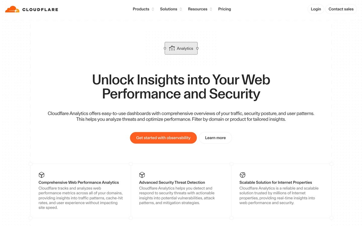
4. Cloudflare, best multi-product dashboard
Cloudflare's dashboard has the hardest IA job in 2026: 30+ products (Workers, R2, D1, Pages, Workers AI, AI Gateway, Stream, Images, Zero Trust, and on) under one shell. The way they pull it off is a left-nav grouped by job (DNS, security, developer platform, AI, analytics), a contextual top nav that swaps based on product, and a global search and command bar that bridges all of them.
What is worth lifting: Cloudflare elevates new AI products (Workers AI, AI Gateway) into their own top-level group, instead of hiding them under "Developer Platform." That gives AI revenue surface area without breaking IA for existing customers.
Key strengths
Job-grouped left nav (DNS, security, platform, AI, analytics) that scales to 30+ products
Contextual top nav that swaps per product without disorienting the user
Global search and command bar that crosses product boundaries
AI products elevated into their own group, not hidden in a sub-route
Account and zone hierarchy made visible without being noisy
Consistent design language across vastly different product surfaces
Best for
Multi-product SaaS where the buyer crosses product boundaries in a single session
Platforms layering AI products on top of an existing infrastructure base
Density profile
High product density, controlled by grouping and contextual nav
Per-product surfaces tuned to each product's primary job
Navigation depth: two clicks to most products, one click via global search
Pros
One of the cleanest "shell for 30 products" patterns in 2026
Demonstrates how to elevate AI revenue without breaking existing IA
Cons
Pattern is hard to apply at smaller scale, simpler products do not need this much navigation
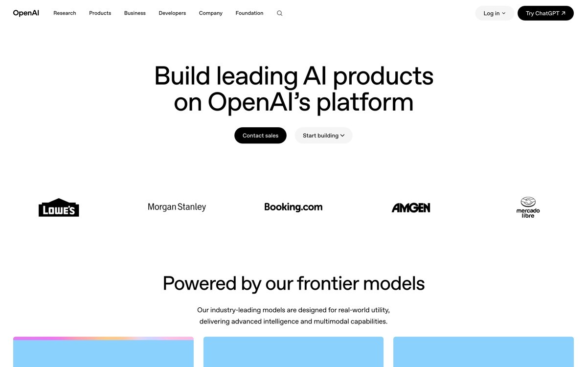
5. OpenAI Platform, best AI API dashboard
OpenAI Platform is the dashboard most AI startups will end up modelling theirs after, because it answers a question every API-first AI company has: how do you sequence model selection, usage, billing, prompt playground, and fine-tuning in one shell without overwhelming the developer?
The answer in 2026: model-first IA. The developer lands on a clear model selector, usage and rate limits are visible without a click, billing lives one click away, and the playground is a first-class surface for testing. AI-specific affordances (prompt history, model comparison, structured output preview) are built in rather than bolted on.
Key strengths
Model-first IA, the unit the developer thinks in
Usage and rate limits visible without a click, no surprise billing
Playground as a first-class surface, not a sub-route
Prompt history and model comparison built in, not third-party tools
Structured output preview that handles JSON gracefully
Calm spend caps and alert configuration, no scare tactics
Best for
AI API and platform products sold to developers
Founders building "the API dashboard" for any model-driven product
Density profile
Medium density, optimised for testing and shipping
Usage charts limited to where they support a billing or scale decision
Navigation depth: one click to playground, one click to usage
Pros
Sets the bar for AI API dashboards in 2026
Strong template for any model-driven product
Cons
Pattern assumes a developer buyer, do not copy for non-technical AI tools
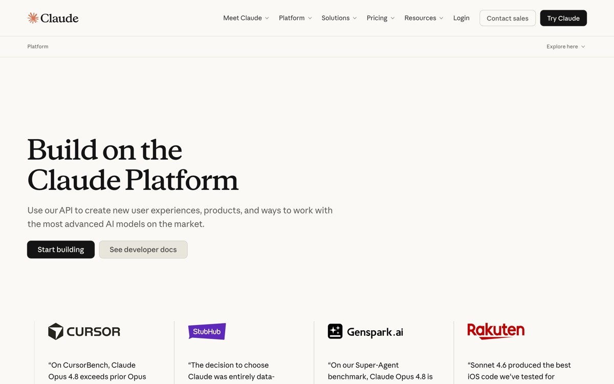
6. Anthropic Console, best AI safety-aware dashboard
Anthropic Console takes the OpenAI Platform pattern (model-first IA, playground front and centre) and layers it with calmer typography and clearer safety affordances. Usage limits, system-prompt defaults, and rate-limit context are visible without modal overload. The console feels like an engineering tool, not a marketing site.
What is worth lifting in 2026 is the console's restraint around new feature rollouts. New models, tool use, and structured output are introduced inside the existing IA rather than as a "new" tab. The buyer never has to relearn the surface to use the latest capability.
Key strengths
Model-first IA with calm typography and clear hierarchy
Playground and system prompt editor as first-class surfaces
Rate limits and usage visible without modal overload
New capabilities introduced inside existing IA, not as new tabs
API key management lightweight and clear
Spend caps and usage alerts surfaced without panic design
Best for
AI API and platform products sold to enterprise and regulated buyers
Founders who want their console to read as "engineering tool" not "marketing site"
Density profile
Medium density, optimised for prompt iteration and key management
Charts limited to billing and usage decisions
Navigation depth: one click to playground, one click to usage
Pros
Strong template for enterprise-friendly AI consoles
Demonstrates how to introduce new capabilities without breaking IA
Cons
Restraint requires strong product opinion, not just visual design
7. PostHog, best analytics dashboard for AI products
PostHog has spent the last two years rebuilding around AI as a query and insight copilot (Max). The dashboard is dense, but the AI integration is the thing to study: natural-language queries generate SQL, AI-suggested insights show up in the existing dashboard surface, and the user can accept, refine, or reject suggestions without leaving their flow.
The pattern worth lifting in 2026: AI suggestions are inline. The user is in a dashboard, an AI tip surfaces next to the chart it relates to, and there is a clear action (accept, refine, dismiss). This is the opposite of "open a chat sidebar to talk to your data," and it converts much higher because it respects the user's current attention.

Key strengths
Natural-language queries that compile to real SQL the user can edit
AI-suggested insights surfaced inline, next to the chart they relate to
Clear accept, refine, dismiss actions on every AI suggestion
Multi-product dashboard (product analytics, session replay, experiments) under one shell
Dashboard density tunable per user, not forced
Open-source heritage shows in the depth of configuration available
Best for
Analytics, observability, and BI products integrating AI as a copilot
Founders building "AI inside an analytics surface" rather than "AI chat about data"
Density profile
High data density by default, tunable per user
AI suggestions are sized to one card, not a full sidebar
Navigation depth: two clicks to most insights, one click via Max query
Pros
Strong template for AI-as-copilot inside analytics
Demonstrates inline AI as a higher-conversion pattern than a chat sidebar
Cons
Density profile can overwhelm first-time users, requires good onboarding
How to choose the right AI dashboard pattern for your product
1) Is AI the product, or AI is a feature inside the product?
If AI is the product (OpenAI Platform, Anthropic Console, Cursor), build a dashboard where AI affordances are first-class: model selector, playground, usage, prompts. If AI is a feature inside another product (Stripe Radar, Vercel observability, PostHog Max), make AI ambient: inline suggestions, in-flow nudges, no separate "AI" tab.
2) What is the primary job your buyer logs in to do?
Designs that survive scale answer this in plain language. Vercel: ship and monitor deployments. Stripe: track revenue and resolve issues. Cursor: write and edit code. Once the primary job is named, the IA writes itself: the primary job is the hero, everything else is a sub-route.
3) Single product or multi-product shell?
If you ship one product, copy Vercel or Stripe: deep IA, no top-level grouping, search built in. If you ship five or more products (or you will within a year), copy Cloudflare: job-grouped left nav, contextual top nav, global command bar. The wrong shell at the wrong scale is the single most common reason dashboards collapse at series B.
4) Should AI suggestions be inline or modal?
Inline is the higher-converting pattern in 2026 (PostHog Max, Stripe Radar, Cursor's tab). Modal AI (chat sidebars, magic buttons) underperforms because it forces a context switch. Default to inline. Only use a modal AI surface when the task itself is generative (drafting a long doc, summarising a meeting).
If you have picked your pattern but the dashboard still feels templated, the bottleneck is usually density, hierarchy, and the way AI is integrated. AY Design redesigns AI product dashboards for founders shipping with Lovable, Bolt, v0, and Cursor outputs who want their command surface to look unicorn-grade, not admin-panel. Book a design audit and we will tell you which pattern fits your buyer, and which parts of your current shell to rip out first.
FAQ
What makes a good AI dashboard in 2026?
A good AI dashboard in 2026 names the user's primary job in the IA, surfaces AI affordances inline rather than in a chat sidebar, and treats density as a hierarchy problem instead of a chart-grid problem. It avoids "magic" buttons, generic admin templates, and AI features that feel bolted on to an existing surface.
Which AI startup has the best dashboard?
For developer-facing AI APIs, OpenAI Platform and Anthropic Console set the bar in 2026. For AI inside a developer surface, Cursor and Vercel are the strongest examples. For AI as a copilot inside analytics, PostHog Max is the clearest template. The "best" depends on whether AI is your product or a feature.
Should AI features live in a chat sidebar?
Usually no. Inline AI suggestions (next to the chart, in the editor, in the existing flow) outperform chat sidebars on engagement and conversion. Chat sidebars work for generative tasks (drafting, summarising) where the output is long-form. For everything else, the inline pattern wins because it does not force a context switch.
How dense should an AI dashboard be?
Dense enough to support the user's job without forcing scroll, but not so dense that the primary action is buried. Stripe, Vercel, and Cloudflare all run high-density dashboards, but they protect hierarchy ruthlessly: the primary action is sized larger, coloured differently, and positioned higher than everything else. Density without hierarchy is noise.
Should usage and billing be visible from the home screen?
Yes, for AI API and platform products. OpenAI Platform, Anthropic Console, and Vercel all surface usage and limits without requiring a click. Hiding usage causes surprise billing, which is the single most common reason developers churn from AI APIs. Calm usage transparency is a retention move, not a marketing move.
How should I integrate AI into an existing SaaS dashboard?
Pick the user's primary job, then layer AI suggestions inside that flow. Stripe Radar surfaces AI-detected fraud inside the dispute resolution flow; PostHog Max surfaces AI insights next to existing charts; Cursor surfaces AI completions inside the editor. Do not add an "AI" tab. Layer AI into the surfaces the user already uses.
What is the most common AI dashboard mistake in 2026?
The most common mistake is shipping a "magic" button or chat sidebar that requires the user to remember to use AI. The AI either gets ignored or feels disconnected from the actual workflow. The fix is ambient AI: inline suggestions, in-flow nudges, and AI affordances inside surfaces the user already touches.
Do AI dashboards need dark mode?
For developer-facing AI dashboards, yes. Dev buyers expect both light and dark themes as production-quality, not afterthought. For operational AI dashboards (sold to finance, sales, ops), light mode is the default and dark mode is optional. Mismatching theme expectations to buyer profile is a small but real conversion drag.
Checkout other Blogs:

AI workflow UX design patterns shaping 2026
Eight AI workflow UX design patterns shaping 2026, scored on usability and trust, with real references from Cursor, v0, ChatGPT, Granola, and Anthropic's Claude SDK.
Author:
AY Designs Team

Best AI coding agent UX examples in 2026
Seven AI coding agents setting the UX bar in 2026, with the diff, plan, and trust patterns to lift for your own agent product.
Author:
AY Designs Team

Best AI customer support agent UX examples 2026
Seven AI customer support agents setting the UX bar in 2026, with the handoff, confidence, and resolution patterns to lift.
Author:
AY Designs Team

Best AI agent interface design examples in 2026
A scored comparison of the strongest AI agent interfaces in 2026, from Claude Code and Cursor to Devin, Perplexity, and Granola, judged on tool clarity, memory, trust, and recovery.
Author:
AY Designs Team