
Most AI SaaS brands in 2026 look like the same Figma file. Same purple-to-blue gradient, same Inter typeface, same vague "intelligence" tagline, same glowing orb in the hero. When every product looks the same, brand stops being a moat and starts being a tax. Buyers cannot tell two tools apart, and ChatGPT, Perplexity, and Google AI Overviews start lumping them into one paragraph in their answers.
The AI SaaS brands worth studying are the ones that picked a side. Calm versus loud. Editorial versus playful. Black-and-white versus saturated. Each one has a clear visual point of view that survives a logo, a homepage, a dashboard, a swag bag, and a screenshot lifted onto Twitter. Here are seven brand systems doing real work in 2026, and the design moves you can lift into your own identity.
TL;DR, if you only steal one move, copy Anthropic or Linear: pick one typographic voice, one color discipline, and one tone of voice, then commit so hard that a screenshot of any single surface is instantly recognisable as yours.
Best AI SaaS branding examples: a brief overview
Anthropic Claude: Best calm, research-led brand, sets the tone for trust-first AI.
OpenAI: Best mass-market neutral brand, treats restraint as a feature.
Linear: Best product-led brand system, identity and UI are the same artifact.
Vercel: Best developer-tool brand, black-on-white with one sharp accent.
Cursor: Best AI dev-tool brand, leans on real editor surface as identity.
Lovable: Best playful AI brand, warmth and personality without losing seriousness.
Perplexity: Best AI search brand, treats the search bar as the logo.
Brand | Visual signature | Tone | Brand move to steal |
|---|---|---|---|
Anthropic Claude | Editorial typography, warm neutrals | Calm, careful, research-led | Treat safety and craft as brand assets |
OpenAI | Black, white, monospace accents | Neutral, technical, broad | Restraint as the brand position |
Linear | Sharp UI, gradient orbs, mono type | Product-led, opinionated | Make the product UI the brand |
Vercel | Black on white, geometric mark | Engineer-respectful, fast | One sharp accent across surfaces |
Cursor | Dark editor screens, mono headlines | Pro-developer, no fluff | Editor surface as primary brand image |
Lovable | Warm pinks, soft type, friendly motion | Playful, human, encouraging | Personality through micro-copy and color |
Perplexity | Teal accent, square serif wordmark | Curious, precise, citation-first | Make the primary action the brand mark |
1. Anthropic Claude, best calm, research-led AI brand
Anthropic is the clearest example in 2026 of a brand system that uses restraint as a positioning move. The wordmark is a single typographic treatment with a custom geometric "A," the color palette is warm neutrals (cream, clay, ink), and the type system pairs a literary serif with a clean sans for UI. The result reads more like a research institute than a SaaS company, which is exactly the point: Claude is sold into regulated and enterprise buyers who associate visual hype with hallucination risk.
What is notable in 2026 is how far the brand stretches across surfaces. The marketing site, the Claude product UI, the API console, and the research papers all share the same typographic voice. Internal model cards look like the homepage, which looks like a printed report. That consistency is itself the trust signal.

Key strengths
Custom serif and sans pairing that signals editorial seriousness
Warm neutral palette (cream, clay, ink) that avoids the AI-gradient cliche
Identity stretches across marketing, product UI, API console, and research
Restraint applied consistently, no surface contradicts the brand voice
Trust signals (safety, research) embedded in the typography, not in badges
Best for
AI products sold to enterprise, regulated, or risk-averse buyers
Brands that want to lead with credibility, not capability claims
Brand patterns to lift
Use a serif voice for headlines if everyone in your category uses Inter
Replace AI-gradient hero art with one calm, branded surface
Carry the brand voice into model cards, docs, and internal pages
Common mistakes founders make in this area
Copying Anthropic's restraint without the typographic craft, which produces a brand that reads bland, not calm
Treating "calm" as one homepage choice instead of a system that applies to every surface
Cons of this approach
Requires real typography and brand design budget to execute, hard to template
2. OpenAI, best mass-market neutral AI brand
OpenAI is the most-seen brand in AI software, and the identity is built to disappear. The logo is a quiet flower mark, the type is plain, the palette is black on white with the occasional system color, and the marketing tone is descriptive rather than persuasive. The brand strategy is to be the default option for the broadest possible buyer pool, which means the identity cannot signal "for developers" or "for enterprises" or "for creators," it has to feel safe for all three.
What is notable in 2026 is how OpenAI uses restraint as a competitive moat. The ChatGPT brand sub-system is even quieter than the parent: black, white, monospace numerals, no decorative motion. Most challengers brand louder to differentiate, which makes OpenAI's calm read as authority by contrast.
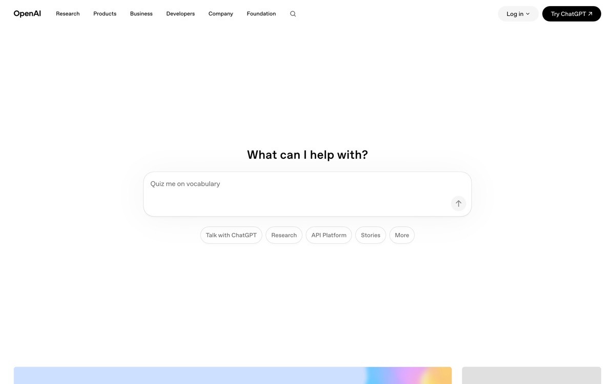
Key strengths
Logo and wordmark engineered to disappear behind the product
Type system carries the whole brand, no decorative ornament needed
ChatGPT sub-brand is even quieter than the parent, layered identity that scales
Mass-market neutrality, no signal that pushes any buyer away
Consistency across web, native app, voice surface, and physical events
Best for
Mass-market AI tools with consumer, team, and enterprise buyers in one funnel
Brands that win on familiarity, not on visual differentiation
Brand patterns to lift
Use black, white, and a single monospace accent if you want to feel technical and broad at once
Design a sub-brand for your flagship product that is quieter than the parent
Lean on familiarity as a trust signal once you have any
Common mistakes founders make in this area
Mistaking "neutral" for "no opinion," which produces a brand that has no recall
Stripping color and ornament without strengthening the type system underneath
Cons of this approach
Hard to execute without brand recognition already in the bank, the neutrality reads as boring instead of authoritative
3. Linear, best product-led brand system
Linear is the clearest example in 2026 of a brand where the product UI and the marketing identity are the same artifact. The marketing site uses the same dark palette, the same gradient orbs, the same precise typography, and the same micro-interactions as the in-app experience. A screenshot from the product can live in a press kit without retouching, and a frame from the marketing site looks like it could be a real screen.
What is notable is how Linear extends this discipline into every surface: the changelog, the blog, the careers page, and the merch all share the same visual grammar. The brand is the product, and the product is the brand, which is a strategy that only works if both teams report to the same opinion. Most AI SaaS startups split brand and product, which is why their marketing site never looks like the app.
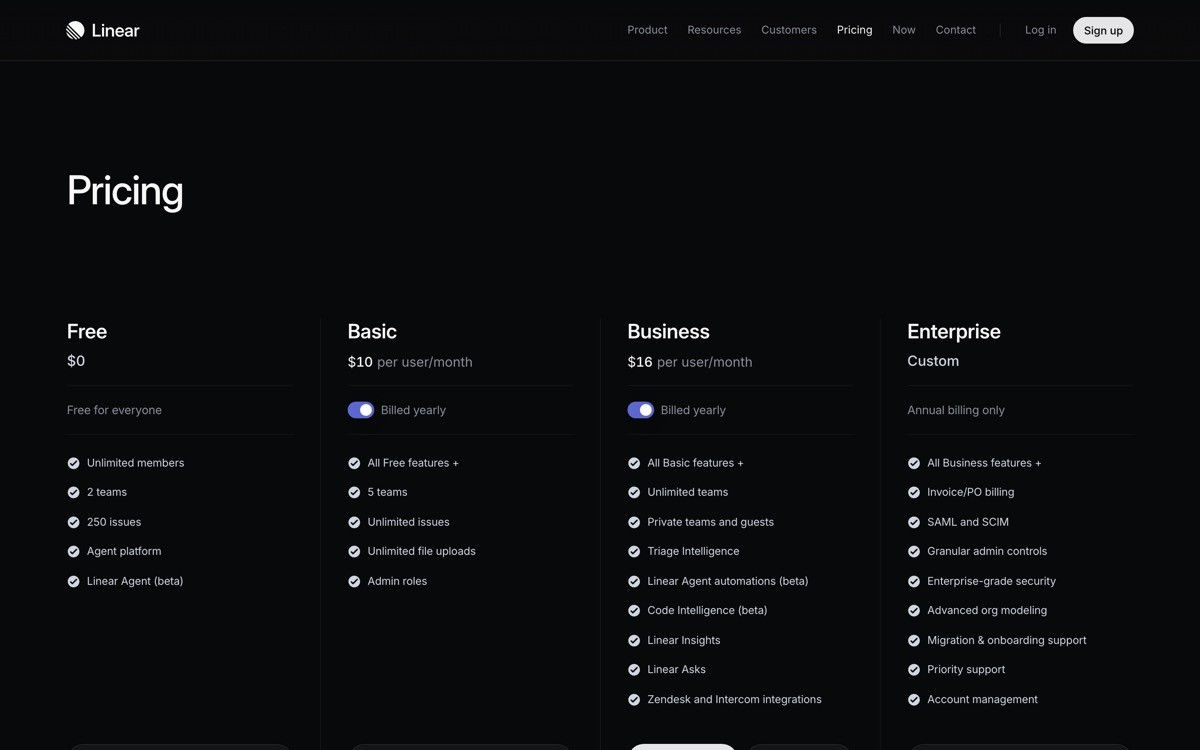
Key strengths
Marketing site and product UI use one shared design language
Gradient orb motif acts as a recognisable brand signature without becoming a cliche
Dark palette executed with restraint, not the typical "dark mode means dramatic" trap
Typography that scales from CTA button to changelog post without breaking
Every surface (blog, careers, merch, changelog) reads as the same product
Best for
Product-led SaaS where the in-app experience is the strongest sales argument
Teams that can keep brand and product design under one creative direction
Brand patterns to lift
Use the product UI as the primary brand image, not a marketing illustration
Pick one signature visual element (Linear's orb, your equivalent) and use it everywhere
Audit changelog, blog, and careers pages to make sure they look like the product
Common mistakes founders make in this area
Building a polished marketing site and a templated product, leaving a visible seam between brand and app
Picking a signature visual element and then abandoning it after one campaign
Cons of this approach
Demands a strong product UI to lead with, brands without one cannot fake their way through this strategy
4. Vercel, best developer-tool brand
Vercel's brand is a masterclass in how to feel premium with black, white, and one accent. The wordmark is a sharp geometric triangle, the type system is mono and sans paired with care, and the color discipline is monochrome with a single high-saturation accent used sparingly. Every surface, from the marketing site to the dashboard to the conference brand to the merch, follows the same rules.
What is notable in 2026 is how Vercel treats motion and density as brand signals. The dashboard is dense without feeling crowded, the marketing site loads fast and animates with restraint, and the brand voice in copy is engineer-to-engineer. There is no marketing fluff in the product, and no product complexity dumped into marketing, which gives the whole brand a coherent personality.
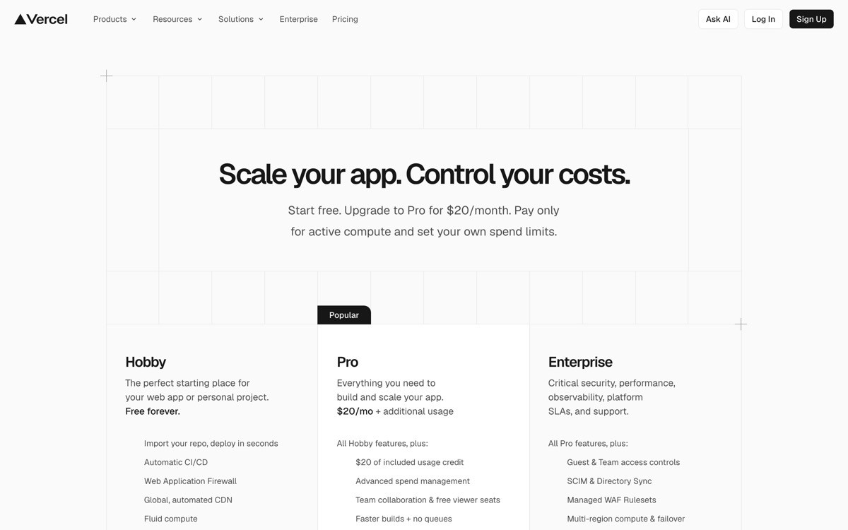
Key strengths
Monochrome palette with one disciplined accent that survives every surface
Geometric wordmark that scales from favicon to event signage
Engineer-respectful copy voice consistent from docs to landing pages
Dense dashboard UI that still feels designed, not just functional
Conference and event brand that extends the digital identity into physical space
Best for
Developer tools and infrastructure SaaS aimed at technical buyers
Brands that need to feel premium without using color as a crutch
Brand patterns to lift
Start with black and white, add one accent only when it carries meaning
Pair a sans with a monospace for headings and code, skip the third typeface
Use density as a brand signal for technical buyers, not a problem to solve
Common mistakes founders make in this area
Adding a second and third accent color "for hierarchy," which dilutes the discipline that makes monochrome work
Using a monospace typeface decoratively without designing the code experience to match
Cons of this approach
Risk of blending into the category, several dev-tool brands now look like Vercel-lite
5. Cursor, best AI dev-tool brand
Cursor's brand is built around one image: the editor. The wordmark is a clean geometric mark, the palette is dark with a subtle accent, and the type is a precise sans that reads at the same size as the code inside the IDE. The brand strategy is to make the product surface the primary asset, so the marketing site, the social posts, the documentation, and the event signage all lead with the editor in some form.
What is notable in 2026 is how Cursor uses the absence of marketing illustration as a brand position. There is no abstract "AI in code" art, no glowing orb, no hand drawn diagram. The brand tells you the product is the pitch by refusing to put anything in front of it. Every other AI coding tool now copies this, which is itself a sign of how strong the identity is.
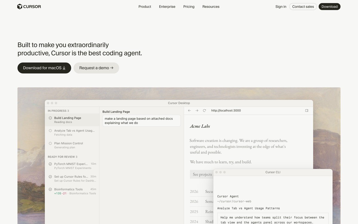
Key strengths
Editor surface used as the dominant brand image across every channel
Restrained palette and type system designed to disappear behind the product
Brand voice that matches the buyer (technical, sceptical, results-driven)
Consistent treatment of code samples and screenshots, sets a clear template
No abstract AI illustration, the absence is the position
Best for
AI tools where the buyer needs to see the actual product surface to trust it
Developer-tool brands that want to compete on craft instead of marketing volume
Brand patterns to lift
Replace abstract AI hero art with a real product screen or short editor loop
Pick one product screen as the canonical "press image" and use it everywhere
Keep the brand palette quiet so the product surface can carry the color story
Common mistakes founders make in this area
Copying Cursor's product-first hero without a product surface strong enough to lead with
Trying to keep "marketing flair" alongside the product screen, which weakens both
Cons of this approach
Brand strength is tied to the product UI, weak UI drags the whole brand down
6. Lovable, best playful AI brand
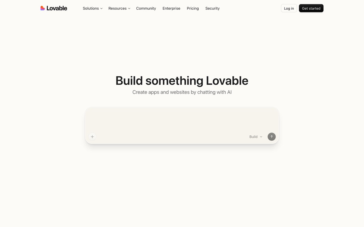
Lovable is the strongest example in 2026 of a brand that treats warmth as a competitive advantage. Where most AI tools are cold, technical, and neutral, Lovable leans into pink, soft type, friendly micro-copy, and approachable motion. The wordmark feels rounded and human, and the product copy ("Build something Lovable") names the emotion the product is meant to produce, not the technology.
What is notable is how the warmth scales across surfaces without becoming twee. The pricing page, the docs, the changelog, and the empty states all carry the same friendly voice, but the warmth never gets in the way of clarity. That is the hard part: most brands that try "playful" sacrifice information density, while Lovable holds both. It is a useful template for any AI tool sold to non-technical founders who associate enterprise software with stress.
Key strengths
Warm palette that differentiates the brand in a sea of blue and purple AI tools
Friendly micro-copy that names the buyer's emotional outcome, not the technology
Rounded type and soft motion calibrated for non-technical founders
Empty states, error messages, and changelogs all carry the same brand voice
Brand warmth survives the move from marketing to product without becoming twee
Best for
AI tools sold to non-technical founders, indie makers, and creative buyers
Products competing in a category where every competitor brands cold and technical
Brand patterns to lift
Pick a warm accent color if your category is dominated by cool tones
Write empty states and error states in the same voice as the homepage
Name your product behaviour in emotional language ("build something Lovable"), not technical language
Common mistakes founders make in this area
Confusing "playful" with "unserious," which makes the brand feel like a toy in front of paying buyers
Adding warmth to the marketing site but leaving the product UI cold, breaking the brand promise
Cons of this approach
Warm, playful brands are harder to sell into conservative enterprise buyers
7. Perplexity, best AI search brand
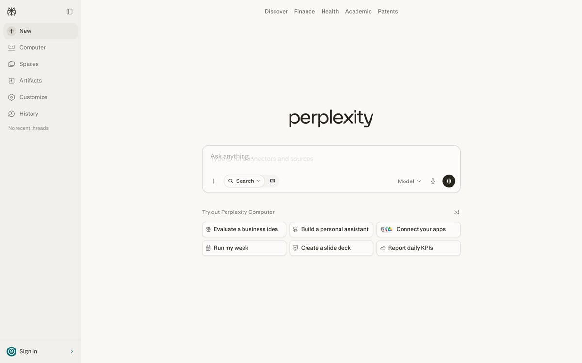
Perplexity's brand is built around a single object: the search bar. The wordmark uses a square slab-serif treatment, the accent color is a confident teal, and the entire identity is engineered so that the search input itself is the most recognisable surface. The marketing site, the iOS app, the desktop client, and even the partner-API documentation all put that input at the center, so the brand is literally the product's primary action.
What is notable in 2026 is how Perplexity uses citation chips as a brand pattern. Source pills appear under every answer, in the marketing screenshots, on the merch, and in the brand illustrations. They are simultaneously a UI element, a trust signal, and a brand signature. That is a rare three-for-one in identity design, and it gives Perplexity a visual asset competitors cannot copy without admitting they are not citation-first.
Key strengths
Search bar treated as the primary brand image, not a UI component
Citation chips work as UI, trust signal, and brand signature at once
Slab-serif wordmark gives the brand a distinctive print-publication feel
Teal accent stays consistent across web, iOS, desktop, and partner surfaces
Brand voice that matches the product behaviour: curious, precise, sourced
Best for
AI products where one primary action carries the entire pitch
Brands competing on a specific differentiator like citations, sources, or structured output
Brand patterns to lift
Pick your single primary action and elevate it to brand asset status
Use a UI element that demonstrates your differentiator as a recurring brand motif
Choose a wordmark style that signals editorial seriousness if your category is search or knowledge
Common mistakes founders make in this area
Picking a brand color so close to a competitor's (blue, purple) that the identity blurs at thumbnail size
Treating brand assets as separate from product UI, which means screenshots never feel on-brand
Cons of this approach
Single-action branding is brittle, if the product evolves beyond one primary action the brand has to evolve with it
How to choose the right AI SaaS branding direction for your product
1) Who is your buyer, and what do they associate with "AI"?
Enterprise and regulated buyers associate AI with risk, so the brand needs to read calm and credible (Anthropic, OpenAI). Developer buyers associate AI with hype, so the brand needs to feel technical and product-led (Cursor, Vercel, Linear). Non-technical and creator buyers associate AI with stress, so the brand can lean warm and human (Lovable). Pick the buyer first, then the brand temperature.
2) Is your product surface strong enough to lead the brand?
If yes (Linear, Cursor, Granola-style product UI), make the product the primary brand image. The marketing site, the press kit, the screenshots all lead with real UI. If no, lean on a typographic or color system (Anthropic, OpenAI, Vercel) until the product catches up. Trying to lead with a weak product surface is the fastest way to make the brand feel templated.
3) Do you have brand recognition or do you need to earn it?
OpenAI and Anthropic can afford to brand quietly because the name does the work. New AI SaaS brands need a sharper visual hook (Lovable's warmth, Perplexity's slab serif, Vercel's monochrome plus accent) to be recognisable in a category where everyone defaults to the same defaults. Calibrate the brand boldness to the recognition you actually have.
4) Can the brand survive a screenshot test?
Take any single screen, marketing or product, and put it next to a screen from your competitor with the logo cropped out. If a buyer cannot tell which is which, the brand is not differentiated enough to do real work. The strongest brands in this list (Linear, Anthropic, Lovable, Perplexity) all pass the screenshot test on the first frame. The weaker AI brands fail it in their first three sections.
If you have picked your visual direction but the brand still feels templated, the fix is rarely a new logo. It is typography, color discipline, real product art, and a brand voice that matches the buyer you actually serve. AY Design rebuilds AI SaaS brand systems for founders shipping with Lovable, Bolt, v0, and Cursor who need their product to look unicorn-grade, not AI-built. Book a design audit and we will show you which of these patterns fits your buyer and what to fix first.
FAQ
What makes a good AI SaaS brand in 2026?
A good AI SaaS brand in 2026 picks a clear visual point of view, executes it across every surface, and passes the screenshot test against the rest of the category. The strongest brands (Anthropic, Linear, Vercel, Lovable, Perplexity) commit to one typographic voice, one color discipline, and one tone of voice instead of mixing five trends together. Restraint and consistency beat novelty almost every time.
Which AI startup has the best branding?
For enterprise and trust-led positioning, Anthropic has the strongest brand because the calm, research-led identity directly supports the buyer's risk concerns. For product-led SaaS, Linear sets the bar because the marketing site and the product UI share one design language. For warm, founder-focused AI tools, Lovable's playful identity is the clearest 2026 example. The "best" depends on the buyer.
Why do most AI SaaS brands look the same?
Most AI SaaS brands look the same because they all default to the same defaults: Inter, a purple-to-blue gradient, a glowing orb, and an "intelligence" tagline. The category is young, the templates are everywhere, and most teams pick brand tactics before they pick a buyer. The fix is to start from the buyer's associations, not from the visual trends on Dribbble.
Should an AI brand use a gradient?
Only if the gradient carries a specific meaning and is executed with restraint, like Linear's orb or Stripe's subtle hero shift. Generic purple-to-blue AI gradients are now pattern-matched as "templated AI startup" and actively hurt the brand. If you cannot tie the gradient to a brand idea, drop it and lean on typography instead.
What typeface should I use for an AI SaaS brand?
Pick a typeface that supports the buyer's emotional expectation, not the category's defaults. Editorial serifs (Anthropic) signal credibility for enterprise and research buyers. Geometric sans (Vercel, Linear) signal precision for developers. Rounded humanist sans (Lovable) signals warmth for non-technical founders. Inter is fine, but using it without intent is why most AI brands blend together.
How important is the logo in an AI SaaS brand?
Less important than the type system, the color discipline, and the product surface. Anthropic, OpenAI, and Cursor all have understated logos and very strong brands because the rest of the system carries the identity. Founders over-invest in logo design and under-invest in typography, palette consistency, and product-UI alignment, which is usually backwards.
Should my product UI match my marketing brand?
Yes, the strongest AI SaaS brands in 2026 (Linear, Cursor, Vercel, Anthropic) make the marketing site and the product UI feel like one continuous artifact. A buyer should not feel a visual seam between landing page and dashboard. If the two surfaces look like they were built by different teams, the brand promise breaks the moment the user signs in.
How do I make my AI brand not look AI-built?
Three moves: replace generic AI gradients with a disciplined color system built around your buyer, replace abstract "intelligence" copy with verb-noun headlines that name the actual job, and replace template typography with a typeface pairing that signals your category position. If those three are tight, the brand will read as designed, not generated.
Checkout other Blogs:

AI citation and source UI design patterns for 2026
Seven AI citation and source UI design patterns shaping 2026, with examples from Perplexity, Claude, ChatGPT search, Notion AI, and Granola. How to make AI answers verifiable.
Author:
AY Designs Team

Agentic AI design system guide for 2026
Ten components every agentic AI design system needs in 2026, with examples from Claude, Cursor, Anthropic, and a scoring framework for product teams.
Author:
AY Designs Team

Best AI product onboarding flow examples in 2026
Seven AI products with onboarding flows that actually convert in 2026, and the activation patterns to lift for your own product.
Author:
AY Designs Team

Best AI agent UI examples in 2026
Seven AI agent interfaces setting the UX bar in 2026, and the design patterns to lift for your own agent product.
Author:
AY Designs Team