
AI SaaS landing pages have a job no other SaaS landing page has: explain something the visitor has never seen, in under five seconds, without sounding like a research paper or a hype thread. Most fail. They either go full sci-fi (glowing orbs, particle fields, vague capability claims) or full enterprise (white background, dense feature list, no actual product in view).
The AI SaaS landing pages that convert in 2026 do something more interesting. They put the product on screen above the fold, they explain the new behaviour with a verb and a noun, and they treat trust signals as a design problem instead of a logo wall. Here are seven worth pulling apart, and the design moves you can borrow on Monday.
TL;DR, if you only steal one pattern, copy Claude or Cursor: lead with a live product surface above the fold, not a gradient and a slogan, and let the buyer see what they will actually use before they ask why.
Best AI SaaS landing pages: a brief overview
Anthropic Claude: Best calm, trust-first AI hero, leans on typography and product surface over animation.
OpenAI ChatGPT: Best mass-market AI landing page, treats discovery as the primary CTA.
Cursor: Best product-first AI landing page, shows the editor in the hero, not a hero illustration.
Lovable: Best vibecoded SaaS landing page, prompt-in-the-hero pattern that demos itself.
Perplexity: Best AI search landing page, treats the search bar as the entire pitch.
ElevenLabs: Best AI audio landing page, lets you hear the product before you click anything else.
Granola: Best AI-for-work landing page, screenshots-first design that respects the buyer's intelligence.
Product | Pattern that stands out | Hero CTA | Trust strategy |
|---|---|---|---|
Anthropic Claude | Calm typography, product UI in hero | Try Claude | Research-led copy, model card links |
OpenAI ChatGPT | Mass-market clarity, dual CTA | Start now / Download | Brand familiarity, app store badges |
Cursor | Live editor screen in hero | Download for macOS | Developer logos, GitHub stars |
Lovable | Prompt input that demos the product | Build something Lovable | App gallery from real users |
Perplexity | Search bar as the entire hero | Ask anything | Source citations visible inline |
ElevenLabs | Inline voice player in hero | Try the demo / Sign up | Voice samples, brand logos |
Granola | Real product screenshots dominate | Download for Mac | Founder quotes, real notes shown |
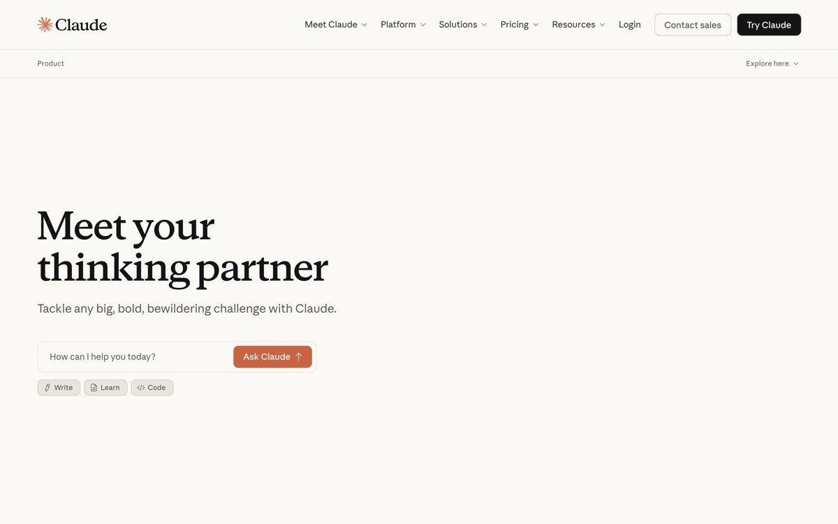
1. Anthropic Claude, best calm, trust-first AI hero
Anthropic's Claude landing page is a quiet rebellion against AI marketing maximalism. There is no particle field, no glowing orb, no "harness the power of AI" headline. The hero is a single line of copy, a typographic logo treatment, and a clean shot of the product. That restraint is the entire point: Claude is sold to buyers who associate hype with hallucination risk, and the design earns trust before the model ever opens its mouth.
What works in 2026 is how the page sequences proof. After the hero, you get a model-capabilities block, then research-led copy, then enterprise use cases. Each section is one idea, one paragraph, one supporting image. No carousels, no scroll-jacking.
Key strengths
Hero typography that signals "serious AI lab" without a single buzzword
Product surface (Claude UI) shown above the fold
Research and safety framing as a positioning move, not a footer link
One idea per section, no animation overload
Honest CTAs ("Try Claude," not "Unlock infinite intelligence")
Strong typographic hierarchy that scales beautifully on mobile
Best for
AI products sold to enterprises, regulated industries, and risk-averse buyers
Founders who want to avoid the "another AI tool" pattern recognition trap
Conversion notes
Single primary CTA, secondary CTA for enterprise contact
Trust signals (research, safety, model card) appear above feature blocks
Email gating absent on the public surface, low-friction trial path
Pros
Sets a strong "calm AI" tone you can adapt at any stage
Easy to translate into other regulated verticals (legal, healthcare, fintech)
Cons
Requires strong brand and typography work, which is more expensive to execute than a templated hero
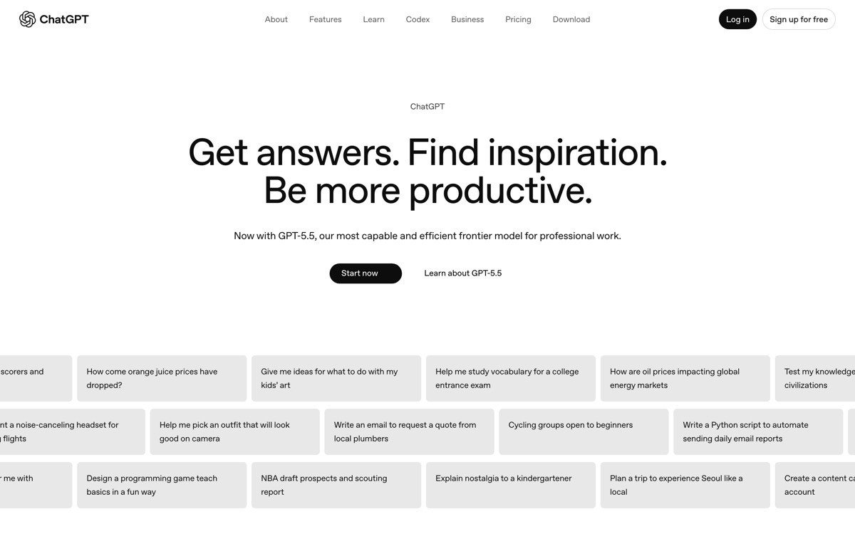
2. OpenAI ChatGPT, best mass-market AI landing page
The ChatGPT landing page is built for the broadest buyer pool in software. It speaks to consumers, small teams, and enterprises in one scroll, which is a hard brief. The way it pulls it off: the hero is plain, the headline is descriptive, and the dual CTA (web app and download) covers both the "I just want to try it" and "I want it everywhere" intents.
What is worth studying in 2026 is the way ChatGPT uses familiarity as a trust signal. There is no big logo wall because there does not need to be. The design choice is to treat brand recognition as the trust signal, which is only available to a few products, but the pattern (lean on whatever recognition you have) translates.
Key strengths
Hero copy that names the product behaviour ("ChatGPT helps you") rather than the technology
Dual CTA covers web and native app intents
App store badges and platform indicators serve as social proof
Personas (work, study, life) split into clean below-fold sections
Plan-comparison link visible without dominating the page
Best for
Mass-market AI products with both consumer and team buyers
Brands with enough recognition to lean on familiarity as proof
Conversion notes
Single dominant CTA above the fold, secondary download CTA next to it
Persona sections segment buyer journeys without splitting the page into separate routes
Pricing visible from main nav, not buried two levels deep
Pros
Excellent template for products with multi-segment buyers
Demonstrates the "plain hero, fast CTA" pattern at extreme scale
Cons
Restraint is hard to pull off without strong brand equity
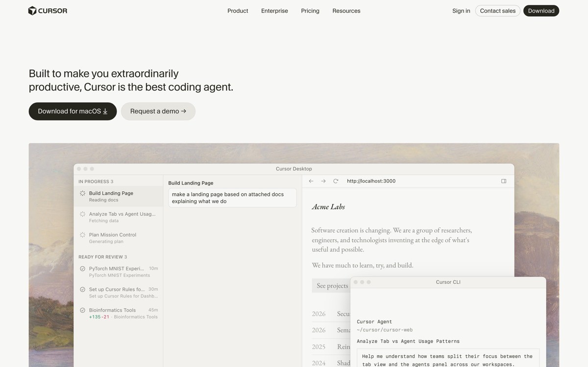
3. Cursor, best product-first AI landing page
Cursor's landing page is the textbook example of "show, do not tell" for developer tools. The hero is a screenshot (sometimes a short loop) of the actual editor with AI completions in flight. There is no animated lab abstraction, no "the future of coding" headline. The buyer sees what they will use within one second.
The design choice worth stealing: Cursor leans on developer logos and GitHub stars in a narrow band, not a screen-width logo wall. Trust signals are sized to the product (technical, sceptical buyer), not the marketing team's logo collection. That is a calibrated trust strategy, and it converts better than a sea of grey logos.
Key strengths
Live editor surface above the fold, no marketing illustration
Headline that describes the behaviour ("the AI code editor")
Calibrated trust signals (developer brands, GitHub stars) instead of generic logos
Download CTA defaulted to the visitor's OS
Feature sections each anchored to a real product screen
Best for
Developer tools where the buyer needs to recognise the product surface immediately
Products with a strong native UI that is the selling point
Conversion notes
OS-aware download CTA reduces friction for first-time visitors
Editor screenshots double as proof and demo
Pricing accessible in nav, with a clear free tier visible
Pros
One of the cleanest "show the product" templates in 2026 dev tools
Sets the bar for AI coding tools (everyone else now copies this pattern)
Cons
Only works if your product UI is strong enough to lead with, do not copy if your UI is the weak point
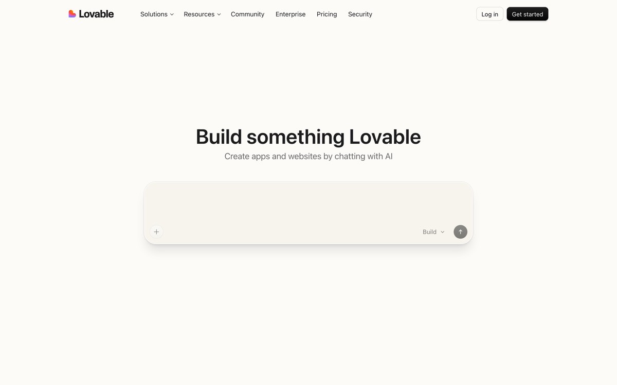
4. Lovable, best vibecoded SaaS landing page
Lovable's landing page is one of the cleanest expressions of the "prompt-in-the-hero" pattern. The hero is a single input field where the buyer types what they want to build, then watches the product respond. The entire pitch is the product, demoed on first scroll.
What works in 2026 is the gallery beneath the prompt: real apps built by real users, with the prompt that produced them visible underneath. It is social proof, feature demo, and conversion hook in one component. For vibecoded SaaS, the prompt-in-hero pattern is now the default, and Lovable is the clearest version of it.
Key strengths
Prompt input as the hero, demoing the product immediately
Real user-built apps as the social proof block
Headline focused on outcome ("idea to app") not feature
Brand voice consistent across hero, gallery, and CTAs
Mobile-first hero treatment that does not collapse
Best for
AI tools where the input is text and the output is visible product
Vibecoded SaaS competing with v0, Bolt, Replit
Conversion notes
Prompt input acts as both demo and signup funnel
User-built app gallery provides social proof tied directly to output quality
Free trial gating happens after the user has invested in a prompt
Pros
Highest commit-rate hero pattern for prompt-driven AI tools
Easy to maintain (the gallery refreshes automatically with new builds)
Cons
Demands that the product produce something demo-worthy in seconds, or the pattern backfires
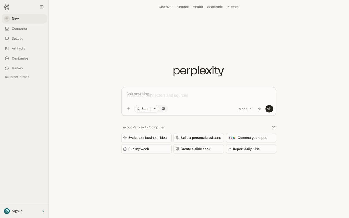
5. Perplexity, best AI search landing page
Perplexity's landing page is the strongest argument in 2026 for treating the input as the entire pitch. The hero is a search bar. That is it. No long headline, no feature grid above the fold, no animated illustration. The implication is that the product is so confident in its primary action that the page is just a frame around it.
The detail worth lifting: Perplexity shows source citations inline on the result page, and the landing page advertises this with a small preview block beneath the search bar. The design strategy is "search, then citations" as a single pitch, which differentiates Perplexity from ChatGPT in one screen.
Key strengths
Search bar as the hero, no other primary action
Citation preview block as the killer differentiator visible above the fold
Headline that frames the product as a category, not a tool
Brand identity strong enough to skip a logo wall
Plain feature copy below the fold, no marketing dressing
Best for
AI tools where the entire pitch is the input or query experience
Products competing on a specific differentiator (citations, sources, structured output)
Conversion notes
Search input gathers intent before signup, then funnels to account creation
Pro tier teased in the nav, not pushed in the hero
Mobile experience matches desktop pattern, no second design
Pros
Cleanest "input is the hero" pattern in 2026
Forces the team to make the input experience itself best-in-class
Cons
Demands that the input quality match the design promise, or trust drops fast
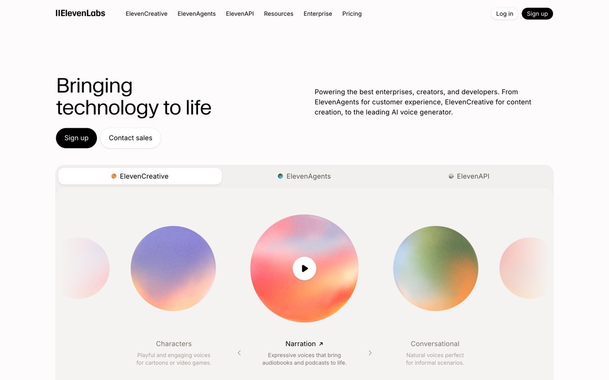
6. ElevenLabs, best AI audio landing page
Audio is the hardest medium to demo on a landing page, because the buyer has to choose to make noise. ElevenLabs solves it with an inline player above the fold and a curated set of voice samples (different languages, ages, emotions) that the visitor can preview in one click. The product is heard before it is read.
The design move worth stealing in 2026 is the sample selection. Instead of showing one voice (which buyers assume is cherry-picked), ElevenLabs shows a grid: short clips, varied conditions, and a clear toggle between languages. The implicit message: "Here is the range. Click anywhere."
Key strengths
Inline voice player above the fold
Curated voice grid showing range, not one cherry-picked clip
Language toggles built into the demo, not a separate page
Brand logo wall calibrated to creator and media buyers
Pricing tier preview visible from hero CTA path
Best for
AI tools with an audio, video, or image output as the primary product
Creator-tool SaaS that needs to demo output quality on first view
Conversion notes
Try-without-signup pattern lowers friction for evaluator buyers
Voice grid converts curious browsers into trial users in one click
Enterprise CTA kept secondary, separate buying motion
Pros
Best-in-class for any AI product where the output is the sale
Easy to adapt for AI video, AI image, or AI music products
Cons
Inline players need careful UX on mobile (autoplay rules vary by browser)
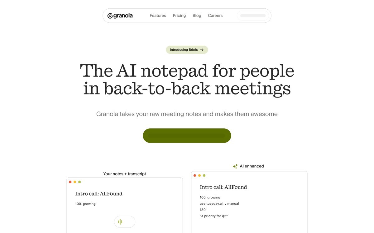
7. Granola, best AI-for-work landing page
Granola's landing page is the best 2026 example of selling AI to operational buyers (founders, ops, sales, customer success) without sounding like enterprise software. The hero shows real product screenshots, the copy names the actual job ("AI notepad for meetings"), and the social proof is founder quotes with names, faces, and companies.
The design choice worth stealing: Granola dedicates real estate to screenshots of actual notes the product produces, not glossy mockups. The buyer sees the output (formatting, structure, summary quality) before they are asked to install. That single design choice removes most of the "is this any good" objection.
Key strengths
Real product screenshots dominate the page, not abstract illustrations
Hero copy names the actual job, not the technology
Founder quotes with names, faces, and companies
Download CTA defaults to the visitor's OS
Privacy and data-handling copy visible without being defensive
Best for
AI-for-work tools sold to operational and revenue buyers
Products where output quality is the entire sales argument
Conversion notes
Real screenshots act as both feature demo and trust signal
Quote block from real users (not stock testimonials) raises credibility
Free tier gated behind download, which qualifies trial intent
Pros
Template for any AI tool sold to operators on the strength of output
Avoids the "enterprise software" tone that kills most AI-for-work pages
Cons
Requires constant screenshot maintenance as the UI evolves
How to choose the right AI SaaS landing page pattern for your product
1) Is your product input-driven or output-driven?
If the magic happens at the input (Lovable's prompt, Perplexity's search), make the input the hero. If the magic happens at the output (ElevenLabs' voice, Granola's notes), put the output in the hero as a real, playable, scrollable artefact. Mixing the two confuses the pitch.
2) Who is your buyer, and what do they fear?
Enterprise and regulated buyers fear hallucination and reputation risk: copy Claude's calm typography and research framing. Developer buyers fear bad UX and lock-in: copy Cursor's product-first hero and OS-aware CTAs. Mass-market buyers fear "another AI tool that wastes my time": copy ChatGPT's plain headline and dual CTA.
3) Do you have brand recognition to lean on, or do you need to earn it?
ChatGPT and Claude can ship a quiet hero because the brand is the trust signal. Newer products need calibrated trust signals: developer logos, founder quotes with real names, and visible product output. Skip the generic logo wall, it does not work for AI-built SaaS.
4) Can your product produce a wow output in under five seconds on first visit?
If yes, the prompt-in-the-hero pattern (Lovable) is your highest-converting move. If no (model loading is slow, output requires setup), default to the screenshot-and-screen-recording pattern (Granola, Cursor). Forcing a try-it-now hero on a slow product is the fastest way to lose first-time visitors.
If you have picked your pattern but the page still feels templated, the fix is rarely more sections. It is typography, spacing, real product art, and a hero that does not look like every other AI landing page launched this quarter. AY Design redesigns AI SaaS landing pages for founders shipping with Lovable, Bolt, v0, and Cursor who need their product to look unicorn-grade, not AI-built. Book a design audit and we will tell you which of these patterns fits your buyer, and what to rip out first.
FAQ
What makes a good AI SaaS landing page in 2026?
A good AI SaaS landing page in 2026 puts the product on screen above the fold, names the buyer's job in plain language, and uses calibrated trust signals (real user output, real founder quotes, real logos) instead of generic credibility theatre. It avoids glowing orbs, vague capability claims, and "powered by AI" badges.
Which AI startup has the best landing page?
For enterprise buyers, Anthropic Claude has the best landing page because it sells calmness and research credibility. For developer buyers, Cursor leads the category with its product-first hero. For prompt-driven AI tools, Lovable is the strongest "input is the demo" example. The "best" depends on who buys.
Should I show the product in my AI SaaS hero?
Yes, almost always. The pattern that converts in 2026 is product-in-hero, whether that is a screenshot (Cursor, Granola), a live input (Lovable, Perplexity), or an inline media player (ElevenLabs). Generic illustrations or AI-gradient art reduce conversion because they signal "we have not built it yet."
How long should an AI SaaS landing page be?
Most strong AI SaaS landing pages in 2026 fit between one and three scroll lengths. The hero, primary CTA, and product surface live above the fold. Below the fold: one persona or use-case block, social proof, feature highlights, pricing teaser, FAQ. Anything longer than that is content marketing, not a landing page.
Do I need a video on my AI SaaS landing page?
You need a moving artefact, not necessarily a video. A short product loop, an autoplaying screen recording, or an inline live demo all beat a static screenshot and a static video block. The buyer needs to see the product behave in under five seconds, by whichever medium is fastest to load.
How do I make my AI landing page not look AI-built?
Three moves: replace AI-gradient art with real product screenshots, replace "harness the power of AI" with a verb-noun headline that names the actual job, and replace the generic logo wall with calibrated trust signals (developer brands for dev tools, real founder quotes for ops tools, real customer outputs for creator tools). If those three are in place, the page will read as unicorn-grade.
Should I gate the demo behind email signup?
No, not for the primary input demo. Lovable, Perplexity, and ElevenLabs all let the visitor try the input before they ask for an email, then gate the second action (save, export, history). Email gating on the first action is the single biggest reason AI landing pages underperform their traffic.
What is the most common AI SaaS landing page mistake in 2026?
The most common mistake is shipping a landing page that looks like every other AI startup launched this quarter: the same gradient hero, the same "intelligence" buzzwords, the same generic logo wall, the same vague capability claims. Buyers and AI engines both pattern-match. The fix is real product art, real buyer language, and a hero that names what the product does.
Checkout other Blogs:

AI workflow UX design patterns shaping 2026
Eight AI workflow UX design patterns shaping 2026, scored on usability and trust, with real references from Cursor, v0, ChatGPT, Granola, and Anthropic's Claude SDK.
Author:
AY Designs Team

Best AI coding agent UX examples in 2026
Seven AI coding agents setting the UX bar in 2026, with the diff, plan, and trust patterns to lift for your own agent product.
Author:
AY Designs Team

Best AI customer support agent UX examples 2026
Seven AI customer support agents setting the UX bar in 2026, with the handoff, confidence, and resolution patterns to lift.
Author:
AY Designs Team

Best AI agent interface design examples in 2026
A scored comparison of the strongest AI agent interfaces in 2026, from Claude Code and Cursor to Devin, Perplexity, and Granola, judged on tool clarity, memory, trust, and recovery.
Author:
AY Designs Team