
Hero sections from AI startups in 2026 fall into two camps: the calm, typography-led hero that lets the product speak (Anthropic, Cursor), and the demo-first hero that puts the product input or output directly above the fold (Lovable, Perplexity, Suno). Both convert; the bad heroes (gradient orbs, "intelligence reimagined," vague capability claims) do not.
We picked eight AI startup hero sections worth studying this year, plus the copy moves and design patterns you can lift before your next homepage push. If you are shipping with Lovable, Bolt, v0, or Cursor, this is the part of the page that decides whether buyers stay or pattern-match you as another templated AI tool.
TL;DR, if you only steal one pattern in 2026, copy Lovable or Perplexity: the input field is the hero, the buyer demos the product in three seconds, and there is no headline you have to read first.
Best AI startup hero sections: a brief overview
Anthropic: Best calm typography hero, product surface above the fold and zero hype.
OpenAI: Best mass-market hero, plain headline plus dual CTA covering web and download.
Cursor: Best product-first hero, the editor itself is the hero illustration.
Lovable: Best prompt-in-the-hero, the input field is the entire pitch.
Perplexity: Best input-as-hero, the search bar with citations is the differentiator.
Runway: Best generative video hero, plays real output above the fold.
Suno: Best generative audio hero, makes the buyer want to press play.
v0: Best vibecoded UI hero, prompt-to-component flow demoed in the hero itself.
Startup | Hero pattern | Above-the-fold action | Trust signal strategy |
|---|---|---|---|
Anthropic | Calm typography, product UI snapshot | Try Claude | Research and safety framing |
OpenAI | Plain hero, dual CTA | Try ChatGPT / Download | Brand familiarity |
Cursor | Live editor screen in hero | Download for macOS | Dev brand logos, GitHub stars |
Lovable | Prompt input as the hero | Type and build | Real user-built app gallery |
Perplexity | Search bar with citations preview | Ask anything | Source citations inline |
Runway | Auto-playing generated video | Try Runway / Watch reel | Studio and creator credits |
Suno | Inline audio player with sample tracks | Make a song | Sample diversity, creator quotes |
v0 | Prompt input plus real component output | Generate | Vercel brand, real app shots |
1. Anthropic, best calm typography hero
Anthropic's hero is the calmest in AI in 2026, and the calmness is the strategy. The headline is short, the typography is deliberate, the product surface (Claude UI) sits in or near the hero, and there is no animation pulling the buyer's eye away. The implicit message: "We are serious, our model is serious, you can trust us with the data."
The detail worth copying is how Anthropic uses negative space. The hero is not packed. The headline has room to breathe, the CTA is one button (with a secondary text link), and the product image is sized to be a confident frame, not an attention grab. That restraint is hard to fake.

Key strengths
Typography-led hero with confident negative space
Product surface above the fold, no abstract illustration
Single primary CTA with calm secondary link
Headline that names the product, not the technology
No animation, no scroll-jacking, no particle field
Brand identity strong enough to skip a logo wall
Best for
AI products sold to enterprise, regulated, or risk-averse buyers
Founders who want to differentiate from gradient-orb maximalism
Copy moves to steal
Short headline, no buzzwords
Subhead that names the user benefit in one sentence
CTA copy that respects the buyer's intelligence ("Try Claude" not "Unlock the future")
Pros
Sets a strong "calm AI" tone you can adapt in regulated verticals
Future-proof, calm typography outlasts trend cycles
Cons
Demands strong brand and typography work to execute, not a template job
2. OpenAI, best mass-market hero
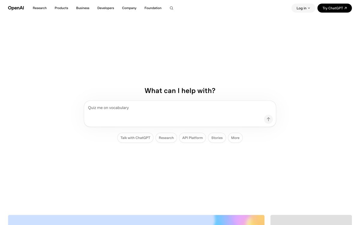
OpenAI's hero is built for the broadest buyer pool in software: consumers, teams, enterprises, all on the same page. The pattern is plain on purpose. A short headline, a primary CTA (try in browser), a secondary CTA (download), and a calm product surface or screenshot below. It reads as confident, not loud.
What works is the discipline. There is no "AGI is here" headline, no animated demo above the fold, no gimmick. The brand recognition does the work of trust signals, so the page leans plain. For most startups, you cannot lean on brand alone, but the pattern (plain hero, fast CTA, calm proof) translates.
Key strengths
Plain, descriptive headline that names the product behaviour
Dual CTA covers web app and native download intents
Hero treatment scales from consumer to enterprise without splitting the page
No animation, no clutter, no buzzword
App store badges and platform indicators act as quiet social proof
Best for
Mass-market AI with both consumer and team buyers
Brands with enough recognition to lean on familiarity as trust
Copy moves to steal
Headline that names the product action, not the technology category
Dual CTA pattern when web and native both matter
Subhead that addresses the buyer's job in one short sentence
Pros
Demonstrates the plain-hero discipline at extreme scale
Template for any product with multiple buyer personas in one page
Cons
Restraint requires strong brand recognition that newer products lack
3. Cursor, best product-first hero
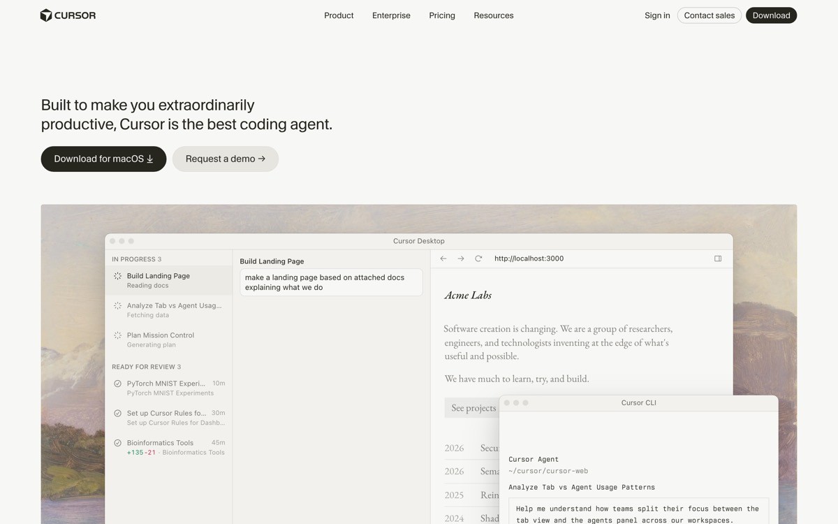
Cursor's hero is the textbook "show, do not tell" for AI dev tools. The editor itself is in the hero. A snippet of code, a Cursor completion in flight, a small selection of brand logos in a narrow band. The buyer sees what they will install within a second, and the headline confirms it.
The design choice worth stealing: Cursor sizes the editor screenshot to be the dominant element above the fold, not an afterthought below the headline. Most dev-tool startups still put a marketing illustration in the hero. Cursor's hero shows the alternative, and it has shifted the category.
Key strengths
Editor screenshot is the hero element, not a sidebar illustration
Headline that describes the product behaviour ("the AI code editor")
Calibrated trust signals (developer brands, GitHub stars) sized to the buyer
OS-aware download CTA reduces first-visit friction
Hero scales gracefully to mobile without losing the product surface
Best for
Developer tools where the product UI is recognisable on sight
AI products with a strong native or web app surface as the selling point
Copy moves to steal
Headline names the product category ("the AI code editor"), not the tech stack
One sentence subhead, no marketing dressing
CTA copy defaulted to the visitor's OS
Pros
The cleanest "product-in-hero" template for AI dev tools in 2026
Sets the bar everyone else copies in the AI coding category
Cons
Only works if your product UI is strong enough to lead with
4. Lovable, best prompt-in-the-hero
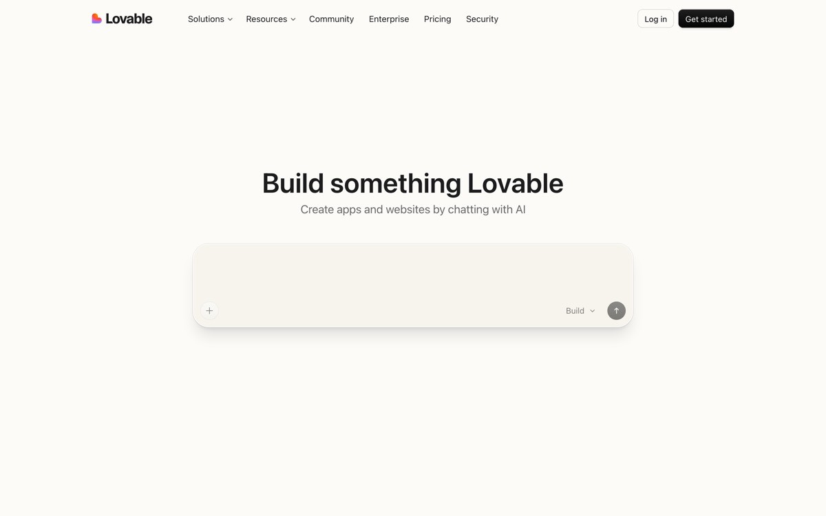
Lovable's hero is the strongest prompt-in-the-hero example in 2026. There is no marketing headline you have to read first. The input field is centred above the fold, with a small placeholder prompt and a clear "Build something Lovable" CTA. The buyer types what they want, hits return, and the product demos itself.
What makes it convert: beneath the prompt, a gallery of real apps built by real users (with the prompt visible underneath each one) acts as social proof, feature demo, and "look what is possible" prompt-priming all at once. The buyer never has to leave the page to understand what Lovable does.
Key strengths
Prompt input as the hero, no headline required before the demo
Real user-built apps as the social proof block
Gallery doubles as prompt-priming for first-time visitors
Hero scales cleanly to mobile (input remains the focal point)
Brand voice consistent across hero, gallery, and CTA
Best for
AI tools where input is text and output is a visible artefact
Vibecoded SaaS competing with v0, Bolt, Replit
Copy moves to steal
Placeholder prompt that primes the buyer's imagination
CTA copy that names the outcome ("Build something Lovable")
Gallery cards that show the prompt next to the output
Pros
Highest commit-rate hero pattern for prompt-driven AI products
Demo-and-gallery combination forces no scrolling to "get it"
Cons
Pattern fails if the product cannot produce a demo-worthy output in under five seconds
5. Perplexity, best input-as-hero
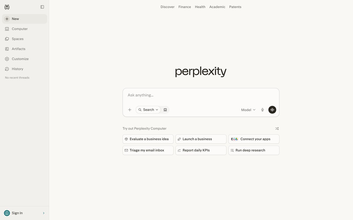
Perplexity's hero is the boldest expression of "the input is the entire pitch" in 2026. The hero is a search bar. There is no long headline above it, no animated demo behind it, no scroll prompt below it. Beneath the input, a tiny citation preview block hints at the differentiator (real sources, inline citations).
The design choice worth lifting: Perplexity does not try to explain what AI search is. The hero asks the buyer to try it. The category education happens in the result, not the marketing copy. For an AI product confident in its core action, this is the highest-converting move in the category.
Key strengths
Search bar as the entire hero, no marketing copy required
Citation preview block as the differentiator, visible above the fold
No animation, no clutter, no hype
Brand strong enough to skip a logo wall
Mobile experience matches desktop pattern, no second design
Best for
AI tools where the input or query experience is the entire pitch
Products competing on a specific differentiator (citations, sources, structured output)
Copy moves to steal
Placeholder text in the input that primes the buyer
Differentiator preview (citation snippet) visible without a click
No headline above the input, just the action
Pros
The boldest input-as-hero pattern in 2026
Forces the team to make the input experience itself best-in-class
Cons
Demands input quality match the design promise, or trust drops fast
6. Runway, best generative video hero
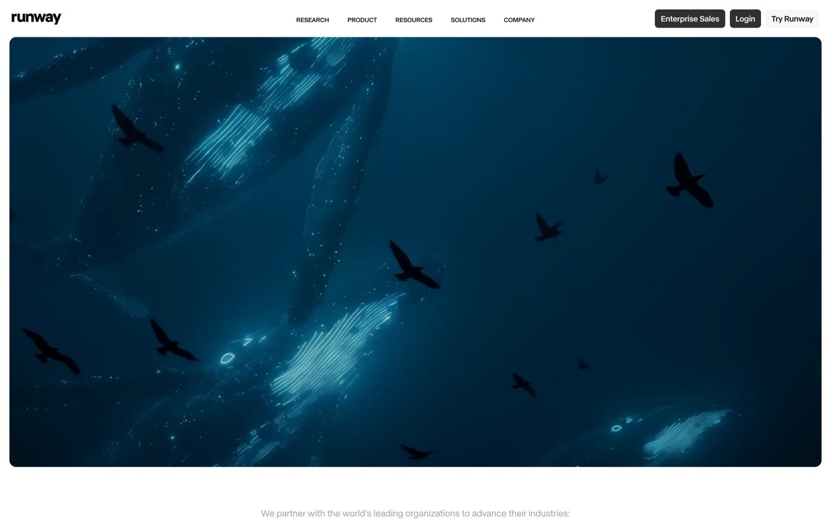
Runway's hero plays generated video above the fold. There is no static image, no marketing illustration. A short auto-playing reel of generated clips loops behind the headline, with a clear "Try Runway" CTA layered on top. Within three seconds, the buyer sees the output quality, the visual range, and the brand at once.
The detail worth stealing is the curation. Runway shows a tight, varied selection (not a single best-case clip), which signals range without feeling cherry-picked. The buyer trusts that the showcase reflects the average, not the cherry pick.
Key strengths
Auto-playing generated video above the fold
Curated, varied reel that signals range, not cherry-pick
Headline overlaid on the video, not stacked above it
Studio and creator credits as calibrated trust signals
Clear "Try Runway" CTA, single primary action
Best for
Generative video, image, or media AI products
Creator tools where output quality is the entire sale
Copy moves to steal
Headline that names the creative job, not the model
CTA that promises the action ("Try Runway") rather than a vague "Get started"
Credit captions on showcase clips for credibility
Pros
Best-in-class for AI products where the output is the sale
Auto-playing video respects mobile data and battery (short loop)
Cons
Video heroes require careful encoding and CDN choice or page weight tanks
7. Suno, best generative audio hero
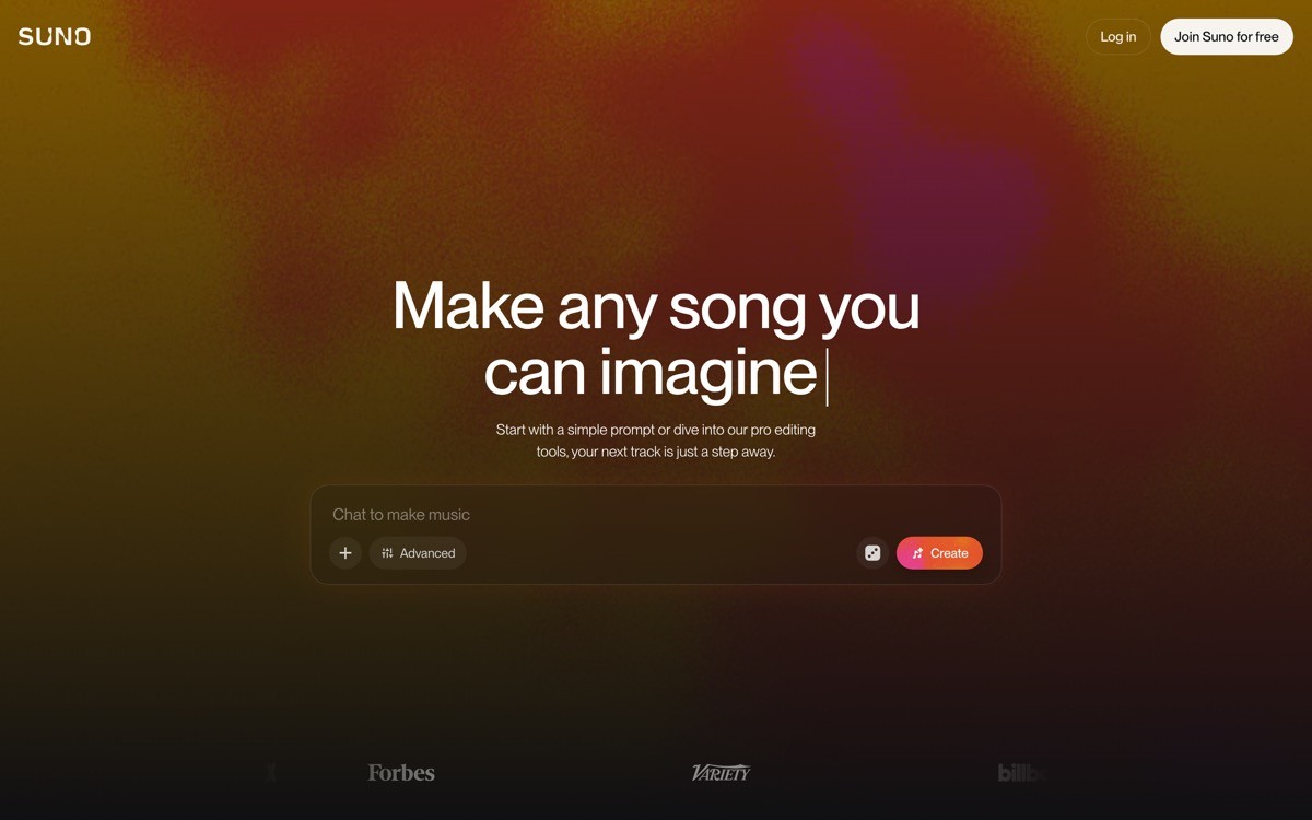
Suno's hero solves the hardest medium to demo in 2026: audio. The hero plays inline sample tracks, with album-art-style covers, song titles, and a clear play button. The buyer can sample the output (different genres, voices, instruments) in one click, without leaving the page.
The design move worth stealing is treating each sample like a record release. Suno gives each generated song a cover, a title, a duration, and a credit. The presentation primes the buyer to perceive the output as creative product, not AI demo. That framing alone shifts perceived quality.
Key strengths
Inline audio player with sample tracks in the hero
Each sample treated like a record release (cover, title, duration)
Genre and voice diversity built into the sample selection
Calm typographic headline framing the creative job
Clear "Make a song" CTA, single primary action
Best for
Generative audio, music, voice, or podcast AI products
Creator tools where the output is the entire pitch
Copy moves to steal
CTA that names the creative outcome ("Make a song")
Track titles and durations next to play buttons
Subhead that names the creative job, not the model
Pros
Template for any AI product where audio is the output
Record-release framing increases perceived output quality
Cons
Inline audio needs careful UX on mobile (autoplay rules vary)
8. v0, best vibecoded UI hero
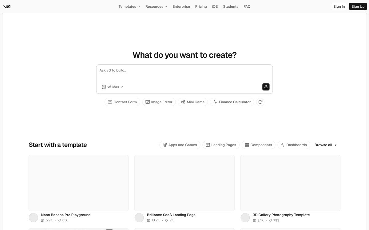
v0's hero is the cleanest expression of "prompt to UI" in 2026. The input is centred above the fold, the placeholder prompt primes the buyer ("a SaaS landing page with pricing"), and beneath it a gallery of generated components and apps shows real output. The buyer types, hits return, and watches v0 generate UI in real time.
What works is the way v0 sits inside the Vercel brand. The hero is recognisably part of the Vercel design language (typography, spacing, button style), which inherits trust from the parent brand. Smaller startups without that brand equity need to build the trust signals themselves, but the pattern translates.
Key strengths
Prompt input as the hero, gallery beneath as proof
Placeholder prompts that prime the buyer's imagination
Generated UI shown as real components, not marketing illustrations
Vercel design language inherited for trust
Clear "Generate" CTA, single primary action
Best for
Vibecoded SaaS tools generating UI, components, or full apps
Products competing with Lovable, Bolt, Replit, Cursor
Copy moves to steal
Placeholder prompts that demonstrate range
Gallery captions that name the prompt and output side by side
Inherited design language if your product sits inside a stronger parent brand
Pros
Strong template for prompt-to-UI AI products
Gallery beneath the prompt removes "what can this make" objection
Cons
Pattern works best when output is visible immediately, slow generation kills the magic
How to choose the right hero pattern for your AI startup
1) Can your product produce a wow output in under five seconds on first visit?
If yes, the prompt-in-hero pattern (Lovable, v0, Perplexity) is your highest-converting move. The buyer types, the product responds, the demo happens before any reading. If no (model loading is slow, output requires setup), default to the product-screenshot pattern (Cursor, Anthropic) or auto-playing media (Runway, Suno).
2) Is your buyer technical, creative, or operational?
Technical buyers respond to product screenshots and calibrated dev brand logos (Cursor, Anthropic). Creative buyers respond to output samples played inline (Runway, Suno). Operational buyers respond to plain headlines, dual CTAs, and real product surfaces (OpenAI, Granola). Mismatching hero pattern to buyer type is the single biggest reason AI startup heroes underperform.
3) Do you have brand recognition to lean on?
OpenAI and Anthropic can ship plain heroes because brand familiarity is the trust signal. Newer startups need calibrated trust signals: dev brand logos for dev tools, real founder quotes for ops tools, creator credits for media tools. Skip the generic logo wall; it does not work for AI-built SaaS in 2026.
4) How much do you want the hero to age?
Calm, typography-led heroes (Anthropic) age slowly. Animation-heavy heroes age fast. If you ship a generative video or audio reel, plan to refresh it quarterly. If you ship typography and product screenshots, you can leave the hero alone for a year or more. Hero longevity is a real cost-of-ownership question.
If you have picked your pattern but the hero still feels templated, the fix is rarely more sections. It is typography, spacing, real product art, and a CTA that names the actual outcome instead of "Get started." AY Design redesigns AI startup heroes and full landing pages for founders shipping with Lovable, Bolt, v0, and Cursor who need their product to look unicorn-grade, not AI-built. Book a design audit and we will tell you which hero pattern fits your product, and what to rip out first.
FAQ
What makes a good AI startup hero section in 2026?
A good AI startup hero in 2026 either puts a real product surface above the fold (screenshot, input, output) or leans on calm typography backed by strong brand. It avoids glowing orbs, gradient soup, vague capability headlines, and generic logo walls. The buyer should see what the product does within five seconds, before any reading.
Which AI startup has the best hero section?
For prompt-driven AI, Lovable and v0 lead on the input-as-hero pattern. For input-as-hero in AI search, Perplexity is the strongest example. For product-first dev tools, Cursor sets the bar. For calm, enterprise-friendly heroes, Anthropic is the cleanest. For media AI, Runway and Suno lead the category. The "best" depends on what your product does.
Should I show the product in my AI startup hero?
Yes, almost always. The pattern that converts in 2026 is product-in-hero: a screenshot, a live input field, an auto-playing reel, or an inline player. Generic illustrations and AI-gradient art reduce conversion because they signal templated thinking and "we have not built it yet."
How long should an AI startup hero headline be?
Most strong AI startup heroes in 2026 keep the headline to six to ten words. Anthropic, Cursor, OpenAI all stay short. Long headlines (Lovable, Suno) work only when the subhead carries the rest of the pitch. If your headline runs to two lines on desktop, cut it in half before shipping.
Should the CTA be "Try" or "Get started"?
"Try [product name]" beats "Get started" almost every time. "Get started" is the default in templated SaaS, and buyers pattern-match it. "Try Claude," "Try Runway," "Try Cursor" all read as confident invitations. "Make a song" (Suno) and "Build something Lovable" go further by naming the outcome.
Do I need a logo wall under my AI startup hero?
Only if you have logos calibrated to your buyer. Cursor uses a narrow band of developer brands because that is who buys it. Anthropic skips the logo wall entirely because brand and research credibility do the work. Generic logo walls (the same six startup names every other landing page uses) are conversion-neutral or negative in 2026.
How do I make my AI hero not look AI-built?
Three moves: replace gradient art with a real product surface, replace buzzword headlines with a verb-noun description of the job, and replace generic CTAs with copy that names the outcome. If those three are in place, the hero will read as unicorn-grade. Most templated AI startup heroes fail at all three.
Should I autoplay video or audio in my AI hero?
Autoplay video, yes, if you keep the file under one megabyte, loop it short, and provide a mute control by default. Autoplay audio, no, never on first visit, even for an AI audio product. Suno gates audio behind a play tap. The browser autoplay rules and user expectations make audio autoplay a trust killer in 2026.
Checkout other Blogs:

Multi-agent system UX design guide for 2026
A pattern-by-pattern guide to designing multi-agent system UX in 2026, with a scoring matrix and references from Claude Code, LangGraph, Devin, and Replit Agent.
Author:
AY Designs Team

Human-in-the-loop AI design guide for 2026
A 2026 guide to human-in-the-loop AI design with patterns, scoring framework, and examples from Cursor, Claude Code, Stripe, and Notion AI.
Author:
AY Designs Team

How to design agentic AI products in 2026: a 7-step playbook
A seven-step design playbook for shipping agentic AI products that users actually trust, with scoring matrix and real product references from Cursor, Claude Code, Devin, and Perplexity.
Author:
AY Designs Team

How much does AI SaaS design cost in 2026?
AI SaaS design cost in 2026 by tier and engagement type, with ranges, timelines, and a value scorecard for founders shipping with Lovable, Bolt, and v0.
Author:
AY Designs Team